Getting Started with UWP Range Selector
18 Nov 201810 minutes to read
Visual Structure
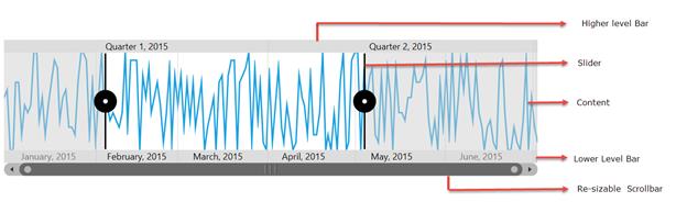
The UWP Range Selector is composed of various elements such as higher level bar, lower level bar, content, and resizable scrollbar.
- Higher level bar - Contains timespan format one level higher than the lower level bar DateTime values. E.g. If the higher level bar contains year format (yyyy), then the lower level bar contains month format (MMM).
- Lower level bar - Contains timespan format one level lower than the higher level bar DateTime values. E.g. If the lower level bar contains month format (MMM), then the higher level bar contains year format (yyyy).
- Content - Can hold any type of UI element inside the navigator.
- Resizable scrollbar - Used to zoom and scroll the content and label bars.
These steps are explained below for both XAML and code behind.
Create a UWP Range Selector from XAML
The following steps explain how to create a UWP Range Selector in XAML.
Adding the assembly reference
- Open the Add Reference window from your project.
- Choose Windows > Extensions > Syncfusion Controls for UWP XAML.
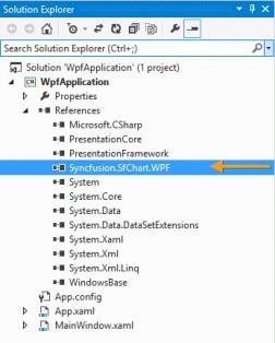
Add the following namespace in your XAML window.
xmlns:syncfusion="using:Syncfusion.UI.Xaml.Charts"Add UWP Range Selector from Toolbox
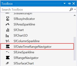
Drag and drop the SfDateTimeRangeNavigator control from the Toolbox to your application.
Initializing UWP Range Selector
<chart:SfDateTimeRangeNavigator>

</chart:SfDateTimeRangeNavigator>
Creating a data source
public class Model
{
    public DateTime Date { get; set; }

    public double High { get; set; }

    public double Low { get; set; }

    public double Open { get; set; }

    public double Close { get; set; }
}

public class ViewModel
{
    public ViewModel()
    {
        this.StockPriceDetails = new ObservableCollection<Model>();

        DateTime date = new DateTime(2015, 1, 1);

        Random rd = new Random();

        for (int i = 0; i < 70; i++)
        {
            this.StockPriceDetails.Add(new Model()
            {
                Date = date.AddDays(i),
                Open = rd.Next(870, 875),
                High = rd.Next(876, 890),
                Low = rd.Next(850, 855),
                Close = rd.Next(856, 860)
            });
        }
    }

    public ObservableCollection<Model> StockPriceDetails { get; set; }
}
Setting ItemsSource for UWP Range Selector
Since initializing will produce an empty UWP Range Selector, we need to set the ItemsSource and XBindingPath for the UWP Range Selector. The ItemsSource must implement the IEnumerable interface.
Defining the ItemsSource for Range Navigator in XAML.
<chart:SfDateTimeRangeNavigator x:Name="RangeNavigator" ItemsSource="{Binding StockPriceDetails}" XBindingPath="Date" />SfDateTimeRangeNavigator rangeNavigator = new SfDateTimeRangeNavigator()
{
ItemsSource = new ViewModel().StockPriceDetails,
XBindingPath ="Date"
};Adding content
Content which needs to be displayed inside a UWP Range Selector can be of any control. Here SfLineSparkline control has been added.
The following properties are used to add content.
-
ItemsSource- Gets or sets an IEnumerable source used to render range. -
XBindingPath- Gets or sets the property path of the x data in ItemsSource. -
Content- Gets or sets the content that needs to be hosted inside the Navigator, the content can be any UI element.
<chart:SfDateTimeRangeNavigator x:Name="RangeNavigator"
ItemsSource="{Binding StockPriceDetails}" XBindingPath="Date">
<chart:SfDateTimeRangeNavigator.Content>
<chart:SfLineSparkline ItemsSource="{Binding StockPriceDetails}" Margin="20" YBindingPath="High" />
</chart:SfDateTimeRangeNavigator.Content>
</chart:SfDateTimeRangeNavigator>SfLineSparkline sparkline = new SfLineSparkline()
{
ItemsSource = new ViewModel().StockPriceDetails,
XBindingPath = "Date",
YBindingPath = "High"
};
SfDateTimeRangeNavigator rangeNavigator = new SfDateTimeRangeNavigator()
{
    ItemsSource = new ViewModel().StockPriceDetails,
    XBindingPath ="Date"
};
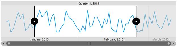
rangeNavigator.Content = sparkline;The following output is displayed as a result of the above code example.
Create a UWP Range Selector from code behind
The following steps explain how to create a UWP Range Selector from code behind.
Adding the assembly reference
- Open the Add Reference window from your project.
- Choose Windows > Extensions > Syncfusion Controls for UWP XAML.
- Add the following namespace in code behind.
using Syncfusion.UI.Xaml.Charts;Initializing UWP Range Selector
SfDateTimeRangeNavigator navigator = new SfDateTimeRangeNavigator();Creating a data source
public class Model
{
    public DateTime Date { get; set; }
    public double High { get; set; }
    public double Low { get; set; }
    public double Open { get; set; }
    public double Close { get; set; }
}

public class ViewModel
{
    public ViewModel()
    {
        this.StockPriceDetails = new ObservableCollection<Model>();

        DateTime date = new DateTime(2015, 1, 1);

        Random rd = new Random();

        for (int i = 0; i < 70; i++)
        {
            this.StockPriceDetails.Add(new Model()
            {
                Date = date.AddDays(i),
                Open = rd.Next(870, 875),
                High = rd.Next(876, 890),
                Low = rd.Next(850, 855),
                Close = rd.Next(856, 860)
            });
        }
    }

    public ObservableCollection<Model> StockPriceDetails { get; set; }
}
Applying ItemsSource to range navigator
ViewModel viewModel = new ViewModel();

SfDateTimeRangeNavigator navigator = new SfDateTimeRangeNavigator();

navigator.ItemsSource = viewModel.StockPriceDetails;

navigator.XBindingPath = "Date";
Adding content
Add the content that needs to be displayed inside SfDateTimeRangeNavigator using the Content property.
SfLineSparkline sparkline = new SfLineSparkline();

sparkline.ItemsSource = viewModel.StockPriceDetails;

sparkline.XBindingPath = "Date";

sparkline.YBindingPath = "High";

SfDateTimeRangeNavigator navigator = new SfDateTimeRangeNavigator();

navigator.ItemsSource = viewModel.StockPriceDetails;

navigator.XBindingPath = "Date";

navigator.Content = sparkline;

this.MainGrid.Children.Add(navigator);
The following output is displayed as a result of the above code example.
You can find the complete getting started sample from this link