How can I help you?
Appearance and Styling in UWP Radial Slider (SfRadialSlider)
18 Feb 202510 minutes to read
Inner Rim
Inner Rim term denotes the circle in the center of SfRadialSlider. Following properties can be used to customize the Inner Rim.
Inner Rim Radius Factor
InnerRimRadiusFactor property decides the radius of Inner Rim from the total radius available to render the Radial Slider.
Inner Rim Stroke
InnerRimStroke property can be used to set the stroke color of the Inner Rim.
Inner Rim Stroke Thickness
InnerRimStrokeThickness property can be used to set the thickness of the Inner Rim.
Inner Rim Fill
InnerRimFill property can be used the set the fill color of the Inner Rim.
<syncfusion:SfRadialSlider

InnerRimFill="LightGray" x:Name="radialSlider"

            InnerRimRadiusFactor="0.25"

            InnerRimStroke="LightSkyBlue"

InnerRimStrokeThickness="4" />radialSlider.InnerRimRadiusFactor = 0.25;
radialSlider.InnerRimStroke = new SolidColorBrush(Colors.SkyBlue);
radialSlider.InnerRimStrokeThickness = 4;radialSlider.InnerRimRadiusFactor = 0.25
radialSlider.InnerRimStroke = New SolidColorBrush(Colors.SkyBlue)
radialSlider.InnerRimStrokeThickness = 4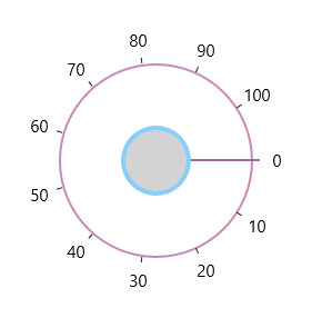
Outer Rim
Outer Rim term denotes circular track (outer circle) of SfRadialSlider. Following properties can be used to customize the Inner Rim
Outer Rim Radius Factor
OuterRimRadiusFactor property decides the radius of Outer Rim from the total radius available to render the SfRadialSlider.
Outer Rim Stroke
OuterRimStroke property can be used to set the stroke color of the Outer Rim.
Outer Rim Stroke Thickness
OuterRimStrokeThickness property can be used to set the thickness of the Outer Rim.
Background
Background property can be used to fill the Outer Rim.
<syncfusion:SfRadialSlider x:Name="radialSlider"

            Background="LightGray"

            OuterRimRadiusFactor="0.8"

            OuterRimStroke="LightSkyBlue"

OuterRimStrokeThickness="4" />radialSlider.OuterRimRadiusFactor = 0.8;
radialSlider.OuterRimStroke = new SolidColorBrush(Colors.SkyBlue);
radialSlider.OuterRimStrokeThickness = 4;radialSlider.OuterRimRadiusFactor = 0.8
radialSlider.OuterRimStroke = New SolidColorBrush(Colors.SkyBlue)
radialSlider.OuterRimStrokeThickness = 4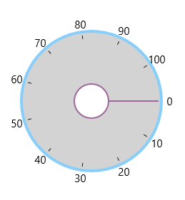
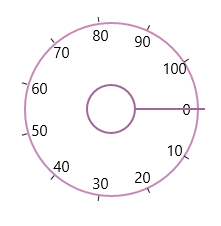
Ticks
Ticks displayed along the circular path can be customized using the following properties.
Tick Template
Ticks can be customized using the TickTemplate property.
<syncfusion:SfRadialSlider>

            <syncfusion:SfRadialSlider.TickTemplate>

                <DataTemplate>

                    <Border Background="Red"></Border>

                </DataTemplate>

            </syncfusion:SfRadialSlider.TickTemplate>

 </syncfusion:SfRadialSlider>
Tick Radius Factor
TickRadiusFactor property decides the radius of the ticks from the total radius available to render the SfRadialSlider.
<syncfusion:SfRadialSlider x:Name="radialSlider" TickRadiusFactor="0.75" />radialSlider.TickRadiusFactor = 0.25;radialSlider.TickRadiusFactor = 0.25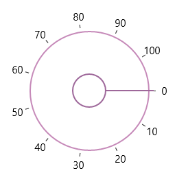
Tick Visibility
Visibility of ticks can be controlled by TickVisibility property.
<syncfusion:SfRadialSlider x:Name="radialSlider" TickVisibility="Collapsed" />radialSlider.TickVisibility = Visibility.Collapsed;radialSlider.TickVisibility = Visibility.Collapsed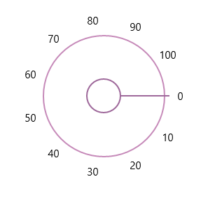
Labels
Labels displayed along the circular path in the Radial slider can be customized by the following properties.
Label Template
The LabelTemplate property can be used to customize the label object.
<syncfusion:SfRadialSlider>

<syncfusion:SfRadialSlider.LabelTemplate>

           <DataTemplate>

               <TextBlock Text="{Binding}" Foreground="DodgerBlue"></TextBlock>

           </DataTemplate>

       </syncfusion:SfRadialSlider.LabelTemplate>

</syncfusion:SfRadialSlider>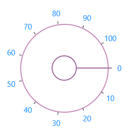
Label Radius Factor
LabelRadiusFactor property decides the radius of the labels from the total radius available to render the SfRadialSlider.
<syncfusion:SfRadialSlider x:Name="radialSlider" LabelRadiusFactor="0.7" />radialSlider.LabelRadiusFactor = 0.7;radialSlider.LabelRadiusFactor = 0.7Label Visibility
Visibility of ticks can be controlled by LabelVisibility property.
<syncfusion:SfRadialSlider x:Name="radialSlider" LabelVisibility="Collapsed" />radialSlider.LabelVisibility = Visibility.Collapsed;radialSlider.LabelVisibility = Visibility.Collapsed
Pointer
The Pointer that is used for the select the value by dragging in circular track can be customized with the following properties.
Pointer Radius Factor
The PointerRadiusFactor property decides the radius of the Pointer from the total radius available to render the SfRadialSlider.
<syncfusion:SfRadialSlider x:Name="radialSlider" PointerRadiusFactor="0.5" />radialSlider.PointerRadiusFactor = 0.5;radialSlider.PointerRadiusFactor = 0.5
Pointer Style
Style of the Pointer can be customized using the PointerStyle property.
<syncfusion:SfRadialSlider>

<syncfusion:SfRadialSlider.PointerStyle>

                <Style TargetType="syncfusion:RadialPointer" >

                    <Setter Property="Height" Value="2"/>

                    <Setter Property="Template">

                        <Setter.Value>

                            <ControlTemplate TargetType="syncfusion:RadialPointer">

                                <Border  Background="Red"/>

                            </ControlTemplate>

                        </Setter.Value>

                    </Setter>

                </Style>

            </syncfusion:SfRadialSlider.PointerStyle>

</syncfusion:SfRadialSlider>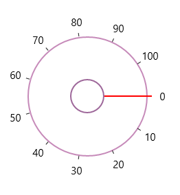
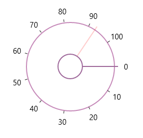
Preview Pointer Style
The Preview Pointer that appears when hovering over the SfRadialSlider can be customized using the PreviewPointerStyle property.
<syncfusion:SfRadialSlider

            Minimum="0"

            Maximum="100"  >

            <syncfusion:SfRadialSlider.PreviewPointerStyle>

                <Style TargetType="syncfusion:RadialPreviewPointer" >

                    <Setter Property="Height" Value="2"/>

                    <Setter Property="Template">

                        <Setter.Value>

     <ControlTemplate TargetType="syncfusion:RadialPreviewPointer">

                                <Border Opacity="0.2"  Background="Red"/>

                          </ControlTemplate>

                        </Setter.Value>

                    </Setter>

                </Style>

            </syncfusion:SfRadialSlider.PreviewPointerStyle>

</syncfusion:SfRadialSlider>