Tooltip in .NET MAUI Sunburst Chart
9 Jul 20268 minutes to read
Tooltips provide additional information about segments in the sunburst chart. A tooltip is displayed when a segment is tapped or clicked. By default, the tooltip displays the corresponding segment’s category (from the Levels group property) and value (from the ValueMemberPath property).
NOTE
Prerequisite: Ensure that the required NuGet package is installed, the necessary namespaces are imported, and the Sunburst Chart control is properly configured in your application. For detailed setup and configuration instructions, refer to the Getting Started guide.
Enable tooltip
To enable tooltips in the chart, set the EnableTooltip property of SfSunburstChart to true. The default value of the EnableTooltip property is false.
<sunburst:SfSunburstChart EnableTooltip="True">
    <!-- code omitted for brevity -->
</sunburst:SfSunburstChart>
SfSunburstChart sunburst = new SfSunburstChart();
// code omitted for brevity
sunburst.EnableTooltip = true;
this.Content = sunburst;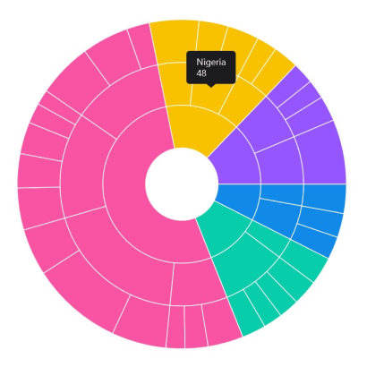
Customization
To customize the tooltip, create an instance of the SunburstTooltipSettings class and assign it to the TooltipSettings property of the SfSunburstChart. The following properties of SunburstTooltipSettings are used to customize the tooltip appearance:
-
Background, of type
Brush, specifies the background color of the tooltip. -
FontAttributes, of type
FontAttributes, specifies the font style of the tooltip text. -
FontFamily, of type
string, specifies the font family for the tooltip text. -
FontSize, of type
float, specifies the font size of the tooltip text. -
Duration, of type
int, specifies how long the tooltip should be displayed (in seconds). The default value is5. -
Margin, of type
Thickness, specifies the margin around the tooltip content. -
TextColor, of type
Color, specifies the color of the tooltip text. -
Stroke, of typeBrush, specifies the border color of the tooltip. -
StrokeWidth, of typedouble, specifies the thickness of the tooltip border. -
UseSeriesFillColor, of typebool, specifies whether the tooltip background should use the fill color of the associated segment. When set totrue, the tooltip adopts the segment color as its background.
<sunburst:SfSunburstChart EnableTooltip="True">
    <sunburst:SfSunburstChart.TooltipSettings>
        <sunburst:SunburstTooltipSettings
                                        Background="White"
                                        TextColor="Black"
                                        FontSize="14"
                                        FontAttributes="Bold"
                                        Duration="5"/>
    </sunburst:SfSunburstChart.TooltipSettings>
    <!-- code omitted for brevity -->
</sunburst:SfSunburstChart>
SfSunburstChart sunburst = new SfSunburstChart();
// code omitted for brevity
sunburst.EnableTooltip = true;
SunburstTooltipSettings tooltipSettings = new SunburstTooltipSettings()
{
TextColor = Colors.Black,
Background = Colors.White,
FontSize = 14,
Duration = 5
};
sunburst.TooltipSettings = tooltipSettings;
this.Content = sunburst;
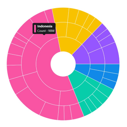
Custom template
Customize the tooltip appearance using the TooltipTemplate property of SfSunburstChart, which accepts a DataTemplate. The data context of the template exposes the segment data, where the Fill property provides the segment’s fill color and the Item collection provides the bound data values (e.g., Item[0] for the category and Item[1] for the value).
<sunburst:SfSunburstChart EnableTooltip="True"
                          TooltipTemplate="{StaticResource template1}">
    <sunburst:SfSunburstChart.Resources>
        <ResourceDictionary>
            <DataTemplate x:Key="template1">
                <HorizontalStackLayout Spacing="5">
                    <Rectangle HeightRequest="30"
                               WidthRequest="8"
                               Fill="{Binding Fill}"/>
                    <VerticalStackLayout>
                        <Label Text="{Binding Item[0]}"
                               TextColor="White"
                               FontFamily="Helvetica"
                               FontSize="12.5"
                               Padding="5,0,0,0"
                               FontAttributes="Bold"/>
                        <Label Text="{Binding Item[1], StringFormat='Count : {0}M'}"
                               TextColor="White"
                               FontFamily="Helvetica"
                               FontSize="12"
                               Padding="5,0,0,0"
                               Margin="0,2,0,0"/>
                    </VerticalStackLayout>
                </HorizontalStackLayout>
            </DataTemplate>
        </ResourceDictionary>
    </sunburst:SfSunburstChart.Resources>
    <!-- code omitted for brevity -->
</sunburst:SfSunburstChart>
SfSunburstChart sunburst = new SfSunburstChart();
// code omitted for brevity
sunburst.EnableTooltip = true;
sunburst.TooltipTemplate = (DataTemplate)sunburst.Resources["template1"];
this.Content = sunburst;