Tooltip in .NET MAUI Step ProgressBar (SfStepProgressBar)
7 Jan 202514 minutes to read
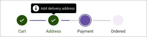
The tooltip provides information when hovering over or tapping the steps in the step progress bar, displaying details about the each steps.
Enable tooltip
To enable the tooltip for the step progress bar control, utilize the ShowToolTip property of SfStepProgressBar. By default, the value of ShowToolTip is set to false. To provide users with additional information or context about specific step, simply set this property to true.
ToolTipText
The tooltip text for a step view can be set using the ToolTipText property from the StepProgressBarItem collection, which is bound to the ItemsSource property.
NOTE
The tooltip is shown only when the ToolTipText is provided.
<stepProgressBar:SfStepProgressBar
                    x:Name="stepProgress"
                    Orientation="Horizontal"
                    ShowToolTip="True"
                    ItemsSource="{Binding StepProgressItem}">
</stepProgressBar:SfStepProgressBar>
<ContentPage.BindingContext>
    <local:ViewModel />
</ContentPage.BindingContext>
SfStepProgressBar stepProgressBar = new SfStepProgressBar();
ViewModel viewModel = new ViewModel();
stepProgressBar.ItemsSource = viewModel.StepProgressItem;
stepProgressBar.Orientation = StepProgressBarOrientation.Horizontal;
stepProgressBar.ShowToolTip = true;
this.Content = stepProgressBar;public class ViewModel
{
/// <summary>
/// The Step progress bar item collection.
/// </summary>
private ObservableCollection<StepProgressBarItem> stepProgressItem;
/// <summary>
/// The Step progress bar item collection.
/// </summary>
public ObservableCollection<StepProgressBarItem> StepProgressItem
{
get
{
return stepProgressItem;
}
set
{
stepProgressItem = value;
}
}
public ViewModel()
{
stepProgressItem = new ObservableCollection<StepProgressBarItem>();
stepProgressItem.Add(new StepProgressBarItem() { PrimaryText = "Cart", ToolTipText = "Add items to cart" });
stepProgressItem.Add(new StepProgressBarItem() { PrimaryText = "Address", ToolTipText = "Add delivery address" });
stepProgressItem.Add(new StepProgressBarItem() { PrimaryText = "Payment", ToolTipText = "Choose payment method" });
stepProgressItem.Add(new StepProgressBarItem() { PrimaryText = "Ordered", ToolTipText = "Place your order" });
}
}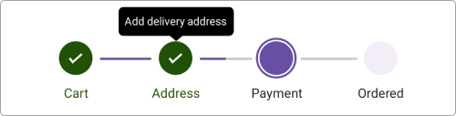
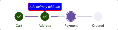
Customize tooltip appearance
The tooltip appearance customization can be achieved by using the Stroke, Duration, TextStyle, and Background properties of ToolTipSettings in the SfStepProgressBar.
Additionally, you can achieve further appearance customization by using ToolTipTemplate of the SfStepProgressBar.
Customize tooltip appearance using its properties
To customize the appearance of the tooltip in the SfStepProgressBar using ToolTipSettings, you can utilize the following properties:
- Background: This property allows you to change the background color of the tooltip.
- Duration: Specifies the duration in milliseconds, for which the tooltip will be displayed. This helps control how long the tooltip remains visible on the screen.
- Stroke: This property enables you to change the border color of the tooltip.
- TextStyle: This property is used to modify the appearance of the tooltip text. You can customize attributes such as TextColor, FontSize, FontFamily, and FontAttributes.
<stepProgressBar:SfStepProgressBar x:Name="stepProgressBar"
ItemsSource="{Binding StepProgressItem}"
Orientation="Horizontal"
ShowToolTip="True">
<stepProgressBar:SfStepProgressBar.ToolTipSettings>
<stepProgressBar:StepProgressBarToolTipSettings Background="Blue"
Stroke="Red"
Duration="0:0:10">
<stepProgressBar:StepProgressBarToolTipSettings.TextStyle>
<stepProgressBar:StepTextStyle TextColor="White"
FontSize="14"
FontAttributes="Italic"/>
</stepProgressBar:StepProgressBarToolTipSettings.TextStyle>
</stepProgressBar:StepProgressBarToolTipSettings>
</stepProgressBar:SfStepProgressBar.ToolTipSettings>
<stepProgressBar:SfStepProgressBar.BindingContext>
<local:ViewModel />
</stepProgressBar:SfStepProgressBar.BindingContext>
</stepProgressBar:SfStepProgressBar>SfStepProgressBar stepProgressBar = new SfStepProgressBar();
ViewModel viewModel = new ViewModel();
stepProgressBar.ItemsSource = viewModel.StepProgressItem;
stepprogressBar.Orientation = StepProgressBarOrientation.Horizontal;
stepProgressBar.ShowToolTip = true;
stepProgressBar.ToolTipSettings = new StepProgressBarToolTipSettings() { Background = Brush.Blue, Stroke = Brush.Red, Duration = new TimeSpan(0, 0, 10), TextStyle = new stepProgressBarTextStyle() { TextColor = Colors.White, FontSize = 14, FontAttributes = FontAttributes.Italic } };
this.Content = stepProgressBar;
public class ViewModel
{
    /// <summary>
    /// The Step progress bar item collection.
    /// </summary>
    private ObservableCollection<StepProgressBarItem> stepProgressItem;

    /// <summary>
    /// The Step progress bar item collection.
    /// </summary>
    public ObservableCollection<StepProgressBarItem> StepProgressItem
    {
        get
        {
            return stepProgressItem;
        }
        set
        {
            stepProgressItem = value;
        }
    }

    public ViewModel()
    {
        stepProgressItem = new ObservableCollection<StepProgressBarItem>();
        stepProgressItem.Add(new StepProgressBarItem() { PrimaryText = "Cart", ToolTipText = "Add items to cart" });
        stepProgressItem.Add(new StepProgressBarItem() { PrimaryText = "Address", ToolTipText = "Add delivery address" });
        stepProgressItem.Add(new StepProgressBarItem() { PrimaryText = "Payment", ToolTipText = "Choose payment method" });
        stepProgressItem.Add(new StepProgressBarItem() { PrimaryText = "Ordered", ToolTipText = "Place your order" });
    }
}NOTE
This property will only be applicable when the ShowToolTip is enabled.
Customize tooltip appearance using DataTemplate
You can customize the tooltip appearance by using the ToolTipTemplate property in the SfStepProgressBar.
The following code example shows the usage of DataTemplate.
<stepProgressBar:SfStepProgressBar x:Name="stepProgressBar"
                    ItemsSource="{Binding StepProgressItem}"
                    Orientation="Horizontal"
                    ShowToolTip="True">
    <progressBar:SfStepProgressBar.ToolTipTemplate>
        <DataTemplate>
            <StackLayout Orientation="Horizontal">
                <Image Source="info.png" WidthRequest="20" HeightRequest="20"/>
                <Label Text="{Binding ToolTipText}"
                    TextColor="White"
                    FontSize="Caption"
                    Padding="5,0,0,0"
                    VerticalOptions="Center"/>
            </StackLayout>
        </DataTemplate>
    </progressBar:SfStepProgressBar.ToolTipTemplate>
    <stepProgressBar:SfStepProgressBar.BindingContext>
        <local:ViewModel />
    </stepProgressBar:SfStepProgressBar.BindingContext>
 </stepProgressBar:SfStepProgressBar>
SfStepProgressBar stepProgressBar = new SfStepProgressBar();
ViewModel viewModel = new ViewModel();
stepProgressBar.Orientation = StepProgressBarOrientation.Horizontal;
stepProgressBar.ShowToolTip = true;
stepProgressBar.ItemsSource = viewModel.StepProgressItem;
DataTemplate toolTipTemplate = new DataTemplate(() =>
{
var stackLayout = new StackLayout();
stackLayout.Orientation = StackOrientation.Horizontal;
Image image = new Image
{
Source = "info.png",
WidthRequest = 20,
HeightRequest = 20
};
var label = new Label
{
TextColor = Colors.White,
Padding = new Thickness(5, 0, 0, 0),
VerticalOptions = LayoutOptions.Center
};
label.SetBinding(Label.TextProperty, "ToolTipText");
stackLayout.Children.Add(image);
stackLayout.Children.Add(label);
return stackLayout;
});
stepProgressBar.ToolTipTemplate = toolTipTemplate;
this.Content = stepProgressBar;public class ViewModel
{
/// <summary>
/// The Step progress bar item collection.
/// </summary>
private ObservableCollection<StepProgressBarItem> stepProgressItem;
/// <summary>
/// The Step progress bar item collection.
/// </summary>
public ObservableCollection<StepProgressBarItem> StepProgressItem
{
get
{
return stepProgressItem;
}
set
{
stepProgressItem = value;
}
}
public ViewModel()
{
stepProgressItem = new ObservableCollection<StepProgressBarItem>();
stepProgressItem.Add(new StepProgressBarItem() { PrimaryText = "Cart", ToolTipText = "Add items to cart" });
stepProgressItem.Add(new StepProgressBarItem() { PrimaryText = "Address", ToolTipText = "Add delivery address" });
stepProgressItem.Add(new StepProgressBarItem() { PrimaryText = "Payment", ToolTipText = "Choose payment method" });
stepProgressItem.Add(new StepProgressBarItem() { PrimaryText = "Ordered", ToolTipText = "Place your order" });
}
}NOTE
This property will only be applicable when the ShowToolTip is enabled.