About Syncfusion® .NET MAUI Step Progress Bar Control
18 Nov 20185 minutes to read
The Syncfusion® .NET MAUI Step Progress Bar (SfStepProgressBar) control allows you to display progress through multiple steps in a process, such as order tracking or a user registration form. It is customizable, with options for step shape, content, progress bar color, and more.
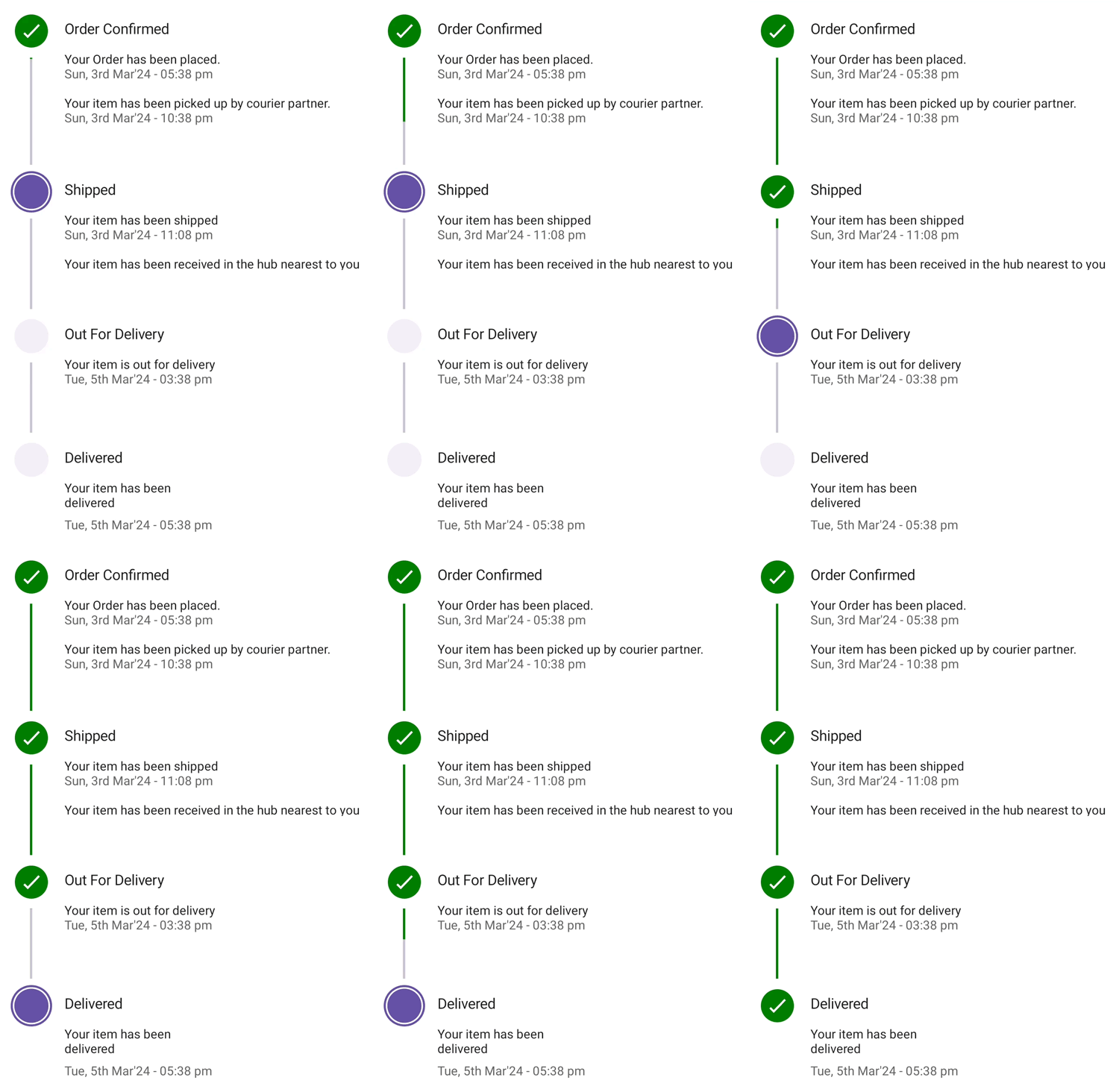
Business use cases
- E-commerce applications that display order tracking stages such as placed, shipped, and delivered.
- Form-based applications that guide users through multi-step processes such as registration or checkout flows.
- Workflow systems that represent progress through defined sequential stages.
- Business applications that require clear visualization of task completion status across steps.
Key features
- Orientation allows displaying the Step Progress Bar in horizontal or vertical layouts.
- Progress status allows representing steps using states such as completed, in progress, and not started.
- Status text allows displaying primary and secondary text to describe each step clearly.
- Formatted text allows customizing the appearance and style of step descriptions.
- Flexible label positioning allows placing labels at start, end, top, or bottom positions.
- Active step control allows setting and updating the current step index programmatically.
- Content customization allows displaying indicators such as tick, cross, dot, or custom content.
- Shape customization allows configuring step shapes such as circle or square.
- Image support allows displaying images within step indicators for enhanced visualization.
- Appearance customization allows modifying colors, sizes, animations, and layout for better UI consistency.
Globalization
The following table summarizes the globalization support available in this control.
 Full Support
 Not Applicable
| Control | Localization | RTL | Time zone | Screen reader | Keyboard navigation |
|---|---|---|---|---|---|
| Step Progress Bar | |
|
|
|
|
Related controls
- Linear Progress Bar for displaying continuous progress using a linear indicator.
- Circular Progress Bar for representing progress using circular visuals.
- Tab View for guiding users through multiple steps or stages using a structured, step-by-step interface.
See Also
- Getting Started shows a step‑by‑step guide to begin using the Step Progress Bar control.
- Customization explains how to customize appearance and step configuration.
- Tooltip helps show helpful hints when hovering.
- UI Kit provides interactive demos and ready‑made UI examples.
Resources
Feature Tour
Get a quick overview of key features and capabilities to kick start your journey.
Explore Features
Tutorial Videos
Watch step‑by‑step video guides to quickly understand concepts and implementation.
Watch now
Knowledge Base
Find practical solutions, troubleshooting tips and how‑to guides for common scenarios.
Search KB's