Visual Customization in .NET MAUI Radio Button (SfRadioButton)
8 Jun 20267 minutes to read
Setting caption
The .NET MAUI Radio Button caption can be defined using the Text property. This caption typically describes the meaning of the Radio Button and is displayed next to it.
<buttons:SfRadioButton x:Name="radioButton" Text="Radio Button"/>SfRadioButton radioButton = new SfRadioButton();
radioButton.Text = "Radio Button";
this.Content = radioButton;
Customizing a state color
The default state colors can be customized using the CheckedColor and UncheckedColor properties. The checked state color is updated to the specified CheckedColor value when the state changes to checked. Similarly, the unchecked state color is updated to the specified UncheckedColor value when the state changes to unchecked.
<syncfusion:SfRadioGroup x:Name="radioGroup">
		<syncfusion:SfRadioButton x:Name="check" Text="Radio Button" IsChecked="True" CheckedColor="Green"/>
		<syncfusion:SfRadioButton x:Name="uncheck" Text="Radio Button" UncheckedColor="Violet"/>
	</syncfusion:SfRadioGroup>
SfRadioGroup radioGroup = new SfRadioGroup();
SfRadioButton check = new SfRadioButton();
check.Text = "Radio Button";
check.IsChecked = true;
check.CheckedColor = Color.Green;
SfRadioButton uncheck = new SfRadioButton();
uncheck.Text = "Radio Button";
uncheck.UncheckedColor = Colors.Violet;
radioGroup.Children.Add(check);
radioGroup.Children.Add(uncheck);
this.Content = radioGroup;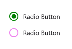
StrokeThickness
The stroke thickness of the circle in the Radio Button control can be customized using the StrokeThickness property.
<syncfusion:SfRadioGroup>
		<syncfusion:SfRadioButton Text="Checked state" IsChecked="True" StrokeThickness="3"/>
		<syncfusion:SfRadioButton Text="Unchecked state" StrokeThickness="3"/>
	</syncfusion:SfRadioGroup>
SfRadioGroup radioGroup = new SfRadioGroup();
SfRadioButton check = new SfRadioButton();
check.Text = "Checked State";
check.IsChecked = true;
check.StrokeThickness = 3;
SfRadioButton uncheck = new SfRadioButton();
uncheck.Text = "Unchecked State";
uncheck.StrokeThickness = 3;
radioGroup.Children.Add(check);
radioGroup.Children.Add(uncheck);
this.Content = radioGroup;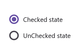
NOTE
StrokeThickness support has not been provided for Android Platform.
Setting a caption text appearance
You can customize the display text appearance of the SfRadioButton control using the following properties:
-
TextColor: Changes the color of the text. -
HorizontalTextAlignment: Changes the horizontal alignment of the caption text. -
FontFamily: Changes the font family of the caption text. -
FontAttributes: Sets font attributes(bold/italic/none) of the caption text. -
FontSize: Sets font size of the caption text.
<syncfusion:SfRadioButton x:Name="radioButton"
				  Text="Radio Button"
				  IsChecked="True"
				  TextColor="Blue"
				  HorizontalTextAlignment="Center"
			          FontFamily="Arial"
				  FontAttributes="Bold"
				  FontSize="20"/>
SfRadioButton radioButton = new SfRadioButton();
radioButton.Text = "Radio Button";
radioButton.IsChecked = true;
radioButton.TextColor = Colors.Blue;
radioButton.HorizontalTextAlignment = TextAlignment.Center;
radioButton.FontFamily = "Arial";
radioButton.FontAttributes = FontAttributes.Bold;
radioButton.FontSize = 20;
this.Content = radioButton;
LineBreakMode
The LineBreakMode allows you to wrap or truncate the text. The default value of this property is NoWrap. The following options are available in LineBreakMode:
-
NoWrap- Avoids the text wrap. -
WordWrap- Wraps the text by words. -
CharacterWrap- Wraps the text by character. -
HeadTruncation- Truncates the text at the start. -
MiddleTruncation- Truncates the text at the center. -
TailTruncation- Truncates the text at the end.
<syncfusion:SfRadioButton x:Name="RadioButton"
				IsChecked="True"
				WidthRequest="200"
				LineBreakMode="WordWrap"
				Text="The LineBreakMode allows you to wrap or truncate the text.">
				</syncfusion:SfRadioButton>
StackLayout stackLayout = new StackLayout();
SfRadioButton radioButton = new SfRadioButton();
radioButton.Text = "The LineBreakMode allows you to wrap or truncate the text.";
radioButton.LineBreakMode = LineBreakMode.WordWrap;
radioButton.WidthRequest = 200;
stackLayout.Children.Add(radioButton);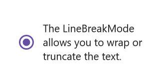
This demo can be downloaded from GitHub link.
Size customization
The ControlSize property is used to customize the size of the Radio Button control.
<StackLayout>
    <syncfusion:SfRadioButton Text="RadioButton" ControlSize="40"/>
</StackLayout>
StackLayout stackLayout = new StackLayout();
SfRadioButton radioButton = new SfRadioButton();
radioButton.Text = "Radio Button";
radioButton.ControlSize = 40;
stackLayout.Children.Add(radioButton);
this.Content = stackLayout;FontAutoScalingEnabled
The FontAutoScalingEnabled property is used to automatically scale the font size of the Radio Button based on the operating system’s text size. The default value of the FontAutoScalingEnabled property is false.
<syncfusion:SfRadioButton Text="RadioButton" FontAutoScalingEnabled="True"/>SfRadioButton radioButton = new SfRadioButton();
radioButton.Text = "Radio Button";
radioButton.FontAutoScalingEnabled = true;Enable animation
The EnabledAnimation property is used to enable or disable the animation for the .NET MAUI Radio Button control. By default, this property is set to true, indicating that animations are enabled.
<syncfusion:SfRadioButton Text="Radio Button" EnabledAnimation="False"/>SfRadioButton radioButton = new SfRadioButton
{
Text = "Radio Button",
EnabledAnimation = false
};ContentSpacing
The ContentSpacing property is used to adjust the content spacing within the SfRadioButton control.
<syncfusion:SfRadioButton Text="Radio Button" ContentSpacing="25"/>StackLayout stackLayout = new StackLayout();
SfRadioButton radioButton = new SfRadioButton();
radioButton.Text = "Radio Button";
radioButton.ContentSpacing = 25;
stackLayout.Children.Add(radioButton);
this.Content = stackLayout;
ContentSpacing
You can control the spacing between the radio button and its associated text using the ContentSpacing property.
<syncfusion:SfRadioButton Text="Radio Button" ContentSpacing="25"/>StackLayout stackLayout = new StackLayout();
SfRadioButton radioButton = new SfRadioButton();
radioButton.Text = "Radio Button";
radioButton.ContentSpacing = 25;
stackLayout.Children.Add(radioButton);
this.Content = stackLayout;