Getting Started with .NET MAUI Radio Button
29 Jun 20265 minutes to read
This section guides you through setting up and configuring a SfRadioButton in your .NET MAUI application. Follow the steps below to add a basic Radio Button to your project.
To quickly get started with the .NET MAUI Radio Button, watch this video.
Prerequisites
Before proceeding, ensure the following are set up:
- Install .NET 9 SDK or later.
- Set up a .NET MAUI environment with Visual Studio 2022 v17.12 or later.
Step 1: Create a new .NET MAUI project
- Go to File > New > Project and choose the .NET MAUI App template.
- Name the project and choose a location. Then, click Next.
- Select the .NET framework version and click Create.
Step 2: Install the Syncfusion® MAUI Buttons NuGet package
- In Solution Explorer, right-click the project and choose Manage NuGet Packages.
- Search for Syncfusion.Maui.Buttons and install the latest version.
- Ensure the necessary dependencies are installed correctly, and the project is restored.
Prerequisites
Before proceeding, ensure the following are set up:
- Install .NET 9 SDK or later.
- Set up a .NET MAUI environment with Visual Studio Code.
- Ensure that the .NET MAUI workloads are installed and configured as described here.
Step 1: Create a new .NET MAUI project
- Open the command palette by pressing
Ctrl+Shift+Pand type .NET:New Project and enter. - Choose the .NET MAUI App template.
- Select the project location, type the project name and press Enter.
- Then choose Create project.
Step 2: Install the Syncfusion® MAUI Buttons NuGet package
- Press Ctrl + ` (backtick) to open the integrated terminal in Visual Studio Code.
- Ensure you’re in the project root directory where your .csproj file is located.
- Run the command
dotnet add package Syncfusion.Maui.Buttonsto install the Syncfusion® .NET MAUI Buttons package. - To ensure all dependencies are installed, run
dotnet restore.
Prerequisites
Before proceeding, ensure the following are set up:
- Install .NET 9 SDK or later.
- Set up a .NET MAUI environment with JetBrains Rider 2024.3 or later.
- Make sure the MAUI workloads are installed and configured as described here.
Step 1: Create a new .NET MAUI project
- Go to File > New Solution, Select .NET (C#), and choose the .NET MAUI App template.
- Enter the Project Name, Solution Name, and Location.
- Select the .NET framework version and click Create.
Step 2: Install the Syncfusion® MAUI Buttons NuGet package
- In Solution Explorer, right-click the project and choose Manage NuGet Packages.
- Search for Syncfusion.Maui.Buttons and install the latest version.
- Ensure the necessary dependencies are installed correctly, and the project is restored. If not, open the terminal in Rider and manually run:
dotnet restore.
Step 3: Register Syncfusion handler
Make sure to add the namespace.
using Syncfusion.Maui.Core.Hosting;Register the Syncfusion core handler in your CreateMauiApp method of MauiProgram.cs file to use Syncfusion controls.
builder.ConfigureSyncfusionCore();Step 4: Import Radio Button namespace
Add the following namespace in your XAML or C#.
xmlns:buttons="clr-namespace:Syncfusion.Maui.Buttons;assembly=Syncfusion.Maui.Buttons"using Syncfusion.Maui.Buttons;Step 5: Add the Radio Button component
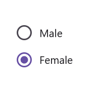
The two different visual states of the .NET MAUI Radio Button are:
- Checked
- Unchecked
To change the state of the .NET MAUI Radio Button, you can utilize the IsChecked property of SfRadioButton. When the Radio Button is checked, an inner circle is added to its visualization.
You can group multiple Radio Buttons together by using Radio Group. Only one button within a group can be selected at a time.
<buttons:SfRadioGroup x:Name="radioGroup">
    <buttons:SfRadioButton x:Name="male" Text="Male"/>
    <buttons:SfRadioButton x:Name="female" Text="Female" IsChecked="True"/>
</buttons:SfRadioGroup>
SfRadioGroup radioGroup = new SfRadioGroup();
SfRadioButton male = new SfRadioButton();
male.Text = "Male";
SfRadioButton female = new SfRadioButton();
female.IsChecked = true;
female.Text = "Female";
radioGroup.Children.Add(male);
radioGroup.Children.Add(female);
this.Content = radioGroup;NOTE
SfRadioButtons are mutually exclusive when they are defined within SfRadioGroup.
You can download the Radio Button Getting Started sample from GitHub. You can also explore our .NET MAUI Radio Button example that shows you how to render the .NET MAUI Radio Button.