Customization in .NET MAUI Pull to Refresh
18 Nov 201824 minutes to read
The .NET MAUI Pull to Refresh control supports customization of various features, including TransitionMode, PullingThreshold, ProgressBackground, ProgressColor, and more. The control can be personalized using the following properties.
PullableContent
The PullableContent is the main view of the PullToRefresh control on which the desired items can be placed.
<syncfusion:SfPullToRefresh x:Name="pullToRefresh"
                            PullingThreshold="120"
                            RefreshViewHeight="30"
                            RefreshViewThreshold="30"
                            RefreshViewWidth="30">
    <syncfusion:SfPullToRefresh.PullableContent>
            <Label x:Name="Monthlabel"
                    VerticalTextAlignment="Start" />
                    TextColor="White"
                    HorizontalTextAlignment="Center"
    </syncfusion:SfPullToRefresh.PullableContent>
</syncfusion:SfPullToRefresh>
TransitionMode
The TransitionMode property specifies the mode of the animations. It has the following two modes:
The default transition is SlideOnTop that draws the RefreshView on top of the PullableContent. Choose Push when you want the refresh content and the main content to move together.
<syncfusion:SfPullToRefresh x:Name="pullToRefresh"
                            TransitionMode="SlideOnTop" />
pullToRefresh.TransitionMode = PullToRefreshTransitionType.SlideOnTop;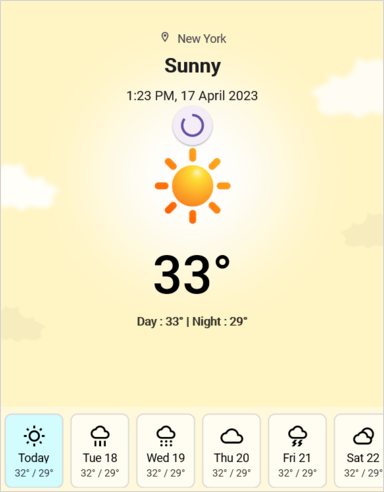
The following code example shows how to set the TransitionMode as Push to Pull to Refresh. This transition moves the refresh content and main content simultaneously.
<syncfusion:SfPullToRefresh x:Name="pullToRefresh"
                            TransitionMode="Push" />
pullToRefresh.TransitionMode = PullToRefreshTransitionType.Push;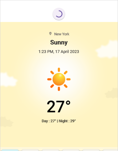
RefreshViewThreshold
The threshold value for the refresh view, indicating the starting position of the progress indicator within the view. This is a double value; the default is 50.
<syncfusion:SfPullToRefresh x:Name="pullToRefresh"
                            RefreshViewThreshold="50"/>
pullToRefresh.RefreshViewThreshold = 50d;PullingThreshold
The threshold value for the refresh view, indicating the progress indicator’s maximum pulling position in view. This is a double value; the default is 200.
<syncfusion:SfPullToRefresh x:Name="pullToRefresh"
                            PullingThreshold="200"/>
pullToRefresh.PullingThreshold = 200d;IsRefreshing
The view gets refreshed while the IsRefreshing property is set to true, and view refreshing is stopped when you set IsRefreshing to false. Use this together with the Refreshing event to refresh your data.
<syncfusion:SfPullToRefresh x:Name="pullToRefresh"
                            IsRefreshing="True"/>
pullToRefresh.IsRefreshing = true;ProgressBackground
The color of the progress indicator’s background.
<syncfusion:SfPullToRefresh x:Name="pullToRefresh"
                            ProgressBackground = "White"/>
pullToRefresh.ProgressBackground = Color.White;ProgressColor
The color of the progress indicator’s arc.
<syncfusion:SfPullToRefresh x:Name="pullToRefresh"
                            ProgressColor = "Blue"/>
pullToRefresh.ProgressColor = Color.Blue;ProgressThickness
The width of the progress indicator’s arc. This is a double value; the default is 3.
<syncfusion:SfPullToRefresh x:Name="pullToRefresh"
                            ProgressThickness="5"/>
pullToRefresh.ProgressThickness = 5d;RefreshViewWidth
The width of the refresh view. This is a double value; the default is 48.
<syncfusion:SfPullToRefresh x:Name="pullToRefresh"
                            RefreshViewWidth="50"/>
pullToRefresh.RefreshViewWidth = 50d;RefreshViewHeight
The height of the refresh view. This is a double value; the default is 48.
<syncfusion:SfPullToRefresh x:Name="pullToRefresh"
                            RefreshViewHeight="50"/>
pullToRefresh.RefreshViewHeight = 50d;Programmatic Support
Use the programmatic API to start or stop the refresh indicator without user interaction. After the data has been refreshed, call EndRefreshing() (or set IsRefreshing to false) to hide the progress indicator.
StartRefreshing()
The StartRefreshing method is used to refresh the content without user interaction on the pullable content. When you invoke the StartRefreshing() method, the progress indicator is shown and the Refreshing event is raised.
private async void OnStartRefreshingClicked(object sender, EventArgs e)
{
    pullToRefresh.StartRefreshing();
    await LoadDataAsync();
    pullToRefresh.EndRefreshing();
}
EndRefreshing()
The EndRefreshing method is used to end the progress animation of the PullToRefresh.
pullToRefresh.EndRefreshing();Host .NET MAUI DataGrid as pullable content
The Pull to Refresh control provides support for loading any custom control as pullable content. To host the .NET MAUI DataGrid inside the Pull to Refresh, follow these steps.
- Add the required assembly references as discussed in the DataGrid and PullToRefresh.
- Define the `OrdersInfo` collection in a ViewModel and implement a `Refresh Item source(int count)` method that updates it. See the View sample in GitHub for a complete example.
- Import Pull to Refresh and DataGrid control namespace as follows.
- Define the DataGrid as PullableContent of the Pull to Refresh.
- Handle the pull to refresh events for refreshing the data.
- Customize the required properties of the DataGrid and Pull to Refresh based on your requirement.
xmlns:sfgrid="clr-namespace:Syncfusion.Maui.DataGrid;assembly=Syncfusion.Maui.DataGrid"
xmlns:pulltoRefresh="clr-namespace:Syncfusion.Maui.PullToRefresh;assembly=Syncfusion.Maui.PullToRefresh"
using Syncfusion.Maui.DataGrid;
using Syncfusion.Maui.PullToRefresh;This is how the final output will look like when hosting a Datagrid control as pullable content.
<ContentPage xmlns="http://schemas.microsoft.com/dotnet/2021/maui"
            xmlns:x="http://schemas.microsoft.com/winfx/2009/xaml"
            x:Class="PullToRefreshTemplate.MainPage"
            xmlns:sfgrid="clr-namespace:Syncfusion.Maui.DataGrid;assembly=Syncfusion.Maui.DataGrid"
            xmlns:pulltoRefresh="clr-namespace:Syncfusion.Maui.PullToRefresh;assembly=Syncfusion.Maui.PullToRefresh"
            xmlns:local="clr-namespace:PullToRefreshTemplate">

    <ContentPage.Behaviors>
        <local:PullToRefreshTemplateBehavior />
    </ContentPage.Behaviors>

    <ContentPage.Content>
        <Grid>
            <pulltoRefresh:SfPullToRefresh x:Name="pullToRefresh"
                                        RefreshViewHeight="50"
                                        RefreshViewThreshold="30"
                                        PullingThreshold="150"
                                        RefreshViewWidth="50"
                                        ProgressThickness='{OnPlatform Android="3", Default="2"}'
                                        TransitionMode="SlideOnTop"
                                        Margin="{StaticResource margin}"
                                        IsRefreshing="False">
                <pulltoRefresh:SfPullToRefresh.PullableContent>
                    <sfgrid:SfDataGrid x:Name="dataGrid"
                                    HeaderRowHeight="52"
                                    RowHeight="48"
                                    SortingMode="Single"
                                    ItemsSource="{Binding OrdersInfo}"
                                    AutoGenerateColumnsMode="None"
                                    ColumnWidthMode="Fill"
                                    HorizontalScrollBarVisibility="Always"
                                    VerticalScrollBarVisibility="Always">

                    </sfgrid:SfDataGrid>
                </pulltoRefresh:SfPullToRefresh.PullableContent>
            </pulltoRefresh:SfPullToRefresh>
        </Grid>
    </ContentPage.Content>
</ContentPage>
using Syncfusion.Maui.DataGrid;
using Syncfusion.Maui.ProgressBar;
using Syncfusion.Maui.PullToRefresh;
namespace PullToRefreshTemplate
{
public class PullToRefreshTemplateBehavior : Behavior<ContentPage>
{
protected override void OnAttachedTo(ContentPage bindable)
{
this.viewModel = new OrderInfoViewModel();
bindable.BindingContext = this.viewModel;
this.pullToRefresh = bindable.FindByName<Syncfusion.Maui.PullToRefresh.SfPullToRefresh>("pullToRefresh");
this.dataGrid = bindable.FindByName<SfDataGrid>("dataGrid");
this.dataGrid.ItemsSource = this.viewModel.OrdersInfo;
this.pullToRefresh.Refreshing += this.PullToRefresh_Refreshing;
this.pullToRefresh.Pulling += this.PullToRefresh_Pulling;
base.OnAttachedTo(bindable);
}
private async void PullToRefresh_Refreshing(object? sender, EventArgs e)
{
this.viewModel!.RefreshItemsource(10);
await Task.Delay(10);
this.pullToRefresh.IsRefreshing = false;
}
}
}If you run the above sample with the TransitionMode as Push, the output will look as follows.
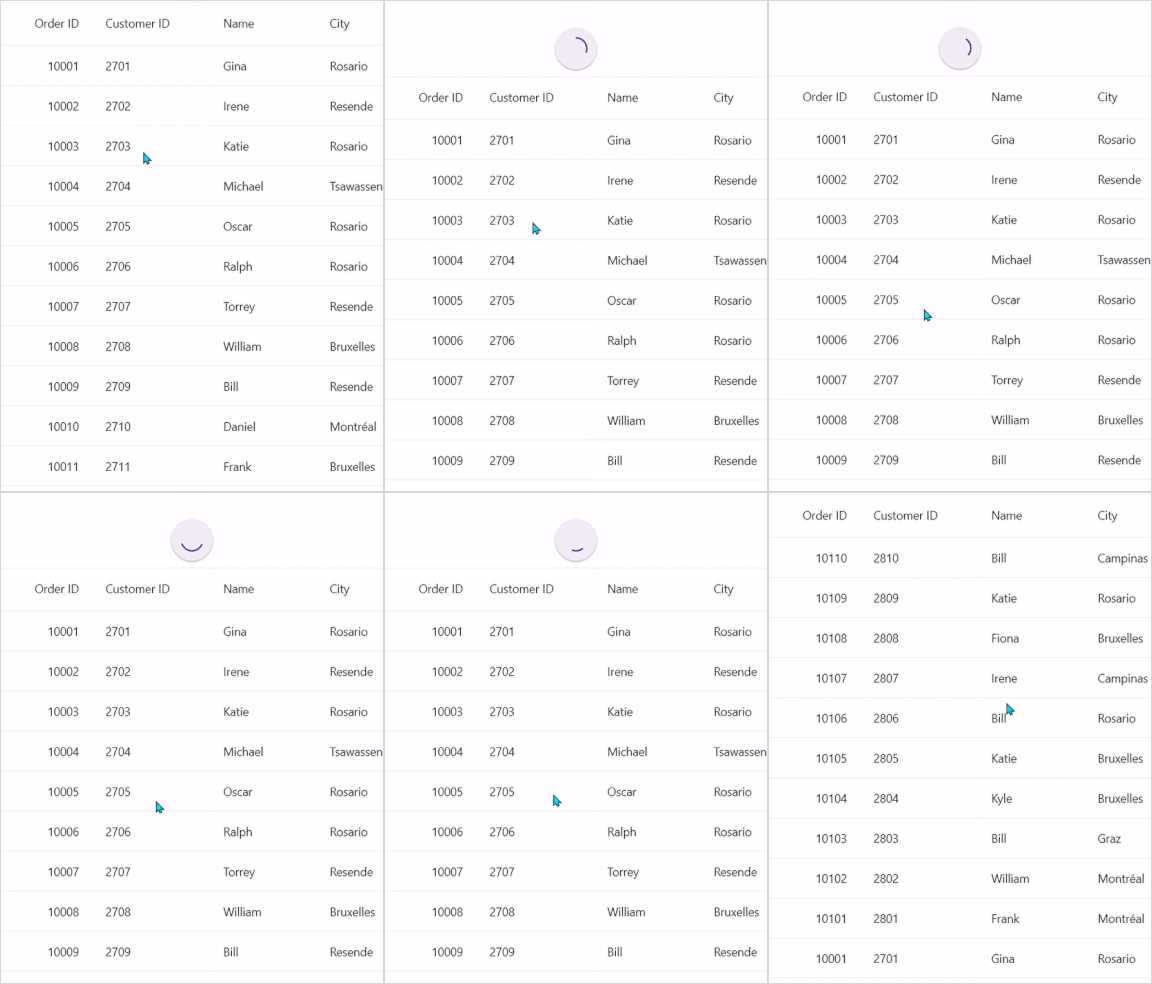
Host .NET MAUI ListView as pullable content
To host the .NET MAUI ListView inside the Pull to Refresh to update items in the list while performing the pull to refresh action, follow these steps.
- Add the required assembly references as discussed in the ListView and Pull to Refresh.
- Define the `InboxInfos` collection in a `ListViewInboxInfoViewModel` and implement an `AddItemsRefresh(int count)` method that adds new items. See the View sample in GitHub for a complete example.
- Import the SfPullToRefresh control and SfListView control namespace as follows.
- Define the ListView as PullableContent of the SfPullToRefresh.
- Handle the pull to refresh events for refreshing the data.
- Customize the required properties of ListView and PullToRefresh based on your requirement.
xmlns:ListView="clr-namespace:Syncfusion.Maui.ListView;assembly=Syncfusion.Maui.ListView"
xmlns:pulltoRefresh="clr-namespace:Syncfusion.Maui.PullToRefresh;assembly=Syncfusion.Maui.PullToRefresh"
using Syncfusion.Maui.ListView;
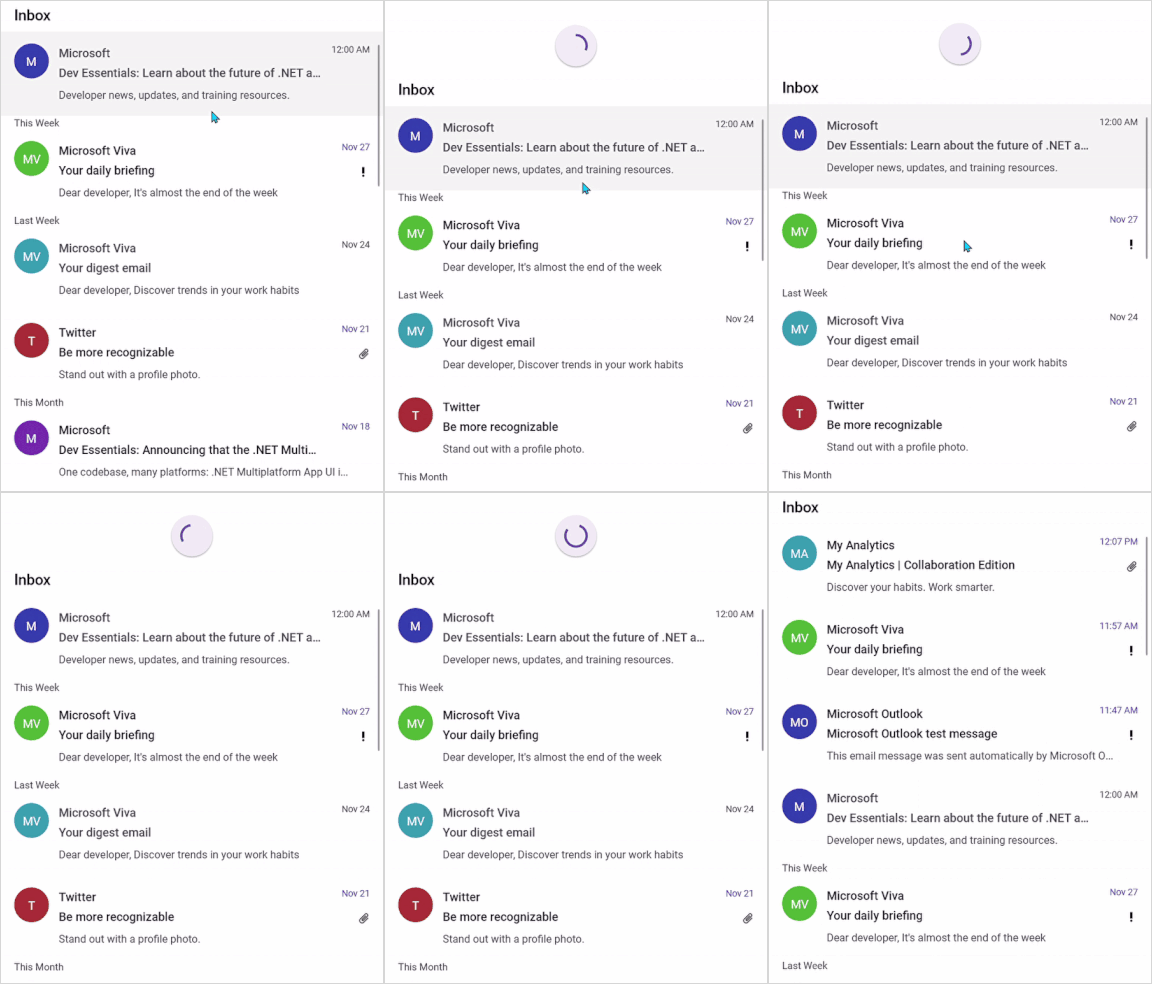
using Syncfusion.Maui.PullToRefresh;This is how the final output will look like when hosting a SfListView control as pullable content.
<ContentPage xmlns="http://schemas.microsoft.com/dotnet/2021/maui"
xmlns:x="http://schemas.microsoft.com/winfx/2009/xaml"
x:Class="RefreshableListView.MainPage"
xmlns:ListView="clr-namespace:Syncfusion.Maui.ListView;assembly=Syncfusion.Maui.ListView"
xmlns:pulltoRefresh="clr-namespace:Syncfusion.Maui.PullToRefresh;assembly=Syncfusion.Maui.PullToRefresh"
xmlns:local="clr-namespace:RefreshableListView">
<ContentPage.Behaviors>
<local:ListViewPullToRefreshBehavior />
</ContentPage.Behaviors>
<ContentPage.Content>
<Grid>
<pulltoRefresh:SfPullToRefresh x:Name="pullToRefresh"
RefreshViewHeight="50"
RefreshViewThreshold="30"
PullingThreshold="150"
RefreshViewWidth="50"
TransitionMode="SlideOnTop"
IsRefreshing="False">
<pulltoRefresh:SfPullToRefresh.PullableContent>
<Grid x:Name="mainGrid">
<ListView:SfListView Grid.Row="1"
x:Name="listView"
ItemsSource="{Binding InboxInfos}"
ItemSize="102"
SelectionMode="Single"
ScrollBarVisibility="Always"
AutoFitMode="Height">
. . .
. . . .
</ListView:SfListView>
</Grid>
</pulltoRefresh:SfPullToRefresh.PullableContent>
</pulltoRefresh:SfPullToRefresh>
</Grid>
</ContentPage.Content>
</ContentPage>using Syncfusion.Maui.DataSource;
using Syncfusion.Maui.DataSource.Extensions;
using Syncfusion.Maui.ListView;
using Syncfusion.Maui.PullToRefresh;
namespace RefreshableListView
{
public class ListViewPullToRefreshBehavior : Behavior<ContentPage>
{
private SfPullToRefresh pullToRefresh;
private SfListView listView;
private ListViewInboxInfoViewModel ViewModel;
protected override void OnAttachedTo(ContentPage bindable)
{
ViewModel = new ListViewInboxInfoViewModel();
bindable.BindingContext = ViewModel;
pullToRefresh = bindable.FindByName<SfPullToRefresh>("pullToRefresh");
listView = bindable.FindByName<SfListView>("listView");
pullToRefresh.Refreshing += PullToRefresh_Refreshing;
base.OnAttachedTo(bindable);
}
private async void PullToRefresh_Refreshing(object? sender, EventArgs e)
{
pullToRefresh!.IsRefreshing = true;
await Task.Delay(2500);
ViewModel!.AddItemsRefresh(3);
pullToRefresh.IsRefreshing = false;
}
}If you run the above sample with the TransitionMode as Push, the output will look as follows.
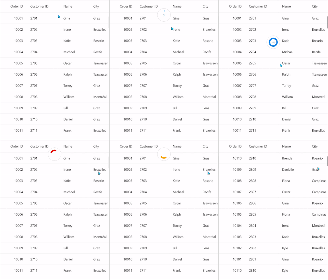
Pulling and refreshing template
The Pull to Refresh allows you to set a template for the pulling and refreshing view. The pulling and refreshing templates can be set using the SfPullToRefresh.PullingViewTemplate and SfPullToRefresh.RefreshingViewTemplate properties, respectively. Both templates accept a DataTemplate and can be assigned independently if you need different views for each state. During the pulling gesture, the Pulling event provides a PullingEventArgs Progress value whose sign indicates the direction; use Math.Abs(e.Progress) for an absolute value.
Refer to the following code example in which a SfCircularProgressBar is loaded in the pulling view template and refreshing view template.
<ContentPage xmlns="http://schemas.microsoft.com/dotnet/2021/maui"
            xmlns:x="http://schemas.microsoft.com/winfx/2009/xaml"
            x:Class="PullToRefreshTemplate.MainPage"
            xmlns:sfgrid="clr-namespace:Syncfusion.Maui.DataGrid;assembly=Syncfusion.Maui.DataGrid"
            xmlns:pulltoRefresh="clr-namespace:Syncfusion.Maui.PullToRefresh;assembly=Syncfusion.Maui.PullToRefresh"
            xmlns:local="clr-namespace:PullToRefreshTemplate">

    <ContentPage.Behaviors>
        <local:PullToRefreshTemplateBehavior />
    </ContentPage.Behaviors>

    <ContentPage.Content>
        <Grid>
            <pulltoRefresh:SfPullToRefresh x:Name="pullToRefresh"
                                        RefreshViewHeight="50"
                                        RefreshViewThreshold="30"
                                        PullingThreshold="150"
                                        RefreshViewWidth="50"
                                        ProgressThickness='{OnPlatform Android="3", Default="2"}'
                                        TransitionMode="SlideOnTop"
                                        Margin="{StaticResource margin}"
                                        IsRefreshing="False">
                <pulltoRefresh:SfPullToRefresh.PullableContent>
                    <sfgrid:SfDataGrid x:Name="dataGrid"
                                    HeaderRowHeight="52"
                                    RowHeight="48"
                                    SortingMode="Single"
                                    ItemsSource="{Binding OrdersInfo}"
                                    AutoGenerateColumnsMode="None"
                                    ColumnWidthMode="Fill"
                                    HorizontalScrollBarVisibility="Always"
                                    VerticalScrollBarVisibility="Always">
                        . . .
                        . . . .

                    </sfgrid:SfDataGrid>
                </pulltoRefresh:SfPullToRefresh.PullableContent>
            </pulltoRefresh:SfPullToRefresh>
        </Grid>
    </ContentPage.Content>
</ContentPage>
public class PullToRefreshTemplateBehavior : Behavior<ContentPage>
{
protected override void OnAttachedTo(ContentPage bindable)
{
this.viewModel = new OrderInfoViewModel();
this.progressbar = new SfCircularProgressBar();
this.border = new Border();
this.progressContent = new Label();
this.progressContent.TextColor = Color.FromRgb(0, 124, 238);
this.progressContent.FontSize = 9;
this.progressContent.WidthRequest = 20;
this.progressContent.HorizontalTextAlignment = TextAlignment.Center;
this.border.Stroke = Colors.LightGray;
this.border.Background = Colors.White;
this.border.StrokeShape = new RoundRectangle { CornerRadius = new CornerRadius(30) };
this.border.Content = this.progressbar;
this.border.Padding = 0;
this.border.Shadow = null;
this.progressbar.SegmentCount = 10;
this.progressbar.ProgressThickness = 6;
this.progressbar.ProgressRadiusFactor = 0.7;
this.progressbar.SegmentGapWidth = 1;
this.progressbar.WidthRequest = 55;
this.progressbar.HeightRequest = 55;
this.progressbar.IndeterminateAnimationDuration = 750;
this.progressbar.Content = this.progressContent;
bindable.BindingContext = this.viewModel;
this.pullToRefresh = bindable.FindByName<Syncfusion.Maui.PullToRefresh.SfPullToRefresh>("pullToRefresh");
this.dataGrid = bindable.FindByName<SfDataGrid>("dataGrid");
this.dataGrid.ItemsSource = this.viewModel.OrdersInfo;
this.pullToRefresh.Refreshing += this.PullToRefresh_Refreshing;
this.pullToRefresh.Pulling += this.PullToRefresh_Pulling;
var pullingTemplate = new DataTemplate(() =>
{
return this.border;
});
this.pullToRefresh.PullingViewTemplate = pullingTemplate;
this.pullToRefresh.RefreshingViewTemplate = pullingTemplate;
base.OnAttachedTo(bindable);
}
private void PullToRefresh_Pulling(object? sender, PullingEventArgs e)
{
this.progressbar!.TrackThickness = 0.8;
this.progressbar.TrackRadiusFactor = 0.1;
this.progressbar.IsIndeterminate = false;
this.progressbar.ProgressFill = Color.FromRgb(0, 124, 238);
this.progressbar.TrackFill = Colors.White;
var absoluteProgress = Convert.ToInt32(Math.Abs(e.Progress));
this.progressbar.Progress = absoluteProgress;
this.progressbar.SetProgress(absoluteProgress, 1, Easing.CubicInOut);
this.progressContent!.Text = e.Progress.ToString();
}
private async void PullToRefresh_Refreshing(object? sender, EventArgs e)
{
this.progressContent!.IsVisible = false;
this.pullToRefresh!.IsRefreshing = true;
await Task.Delay(10);
await this.AnimateRefresh();
this.viewModel!.RefreshItemsource(10);
await Task.Delay(10);
this.pullToRefresh.IsRefreshing = false;
this.progressContent.IsVisible = true;
}
private async Task AnimateRefresh()
{
this.progressbar!.Progress = 0;
this.progressbar.IsIndeterminate = true;
await Task.Delay(750);
this.progressbar.ProgressFill = Colors.Red;
await Task.Delay(750);
this.progressbar.ProgressFill = Colors.Green;
await Task.Delay(750);
this.progressbar.ProgressFill = Colors.Orange;
await Task.Delay(750);
}
}