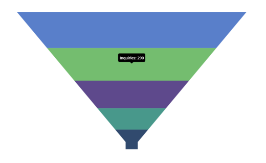
Tooltip in .NET MAUI Funnel Chart
18 Nov 20186 minutes to read
The tooltip provides additional information when hovering over a funnel segment. By default, the segment’s Y value will be shown in the tooltip.
Prerequisite: Ensure that the required NuGet package is installed, the necessary namespaces are imported, and the Funnel Chart control is properly configured in your application. For detailed setup and configuration instructions, refer to the Getting Started guide.
Enable Tooltip
To enable the tooltip in the chart, set the EnableTooltip property of SfFunnelChart to true.
<chart:SfFunnelChart ItemsSource="{Binding Data}"
                     XBindingPath="XValue"
                     YBindingPath="YValue"
                     EnableTooltip="True">
</chart:SfFunnelChart>
SfFunnelChart chart = new SfFunnelChart();
chart.ItemsSource = viewModel.Data;
chart.XBindingPath = "XValue";
chart.YBindingPath = "YValue";
chart.EnableTooltip = true;
this.Content = chart;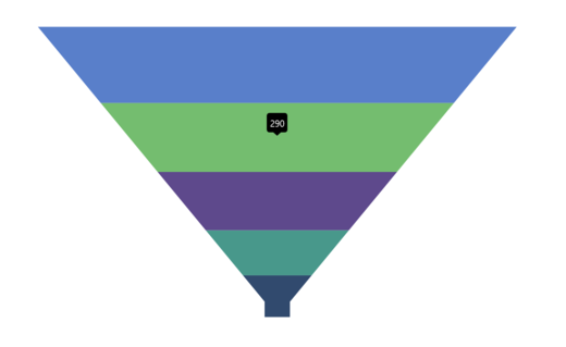
Tooltip Customization
The ChartTooltipBehavior is used to customize the tooltip. To customize the tooltip, create an instance of ChartTooltipBehavior and set it to the TooltipBehavior property of SfFunnelChart. The following properties are used to customize the tooltip:
-
Background of type
Brush- indicates the background color of the tooltip label. -
FontAttributes of type
FontAttributes- indicates the font style of the label. -
FontFamily of type
string- indicates the font family for the label. -
FontSize of type
float- indicates the font size. -
Duration of type
int- indicates the duration for displaying the tooltip. -
Margin of type
Thickness- indicates the label’s margin. -
TextColor of type
Color- indicates the color of the displayed text. -
Stroke of type
Brush- indicates the border color of the tooltip. -
StrokeWidth of type
double- indicates the thickness of the tooltip border. -
UseSeriesFillColor of type
bool- indicates whether the tooltip background should use the fill color of the associated segment; whentrue, the tooltip adopts the segment color as its background.
<chart:SfFunnelChart ItemsSource="{Binding Data}"
                     XBindingPath="XValue"
                     YBindingPath="YValue"
                     EnableTooltip="True">
    <chart:SfFunnelChart.TooltipBehavior>
        <chart:ChartTooltipBehavior Duration="4"/>
    </chart:SfFunnelChart.TooltipBehavior>
</chart:SfFunnelChart>
SfFunnelChart chart = new SfFunnelChart();
chart.ItemsSource = viewModel.Data;
chart.XBindingPath = "XValue";
chart.YBindingPath = "YValue";
chart.EnableTooltip = true;
chart.TooltipBehavior = new ChartTooltipBehavior()
{
Duration = 4,
};
this.Content = chart;Tooltip Template
TooltipTemplate is used to customize the tooltip with additional information beyond the default display. The template binding context is the chart segment’s TooltipInfo object, which contains an Item property for the data point.
<Grid x:Name="grid">
    <Grid.Resources>
        <DataTemplate x:Key="tooltipTemplate">
            <HorizontalStackLayout Padding="8" Spacing="4">
                <Label Text="{Binding Item.XValue}"
                       TextColor="White"
                       FontAttributes="Bold"
                       VerticalOptions="Center"/>
                <Label Text="{Binding Item.YValue, StringFormat=': {0}'}"
                       TextColor="White"
                       FontAttributes="Bold"
                       VerticalOptions="Center"/>
            </HorizontalStackLayout>
        </DataTemplate>
    </Grid.Resources>

    <chart:SfFunnelChart ItemsSource="{Binding Data}"
                         XBindingPath="XValue"
                         YBindingPath="YValue"
                         EnableTooltip="True"
                         TooltipTemplate="{StaticResource tooltipTemplate}">
    </chart:SfFunnelChart>
</Grid>
SfFunnelChart chart = new SfFunnelChart();
chart.ItemsSource = viewModel.Data;
chart.XBindingPath = "XValue";
chart.YBindingPath = "YValue";
chart.EnableTooltip = true;
chart.TooltipTemplate = grid.Resources["tooltipTemplate"] as DataTemplate;
grid.Children.Add(chart);
this.Content = grid;