Legend in .NET MAUI Funnel Chart
8 Jul 202617 minutes to read
The Legend provides a list of data points, helping to identify the corresponding funnel segments in the chart. Here’s a detailed guide on how to define and customize the legend in the funnel chart.
NOTE
Prerequisite: Ensure that the required NuGet package is installed, the necessary namespaces are imported, and the Funnel Chart control is properly configured in your application. For detailed setup and configuration instructions, refer to the Getting Started guide.
Defining the legend
To define the legend in the chart, initialize the ChartLegend class and assign it to the Legend property.
<chart:SfFunnelChart ItemsSource="{Binding Data}"
                     XBindingPath="XValue"
                     YBindingPath="YValue">
    <chart:SfFunnelChart.Legend>
        <chart:ChartLegend/>
    </chart:SfFunnelChart.Legend>
</chart:SfFunnelChart>
SfFunnelChart chart = new SfFunnelChart()
{
ItemsSource = new ViewModel().Data,
XBindingPath = "XValue",
YBindingPath = "YValue",
};
chart.Legend = new ChartLegend();
this.Content = chart;Legend visibility
The visibility of the chart legend can be controlled using the IsVisible property. By default, the IsVisible property is set to true.
<chart:SfFunnelChart ItemsSource="{Binding Data}"
                     XBindingPath="XValue"
                     YBindingPath="YValue">
    <chart:SfFunnelChart.Legend>
        <chart:ChartLegend IsVisible="True"/>
    </chart:SfFunnelChart.Legend>
</chart:SfFunnelChart>
SfFunnelChart chart = new SfFunnelChart()
{
ItemsSource = new ViewModel().Data,
XBindingPath = "XValue",
YBindingPath = "YValue",
};
chart.Legend = new ChartLegend()
{
IsVisible = true
};
this.Content = chart;Customizing labels
The appearance of the legend label can be customized using the LabelStyle property.
-
TextColor— Gets or sets the color of the label. -
FontFamily— Gets or sets the font family for the legend label. -
FontAttributes— Gets or sets the font style for the legend label. -
FontSize— Gets or sets the font size for the legend label. -
Margin— Gets or sets the margin size of labels.
<chart:SfFunnelChart ItemsSource="{Binding Data}"
                     XBindingPath="XValue"
                     YBindingPath="YValue">
    <chart:SfFunnelChart.Legend>
        <chart:ChartLegend>
            <chart:ChartLegend.LabelStyle>
                <chart:ChartLegendLabelStyle TextColor="Blue" Margin="5" FontSize="18" FontAttributes="Bold" FontFamily="PlaywriteAR-Regular"/>
            </chart:ChartLegend.LabelStyle>
        </chart:ChartLegend>
    </chart:SfFunnelChart.Legend>
</chart:SfFunnelChart>
SfFunnelChart chart = new SfFunnelChart()
{
XBindingPath = "XValue",
YBindingPath = "YValue",
ItemsSource = new ViewModel().Data,
};
chart.Legend = new ChartLegend();
ChartLegendLabelStyle labelStyle = new ChartLegendLabelStyle()
{
TextColor = Colors.Blue,
FontSize = 18,
FontAttributes = FontAttributes.Bold,
Margin = 5,
FontFamily = "PlaywriteAR-Regular"
};
chart.Legend.LabelStyle = labelStyle;
this.Content = chart;
Legend icon
To specify the legend icon for the chart segments, use the LegendIcon property and change its type using the ChartLegendIconType enum values. The default value of the LegendIcon property is Circle.
<chart:SfFunnelChart ItemsSource="{Binding Data}"
                     XBindingPath="XValue"
                     YBindingPath="YValue"
                     LegendIcon="Diamond">
    <chart:SfFunnelChart.Legend>
        <chart:ChartLegend/>
    </chart:SfFunnelChart.Legend>
</chart:SfFunnelChart>
SfFunnelChart chart = new SfFunnelChart()
{
ItemsSource = new ViewModel().Data,
XBindingPath = "XValue",
YBindingPath = "YValue",
LegendIcon = ChartLegendIconType.Diamond
};
chart.Legend = new ChartLegend();
this.Content = chart;Placement
The legend can be positioned to the left, right, top, or bottom of the chart area using the Placement property in the ChartLegend class. The default placement is Top.
<chart:SfFunnelChart ItemsSource="{Binding Data}"
                     XBindingPath="XValue"
                     YBindingPath="YValue">
    <chart:SfFunnelChart.Legend>
        <chart:ChartLegend Placement="Bottom"/>
    </chart:SfFunnelChart.Legend>
</chart:SfFunnelChart>
SfFunnelChart chart = new SfFunnelChart()
{
XBindingPath = "XValue",
YBindingPath = "YValue",
ItemsSource = new ViewModel().Data,
};
chart.Legend = new ChartLegend()
{
Placement = LegendPlacement.Bottom
};
this.Content = chart;Floating legend
The floating legend feature allows you to position the legend inside the chart area based on its defined placement. When IsFloating is set to true, the legend will start from the specified Placement (such as Top, Bottom, Left, or Right) and then move according to the offset values, enabling precise control over the legend’s location.
- OffsetX — Specifies the horizontal distance from the defined placement position.
- OffsetY — Specifies the vertical distance from the defined placement position.
<chart:SfFunnelChart ItemsSource="{Binding Data}"
                     XBindingPath="XValue"
                     YBindingPath="YValue">
    <chart:SfFunnelChart.Legend>
        <chart:ChartLegend Placement="Right"
                           IsFloating="True"
                           OffsetX="-250"
                           OffsetY="-100"/>
    </chart:SfFunnelChart.Legend>
</chart:SfFunnelChart>
SfFunnelChart chart = new SfFunnelChart()
{
XBindingPath = "XValue",
YBindingPath = "YValue",
ItemsSource = new ViewModel().Data,
};
chart.Legend = new ChartLegend()
{
Placement = LegendPlacement.Top,
IsFloating = true,
OffsetX = -170,
OffsetY = 30
};
this.Content = chart;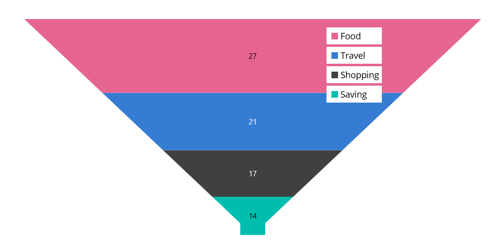
Toggle segment visibility
The visibility of segments in the funnel chart can be controlled by tapping the legend item using the ToggleSeriesVisibility property. The default value of ToggleSeriesVisibility is false.
<chart:SfFunnelChart ItemsSource="{Binding Data}"
                     XBindingPath="XValue"
                     YBindingPath="YValue">
    <chart:SfFunnelChart.Legend>
        <chart:ChartLegend ToggleSeriesVisibility="True"/>
    </chart:SfFunnelChart.Legend>
</chart:SfFunnelChart>
SfFunnelChart chart = new SfFunnelChart()
{
ItemsSource = new ViewModel().Data,
XBindingPath = "XValue",
YBindingPath = "YValue"
};
chart.Legend = new ChartLegend()
{
ToggleSeriesVisibility = true
};
this.Content = chart;Legend maximum size request
To set the maximum size request for the legend view, override the GetMaximumSizeCoefficient protected method in ChartLegend class. The value should be between 0 and 1, representing the maximum size request, not the desired size for the legend items layout.
xmlns:chart="clr-namespace:Syncfusion.Maui.Charts;assembly=Syncfusion.Maui.Charts"

<chart:SfFunnelChart ItemsSource="{Binding Data}"
                     XBindingPath="XValue"
                     YBindingPath="YValue">
    <chart:SfFunnelChart.Legend>
        <chart:LegendExt/>
    </chart:SfFunnelChart.Legend>
</chart:SfFunnelChart>
public class LegendExt : ChartLegend
{
protected override double GetMaximumSizeCoefficient()
{
return 0.7;
}
}
SfFunnelChart chart = new SfFunnelChart()
{
ItemsSource = new ViewModel().Data,
XBindingPath = "XValue",
YBindingPath = "YValue"
};
chart.Legend = new LegendExt();
this.Content = chart;Items layout
The ItemsLayout property is used to customize the arrangement and position of each legend item. The default value is null. This property accepts any layout type.
<chart:SfFunnelChart ItemsSource="{Binding Data}"
                     XBindingPath="XValue"
                     YBindingPath="YValue">
    <chart:SfFunnelChart.Legend>
        <chart:ChartLegend>
            <chart:ChartLegend.ItemsLayout>
                <FlexLayout Wrap="Wrap"
                            WidthRequest="400">
                </FlexLayout>
            </chart:ChartLegend.ItemsLayout>
        </chart:ChartLegend>
    </chart:SfFunnelChart.Legend>
</chart:SfFunnelChart>
SfFunnelChart chart = new SfFunnelChart()
{
ItemsSource = new ViewModel().Data,
XBindingPath = "XValue",
YBindingPath = "YValue",
};
ChartLegend legend = new ChartLegend();
legend.ItemsLayout = new FlexLayout()
{
Wrap = FlexWrap.Wrap,
WidthRequest = 400
};
chart.Legend = legend;
this.Content = chart;Item template
The ChartLegend supports customizing the appearance of legend items using the ItemTemplate property. The default value of ItemTemplate is null.
NOTE
The BindingContext of the template is the corresponding underlying legend item provided in the ChartLegendItem class.
<chart:SfFunnelChart ItemsSource="{Binding Data}" x:Name="chart"
                     XBindingPath="XValue"
                     YBindingPath="YValue">
    <chart:SfFunnelChart.Resources>
        <DataTemplate x:Key="legendTemplate">
            <HorizontalStackLayout Padding="3">
                <Rectangle HeightRequest="12"
                           WidthRequest="12" Margin="3"
                           Background="{Binding IconBrush}"/>
                <Label Text="{Binding XValue}"
                       Margin="3"/>
            </HorizontalStackLayout>
        </DataTemplate>
    </chart:SfFunnelChart.Resources>

    <chart:SfFunnelChart.Legend>
        <chart:ChartLegend ItemTemplate="{StaticResource legendTemplate}"/>
    </chart:SfFunnelChart.Legend>
</chart:SfFunnelChart>
SfFunnelChart chart = new SfFunnelChart()
{
ItemsSource = new ViewModel().Data,
XBindingPath = "XValue",
YBindingPath = "YValue",
};
ChartLegend legend = new ChartLegend();
legend.ItemTemplate = chart.Resources["legendTemplate"] as DataTemplate;
chart.Legend = legend;
this.Content = chart;
LegendItemCreated event
The LegendItemCreated event is triggered when the chart legend item is created. The argument contains the LegendItem object. The following properties are present in LegendItem.
-
Text— Used to get or set the text of the label. -
TextColor— Used to get or set the color of the label. -
FontFamily— Used to get or set the font family for the legend label. -
FontAttributes— Used to get or set the font style for the legend label. -
FontSize— Used to get or set the font size for the legend label. -
TextMargin— Used to get or set the margin size of labels. -
IconBrush— Used to change the color of the legend icon. -
IconType— Used to get or set the icon type for the legend icon. -
IconHeight— Used to get or set the icon height of the legend icon. -
IconWidth— Used to get or set the icon width of the legend icon. -
IsToggled— Used to get or set the toggle visibility of the legend. -
DisableBrush— Used to get or set the color of the legend when toggled. -
Index— Used to get index position of the legend. -
Item— Used to get the corresponding segment for the legend item.
Limitations
- Do not add items explicitly.
- When using BindableLayouts, do not bind ItemsSource explicitly.
- For better UX, arrange items vertically for left and right dock positions, and horizontally for top and bottom dock positions.
- If the layout’s measured size is larger than the available space, scrolling will be enabled.
- If the chart’s available size is smaller than the layout’s measured size, segments may not have enough space to draw properly.