Customization in .NET MAUI Effects View
18 Nov 201824 minutes to read
The .NET MAUI Effects View control exposes properties that customize the duration, size, color, and angle of each effect.
Prerequisites
Before using the SfEffectsView, ensure the following NuGet package is installed in your .NET MAUI project:
Syncfusion.Maui.Core
For a step-by-step setup, refer to the Getting Started documentation.
Animation Durations
The three animation-duration properties control how long each effect takes to complete, in milliseconds.
RippleAnimationDuration
The RippleAnimationDuration property sets the duration of the ripple animation.
<syncEffectsView:SfEffectsView x:Name="effectsView"
                               HorizontalOptions="Center"
                               VerticalOptions="Center"
                               RippleAnimationDuration="800">
    <Grid Padding="12"
          WidthRequest="350"
          HeightRequest="150"
          HorizontalOptions="Center"
          VerticalOptions="Center">
        <Grid.Background>
            <LinearGradientBrush EndPoint="1,1">
                <GradientStop Color="#FF6B6B"
                              Offset="0.0" />
                <GradientStop Color="#4ECDC4"
                              Offset="1.0" />
            </LinearGradientBrush>
        </Grid.Background>
    </Grid>
</syncEffectsView:SfEffectsView>
var grid = new Grid
{
Padding = new Thickness(12),
WidthRequest = 350,
HeightRequest = 150,
HorizontalOptions = LayoutOptions.Center,
VerticalOptions = LayoutOptions.Center,
Background = new LinearGradientBrush
{
EndPoint = new Point(1, 1),
GradientStops = new GradientStopCollection
{
new GradientStop(Color.FromArgb("#FF6B6B"), 0.0f),
new GradientStop(Color.FromArgb("#4ECDC4"), 1.0f)
}
}
};
var effectsView = new SfEffectsView
{
HorizontalOptions = LayoutOptions.Center,
VerticalOptions = LayoutOptions.Center,
RippleAnimationDuration = 800,
Content = grid
};
this.Content = effectsView;ScaleAnimationDuration
The ScaleAnimationDuration property sets the duration of the scale animation.
<syncEffectsView:SfEffectsView x:Name="effectsView"
                               HorizontalOptions="Center"
                               VerticalOptions="Center"
                               ScaleAnimationDuration="800"
                               LongPressEffects="Scale"
                               ScaleFactor="0.85">
    <Grid Padding="12"
          WidthRequest="350"
          HeightRequest="150"
          HorizontalOptions="Center"
          VerticalOptions="Center">
        <Grid.Background>
            <LinearGradientBrush EndPoint="1,1">
                <GradientStop Color="#FF6B6B"
                              Offset="0.0" />
                <GradientStop Color="#4ECDC4"
                              Offset="1.0" />
            </LinearGradientBrush>
        </Grid.Background>
    </Grid>
</syncEffectsView:SfEffectsView>
var grid = new Grid
{
Padding = new Thickness(12),
WidthRequest = 350,
HeightRequest = 150,
HorizontalOptions = LayoutOptions.Center,
VerticalOptions = LayoutOptions.Center,
Background = new LinearGradientBrush
{
EndPoint = new Point(1, 1),
GradientStops = new GradientStopCollection
{
new GradientStop(Color.FromArgb("#FF6B6B"), 0.0f),
new GradientStop(Color.FromArgb("#4ECDC4"), 1.0f)
}
}
};
var effectsView = new SfEffectsView
{
HorizontalOptions = LayoutOptions.Center,
VerticalOptions = LayoutOptions.Center,
ScaleAnimationDuration = 800,
LongPressEffects = SfEffects.Scale,
ScaleFactor = 0.85,
Content = grid
};
this.Content = effectsView;RotationAnimationDuration
The RotationAnimationDuration property sets the duration of the rotation animation.
<syncEffectsView:SfEffectsView x:Name="effectsView"
                               HorizontalOptions="Center"
                               VerticalOptions="Center"
                               RotationAnimationDuration="800"
                               Angle="180"
                               TouchDownEffects="Rotation">
    <Grid Padding="12"
          WidthRequest="350"
          HeightRequest="150"
          HorizontalOptions="Center"
          VerticalOptions="Center">
        <Grid.Background>
            <LinearGradientBrush EndPoint="1,1">
                <GradientStop Color="#FF6B6B"
                              Offset="0.0" />
                <GradientStop Color="#4ECDC4"
                              Offset="1.0" />
            </LinearGradientBrush>
        </Grid.Background>
    </Grid>
</syncEffectsView:SfEffectsView>
var grid = new Grid
{
Padding = new Thickness(12),
WidthRequest = 350,
HeightRequest = 150,
HorizontalOptions = LayoutOptions.Center,
VerticalOptions = LayoutOptions.Center,
Background = new LinearGradientBrush
{
EndPoint = new Point(1, 1),
GradientStops = new GradientStopCollection
{
new GradientStop(Color.FromArgb("#FF6B6B"), 0.0f),
new GradientStop(Color.FromArgb("#4ECDC4"), 1.0f)
}
}
};
var effectsView = new SfEffectsView
{
HorizontalOptions = LayoutOptions.Center,
VerticalOptions = LayoutOptions.Center,
RotationAnimationDuration = 800,
Angle = 180,
TouchDownEffects = SfEffects.Rotation,
Content = grid
};
this.Content = effectsView;Size and Position
InitialRippleFactor
The InitialRippleFactor property is used to customize the radius of the ripple when the ripple animation starts. Valid range is 0 to 1.
<Border HorizontalOptions="Center"
        VerticalOptions="Center">
    <Border.StrokeShape>
        <RoundRectangle CornerRadius="18" />
    </Border.StrokeShape>
    <Border.Background>
        <LinearGradientBrush EndPoint="1,0">
            <GradientStop Color="#FFCDCDD2"
                          Offset="0.0" />
            <GradientStop Color="#FFCDCDD2"
                          Offset="1.0" />
        </LinearGradientBrush>
    </Border.Background>
    <syncEffectsView:SfEffectsView InitialRippleFactor="0.1">
        <Grid>
            <Grid.ColumnDefinitions>
                <ColumnDefinition Width="90" />
                <ColumnDefinition Width="*"/>
            </Grid.ColumnDefinitions>
            <Image Source="laura.png"
                   Margin="7"
                   VerticalOptions="Center"
                   WidthRequest="72"
                   HeightRequest="72" />
                <StackLayout Grid.Column="1"
                             VerticalOptions="Center">
                    <Label Text="Laura Steffi"
                           Margin="10,0,10,0"
                           FontSize="18" />
                    <Label Text="Data Science Analyst"
                           Margin="10,0,10,0"
                           FontSize="12"/>
                </StackLayout>
        </Grid>
    </syncEffectsView:SfEffectsView>
</Border>
var grid = new Grid
{
ColumnDefinitions =
{
new ColumnDefinition { Width = 90 },
new ColumnDefinition { Width = GridLength.Star }
}
};
var image = new Image
{
Source = "laura.png",
Margin = new Thickness(7),
VerticalOptions = LayoutOptions.Center,
WidthRequest = 72,
HeightRequest = 72
};
var nameLabel = new Label
{
Text = "Laura Steffi",
Margin = new Thickness(10, 0),
FontSize = 18
};
var roleLabel = new Label
{
Text = "Data Science Analyst",
Margin = new Thickness(10, 0),
FontSize = 12
};
var stackLayout = new StackLayout
{
VerticalOptions = LayoutOptions.Center,
Children = { nameLabel, roleLabel }
};
grid.Add(image);
grid.Add(stackLayout, 1, 0);
var effectsView = new SfEffectsView
{
InitialRippleFactor = 0.1,
Content = grid
};
var border = new Border
{
HorizontalOptions = LayoutOptions.Center,
VerticalOptions = LayoutOptions.Center,
StrokeShape = new RoundRectangle
{
CornerRadius = 18
},
Background = new LinearGradientBrush
{
EndPoint = new Point(1, 0),
GradientStops = new GradientStopCollection
{
new GradientStop(Color.FromArgb("#FFCDCDD2"), 0.0f),
new GradientStop(Color.FromArgb("#FFCDCDD2"), 1.0f)
}
},
Content = effectsView
};
this.Content = border;
ScaleFactor
The ScaleFactor property sets the target scale applied during the Scale effect.
<HorizontalStackLayout HorizontalOptions="Center"
                       Spacing="12">
    <syncEffectsView:SfEffectsView x:Name="EffectsView1"
                                   ScaleFactor="0.85"
                                   LongPressEffects="Scale"
                                   TouchDownEffects="None"
                                   TouchUpEffects="None"
                                   LongPressed="OnEffectsView1LongPressed">
        <Grid WidthRequest="100"
              HeightRequest="100">
            <Image Source="person3.jpg"
                   WidthRequest="100"
                   HeightRequest="100"
                   Aspect="AspectFill" />
            <Border x:Name="Tick1"
                    Padding="0"
                    IsVisible="False"
                    BackgroundColor="Blue"
                    WidthRequest="18"
                    HeightRequest="18"
                    HorizontalOptions="End"
                    VerticalOptions="Start"
                    StrokeThickness="0">
                <Border.StrokeShape>
                    <RoundRectangle CornerRadius="9" />
                </Border.StrokeShape>
                <Label Text="✓"
                       FontSize="12"
                       TextColor="White"
                       FontAttributes="Bold"
                       HorizontalOptions="Center"
                       VerticalOptions="Center" />
            </Border>
        </Grid>
    </syncEffectsView:SfEffectsView>

    <syncEffectsView:SfEffectsView x:Name="EffectsView2"
                                   ScaleFactor="0.85"
                                   LongPressEffects="Scale"
                                   TouchDownEffects="None"
                                   TouchUpEffects="None"
                                   LongPressed="OnEffectsView2LongPressed">
        <Grid WidthRequest="100"
              HeightRequest="100">
            <Image Source="person2.jpg"
                   WidthRequest="100"
                   HeightRequest="100"
                   Aspect="AspectFill" />
            <Border x:Name="Tick2"
                    Padding="0"
                    IsVisible="False"
                    BackgroundColor="Blue"
                    WidthRequest="18"
                    HeightRequest="18"
                    HorizontalOptions="End"
                    VerticalOptions="Start"
                    StrokeThickness="0">
                <Border.StrokeShape>
                    <RoundRectangle CornerRadius="9" />
                </Border.StrokeShape>
                <Label Text="✓"
                       FontSize="12"
                       TextColor="White"
                       FontAttributes="Bold"
                       HorizontalOptions="Center"
                       VerticalOptions="Center" />
            </Border>
        </Grid>
    </syncEffectsView:SfEffectsView>

    <syncEffectsView:SfEffectsView x:Name="EffectsView3"
                                   ScaleFactor="0.85"
                                   LongPressEffects="Scale"
                                   TouchDownEffects="None"
                                   TouchUpEffects="None"
                                   LongPressed="OnEffectsView3LongPressed">
        <Grid WidthRequest="100"
              HeightRequest="100">
            <Image Source="person1.jpg"
                   WidthRequest="100"
                   HeightRequest="100"
                   Aspect="AspectFill" />
            <Border x:Name="Tick3"
                    Padding="0"
                    IsVisible="False"
                    BackgroundColor="Blue"
                    WidthRequest="18"
                    HeightRequest="18"
                    HorizontalOptions="End"
                    VerticalOptions="Start"
                    StrokeThickness="0">
                <Border.StrokeShape>
                    <RoundRectangle CornerRadius="9" />
                </Border.StrokeShape>
                <Label Text="✓"
                       FontSize="12"
                       TextColor="White"
                       FontAttributes="Bold"
                       HorizontalOptions="Center"
                       VerticalOptions="Center" />
            </Border>
        </Grid>
    </syncEffectsView:SfEffectsView>
</HorizontalStackLayout>
private void OnEffectsView1LongPressed(object sender, EventArgs e)
{
SelectImage(EffectsView1, Tick1);
}
private void OnEffectsView2LongPressed(object sender, EventArgs e)
{
SelectImage(EffectsView2, Tick2);
}
private void OnEffectsView3LongPressed(object sender, EventArgs e)
{
SelectImage(EffectsView3, Tick3);
}
private async void SelectImage(SfEffectsView effectsView, Border tickFrame)
{
// Apply scale effect to the newly selected image
await effectsView.ScaleTo(0.85, 300, Easing.CubicInOut);
// Show the tick mark
tickFrame.IsVisible = true;
}
Background Colors
HighlightBackground
The HighlightBackground property is used to customize the color of the Highlight effect.
<Border HorizontalOptions="Center"
        VerticalOptions="Center">
    <Border.StrokeShape>
        <RoundRectangle CornerRadius="18" />
    </Border.StrokeShape>
    <Border.Background>
        <LinearGradientBrush EndPoint="1,0">
            <GradientStop Color="#FFCDCDD2"
                          Offset="0.0" />
            <GradientStop Color="#FFCDCDD2"
                          Offset="1.0" />
        </LinearGradientBrush>
    </Border.Background>
    <syncEffectsView:SfEffectsView  HighlightBackground="#FFF36421"
                                    TouchDownEffects="Highlight">
        <Grid>
            <Grid.ColumnDefinitions>
                <ColumnDefinition Width="90" />
                <ColumnDefinition Width="*"/>
            </Grid.ColumnDefinitions>
            <Image Source="laura.png"
                   Margin="7"
                   VerticalOptions="Center"
                   WidthRequest="72"
                   HeightRequest="72" />
                <StackLayout Grid.Column="1"
                             VerticalOptions="Center">
                    <Label Text="Laura Steffi"
                           Margin="10,0,10,0"
                           FontSize="18" />
                    <Label Text="Data Science Analyst"
                           Margin="10,0,10,0"
                           FontSize="12"/>
                </StackLayout>
        </Grid>
    </syncEffectsView:SfEffectsView>
</Border>
var grid = new Grid
{
ColumnDefinitions =
{
new ColumnDefinition { Width = 90 },
new ColumnDefinition { Width = GridLength.Star }
}
};
var image = new Image
{
Source = "laura.png",
Margin = new Thickness(7),
VerticalOptions = LayoutOptions.Center,
WidthRequest = 72,
HeightRequest = 72
};
var nameLabel = new Label
{
Text = "Laura Steffi",
Margin = new Thickness(10, 0),
FontSize = 18
};
var roleLabel = new Label
{
Text = "Data Science Analyst",
Margin = new Thickness(10, 0),
FontSize = 12
};
var stackLayout = new StackLayout
{
VerticalOptions = LayoutOptions.Center,
Children = { nameLabel, roleLabel }
};
grid.Add(image);
grid.Add(stackLayout, 1, 0);
var effectsView = new SfEffectsView
{
HighlightBackground = new SolidColorBrush(Colors.OrangeRed),
TouchDownEffects = SfEffects.Highlight,
Content = grid
};
var border = new Border
{
HorizontalOptions = LayoutOptions.Center,
VerticalOptions = LayoutOptions.Center,
StrokeShape = new RoundRectangle
{
CornerRadius = 18
},
Background = new LinearGradientBrush
{
EndPoint = new Point(1, 0),
GradientStops = new GradientStopCollection
{
new GradientStop(Color.FromArgb("#FFCDCDD2"), 0.0f),
new GradientStop(Color.FromArgb("#FFCDCDD2"), 1.0f)
}
},
Content = effectsView
};
this.Content = border;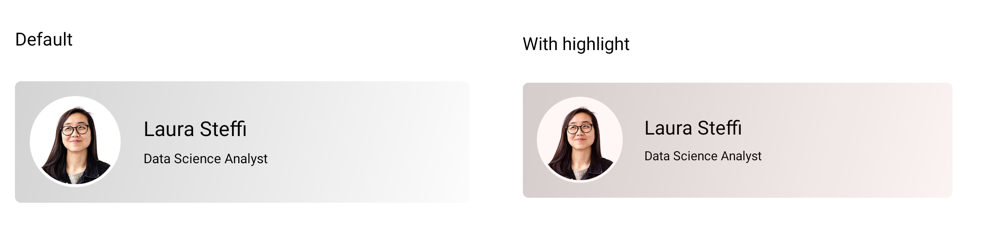
RippleBackground
The RippleBackground property is used to customize the color of the Ripple effect.
<Border HorizontalOptions="Center"
        VerticalOptions="Center">
    <Border.StrokeShape>
        <RoundRectangle CornerRadius="18" />
    </Border.StrokeShape>
    <Border.Background>
        <LinearGradientBrush EndPoint="1,0">
            <GradientStop Color="#FFCDCDD2"
                          Offset="0.0" />
            <GradientStop Color="#FFCDCDD2"
                          Offset="1.0" />
        </LinearGradientBrush>
    </Border.Background>
    <syncEffectsView:SfEffectsView  x:Name="effectsView"
                                    RippleBackground="#2196F3">
        <Grid>
            <Grid.ColumnDefinitions>
                <ColumnDefinition Width="90" />
                <ColumnDefinition Width="*"/>
            </Grid.ColumnDefinitions>
            <Image Source="laura.png"
                   Margin="7"
                   VerticalOptions="Center"
                   WidthRequest="72"
                   HeightRequest="72" />
                <StackLayout Grid.Column="1"
                             VerticalOptions="Center">
                    <Label Text="Laura Steffi"
                           Margin="10,0,10,0"
                           FontSize="18" />
                    <Label Text="Data Science Analyst"
                           Margin="10,0,10,0"
                           FontSize="12"/>
                </StackLayout>
        </Grid>
    </syncEffectsView:SfEffectsView>
</Border>
var grid = new Grid
{
ColumnDefinitions =
{
new ColumnDefinition { Width = 90 },
new ColumnDefinition { Width = GridLength.Star }
}
};
var image = new Image
{
Source = "laura.png",
Margin = new Thickness(7),
VerticalOptions = LayoutOptions.Center,
WidthRequest = 72,
HeightRequest = 72
};
var nameLabel = new Label
{
Text = "Laura Steffi",
Margin = new Thickness(10, 0),
FontSize = 18
};
var roleLabel = new Label
{
Text = "Data Science Analyst",
Margin = new Thickness(10, 0),
FontSize = 12
};
var stackLayout = new StackLayout
{
VerticalOptions = LayoutOptions.Center,
Children = { nameLabel, roleLabel }
};
grid.Add(image);
grid.Add(stackLayout, 1, 0);
var effectsView = new SfEffectsView
{
RippleBackground = new SolidColorBrush(Colors.Aqua),
Content = grid
};
var border = new Border
{
HorizontalOptions = LayoutOptions.Center,
VerticalOptions = LayoutOptions.Center,
StrokeShape = new RoundRectangle
{
CornerRadius = 18
},
Background = new LinearGradientBrush
{
EndPoint = new Point(1, 0),
GradientStops = new GradientStopCollection
{
new GradientStop(Color.FromArgb("#FFCDCDD2"), 0.0f),
new GradientStop(Color.FromArgb("#FFCDCDD2"), 1.0f)
}
},
Content = effectsView
};
this.Content = border;
SelectionBackground
The SelectionBackground property is used to customize the color of Selection effect.
<Border HorizontalOptions="Center"
        VerticalOptions="Center">
    <Border.StrokeShape>
        <RoundRectangle CornerRadius="18" />
    </Border.StrokeShape>
    <Border.Background>
        <LinearGradientBrush EndPoint="1,0">
            <GradientStop Color="#FFCDCDD2"
                          Offset="0.0" />
            <GradientStop Color="#FFCDCDD2"
                          Offset="1.0" />
        </LinearGradientBrush>
    </Border.Background>
    <syncEffectsView:SfEffectsView  x:Name="effectsView"
                                    LongPressEffects="Selection"
                                    SelectionBackground="#2196F3">
        <Grid>
            <Grid.ColumnDefinitions>
                <ColumnDefinition Width="90" />
                <ColumnDefinition Width="*"/>
            </Grid.ColumnDefinitions>
            <Image Source="laura.png"
                   Margin="7"
                   VerticalOptions="Center"
                   WidthRequest="72"
                   HeightRequest="72" />
                <StackLayout Grid.Column="1"
                             VerticalOptions="Center">
                    <Label Text="Laura Steffi"
                           Margin="10,0,10,0"
                           FontSize="18" />
                    <Label Text="Data Science Analyst"
                           Margin="10,0,10,0"
                           FontSize="12"/>
                </StackLayout>
        </Grid>
    </syncEffectsView:SfEffectsView>
</Border>
var grid = new Grid
{
ColumnDefinitions =
{
new ColumnDefinition { Width = 90 },
new ColumnDefinition { Width = GridLength.Star }
}
};
var image = new Image
{
Source = "laura.png",
Margin = new Thickness(7),
VerticalOptions = LayoutOptions.Center,
WidthRequest = 72,
HeightRequest = 72
};
var nameLabel = new Label
{
Text = "Laura Steffi",
Margin = new Thickness(10, 0),
FontSize = 18
};
var roleLabel = new Label
{
Text = "Data Science Analyst",
Margin = new Thickness(10, 0),
FontSize = 12
};
var stackLayout = new StackLayout
{
VerticalOptions = LayoutOptions.Center,
Children = { nameLabel, roleLabel }
};
grid.Add(image);
grid.Add(stackLayout, 1, 0);
var effectsView = new SfEffectsView
{
LongPressEffects = SfEffects.Selection,
SelectionBackground = new SolidColorBrush(Colors.Aqua),
Content = grid
};
var border = new Border
{
HorizontalOptions = LayoutOptions.Center,
VerticalOptions = LayoutOptions.Center,
StrokeShape = new RoundRectangle
{
CornerRadius = 18
},
Background = new LinearGradientBrush
{
EndPoint = new Point(1, 0),
GradientStops = new GradientStopCollection
{
new GradientStop(Color.FromArgb("#FFCDCDD2"), 0.0f),
new GradientStop(Color.FromArgb("#FFCDCDD2"), 1.0f)
}
},
Content = effectsView
};
this.Content = border;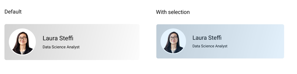
Angle
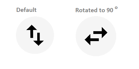
The Angle property sets the rotation angle in degrees.
<VerticalStackLayout VerticalOptions="Center"
                     Spacing="8">
    <Label x:Name="tagText"
           Text="Default"
           HorizontalTextAlignment="Center"
           VerticalTextAlignment="Start"/>
    <Border WidthRequest="32"
            HeightRequest="32"
            HorizontalOptions="Center"
            VerticalOptions="Center"
            StrokeThickness="0">
        <Border.StrokeShape>
            <RoundRectangle CornerRadius="10" />
        </Border.StrokeShape>
        <syncEffectsView:SfEffectsView Angle="90"
                                       TouchDownEffects="Ripple,Rotation"
                                       TouchDown="SfEffectsView_TouchDown">
            <HorizontalStackLayout Spacing="-4">
                <Label Text="↑"
                       FontSize="20"
                       FontAttributes="Bold"
                       VerticalOptions="Start" />
                <Label Text="↓"
                       FontSize="20"
                       FontAttributes="Bold"
                       VerticalOptions="End"
                       Margin="0,8,0,0" />
            </HorizontalStackLayout>
        </syncEffectsView:SfEffectsView>
    </Border>
</VerticalStackLayout>
Label tagText;
// Create the tag label
tagText = new Label
{
Text = "Default",
HorizontalTextAlignment = TextAlignment.Center,
VerticalTextAlignment = TextAlignment.Start
};
// Create the up arrow label
var upArrowLabel = new Label
{
Text = "↑",
FontSize = 20,
FontAttributes = FontAttributes.Bold,
VerticalOptions = LayoutOptions.Start
};
// Create the down arrow label
var downArrowLabel = new Label
{
Text = "↓",
FontSize = 20,
FontAttributes = FontAttributes.Bold,
VerticalOptions = LayoutOptions.End,
Margin = new Thickness(0, 8, 0, 0)
};
// Create the horizontal stack layout with arrows
var arrowStackLayout = new HorizontalStackLayout
{
Spacing = -4,
Children = { upArrowLabel, downArrowLabel }
};
// Create the effects view
var effectsView = new SfEffectsView
{
Angle = 90,
TouchDownEffects = SfEffects.Ripple | SfEffects.Rotation,
Content = arrowStackLayout
};
// Attach the TouchDown event handler
effectsView.TouchDown += SfEffectsView_TouchDown;
// Create the border with rounded corners
var border = new Border
{
WidthRequest = 32,
HeightRequest = 32,
HorizontalOptions = LayoutOptions.Center,
VerticalOptions = LayoutOptions.Center,
StrokeThickness = 0,
StrokeShape = new RoundRectangle { CornerRadius = 10 },
Content = effectsView
};
// Create the vertical stack layout container
var verticalStackLayout = new VerticalStackLayout
{
VerticalOptions = LayoutOptions.Center,
Spacing = 8,
Children = { tagText, border }
};
this.Content = verticalStackLayout;The TouchDown event can be handled in C# as follows:
private void SfEffectsView_TouchDown(object sender, EventArgs e)
{
    if (sender is SfEffectsView view)
    {
        if (view.Angle == 90)
        {
            tagText.Text = "Rotated to 90";
        }
    }
}