Reveal Height Customization in .NET MAUI Backdrop Page
18 Nov 20185 minutes to read
When revealing the back layer, the front layer will be moved downwards. By setting the BackLayerRevealOption property of the Backdrop, customize how far the front layer can be moved from the header when revealing the back layer.
The following options are provided to move the front layer:
Fill – Moves the front layer downwards to the entire height of the page, excluding the RevealedHeight.
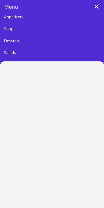
Auto – Moves the front layer downwards to the height of the back layer content.
Reveal and conceal the back layer
The following options are provided in the Backdrop to reveal and conceal the back layer.
-
Programmatically - Reveals the back layer by setting the
IsBackLayerRevealedproperty to true. By default, it is set to false. - Touch interaction - Reveals the back layer by clicking the toolbar icon at the top-right corner of the navigation bar header. The Hamburger (or menu ) icon reveals, and the Close icon conceals the back layer. When adding the backdrop as a child of the Fly out Page, the Hamburger and Close icons will be replaced by expand (or down arrow) and collapse (or up arrow) icons respectively.
-
Swipe or fling action - Reveals the back layer by swipe or fling action on the front layer to the required direction. Swipe downwards to reveal, and swipe upwards to conceal the back layer. The swipe or fling action will be handled only on the top of the front layer to the
RevealedHeight.
<backdrop:SfBackdropPage xmlns="http://schemas.microsoft.com/dotnet/2021/maui"
                         xmlns:x="http://schemas.microsoft.com/winfx/2009/xaml"
                         x:Class="BackdropGettingStarted.BackdropSamplePage"
                         Title="Menu"
                         xmlns:backdrop="clr-namespace:Syncfusion.Maui.Backdrop;assembly=Syncfusion.Maui.Backdrop"
                         BackLayerRevealOption="Auto"
                         IsBackLayerRevealed="True">

    <backdrop:SfBackdropPage.BackLayer>
        <backdrop:BackdropBackLayer>
            <Grid>
                <Grid.RowDefinitions>
                    <RowDefinition Height="Auto"/>
                </Grid.RowDefinitions>
                <ListView >
                    <ListView.ItemsSource>
                        <x:Array Type="{x:Type x:String}">
                            <x:String>Appetizers</x:String>
                            <x:String>Soups</x:String>
                            <x:String>Desserts</x:String>
                            <x:String>Salads</x:String>
                        </x:Array>
                    </ListView.ItemsSource>
                </ListView>
            </Grid>
        </backdrop:BackdropBackLayer>
    </backdrop:SfBackdropPage.BackLayer>

    <backdrop:SfBackdropPage.FrontLayer>
        <backdrop:BackdropFrontLayer>
            <Grid BackgroundColor="WhiteSmoke" />
        </backdrop:BackdropFrontLayer>
    </backdrop:SfBackdropPage.FrontLayer>

</backdrop:SfBackdropPage>this.IsBackLayerRevealed = true;
this.BackLayerRevealOption = RevealOption.Auto;
this.BackLayer = new BackdropBackLayer
{
Content = new Grid
{
RowDefinitions =
{
new RowDefinition () { Height = GridLength.Auto}
},
Children =
{
new ListView
{
ItemsSource = new string[] { "Appetizers", "Soups", "Desserts" ,"Salads"}
}
}
}
};
this.FrontLayer = new BackdropFrontLayer()
{
Content = new Grid
{
BackgroundColor = Colors.WhiteSmoke,
}
};