Header Configuration in .NET MAUI Backdrop Page (SfBackdropPage)
12 Sep 20254 minutes to read
Add a backdrop page as a child of the NavigationPage in the App.xaml.cs class. Also, the BarBackgroundColor, BarTextColor, and other properties of the NavigationPage can be set to customize the default appearance of the header.
// In App.xaml.cs
#region Constructor

public App()
{
   …
  MainPage = new NavigationPage(new BackdropSamplePage());
   …
}

#endregion
NOTE
The page header for the backdrop will appear only when adding backdrop as a child of the
NavigationPage.
Icon customization
The default icons in the navigation header can be customized using the following ways:
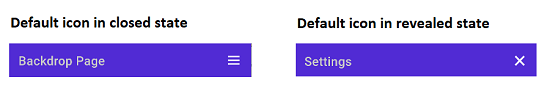
Default icons in NavigationPage
When the backdrop page contained within the NavigationPage, the hamburger icon and close icon (X mark ) will be used by default.
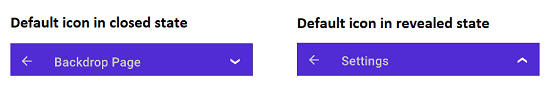
Default icons in FlyoutPage
When the backdrop page is placed in the FlyoutPage, the down arrow icon and up arrow icon will be used by default.
Custom icons
Customize the default icons in the navigation header by setting the OpenIconImageSource and CloseIconImageSource properties in the SfBackdropPage. It accepts following inputs:
- FileImageSource
- UriImageSource
- StreamImageSource
- FromResource
<backdrop:SfBackdropPage xmlns="http://schemas.microsoft.com/dotnet/2021/maui"
                         xmlns:x="http://schemas.microsoft.com/winfx/2009/xaml"
                         x:Class="BackdropGettingStarted.BackdropSamplePage"
                         xmlns:backdrop="clr-namespace:Syncfusion.Maui.Backdrop;assembly=Syncfusion.Maui.Backdrop"
                         OpenIconImageSource="open.png"
                         CloseIconImageSource="close.png">

</backdrop:SfBackdropPage>
using Syncfusion.Maui.Backdrop;
namespace BackdropGettingStarted;
public partial class BackdropSamplePage : SfBackdropPage
{
public BackdropSamplePage()
{
InitializeComponent();
this.OpenIconImageSource = "open.png";
this.CloseIconImageSource = "close.png";
}
}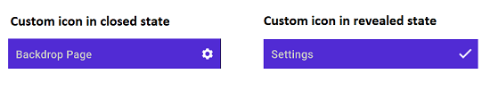
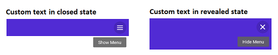
Icon text customization
Customize the icon text in the navigation header by setting the OpenText and CloseText properties in the SfBackdropPage.
<backdrop:SfBackdropPage xmlns="http://schemas.microsoft.com/dotnet/2021/maui"
                         xmlns:x="http://schemas.microsoft.com/winfx/2009/xaml"
                         x:Class="BackdropGettingStarted.BackdropSamplePage"
                         xmlns:backdrop="clr-namespace:Syncfusion.Maui.Backdrop;assembly=Syncfusion.Maui.Backdrop"
                         OpenText="Show Menu"
                         CloseText="Hide Menu">

</backdrop:SfBackdropPage>
using Syncfusion.Maui.Backdrop;
namespace BackdropGettingStarted;
public partial class BackdropSamplePage : SfBackdropPage
{
public BackdropSamplePage()
{
InitializeComponent();
this.OpenText = "Show Menu";
this.CloseText = "Hide Menu";
}
}