How can I help you?
Create Segment Content in .NET MAUI Segmented Control
Depending on the application, different scenarios may require icons, text, or a combination of both for effective communication.
Text
Create segmented control with segments having the given text.
<ContentPage
    xmlns:local="clr-namespace:SegmentSample"
    xmlns:segmentedControl="clr-namespace:Syncfusion.Maui.Toolkit.SegmentedControl;assembly=Syncfusion.Maui.Toolkit">
    <ContentPage.BindingContext>
        <local:ViewModel/>
    </ContentPage.BindingContext>
    <segmentedControl:SfSegmentedControl ItemsSource="{Binding SegmentItems}"/>
</ContentPage>
using Syncfusion.Maui.Toolkit.SegmentedControl;
. . .
public partial class MainPage : ContentPage
{
public MainPage()
{
InitializeComponent();
ViewModel viewModel = new ViewModel();
SfSegmentedControl segmentedControl = new SfSegmentedControl();
segmentedControl.ItemsSource = viewModel.SegmentItems;
this.Content = segmentedControl;
}
}public class ViewModel
{
public List<SfSegmentItem> SegmentItems { get; set; }
public ViewModel()
{
SegmentItems = new List<SfSegmentItem>()
{
new SfSegmentItem() {Text="Day"},
new SfSegmentItem() {Text="Week"},
new SfSegmentItem() {Text="Month"},
new SfSegmentItem() {Text="Year"},
};
}
}
Image
Create a segmented control with segments that contain the provided images by using the SfSegmentItem collection, which is bound to the ItemsSource property.
<ContentPage
    xmlns:local="clr-namespace:SegmentSample"
    xmlns:segmentedControl="clr-namespace:Syncfusion.Maui.Toolkit.SegmentedControl;assembly=Syncfusion.Maui.Toolkit">
    <ContentPage.BindingContext>
        <local:ViewModel/>
    </ContentPage.BindingContext>
    <segmentedControl:SfSegmentedControl ItemsSource="{Binding SegmentItems}"/>
</ContentPage>
using Syncfusion.Maui.Toolkit.SegmentedControl;
. . .
public partial class MainPage : ContentPage
{
public MainPage()
{
InitializeComponent();
ViewModel viewModel = new ViewModel();
SfSegmentedControl segmentedControl = new SfSegmentedControl();
segmentedControl.ItemsSource = viewModel.SegmentItems;
this.Content = segmentedControl;
}
}public class ViewModel
{
public List<SfSegmentItem> SegmentItems { get; set; }
public ViewModel()
{
SegmentItems = new List<SfSegmentItem>()
{
new SfSegmentItem(){Text = "\ue700", TextStyle = new SegmentTextStyle{ FontSize = 20, FontFamily = "Date Picker Icon" } },
new SfSegmentItem(){Text = "\ue701", TextStyle = new SegmentTextStyle{ FontSize = 20, FontFamily = "Date Picker Icon" } },
new SfSegmentItem(){Text = "\ue702", TextStyle = new SegmentTextStyle{ FontSize = 20, FontFamily = "Date Picker Icon" } },
new SfSegmentItem(){Text = "\ue703", TextStyle = new SegmentTextStyle{ FontSize = 20, FontFamily = "Date Picker Icon" } },
};
}
}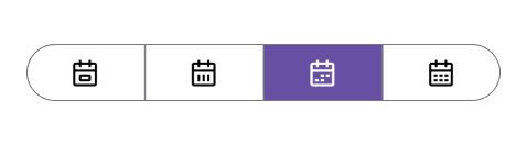
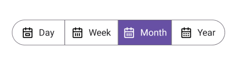
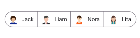
Image with Text
Display images and text in the segmented items of the control.
<ContentPage
    xmlns:local="clr-namespace:SegmentSample"
    xmlns:segmentedControl="clr-namespace:Syncfusion.Maui.Toolkit.SegmentedControl;assembly=Syncfusion.Maui.Toolkit">
    <ContentPage.BindingContext>
        <local:ViewModel/>
    </ContentPage.BindingContext>
    <segmentedControl:SfSegmentedControl ItemsSource="{Binding SegmentItems}"/>
</ContentPage>
using Syncfusion.Maui.Toolkit.SegmentedControl;
. . .
public partial class MainPage : ContentPage
{
public MainPage()
{
InitializeComponent();
ViewModel viewModel = new ViewModel();
SfSegmentedControl segmentedControl = new SfSegmentedControl();
segmentedControl.ItemsSource = viewModel.SegmentItems;
this.Content = segmentedControl;
}
}public class ViewModel
{
public List<SfSegmentItem> SegmentItems { get; set; }
public ViewModel()
{
SegmentItems = new List<SfSegmentItem>()
{
new SfSegmentItem() { ImageSource="jackson.png", Text="Jack" },
new SfSegmentItem() { ImageSource="liam.png", Text="Liam" },
new SfSegmentItem() { ImageSource ="nora.png", Text="Nora" },
new SfSegmentItem() { ImageSource ="lita.png" , Text="Lita" },
};
}
}
Custom Font with Text
Display custom font with text in the segmented items of the control.
<ContentPage
    xmlns:local="clr-namespace:SegmentSample"
    xmlns:segmentedControl="clr-namespace:Syncfusion.Maui.Toolkit.SegmentedControl;assembly=Syncfusion.Maui.Toolkit">
    <ContentPage.BindingContext>
        <local:ViewModel/>
    </ContentPage.BindingContext>
    <segmentedControl:SfSegmentedControl ItemsSource="{Binding SegmentItems}"/>
    </segmentedControl:SfSegmentedControl>
</ContentPage>
using Syncfusion.Maui.Toolkit.SegmentedControl;
. . .
public partial class MainPage : ContentPage
{
public MainPage()
{
InitializeComponent();
ViewModel viewModel = new ViewModel();
SfSegmentedControl segmentedControl = new SfSegmentedControl();
segmentedControl.ItemsSource = viewModel.SegmentItems;
this.Content = segmentedControl;
}
}public class ViewModel
{
public List<SfSegmentItem> SegmentItems { get; set; }
public ViewModel()
{
SegmentItems = new List<SfSegmentItem>()
{
new SfSegmentItem() { ImageSource = new FontImageSource() { Glyph = "\ue700", Size = 20, FontFamily = "Date Picker Icon", Color = Colors.Black}, Text = "Day"},
new SfSegmentItem() { ImageSource = new FontImageSource() { Glyph = "\ue701", Size = 20, FontFamily = "Date Picker Icon", Color = Colors.Black }, Text = "Week"},
new SfSegmentItem() { ImageSource = new FontImageSource() { Glyph = "\ue701", Size = 20, FontFamily = "Date Picker Icon", Color = Colors.Black}, Text = "Month"},
new SfSegmentItem() { ImageSource = new FontImageSource() { Glyph = "\ue703", Size = 20, FontFamily = "Date Picker Icon", Color = Colors.Black}, Text = "Year"},
};
}
}