Cartesian chart types
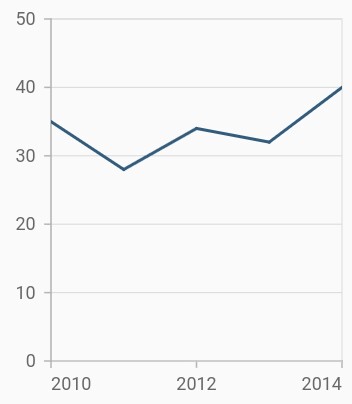
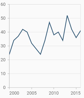
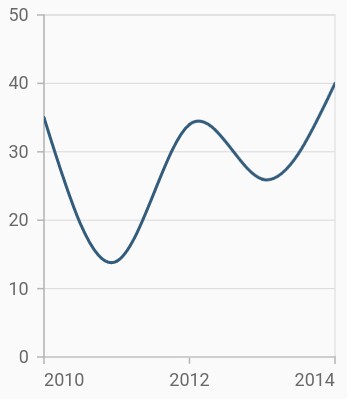
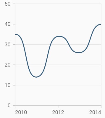
Line chart
To render a line chart, create an instance of LineSeries, and add it to the series collection property of SfCartesianChart. The following properties are used to customize the appearance:
-
color– Changes the color of the line. -
opacity- Controls the transparency of the chart series. -
width– Changes the stroke width of the line.
@override
    Widget build(BuildContext context) {
        final List<SalesData> chartData = [
            SalesData(2010, 35),
            SalesData(2011, 28),
            SalesData(2012, 34),
            SalesData(2013, 32),
            SalesData(2014, 40)
        ];

        return Scaffold(
            body: Center(
                child: Container(
                    child: SfCartesianChart(
                        series: <ChartSeries>[
                            // Renders line chart
                            LineSeries<SalesData, double>(
                                dataSource: chartData,
                                xValueMapper: (SalesData sales, _) => sales.year,
                                yValueMapper: (SalesData sales, _) => sales.sales
                            )
                        ]
                    )
                )
            )
        );
    }

    class SalesData {
        SalesData(this.year, this.sales);
            final double year;
            final double sales;
    }
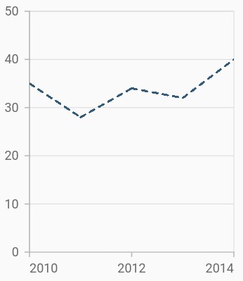
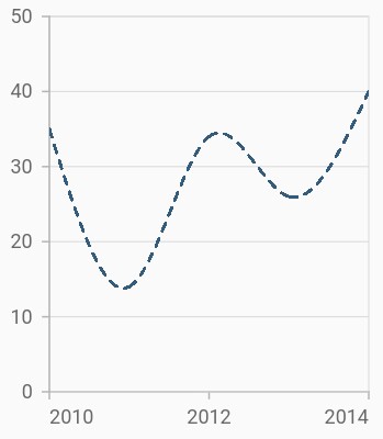
Dashed line
The dashArray property of LineSeries is used to render line series with dashes. Odd value is considered as rendering size and even value is considered as gap.
@override
    Widget build(BuildContext context) {
        return Scaffold(
            body: Center(
                child: Container(
                    child: SfCartesianChart(
                        series: <ChartSeries>[
                            LineSeries<SalesData, String>(
                                dataSource: chartData,
                                // Dash values for line
                                dashArray: <double>[5,5],
                                xValueMapper: (SalesData sales, _) => sales.year,
                                yValueMapper: (SalesData sales, _) => sales.sales
                            )
                        ]
                    )
                )
            )
        );
    }
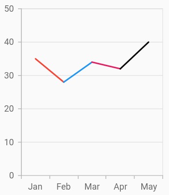
Multi-colored line
To render a multi-colored line series, map the individual colors to the data using the pointColorMapper property.
@override
    Widget build(BuildContext context) {
        return Scaffold(
            body: Center(
                child: Container(
                    child: SfCartesianChart(
                        primaryXAxis: CategoryAxis(),
                        series: <ChartSeries>[
                            LineSeries<SalesData, String>(
                                dataSource: [
                                    SalesData('Jan', 35, Colors.red),
                                    SalesData('Feb', 28, Colors.green),
                                    SalesData('Mar', 34, Colors.blue),
                                    SalesData('Apr', 32, Colors.pink),
                                    SalesData('May', 40, Colors.black)
                                ],
                                // Bind the color for all the data points from the data source
                                pointColorMapper:(SalesData sales, _) => sales.segmentColor,
                                xValueMapper: (SalesData sales, _) => sales.year,
                                yValueMapper: (SalesData sales, _) => sales.sales
                            )
                        ]
                    )
                )
            )
        );
    }

    class SalesData {
        SalesData(this.year, this.sales, this.segmentColor);
        final double year;
        final double sales;
        final Color segmentColor;
    }
Also refer, color palette, color mapping, animation, gradient and empty points for customizing the line series further.
Fast line chart
FastLineSeries is a line chart, but it loads faster than LineSeries. You can use this when there are large number of points to be loaded in a chart. To render a fast line chart, create an instance of FastLineSeries, and add it to the series collection property of SfCartesianChart. The following properties are used to customize the appearance of fast line segment:
-
color– Changes the color of the line. -
opacity- Controls the transparency of the chart series. -
width– Changes the stroke width of the line.
@override
    Widget build(BuildContext context) {
        return Scaffold(
            body: Center(
                child: Container(
                    child: SfCartesianChart(
                        series: <ChartSeries>[
                            // Renders fast line chart
                            FastLineSeries<SalesData, double>(
                                dataSource: chartData,
                                xValueMapper: (SalesData sales, _) => sales.year,
                                yValueMapper: (SalesData sales, _) => sales.sales
                            )
                        ]
                    )
                )
            )
        );
    }
Also refer, color palette, color mapping, animation, gradient and empty points for customizing the fast line series further.
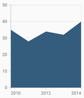
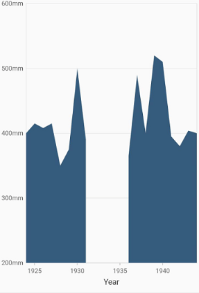
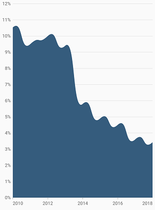
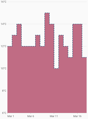
Area chart
To render an area chart, create an instance of AreaSeries, and add it to the series collection property of SfCartesianChart. The area chart shows the filled area to represent the data, but when there are more than a series, this may hide the other series. To get rid of this, increase or decrease the transparency of the series.
The following properties are used to customize the appearance:
-
color– Changes the color of the series. -
opacity- Controls the transparency of the chart series. -
borderWidth– Changes the stroke width of the series. -
borderColor– Changes the stroke color of the series.
@override
    Widget build(BuildContext context) {
        return Scaffold(
            body: Center(
                child: Container(
                    child: SfCartesianChart(
                        series: <ChartSeries>[
                            // Renders area chart
                            AreaSeries<SalesData, double>(
                                dataSource: chartData,
                                xValueMapper: (SalesData sales, _) => sales.year,
                                yValueMapper: (SalesData sales, _) => sales.sales
                            )
                        ]
                    )
                )
            )
        );
    }
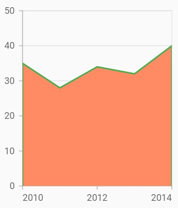
Border customization
The borders of the area chart can be customized using the borderMode property. The default value of the borderMode property is top. The other values are all and excludeBottom.
@override
    Widget build(BuildContext context) {
        return Scaffold(
            body: Center(
                child: Container(
                    child: SfCartesianChart(
                        series: <ChartSeries>[
                            AreaSeries<SalesData, double>(
                                dataSource: chartData,
                                color: Colors.deepOrange[300],
                                borderMode: AreaBorderMode.excludeBottom,
                                borderColor: Colors.green,
                                borderWidth: 2,
                                xValueMapper: (SalesData sales, _) => sales.year,
                                yValueMapper: (SalesData sales, _) => sales.sales
                            )
                        ]
                    )
                )
            )
        );
    }
Also refer, color palette, color mapping, animation, gradient and empty points for customizing the area series further.
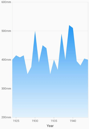
Area with gradients
The gradient property is used to define the gradient colors. The colors from this property is used for series.
@override
    Widget build(BuildContext context) {
         final List<Color> color = <Color>[];
        color.add(Colors.blue[50]);
        color.add(Colors.blue[200]);
        color.add(Colors.blue);

        final List<double> stops = <double>[];
        stops.add(0.0);
        stops.add(0.5);
        stops.add(1.0);

        final LinearGradient gradientColors =
            LinearGradient(colors: color, stops: stops);
        return Scaffold(
            body: Center(
                child: Container(
                    child: SfCartesianChart(
                        series: <ChartSeries>[
                            // Renders area chart
                            AreaSeries<SalesData, double>(
                                dataSource: chartData,
                                xValueMapper: (SalesData sales, _) => sales.year,
                                yValueMapper: (SalesData sales, _) => sales.sales,
                                 gradient: gradientColors
                            )
                        ]
                    )
                )
            )
        );
    }
Area with empty points
Data points with a null value are considered empty points. Empty data points are ignored and are not plotted in the chart. By using emptyPointSettings property in series, you can decide the action taken for empty points. Available modes are gap, zero, drop and average. Default mode of the empty point is gap.
@override
    Widget build(BuildContext context) {
        return Scaffold(
            body: Center(
                child: Container(
                    child: SfCartesianChart(
                        series: <ChartSeries>[
                            AreaSeries<SalesData, double>(
                                dataSource: chartData,
                                color: Colors.deepOrange[300],
                                borderMode: AreaBorderMode.excludeBottom,
                                borderColor: Colors.green,
                                borderWidth: 2,
                                xValueMapper: (SalesData sales, _) => sales.year,
                                yValueMapper: (SalesData sales, _) => sales.sales
                            )
                        ]
                    )
                )
            )
        );
    }
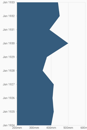
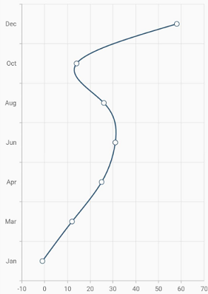
Vertical area chart
The isTransposed property of CartesianSeries is used to transpose the horizontal and vertical axes, to view the data in a different perspective. Using this feature, you can render vertical area chart.
@override
    Widget build(BuildContext context) {
        return Scaffold(
            body: Center(
                child: Container(
                    child: SfCartesianChart(
                        isTransposed: true,
                        series: <ChartSeries>[
                            AreaSeries<SalesData, double>(
                                dataSource: chartData,
                                xValueMapper: (SalesData sales, _) => sales.year,
                                yValueMapper: (SalesData sales, _) => sales.sales
                            )
                        ]
                    )
                )
            )
        );
    }
Spline chart
To render a spline chart, create an instance of SplineSeries, and add it to the series collection property of SfCartesianChart. The following properties are used to customize the appearance of spline segment:
-
color– Changes the color of the series. -
opacity- Controls the transparency of the chart series. -
width– Changes the stroke width of the series.
@override
    Widget build(BuildContext context) {
        return Scaffold(
            body: Center(
                child: Container(
                    child: SfCartesianChart(
                        series: <ChartSeries>[
                            // Renders spline chart
                            SplineSeries<SalesData, double>(
                                dataSource: chartData,
                                xValueMapper: (SalesData sales, _) => sales.year,
                                yValueMapper: (SalesData sales, _) => sales.sales
                            )
                        ]
                    )
                )
            )
        );
    }
Dashed spline
The dashArray property of the SplineSeries is used to render spline series with dashes. Odd value is considered as rendering size and even value is considered as gap.
@override
    Widget build(BuildContext context) {
        return Scaffold(
            body: Center(
                child: Container(
                    child: SfCartesianChart(
                        series: <ChartSeries>[
                            SplineSeries<SalesData, String>(
                                dataSource: chartData,
                                // Dash values for spline
                                dashArray: <double>[5, 5],
                                xValueMapper: (SalesData sales, _) => sales.year,
                                yValueMapper: (SalesData sales, _) => sales.sales
                            )
                        ]
                    )
                )
            )
        );
    }
Spline rendering types
The splineType allows you to change the spline curve in series. The following types are used in SplineSeries:
- natural
- monotonic
- cardinal
- clamped
By default, the value of splineType is natural.
The following code sample demonstrates how to set the splineType value to cardinal. When you set the cardinal type, you can specify the desired line tension of the cardinal spline using the cardinalSplineTension property. The value of this property ranges from 0 to 1.
@override
    Widget build(BuildContext context) {
        return Scaffold(
            body: Center(
                child: Container(
                    child: SfCartesianChart(
                        series: <ChartSeries>[
                            SplineSeries<SalesData, double>(
                                dataSource: chartData,
                                // Type of spline
                                splineType: SplineType.cardinal,
                                cardinalSplineTension: 0.9,
                                xValueMapper: (SalesData sales, _) => sales.year,
                                yValueMapper: (SalesData sales, _) => sales.sales
                            )
                        ]
                    )
                )
            )
        );
    }
Also refer, color palette, color mapping, animation, gradient and empty points for customizing the spline series further.
Vertical spline chart
The isTransposed property of CartesianSeries is used to transpose the horizontal and vertical axes, to view the data in a different perspective. Using this feature, you can render vertical Spline chart.
@override
    Widget build(BuildContext context) {
        return Scaffold(
            body: Center(
                child: Container(
                    child: SfCartesianChart(
                        isTransposed: true,
                        series: <ChartSeries>[
                            SplineSeries<SalesData, double>(
                                dataSource: chartData,
                                xValueMapper: (SalesData sales, _) => sales.year,
                                yValueMapper: (SalesData sales, _) => sales.sales
                            )
                        ]
                    )
                )
            )
        );
    }
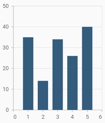
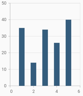
Column chart
To render a column chart, create an instance of ColumnSeries, and add it to the series collection property of SfCartesianChart. The following properties are used to customize the appearance:
-
color– Changes the color of the series. -
opacity- Controls the transparency of the chart series. -
borderWidth– Changes the stroke width of the series. -
borderColor– Changes the stroke color of the series.
@override
    Widget build(BuildContext context) {
        return Scaffold(
            body: Center(
                child: Container(
                    child: SfCartesianChart(
                        series: <ChartSeries>[
                            // Renders column chart
                            ColumnSeries<SalesData, double>(
                                dataSource: chartData,
                                xValueMapper: (SalesData sales, _) => sales.year,
                                yValueMapper: (SalesData sales, _) => sales.sales
                            )
                        ]
                    )
                )
            )
        );
    }
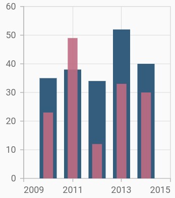
Side-by-side series placement
By default, all the column series that have the same x and y-axes are placed side by side in a chart. If you want to place a series one over the other (overlapped), set the enableSideBySideSeriesPlacement property of SfCartesianChart to false and configure the width property to differentiate the series. The following code snippet and screenshot illustrate the overlapped placement of column series.
@override
    Widget build(BuildContext context) {
        final List<SalesData> chartData = [
            SalesData(2010, 35, 23),
            SalesData(2011, 38, 49),
            SalesData(2012, 34, 12),
            SalesData(2013, 52, 33),
            SalesData(2014, 40, 30)
        ];

        return Scaffold(
            body: Center(
                child: Container(
                    child: SfCartesianChart(
                        // Columns will be rendered back to back
                        enableSideBySideSeriesPlacement: false,
                        series: <ChartSeries>[
                            ColumnSeries<SalesData, double>(
                                dataSource: chartData,
                                xValueMapper: (SalesData sales, _) => sales.year,
                                yValueMapper: (SalesData sales, _) => sales.sales
                            ),
                            ColumnSeries<SalesData, double>(
                                opacity: 0.9,
                                width: 0.4,
                                dataSource: chartData,
                                xValueMapper: (SalesData sales, _) => sales.year,
                                yValueMapper: (SalesData sales, _) => sales.loss
                            )
                        ]
                    )
                )
            )
        );
    }
Column width and spacing
The spacing property is used to change the spacing between two segments. The default value of spacing is 0, and the value ranges from 0 to 1. Here, 1 and 0 correspond to 100% and 0% of the available space, respectively.
The width property is used to change the width of the rectangle. The default value of the width is 0.7, and the value ranges from 0 to 1. Here, 1 and 0 correspond to 100% and 0% of the available width, respectively.
@override
    Widget build(BuildContext context) {
        return Scaffold(
            body: Center(
                child: Container(
                    child: SfCartesianChart(
                        series: <ChartSeries>[
                            ColumnSeries<SalesData, double>(
                                dataSource: chartData,
                                xValueMapper: (SalesData sales, _) => sales.year,
                                yValueMapper: (SalesData sales, _) => sales.sales,
                                width: 0.8, // Width of the columns
                                spacing: 0.2 // Spacing between the columns
                            )
                        ]
                    )
                )
            )
        );
    }
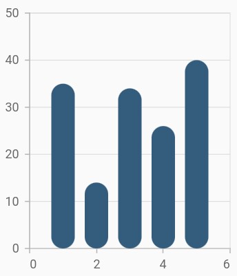
Rounded corners
The borderRadius property is used to add the rounded corners to the rectangle.
@override
    Widget build(BuildContext context) {
        return Scaffold(
            body: Center(
                child: Container(
                    child: SfCartesianChart(
                        series: <ChartSeries>[
                            ColumnSeries<SalesData, double>(
                                dataSource: chartData,
                                xValueMapper: (SalesData sales, _) => sales.year,
                                yValueMapper: (SalesData sales, _) => sales.sales,
                                // Sets the corner radius
                                borderRadius: BorderRadius.all(Radius.circular(15))
                            )
                        ]
                    )
                )
            )
        );
    }
Track customization
Renders column with track. Track is a rectangular bar rendered from the start to the end of the axis. Column series will be rendered above the track. The isTrackVisible property is used to enable the track. The following properties are used to customize the appearance:
-
trackColor– Changes the color of the track. -
trackBorderWidth– Changes the stroke width of the track. -
trackBorderColor– Changes the stroke color of the track. -
trackPadding- Adds padding to the track.
@override
    Widget build(BuildContext context) {
        return Scaffold(
            body: Center(
                child: Container(
                    child: SfCartesianChart(
                        series: <ChartSeries>[
                            ColumnSeries<SalesData, double>(
                                dataSource: chartData,
                                // Renders the track
                                isTrackVisible: true,
                                xValueMapper: (SalesData sales, _) => sales.year,
                                yValueMapper: (SalesData sales, _) => sales.sales
                            )
                        ]
                    )
                )
            )
        );
    }
Also refer, color palette, color mapping, animation, gradient and empty points for customizing the column series further.
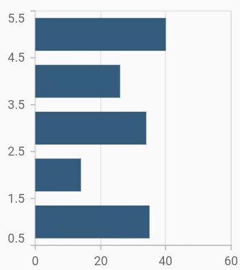
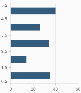
Bar chart
To render a bar chart, create an instance of BarSeries, and add it to the series collection property of SfCartesianChart. The following properties are used to customize the appearance:
-
color– Changes the color of the series. -
opacity- Controls the transparency of the chart series. -
borderWidth– Changes the stroke width of the series. -
borderColor– Changes the stroke color of the series.
@override
    Widget build(BuildContext context) {
        return Scaffold(
            body: Center(
                child: Container(
                    child: SfCartesianChart(
                        series: <ChartSeries>[
                            // Renders bar chart
                            BarSeries<SalesData, double>(
                                dataSource: chartData,
                                xValueMapper: (SalesData sales, _) => sales.year,
                                yValueMapper: (SalesData sales, _) => sales.sales
                            )
                        ]
                    )
                )
            )
        );
    }
Bar width and spacing
The spacing property is used to change the spacing between two segments. The default value of spacing is 0, and the value ranges from 0 to 1. Here, 1 and 0 correspond to 100% and 0% of the available space, respectively.
The width property is used to change the width of the rectangle. The default value of the width is 0.7, and the value ranges from 0 to 1. Here, 1 and 0 correspond to 100% and 0% of the available width, respectively.
@override
    Widget build(BuildContext context) {
        return Scaffold(
            body: Center(
                child: Container(
                    child: SfCartesianChart(
                        series: <ChartSeries>[
                            BarSeries<SalesData, double>(
                                dataSource: chartData,
                                xValueMapper: (SalesData sales, _) => sales.year,
                                yValueMapper: (SalesData sales, _) => sales.sales,
                                width: 0.6, // Width of the bars
                                spacing: 0.3 // Spacing between the bars
                            )
                        ]
                    )
                )
            )
        );
    }
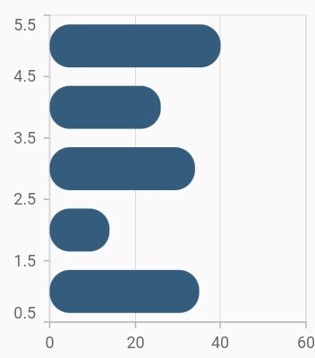
Rounded corners
The borderRadius property is used to add the rounded corners to the rectangle.
@override
    Widget build(BuildContext context) {
        return Scaffold(
            body: Center(
                child: Container(
                    child: SfCartesianChart(
                        series: <ChartSeries>[
                            BarSeries<SalesData, double>(
                                dataSource: chartData,
                                xValueMapper: (SalesData sales, _) => sales.year,
                                yValueMapper: (SalesData sales, _) => sales.sales,
                                borderRadius: BorderRadius.all(Radius.circular(15))
                            )
                        ]
                    )
                )
            )
        );
    }
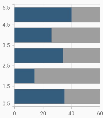
Track customization
You can render the bar chart with track. Track is a rectangular bar rendered from the start to the end of the axis. Bar series will be rendered above the track. The isTrackVisible property is used to enable the track. The following properties are used to customize the appearance:
-
trackColor– Changes the color of the track. -
trackBorderWidth– Changes the stroke width of the track. -
trackBorderColor– Changes the stroke color of the track. -
trackPadding- Adds padding to the track.
@override
    Widget build(BuildContext context) {
        return Scaffold(
            body: Center(
                child: Container(
                    child: SfCartesianChart(
                        series: <ChartSeries>[
                            BarSeries<SalesData, double>(
                                dataSource: chartData,
                                // Renders the track
                                isTrackVisible: true,
                                xValueMapper: (SalesData sales, _) => sales.year,
                                yValueMapper: (SalesData sales, _) => sales.sales
                            )
                        ]
                    )
                )
            )
        );
    }
Also refer, color palette, color mapping, animation, gradient and empty points for customizing the bar series further.
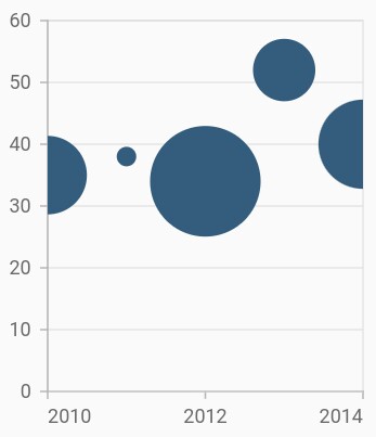
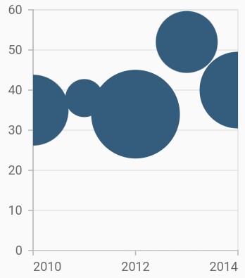
Bubble chart
To render a bubble chart, create an instance of BubbleSeries, and add it to the series collection property of SfCartesianChart.
Bubble chart requires three fields (X, Y, and Size) to plot a point. Here, sizeValueMapper is used to map the size of each bubble segment from data source.
-
color– Changes the color of the series. -
opacity- Controls the transparency of the chart series. -
borderColor– Changes the stroke width of the series. -
borderWidth– Changes the stroke color of the series.
@override
    Widget build(BuildContext context) {
         final List<ChartData> chartData = [
            ChartData(2010, 35, 0.32),
            ChartData(2011, 38, 0.21),
            ChartData(2012, 34, 0.38),
            ChartData(2013, 52, 0.29),
            ChartData(2014, 40, 0.34)
        ];

        return Scaffold(
            body: Center(
                child: Container(
                    child: SfCartesianChart(
                        series: <ChartSeries>[
                            // Renders bubble chart
                            BubbleSeries<ChartData, double>(
                                dataSource: chartData,
                                sizeValueMapper: (ChartData sales, _) => sales.size,
                                xValueMapper: (ChartData sales, _) => sales.x,
                                yValueMapper: (ChartData sales, _) => sales.y
                            )
                        ]
                    )
                )
            )
        );
    }

    class ChartData {
        ChartData(this.x, this.y, this.size);
            final double x;
            final double y;
            final double size;
    }
Change the min and max radius of bubble
The minimumRadius property is used to change the minimum size of the series and the maximumRadius property is used to change the maximum size of the series.
@override
    Widget build(BuildContext context) {
        return Scaffold(
            body: Center(
                child: Container(
                    child: SfCartesianChart(
                        series: <ChartSeries>[
                            BubbleSeries<ChartData, double>(
                                dataSource: chartData,
                                sizeValueMapper: (ChartData sales, _) => sales.size,
                                minimumRadius:9, // Minimum radius of bubble
                                maximumRadius: 15, // Maximum radius of bubble
                                xValueMapper: (ChartData sales, _) => sales.x,
                                yValueMapper: (ChartData sales, _) => sales.y
                            )
                        ]
                    )
                )
            )
        );
    }
Also refer, color palette, color mapping, animation, gradient and empty points for customizing the bubble series further.
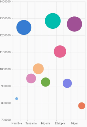
Bubble with various color
Using the pointColorMapper and sizeValueMapper properties in the Cartesian charts, the Bubble series with different colors and sizes can be rendered.
@override
    Widget build(BuildContext context) {
        return Scaffold(
            body: Center(
                child: Container(
                    child: SfCartesianChart(
                        series: <ChartSeries>[
                            BubbleSeries<ChartData, double>(
                                dataSource: chartData,
                                sizeValueMapper: (ChartData sales, _) => sales.size,
                                pointColorMapper:(ChartData sales, _) => sales.pointColor,
                                xValueMapper: (ChartData sales, _) => sales.x,
                                yValueMapper: (ChartData sales, _) => sales.y
                            )
                        ]
                    )
                )
            )
        );
    }
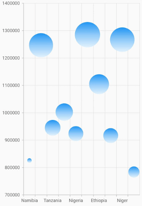
Bubble with gradients
The gradient property is used to define the gradient colors. The colors from this property is used for series.
@override
    Widget build(BuildContext context) {
        final List<Color> color = <Color>[];
        color.add(Colors.blue[50]);
        color.add(Colors.blue[200]);
        color.add(Colors.blue);

        final List<double> stops = <double>[];
        stops.add(0.0);
        stops.add(0.5);
        stops.add(1.0);

        final LinearGradient gradientColors =
            LinearGradient(colors: color, stops: stops);

        return Scaffold(
            body: Center(
                child: Container(
                    child: SfCartesianChart(
                        series: <CartesianSeries>[
                            BubbleSeries<ChartData, double>(
                                dataSource: chartData,
                                xValueMapper: (ChartData sales, _) => sales.x,
                                yValueMapper: (ChartData sales, _) => sales.y,
                                 sizeValueMapper:(ChartData sales, _) => sales.size,
                                // Applies gradient color
                                gradient: gradientColors
                            )
                        ]
                    )
                )
            )
        );
    }
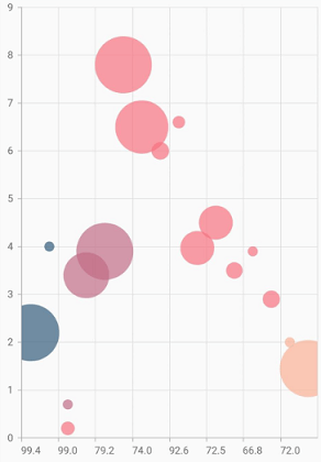
Bubble with multiple series
Using the datasource property in the Map charts, multiple series can be rendered in a bubble chart.
@override
    Widget build(BuildContext context) {
        return Scaffold(
            body: Center(
                child: Container(
                    child: SfCartesianChart(
                        series: <ChartSeries>[
                            BubbleSeries<ChartData, num>(
                                  dataSource: northAmerica,
                                  xValueMapper: (ChartData sales, _) => sales.xValue,
                                  yValueMapper: (ChartData sales, _) => sales.y,
                                  sizeValueMapper: (ChartData sales, _) => sales.size),
                            BubbleSeries<ChartData, num>(
                                  dataSource: europe,
                                  xValueMapper: (ChartData sales, _) => sales.xValue,
                                  yValueMapper: (ChartData sales, _) => sales.y,
                                  sizeValueMapper:(ChartData sales, _) => sales.size),
                            BubbleSeries<ChartData, num>(
                                  dataSource: asia,
                                  xValueMapper: (ChartData sales, _) => sales.xValue,
                                  yValueMapper: (ChartData sales, _) => sales.y,
                                  sizeValueMapper: (ChartData sales, _) => sales.size),
                            BubbleSeries<ChartData, num>(
                                  dataSource: africa,
                                  xValueMapper: (ChartData sales, _) => sales.xValue,
                                  yValueMapper: (ChartData sales, _) => sales.y,
                                  sizeValueMapper: (ChartData sales, _) => sales.size),
                        ]
                    )
                )
            )
        );
    }
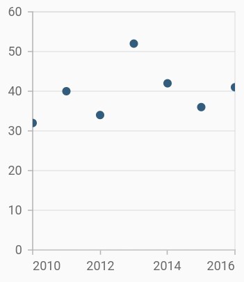
Scatter chart
To render a scatter chart, create an instance of ScatterSeries, and add it to the series collection property of SfCartesianChart. The following properties are used to customize the scatter segment appearance.
-
color– Changes the color of the series. -
opacity- Controls the transparency of the chart series. -
borderWidth– Changes the stroke width of the series. -
borderColor– Changes the stroke color of the series.
@override
    Widget build(BuildContext context) {
         return Scaffold(
            body: Center(
                child: Container(
                    child: SfCartesianChart(
                        series: <ChartSeries>[
                            // Renders scatter chart
                            ScatterSeries<ChartData, double>(
                                dataSource: chartData,
                                xValueMapper: (ChartData sales, _) => sales.x,
                                yValueMapper: (ChartData sales, _) => sales.y
                            )
                        ]
                    )
                )
            )
        );
    }
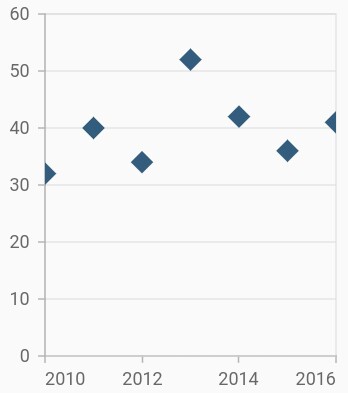
Change shape and size of the scatter
The shape property is used to change the rendering shape of scatter series. The available shapes are circle, rectangle, pentagon, verticalLine, horizontalLine, diamond, triangle, image, and invertedTriangle. If image shape is specified, then you can assign the image using the imageUrl property.
The height and width properties of markerSettings are used to change the height and width of the scatter series, respectively.
@override
    Widget build(BuildContext context) {
         return Scaffold(
            body: Center(
                child: Container(
                    child: SfCartesianChart(
                        series: <ChartSeries>[
                            ScatterSeries<ChartData, double>(
                                dataSource: chartData,
                                xValueMapper: (ChartData sales, _) => sales.x,
                                yValueMapper: (ChartData sales, _) => sales.y,
                                markerSettings: MarkerSettings(
                                    height: 15,
                                    width: 15,
                                    // Scatter will render in diamond shape
                                    shape: DataMarkerType.diamond
                                )
                            )
                        ]
                    )
                )
            )
        );
    }
Also refer, color palette, color mapping, animation, gradient and empty points for customizing the scatter series further.
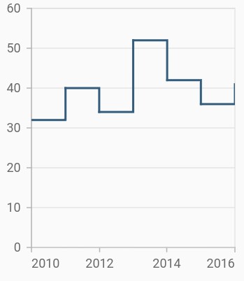
Step line chart
To render a step line chart, create an instance of StepLineSeries, and add it to the series collection property of SfCartesianChart. The following properties are used to customize the appearance of spline segment:
-
color– Changes the color of the line. -
opacity- Controls the transparency of the chart series. -
width– Changes the stroke width of the line.
@override
    Widget build(BuildContext context) {
         return Scaffold(
            body: Center(
                child: Container(
                    child: SfCartesianChart(
                        series: <ChartSeries>[
                            // Renders step line chart
                            StepLineSeries<ChartData, double>(
                                dataSource: chartData,
                                xValueMapper: (ChartData sales, _) => sales.x,
                                yValueMapper: (ChartData sales, _) => sales.y
                            )
                        ]
                    )
                )
            )
        );
    }
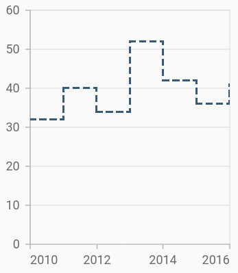
Dashed step line
The dashArray property of the StepLineSeries is used to render step line series with dashes. Odd value is considered as rendering size and even value is considered as gap.
@override
    Widget build(BuildContext context) {
         return Scaffold(
            body: Center(
                child: Container(
                    child: SfCartesianChart(
                        series: <ChartSeries>[
                            StepLineSeries<ChartData, double>(
                                dataSource: chartData,
                                // Dashes for step line
                                dashArray: <double>[5, 5],
                                xValueMapper: (ChartData sales, _) => sales.x,
                                yValueMapper: (ChartData sales, _) => sales.y
                            )
                        ]
                    )
                )
            )
        );
    }
Also refer, color palette, color mapping, animation, gradient and empty points for customizing the step line series further.
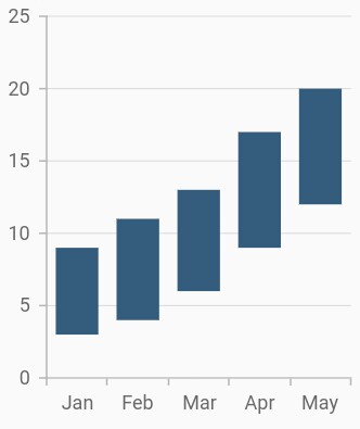
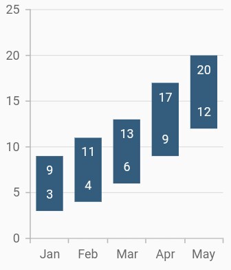
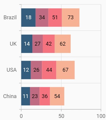
Range column chart
To render a range column chart, create an instance of RangeColumnSeries and add to the series collection property of SfCartesianChart.
Since the RangeColumnSeries requires two Y values for a point, your data should contain high and low values. High and low value specifies the maximum and minimum range of the point.
-
highValueMapper- Field in the data source, which is considered as high value for the data points. -
lowValueMapper- Field in the data source, which is considered as low value for the data points.
@override
    Widget build(BuildContext context) {
         return Scaffold(
            body: Center(
                child: Container(
                    child: SfCartesianChart(
                        primaryXAxis: CategoryAxis(),
                        series: <ChartSeries>[
                            RangeColumnSeries<ChartData, double>(
                                dataSource: <ChartData>[
                                    ChartData('Jan', 3, 9),
                                    ChartData('Feb', 4, 11),
                                    ChartData('Mar', 6, 13),
                                    ChartData('Apr', 9, 17),
                                    ChartData('May', 12, 20),
                                ],
                                xValueMapper: (ChartData sales, _) => sales.x,
                                lowValueMapper: (ChartData sales, _) => sales.low,
                                highValueMapper: (ChartData sales, _) => sales.high,
                            )
                        ]
                    )
                )
            )
        );
    }

    class ChartData {
        ChartData(this.x, this.high, this.low);
            final String x;
            final double high;
            final double low;
    }
Data label
In the range column chart when data label is enabled, by default there will be two values displayed namely, high and low, but in the other types of charts, only y value will be displayed.
@override
    Widget build(BuildContext context) {
         return Scaffold(
            body: Center(
                child: Container(
                    child: SfCartesianChart(
                        primaryXAxis: CategoryAxis(),
                        series: <ChartSeries>[
                            RangeColumnSeries<ChartData, double>(
                                dataSource: chartData,
                                xValueMapper: (ChartData sales, _) => sales.x,
                                lowValueMapper: (ChartData sales, _) => sales.low,
                                highValueMapper: (ChartData sales, _) => sales.high,
                                dataLabelSettings: DataLabelSettings(
                                    isVisible: true,
                                    position: CartesianLabelPosition.top
                                ),
                            )
                        ]
                    )
                )
            )
        );
    }
Transposed range column
The isTransposed property of CartesianSeries is used to transpose the horizontal and vertical axes, to view the data in a different perspective. Using this feature, you can render range column chart.
@override
Widget build(BuildContext context) {
return Scaffold(
body: Center(
child: Container(
child: SfCartesianChart(
isTransposed: true,
primaryXAxis: CategoryAxis(),
series: <ChartSeries>[
RangeColumnSeries<ChartData, double>(
dataSource: <ChartData>[
ChartData('Jan', 3, 9),
ChartData('Feb', 4, 11),
ChartData('Mar', 6, 13),
ChartData('Apr', 9, 17),
ChartData('May', 12, 20),
],
xValueMapper: (ChartData sales, _) => sales.x,
lowValueMapper: (ChartData sales, _) => sales.low,
highValueMapper: (ChartData sales, _) => sales.high,
)
]
)
)
)
);
}
class ChartData {
ChartData(this.x, this.high, this.low);
final String x;
final double high;
final double low;
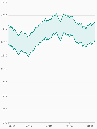
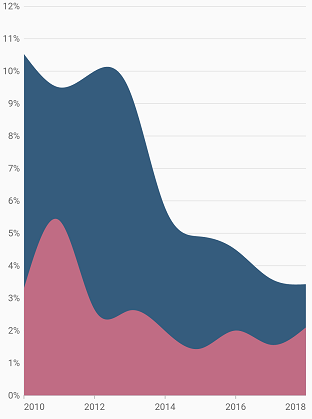
}Range area chart
To render a range area chart, create an instance of RangeAreaSeries and add to the series collection property of SfCartesianChart.
Since the RangeAreaSeries requires two Y values for a point, your data should contain high and low values. High and low value specifies the maximum and minimum range of the point.
-
highValueMapper- Field in the data source, which is considered as high value for the data points. -
lowValueMapper- Field in the data source, which is considered as low value for the data points.
@override
    Widget build(BuildContext context) {
         return Scaffold(
            body: Center(
                child: Container(
                    child: SfCartesianChart(
                        series: <ChartSeries>[
                            RangeAreaSeries<ChartData, double>(
                                dataSource: chartData,
                                xValueMapper: (ChartData sales, _) => sales.x,
                                lowValueMapper: (ChartData sales, _) => sales.low,
                                highValueMapper: (ChartData sales, _) => sales.high,
                            )
                        ]
                    )
                )
            )
        );
    }

    class ChartData {
        ChartData(this.x, this.high, this.low);
            final double x;
            final double high;
            final double low;
    }
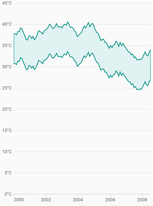
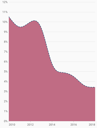
Border customization
The borders of the range area chart can be customized using the borderDrawMode property. The default value of the borderMode property is all and the other value is excludeSides.
@override
    Widget build(BuildContext context) {
        return Scaffold(
            body: Center(
                child: Container(
                    child: SfCartesianChart(
                        series: <ChartSeries>[
                            RangeAreaSeries<SalesData, double>(
                                dataSource: chartData,
                                color: Colors.deepOrange[300],
                                borderDrawMode: RangeAreaBorderMode.excludeSides,
                                borderColor: Colors.green,
                                borderWidth: 2,
                                xValueMapper: (SalesData sales, _) => sales.year,
                                yValueMapper: (SalesData sales, _) => sales.sales
                            )
                        ]
                    )
                )
            )
        );
    }
Spline area chart
To render a spline area chart, create an instance of SplineAreaSeries, and add it to the series collection property of SfCartesianChart. The following properties are used to customize the appearance of spline area chart:
-
color– Changes the color of the series. -
opacity- Controls the transparency of the chart series. -
width– Changes the stroke width of the series.
@override
    Widget build(BuildContext context) {
        return Scaffold(
            body: Center(
                child: Container(
                    child: SfCartesianChart(
                        series: <ChartSeries>[
                            SplineAreaSeries<SalesData, double>(
                                dataSource: chartData,
                                xValueMapper: (SalesData sales, _) => sales.year,
                                yValueMapper: (SalesData sales, _) => sales.sales
                            )
                        ]
                    )
                )
            )
        );
    }
Dashed spline area
The dashArray property of the SplineAreaSeries is used to render spline area series with dashes. Odd value is considered as rendering size and even value is considered as gap.
@override
    Widget build(BuildContext context) {
        return Scaffold(
            body: Center(
                child: Container(
                    child: SfCartesianChart(
                        series: <ChartSeries>[
                            SplineAreaSeries<SalesData, double>(
                                dataSource: chartData,
                                dashArray: <double>[5, 5],
                                xValueMapper: (SalesData sales, _) => sales.year,
                                yValueMapper: (SalesData sales, _) => sales.sales
                            )
                        ]
                    )
                )
            )
        );
    }
Spline area rendering types
The splineType allows you to change the spline area curve in series. The following types are used in SplineAreaSeries:
- natural
- monotonic
- cardinal
- clamped
By default, the value of splineType is natural.
The following code sample demonstrates how to set the splineType value to cardinal. When you set the cardinal type, you can specify the desired line tension of the cardinal spline using the cardinalSplineTension property. The value of this property ranges from 0 to 1.
@override
    Widget build(BuildContext context) {
        return Scaffold(
            body: Center(
                child: Container(
                    child: SfCartesianChart(
                        series: <ChartSeries>[
                            SplineAreaSeries<SalesData, double>(
                                dataSource: chartData,
                                splineType: SplineType.cardinal,
                                cardinalSplineTension: 0.9,
                                xValueMapper: (SalesData sales, _) => sales.year,
                                yValueMapper: (SalesData sales, _) => sales.sales
                            )
                        ]
                    )
                )
            )
        );
    }
Step area chart
To render a spline area chart, create an instance of StepAreaSeries, and add it to the series collection property of SfCartesianChart. The following properties are used to customize the appearance of spline area chart:
-
color– Changes the color of the series. -
opacity- Controls the transparency of the chart series. -
width– Changes the stroke width of the series.
@override
    Widget build(BuildContext context) {
        return Scaffold(
            body: Center(
                child: Container(
                    child: SfCartesianChart(
                        series: <ChartSeries>[
                            StepAreaSeries<SalesData, double>(
                                dataSource: chartData,
                                xValueMapper: (SalesData sales, _) => sales.year,
                                yValueMapper: (SalesData sales, _) => sales.sales
                            )
                        ]
                    )
                )
            )
        );
    }
Dashed step area
The dashArray property of the StepAreaSeries is used to render spline area series with dashes. Odd value is considered as rendering size and even value is considered as gap.
@override
    Widget build(BuildContext context) {
        return Scaffold(
            body: Center(
                child: Container(
                    child: SfCartesianChart(
                        series: <ChartSeries>[
                            StepAreaSeries<SalesData, double>(
                                dataSource: chartData,
                                dashArray: <double>[5, 5],
                                xValueMapper: (SalesData sales, _) => sales.year,
                                yValueMapper: (SalesData sales, _) => sales.sales
                            )
                        ]
                    )
                )
            )
        );
    }
Stacked line chart
To render a stacked line chart, create an instance of StackedLineSeries, and add it to the series collection property of SfCartesianChart. The following properties are used to customize the appearance of stacked line series:
-
color– Changes the color of the line. -
opacity– Controls the transparency of the chart series. -
width– Changes the stroke width of the line.
@override
    Widget build(BuildContext context) {
         return Scaffold(
            body: Center(
                child: Container(
                    child: SfCartesianChart(
                        series: <ChartSeries>[
                            StackedLineSeries<ChartData, double>(
                                dataSource: chartData,
                                xValueMapper: (ChartData sales, _) => sales.x,
                                yValueMapper: (ChartData sales, _) => sales.y1
                            ),
                            StackedLineSeries<ChartData, double>(
                                dataSource: chartData,
                                xValueMapper: (ChartData sales, _) => sales.x,
                                yValueMapper: (ChartData sales, _) => sales.y2
                            ),
                             StackedLineSeries<ChartData, double>(
                                dataSource: chartData,
                                xValueMapper: (ChartData sales, _) => sales.x,
                                yValueMapper: (ChartData sales, _) => sales.y3
                            ),
                            StackedLineSeries<ChartData, double>(
                                dataSource: chartData,
                                xValueMapper: (ChartData sales, _) => sales.x,
                                yValueMapper: (ChartData sales, _) => sales.y4
                            )
                        ]
                    )
                )
            )
        );
    }
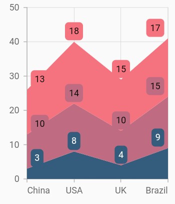
Grouping series
You can group and stack the similar stacked series types using the groupName property of stacked series. The stacked series that contains the same groupName will be stacked in a single group.
@override
    Widget build(BuildContext context) {
         return Scaffold(
            body: Center(
                child: Container(
                    child: SfCartesianChart(
                        series: <ChartSeries>[
                            StackedLineSeries<ChartData, double>(
                                groupName: 'Group A',
                                dataLabelSettings: DataLabelSettings(
                                    isVisible: true,
                                    useSeriesColor: true
                                ),
                                dataSource: chartData,
                                xValueMapper: (ChartData sales, _) => sales.x,
                                yValueMapper: (ChartData sales, _) => sales.y1
                            ),
                            StackedLineSeries<ChartData, double>(
                                groupName: 'Group B',
                                dataLabelSettings: DataLabelSettings(
                                    isVisible: true,
                                    useSeriesColor: true
                                ),
                                dataSource: chartData,
                                xValueMapper: (ChartData sales, _) => sales.x,
                                yValueMapper: (ChartData sales, _) => sales.y2
                            ),
                            StackedLineSeries<ChartData, double>(
                                groupName: 'Group A',
                                dataLabelSettings: DataLabelSettings(
                                    isVisible: true,
                                    useSeriesColor: true
                                ),
                                dataSource: chartData,
                                xValueMapper: (ChartData sales, _) => sales.x,
                                yValueMapper: (ChartData sales, _) => sales.y3
                            ),
                        ]
                    )
                )
            )
        );
    }
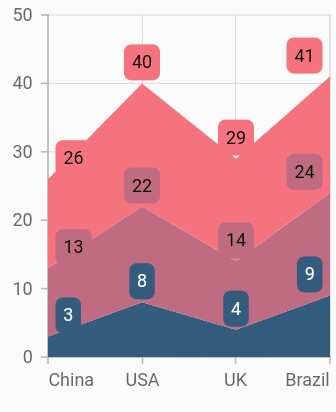
Display cumulative values
You can show the cumulative data label values using the showCumulativeValues property. If the series are grouped using groupName, then cumulative values will be shown based on grouping.
@override
    Widget build(BuildContext context) {
         return Scaffold(
            body: Center(
                child: Container(
                    child: SfCartesianChart(
                        series: <ChartSeries>[
                            StackedLineSeries<ChartData, double>(
                                groupName: 'Group A',
                                dataLabelSettings: DataLabelSettings(
                                    isVisible: true,
                                    showCumulativeValues: true,
                                    useSeriesColor: true
                                ),
                                dataSource: chartData,
                                xValueMapper: (ChartData sales, _) => sales.x,
                                yValueMapper: (ChartData sales, _) => sales.y1
                            ),
                            StackedLineSeries<ChartData, double>(
                                groupName: 'Group B',
                                dataLabelSettings: DataLabelSettings(
                                    isVisible: true,
                                    showCumulativeValues: true,
                                    useSeriesColor: true
                                ),
                                dataSource: chartData,
                                xValueMapper: (ChartData sales, _) => sales.x,
                                yValueMapper: (ChartData sales, _) => sales.y2
                            ),
                            StackedLineSeries<ChartData, double>(
                                groupName: 'Group A',
                                dataLabelSettings: DataLabelSettings(
                                    isVisible: true,
                                    showCumulativeValues: true,
                                    useSeriesColor: true
                                ),
                                dataSource: chartData,
                                xValueMapper: (ChartData sales, _) => sales.x,
                                yValueMapper: (ChartData sales, _) => sales.y3
                            ),
                        ]
                    )
                )
            )
        );
    }
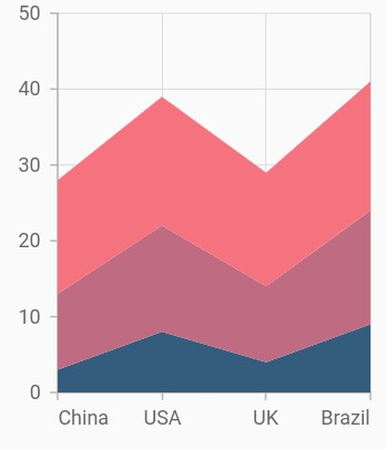
Stacked area chart
To render a stacked area chart, create an instance of StackedAreaSeries, and add it to the series collection property of SfCartesianChart. The following properties are used to customize the appearance of stacked line series:
-
color– Changes the color of the line. -
opacity– Controls the transparency of the chart series. -
borderWidth– Changes the stroke width of the series. -
borderColor– Changes the stroke color of the series.
@override
    Widget build(BuildContext context) {
         return Scaffold(
            body: Center(
                child: Container(
                    child: SfCartesianChart(
                        series: <ChartSeries>[
                            StackedAreaSeries<ChartData, double>(
                                dataSource: chartData,
                                xValueMapper: (ChartData sales, _) => sales.x,
                                yValueMapper: (ChartData sales, _) => sales.y1
                            ),
                            StackedAreaSeries<ChartData, double>(
                                dataSource: chartData,
                                xValueMapper: (ChartData sales, _) => sales.x,
                                yValueMapper: (ChartData sales, _) => sales.y2
                            ),
                            StackedAreaSeries<ChartData, double>(
                                dataSource: chartData,
                                xValueMapper: (ChartData sales, _) => sales.x,
                                yValueMapper: (ChartData sales, _) => sales.y3
                            ),
                        ]
                    )
                )
            )
        );
    }
Grouping series
You can group and stack the similar stacked series types using the groupName property of stacked series. The stacked series that contains the same groupName will be stacked in a single group.
@override
    Widget build(BuildContext context) {
         return Scaffold(
            body: Center(
                child: Container(
                    child: SfCartesianChart(
                        series: <ChartSeries>[
                            StackedAreaSeries<ChartData, double>(
                                groupName: 'Group A',
                                dataLabelSettings: DataLabelSettings(
                                    isVisible: true,
                                    useSeriesColor: true
                                ),
                                dataSource: chartData,
                                xValueMapper: (ChartData sales, _) => sales.x,
                                yValueMapper: (ChartData sales, _) => sales.y1
                            ),
                            StackedAreaSeries<ChartData, double>(
                                groupName: 'Group B',
                                dataLabelSettings: DataLabelSettings(
                                    isVisible: true,
                                    useSeriesColor: true
                                ),
                                dataSource: chartData,
                                xValueMapper: (ChartData sales, _) => sales.x,
                                yValueMapper: (ChartData sales, _) => sales.y2
                            ),
                            StackedAreaSeries<ChartData, double>(
                                groupName: 'Group A',
                                dataLabelSettings: DataLabelSettings(
                                    isVisible: true,
                                    useSeriesColor: true
                                ),
                                dataSource: chartData,
                                xValueMapper: (ChartData sales, _) => sales.x,
                                yValueMapper: (ChartData sales, _) => sales.y3
                            ),
                        ]
                    )
                )
            )
        );
    }
Display cumulative values
You can show the cumulative data label values using the showCumulativeValues property. If the series are grouped using groupName, then cumulative values will be shown based on grouping.
@override
    Widget build(BuildContext context) {
         return Scaffold(
            body: Center(
                child: Container(
                    child: SfCartesianChart(
                        series: <ChartSeries>[
                            StackedAreaSeries<ChartData, double>(
                                groupName: 'Group A',
                                dataLabelSettings: DataLabelSettings(
                                    isVisible: true,
                                    showCumulativeValues: true,
                                    useSeriesColor: true
                                ),
                                dataSource: chartData,
                                xValueMapper: (ChartData sales, _) => sales.x,
                                yValueMapper: (ChartData sales, _) => sales.y1
                            ),
                            StackedAreaSeries<ChartData, double>(
                                groupName: 'Group B',
                                dataLabelSettings: DataLabelSettings(
                                    isVisible: true,
                                    showCumulativeValues: true,
                                    useSeriesColor: true
                                ),
                                dataSource: chartData,
                                xValueMapper: (ChartData sales, _) => sales.x,
                                yValueMapper: (ChartData sales, _) => sales.y2
                            ),
                            StackedAreaSeries<ChartData, double>(
                                groupName: 'Group A',
                                dataLabelSettings: DataLabelSettings(
                                    isVisible: true,
                                    showCumulativeValues: true,
                                    useSeriesColor: true
                                ),
                                dataSource: chartData,
                                xValueMapper: (ChartData sales, _) => sales.x,
                                yValueMapper: (ChartData sales, _) => sales.y3
                            ),
                        ]
                    )
                )
            )
        );
    }
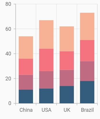
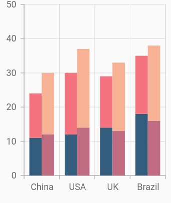
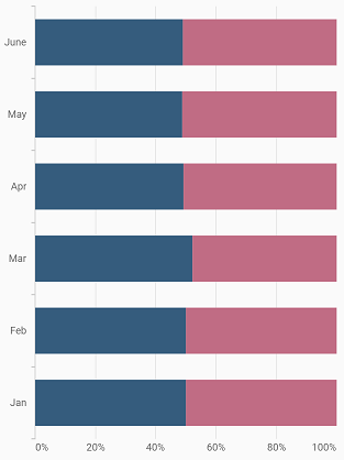
Stacked column chart
To render a stacked column chart, create an instance of StackedColumnSeries, and add it to the series collection property of SfCartesianChart. The following properties are used to customize the appearance of stacked line series:
-
color– Changes the color of the line. -
opacity– Controls the transparency of the chart series. -
borderWidth– Changes the stroke width of the series. -
borderColor– Changes the stroke color of the series.
@override
    Widget build(BuildContext context) {
         return Scaffold(
            body: Center(
                child: Container(
                    child: SfCartesianChart(
                        series: <ChartSeries>[
                            StackedColumnSeries<ChartData, double>(
                                dataSource: chartData,
                                xValueMapper: (ChartData sales, _) => sales.x,
                                yValueMapper: (ChartData sales, _) => sales.y1
                            ),
                            StackedColumnSeries<ChartData, double>(
                                dataSource: chartData,
                                xValueMapper: (ChartData sales, _) => sales.x,
                                yValueMapper: (ChartData sales, _) => sales.y2
                            ),
                             StackedColumnSeries<ChartData, double>(
                                dataSource: chartData,
                                xValueMapper: (ChartData sales, _) => sales.x,
                                yValueMapper: (ChartData sales, _) => sales.y3
                            ),
                            StackedColumnSeries<ChartData, double>(
                                dataSource: chartData,
                                xValueMapper: (ChartData sales, _) => sales.x,
                                yValueMapper: (ChartData sales, _) => sales.y4
                            )
                        ]
                    )
                )
            )
        );
    }
Grouping series
You can group and stack the similar stacked series types using the groupName property of stacked series. The stacked series that contains the same groupName will be stacked in a single group.
@override
    Widget build(BuildContext context) {
         return Scaffold(
            body: Center(
                child: Container(
                    child: SfCartesianChart(
                        series: <ChartSeries>[
                            StackedColumnSeries<ChartData, double>(
                                groupName: 'Group A',
                                dataSource: chartData,
                                xValueMapper: (ChartData sales, _) => sales.x,
                                yValueMapper: (ChartData sales, _) => sales.y1
                            ),
                            StackedColumnSeries<ChartData, double>(
                                groupName: 'Group B',
                                dataSource: chartData,
                                xValueMapper: (ChartData sales, _) => sales.x,
                                yValueMapper: (ChartData sales, _) => sales.y2
                            ),
                            StackedColumnSeries<ChartData, double>(
                                groupName: 'Group A',
                                dataSource: chartData,
                                xValueMapper: (ChartData sales, _) => sales.x,
                                yValueMapper: (ChartData sales, _) => sales.y3
                            ),
                            StackedColumnSeries<ChartData, double>(
                                groupName: 'Group B',
                                dataSource: chartData,
                                xValueMapper: (ChartData sales, _) => sales.x,
                                yValueMapper: (ChartData sales, _) => sales.y4
                            )
                        ]
                    )
                )
            )
        );
    }
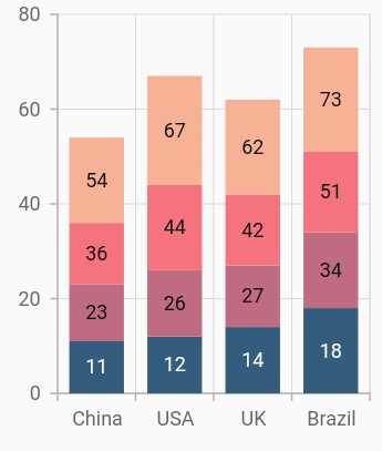
Display cumulative values
You can show the cumulative data label values using the showCumulativeValues property. If the series are grouped using groupName, then cumulative values will be shown based on grouping.
@override
    Widget build(BuildContext context) {
         return Scaffold(
            body: Center(
                child: Container(
                    child: SfCartesianChart(
                        series: <ChartSeries>[
                            StackedColumnSeries<ChartData, double>(
                                groupName: 'Group A',
                                dataLabelSettings: DataLabelSettings(isVisible:true, showCumulativeValues: true),
                                dataSource: chartData,
                                xValueMapper: (ChartData sales, _) => sales.x,
                                yValueMapper: (ChartData sales, _) => sales.y1
                            ),
                            StackedColumnSeries<ChartData, double>(
                                groupName: 'Group B',
                                dataLabelSettings: DataLabelSettings(isVisible:true, showCumulativeValues: true),
                                dataSource: chartData,
                                xValueMapper: (ChartData sales, _) => sales.x,
                                yValueMapper: (ChartData sales, _) => sales.y2
                            ),
                            StackedColumnSeries<ChartData, double>(
                                groupName: 'Group A',
                                dataLabelSettings: DataLabelSettings(isVisible:true, showCumulativeValues: true),
                                dataSource: chartData,
                                xValueMapper: (ChartData sales, _) => sales.x,
                                yValueMapper: (ChartData sales, _) => sales.y3
                            ),
                            StackedColumnSeries<ChartData, double>(
                                groupName: 'Group B',
                                dataLabelSettings: DataLabelSettings(isVisible:true, showCumulativeValues: true),
                                dataSource: chartData,
                                xValueMapper: (ChartData sales, _) => sales.x,
                                yValueMapper: (ChartData sales, _) => sales.y4
                            )
                        ]
                    )
                )
            )
        );
    }
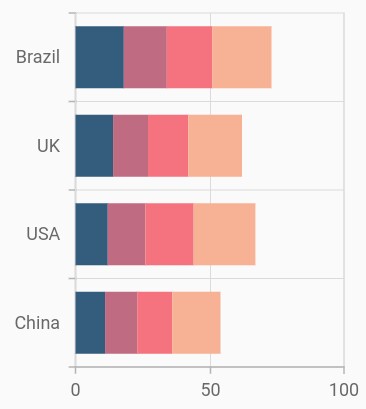
Stacked bar chart
To render a stacked bar chart, create an instance of StackedBarSeries, and add it to the series collection property of SfCartesianChart. The following properties are used to customize the appearance of stacked line series:
-
color– Changes the color of the line. -
opacity– Controls the transparency of the chart series. -
borderWidth– Changes the stroke width of the series. -
borderColor– Changes the stroke color of the series.
@override
    Widget build(BuildContext context) {
         return Scaffold(
            body: Center(
                child: Container(
                    child: SfCartesianChart(
                        series: <ChartSeries>[
                            StackedBarSeries<ChartData, double>(
                                dataSource: chartData,
                                xValueMapper: (ChartData sales, _) => sales.x,
                                yValueMapper: (ChartData sales, _) => sales.y1
                            ),
                            StackedBarSeries<ChartData, double>(
                                dataSource: chartData,
                                xValueMapper: (ChartData sales, _) => sales.x,
                                yValueMapper: (ChartData sales, _) => sales.y2
                            ),
                             StackedBarSeries<ChartData, double>(
                                dataSource: chartData,
                                xValueMapper: (ChartData sales, _) => sales.x,
                                yValueMapper: (ChartData sales, _) => sales.y3
                            ),
                            StackedBarSeries<ChartData, double>(
                                dataSource: chartData,
                                xValueMapper: (ChartData sales, _) => sales.x,
                                yValueMapper: (ChartData sales, _) => sales.y4
                            )
                        ]
                    )
                )
            )
        );
    }
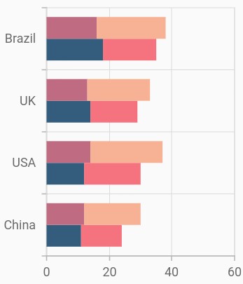
Grouping series
You can group and stack the similar stacked series types using the groupName property of stacked series. The stacked series that contains the same groupName will be stacked in a single group.
@override
    Widget build(BuildContext context) {
         return Scaffold(
            body: Center(
                child: Container(
                    child: SfCartesianChart(
                        series: <ChartSeries>[
                            StackedBarSeries<ChartData, double>(
                                groupName: 'Group A',
                                dataSource: chartData,
                                xValueMapper: (ChartData sales, _) => sales.x,
                                yValueMapper: (ChartData sales, _) => sales.y1
                            ),
                            StackedBarSeries<ChartData, double>(
                                groupName: 'Group B',
                                dataSource: chartData,
                                xValueMapper: (ChartData sales, _) => sales.x,
                                yValueMapper: (ChartData sales, _) => sales.y2
                            ),
                            StackedBarSeries<ChartData, double>(
                                groupName: 'Group A',
                                dataSource: chartData,
                                xValueMapper: (ChartData sales, _) => sales.x,
                                yValueMapper: (ChartData sales, _) => sales.y3
                            ),
                            StackedBarSeries<ChartData, double>(
                                groupName: 'Group B',
                                dataSource: chartData,
                                xValueMapper: (ChartData sales, _) => sales.x,
                                yValueMapper: (ChartData sales, _) => sales.y4
                            )
                        ]
                    )
                )
            )
        );
    }
Display cumulative values
You can show the cumulative data label values using the showCumulativeValues property. If the series are grouped using groupName, then cumulative values will be shown based on grouping.
@override
    Widget build(BuildContext context) {
         return Scaffold(
            body: Center(
                child: Container(
                    child: SfCartesianChart(
                        series: <ChartSeries>[
                            StackedBarSeries<ChartData, double>(
                                groupName: 'Group A',
                                dataLabelSettings: DataLabelSettings(isVisible:true, showCumulativeValues: true),
                                dataSource: chartData,
                                xValueMapper: (ChartData sales, _) => sales.x,
                                yValueMapper: (ChartData sales, _) => sales.y1
                            ),
                            StackedBarSeries<ChartData, double>(
                                groupName: 'Group B',
                                dataLabelSettings: DataLabelSettings(isVisible:true, showCumulativeValues: true),
                                dataSource: chartData,
                                xValueMapper: (ChartData sales, _) => sales.x,
                                yValueMapper: (ChartData sales, _) => sales.y2
                            ),
                            StackedBarSeries<ChartData, double>(
                                groupName: 'Group A',
                                dataLabelSettings: DataLabelSettings(isVisible:true, showCumulativeValues: true),
                                dataSource: chartData,
                                xValueMapper: (ChartData sales, _) => sales.x,
                                yValueMapper: (ChartData sales, _) => sales.y3
                            ),
                            StackedBarSeries<ChartData, double>(
                                groupName: 'Group B',
                                dataLabelSettings: DataLabelSettings(isVisible:true, showCumulativeValues: true),
                                dataSource: chartData,
                                xValueMapper: (ChartData sales, _) => sales.x,
                                yValueMapper: (ChartData sales, _) => sales.y4
                            )
                        ]
                    )
                )
            )
        );
    }
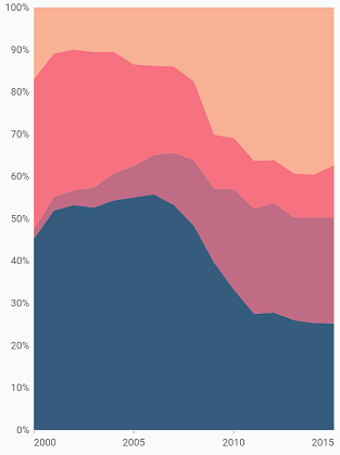
100% Stacked Area Chart
To render a 100% stacked area chart, create an instance of StackingArea100Series and add to the series collection property of SfCartesianChart. You can use the following properties to customize the 100% stacked area appearance.
-
color– Changes the color of the series. -
opacity- Controls the transparency of the chart series. -
borderWidth– Changes the stroke width of the series. -
borderColor– Changes the stroke color of the series. -
borderDrawMode- Specifies the type of the border mode and it defaults to top.
@override
    Widget build(BuildContext context) {
        return Scaffold(
            body: Center(
                child: Container(
                    child: SfCartesianChart(
                        series: <ChartSeries>[
                            StackedArea100Series<ChartData, DateTime>(
                                dataSource: chartData,
                                xValueMapper: (ChartData sales, _) => sales.year,
                                yValueMapper: (ChartData sales, _) => sales.sales1
                            ),
                            StackedArea100Series<ChartData, DateTime>(
                                dataSource: chartData,
                                xValueMapper: (ChartData sales, _) => sales.year,
                                yValueMapper: (ChartData sales, _) => sales.sales2
                            ),
                            StackedArea100Series<ChartData, DateTime>(
                                dataSource: chartData,
                                xValueMapper: (ChartData sales, _) => sales.year,
                                yValueMapper: (ChartData sales, _) => sales.sales3
                            ),
                            StackedArea100Series<ChartData, DateTime>(
                                dataSource: chartData,
                                xValueMapper: (ChartData sales, _) => sales.year,
                                yValueMapper: (ChartData sales, _) => sales.sales4
                            )
                        ]
                    )
                )
            )
        );
    }
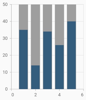
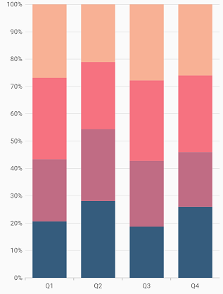
100% Stacked Column Chart
To render a 100% stacked column chart, create an instance of StackedColumn100Series, and add it to the series collection property of SfCartesianChart. The following properties are used to customize the appearance:
-
color– Changes the color of the series. -
opacity- Controls the transparency of the chart series. -
borderWidth– Changes the stroke width of the series. -
borderColor– Changes the stroke color of the series. -
borderRadius- used to add the rounded corners to the rectangle.
@override
    Widget build(BuildContext context) {
        return Scaffold(
            body: Center(
                child: Container(
                    child: SfCartesianChart(
                        series: <ChartSeries>[
                            StackedColumn100Series<SalesData, double>(
                                dataSource: chartData,
                                xValueMapper: (SalesData sales, _) => sales.year,
                                yValueMapper: (SalesData sales, _) => sales.sales
                            ),
                            StackedColumn100Series<SalesData, double>(
                                dataSource: chartData,
                                xValueMapper: (SalesData sales, _) => sales.year,
                                yValueMapper: (SalesData sales, _) => sales.sales2
                            ),
                            StackedColumn100Series<SalesData, double>(
                                dataSource: chartData,
                                xValueMapper: (SalesData sales, _) => sales.year,
                                yValueMapper: (SalesData sales, _) => sales.sales3
                            ),
                            StackedColumn100Series<SalesData, double>(
                                dataSource: chartData,
                                xValueMapper: (SalesData sales, _) => sales.year,
                                yValueMapper: (SalesData sales, _) => sales.sales4
                            )
                        ]
                    )
                )
            )
        );
    }
Column width and spacing
The spacing property is used to change the spacing between two segments. The default value of spacing is 0, and the value ranges from 0 to 1. Here, 1 and 0 correspond to 100% and 0% of the available space, respectively.
The width property is used to change the width of the rectangle. The default value of the width is 0.7, and the value ranges from 0 to 1. Here, 1 and 0 correspond to 100% and 0% of the available width, respectively.
@override
    Widget build(BuildContext context) {
        return Scaffold(
            body: Center(
                child: Container(
                    child: SfCartesianChart(
                        series: <ChartSeries>[
                            StackedColumn100Series<SalesData, double>(
                                dataSource: chartData,
                                xValueMapper: (SalesData sales, _) => sales.year,
                                yValueMapper: (SalesData sales, _) => sales.sales,
                                width: 0.8, // Width of the columns
                                spacing: 0.2 // Spacing between the columns
                            ),
                            StackedColumn100Series<SalesData, double>(
                                dataSource: chartData,
                                xValueMapper: (SalesData sales, _) => sales.year,
                                yValueMapper: (SalesData sales, _) => sales.sales2,
                                width: 0.8, // Width of the columns
                                spacing: 0.2 // Spacing between the columns
                            )
                        ]
                    )
                )
            )
        );
    }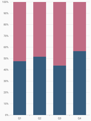
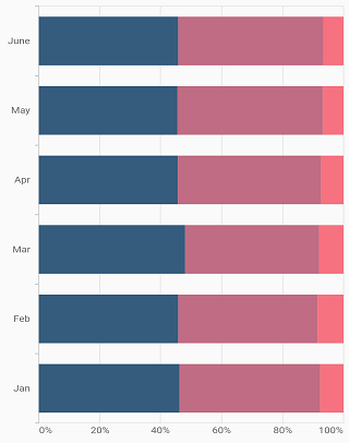
100% Stacked Bar Chart
To render a 100% stacked bar chart, create an instance of StackedBar100Series, and add it to the series collection property of SfCartesianChart. The following properties are used to customize the appearance:
-
color– Changes the color of the series. -
opacity- Controls the transparency of the chart series. -
borderWidth– Changes the stroke width of the series. -
borderColor– Changes the stroke color of the series. -
borderRadius- used to add the rounded corners to the rectangle.
@override
    Widget build(BuildContext context) {
        return Scaffold(
            body: Center(
                child: Container(
                    child: SfCartesianChart(
                        series: <ChartSeries>[
                            StackedBar100Series<SalesData, double>(
                                dataSource: chartData,
                                xValueMapper: (SalesData sales, _) => sales.year,
                                yValueMapper: (SalesData sales, _) => sales.sales
                            ),
                            StackedBar100Series<SalesData, double>(
                                dataSource: chartData,
                                xValueMapper: (SalesData sales, _) => sales.year,
                                yValueMapper: (SalesData sales, _) => sales.sales2
                            ),
                            StackedBar100Series<SalesData, double>(
                                dataSource: chartData,
                                xValueMapper: (SalesData sales, _) => sales.year,
                                yValueMapper: (SalesData sales, _) => sales.sales3
                            ),
                            StackedBar100Series<SalesData, double>(
                                dataSource: chartData,
                                xValueMapper: (SalesData sales, _) => sales.year,
                                yValueMapper: (SalesData sales, _) => sales.sales4
                            )
                        ]
                    )
                )
            )
        );
    }
Bar width and spacing
The spacing property is used to change the spacing between two segments. The default value of spacing is 0, and the value ranges from 0 to 1. Here, 1 and 0 correspond to 100% and 0% of the available space, respectively.
The width property is used to change the width of the rectangle. The default value of the width is 0.7, and the value ranges from 0 to 1. Here, 1 and 0 correspond to 100% and 0% of the available width, respectively.
@override
    Widget build(BuildContext context) {
        return Scaffold(
            body: Center(
                child: Container(
                    child: SfCartesianChart(
                        series: <ChartSeries>[
                            StackedBar100Series<SalesData, double>(
                                dataSource: chartData,
                                xValueMapper: (SalesData sales, _) => sales.year,
                                yValueMapper: (SalesData sales, _) => sales.sales,
                                width: 0.8,
                                spacing: 0.2
                            ),
                            StackedBar100Series<SalesData, double>(
                                dataSource: chartData,
                                xValueMapper: (SalesData sales, _) => sales.year,
                                yValueMapper: (SalesData sales, _) => sales.sales2,
                                width: 0.8,
                                spacing: 0.2
                            )
                        ]
                    )
                )
            )
        );
    }
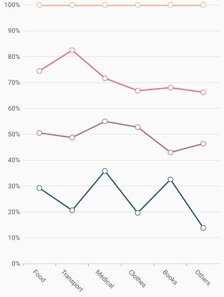
100% Stacked Line Chart
To render a 100% stacked line chart, create an instance of StackedLine100Series, and add it to the series collection property of SfCartesianChart. The following properties are used to customize the appearance:
-
color– Changes the color of the line. -
opacity- Controls the transparency of the chart series. -
width– Changes the stroke width of the line.
@override
    Widget build(BuildContext context) {
        return Scaffold(
            body: Center(
                child: Container(
                    child: SfCartesianChart(
                        series: <ChartSeries>[
                            StackedLine100Series<SalesData, double>(
                                dataSource: chartData,
                                xValueMapper: (SalesData sales, _) => sales.year,
                                yValueMapper: (SalesData sales, _) => sales.sales
                            ),
                            StackedLine100Series<SalesData, double>(
                                dataSource: chartData,
                                xValueMapper: (SalesData sales, _) => sales.year,
                                yValueMapper: (SalesData sales, _) => sales.sales2
                            ),
                            StackedLine100Series<SalesData, double>(
                                dataSource: chartData,
                                xValueMapper: (SalesData sales, _) => sales.year,
                                yValueMapper: (SalesData sales, _) => sales.sales3
                            ),
                            StackedLine100Series<SalesData, double>(
                                dataSource: chartData,
                                xValueMapper: (SalesData sales, _) => sales.year,
                                yValueMapper: (SalesData sales, _) => sales.sales4
                            )
                        ]
                    )
                )
            )
        );
    }
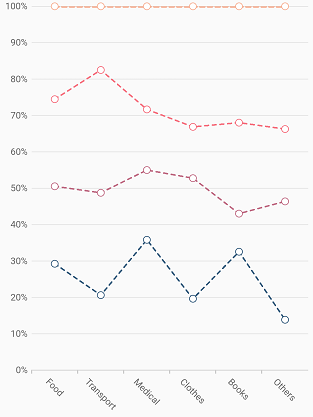
Dashed line
The dashArray property of StackedLine100Series is used to render line series with dashes. Odd value is considered as rendering size and even value is considered as gap.
@override
    Widget build(BuildContext context) {
        return Scaffold(
            body: Center(
                child: Container(
                    child: SfCartesianChart(
                        series: <ChartSeries>[
                            StackedLine100Series<SalesData, String>(
                                dataSource: chartData,
                                dashArray: <double>[5,5],
                                xValueMapper: (SalesData sales, _) => sales.year,
                                yValueMapper: (SalesData sales, _) => sales.sales
                            ),
                            StackedLine100Series<SalesData, String>(
                                dataSource: chartData,
                                dashArray: <double>[5,5],
                                xValueMapper: (SalesData sales, _) => sales.year,
                                yValueMapper: (SalesData sales, _) => sales.sales2
                            ),
                            StackedLine100Series<SalesData, String>(
                                dataSource: chartData,
                                dashArray: <double>[5,5],
                                xValueMapper: (SalesData sales, _) => sales.year,
                                yValueMapper: (SalesData sales, _) => sales.sales3
                            ),
                            StackedLine100Series<SalesData, String>(
                                dataSource: chartData,
                                dashArray: <double>[5,5],
                                xValueMapper: (SalesData sales, _) => sales.year,
                                yValueMapper: (SalesData sales, _) => sales.sales4
                            )
                        ]
                    )
                )
            )
        );
    }
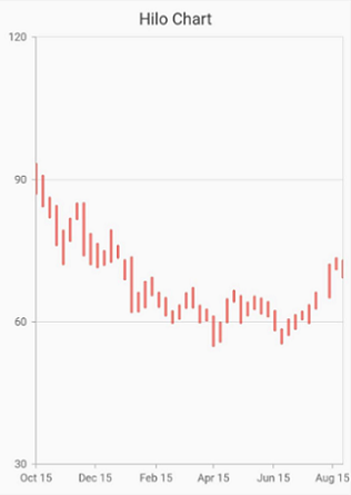
HiLo chart
HiLo Series illustrates the price movements in stock using the high and low values.
To render a HiLo chart, create an instance of HiloSeries, and add it to the series collection property of SfCartesianChart. The following properties are used to customize the appearance:
-
color– Changes the color of the series. -
opacity- Controls the transparency of the chart series. -
borderWidth– Changes the stroke width of the series. -
borderColor– Changes the stroke color of the series. -
lowValueMapper- used to get the low values from the series. -
highValueMapper- used to get the high values from the series.
@override
    Widget build(BuildContext context) {
        return Scaffold(
            body: Center(
                child: Container(
                    child: SfCartesianChart(
                        series: <ChartSeries>[
                            // Renders bar chart
                            HiloSeries<SalesData, double>(
                                dataSource: chartData,
                                xValueMapper: (SalesData sales, _) => sales.year,
                                yValueMapper: (SalesData sales, _) => sales.sales,
                                  lowValueMapper: (Sample sales, _) => sales.low,
              highValueMapper: (Sample sales, _) => sales.high
                            )
                        ]
                    )
                )
            )
        );
    }
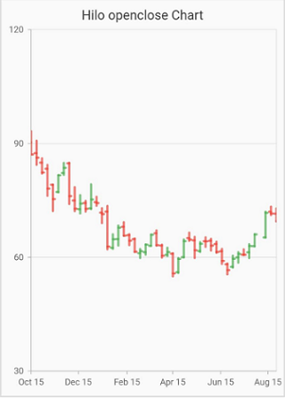
Open High Low Close (OHLC)
OpenHighLowClose series is used to represent the low, high, open and closing values over time.
To render a OpenHighLowClose chart, create an instance of hiloOpenCloseSeries, and add it to the series collection property of SfCartesianChart. The following properties are used to customize the appearance:
-
color– Changes the color of the series. -
opacity- Controls the transparency of the chart series. -
borderWidth– Changes the stroke width of the series. -
borderColor– Changes the stroke color of the series. -
lowValueMapper- used to get the low values from the series. -
highValueMapper- used to get the high values from the series. -
openValueMapper- used to get the open values from the series. -
closeValueMapper- used to get the close values from the series. -
bearFillColor- bearFillColor will be applied when the opening value is less than the closing value. -
bullFillColor- bullFillColor will be applied when the opening value is greater than closing value.
@override
    Widget build(BuildContext context) {
        return Scaffold(
            body: Center(
                child: Container(
                    child: SfCartesianChart(
                        series: <ChartSeries>[
                            // Renders hiloOpenCloseSeries
                            hiloOpenCloseSeries<SalesData, double>(
                                dataSource: chartData,
                                xValueMapper: (SalesData sales, _) => sales.year,
                                yValueMapper: (SalesData sales, _) => sales.sales,
                                lowValueMapper: (Sample sales, _) => sales.low,
                                highValueMapper: (Sample sales, _) => sales.high,
                                openValueMapper: (Sample sales, _) => sales.open,
                          closeValueMapper: (Sample sales, _) => sales.close,

                            )
                        ]
                    )
                )
            )
        );
    }
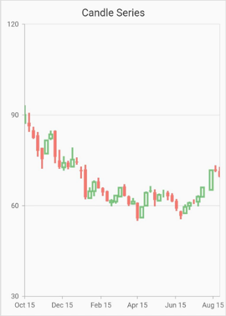
Candle
Candle series is similar to HiLo Open Close series, used to represent the low, high, open and closing price over time.
To render a Candle chart, create an instance of CandleSeries, and add it to the series collection property of SfCartesianChart. The following properties are used to customize the appearance:
-
color– Changes the color of the series. -
opacity- Controls the transparency of the chart series. -
borderWidth– Changes the stroke width of the series. -
borderColor– Changes the stroke color of the series. -
enableSolidCandles- Used to enable/disable the solid candles. By default is set to be false. The fill color of the candle will be defined by its opening and closing values. -
lowValueMapper- used to get the low values from the series. -
highValueMapper- used to get the high values from the series. -
openValueMapper- used to get the open values from the series. -
closeValueMapper- used to get the close values from the series. -
bearFillColor- bearFillColor will be applied when the opening value is less than the closing value. -
bullFillColor- bullFillColor will be applied when the opening value is greater than closing value.
@override
    Widget build(BuildContext context) {
        return Scaffold(
            body: Center(
                child: Container(
                    child: SfCartesianChart(
                        series: <ChartSeries>[
                            // Renders CandleSeries
                            CandleSeries<SalesData, double>(
                                dataSource: chartData,
                                xValueMapper: (SalesData sales, _) => sales.year,
                                yValueMapper: (SalesData sales, _) => sales.sales,
                                lowValueMapper: (Sample sales, _) => sales.low,
                                highValueMapper: (Sample sales, _) => sales.high,
                                openValueMapper: (Sample sales, _) => sales.open,
                          closeValueMapper: (Sample sales, _) => sales.close,

                            )
                        ]
                    )
                )
            )
        );
    }