How can I help you?
Getting Started
- The ASP.NET Circular Gauge provides support to display the CircularGauge within your web page and allows you to customize it. This section encompasses the details on how to configure Circular Gauge.
- You will learn how to provide data for a Circular Gauge and to display that data in the required way. In addition, you will learn how to customize the default Circular Gauge appearance to your requirements.
- As a result, you will get a Circular Gauge that shows how the Automobile speedometer works with rpm (Rotation per Minute), kph (Kilometer per hour) and denotes the speed level indication (Safe, Caution and Danger).
Speedometer Gauge
Create a Circular Gauge
ASP.NET Circular Gauge widget basically renders with animation and flexible API’s. You can easily create the Circular Gauge widget by using simple code example as follows.
- First create an ASP Project and adding necessary Dll’s and Scripts with the help of the given ASP-Getting Started Documentation.
-
Configure web.config files for assemblies
- The following assemblies references are added properly in web.config file.
<compilation debug="true" targetFramework="4.5"> <assemblies> <add assembly="Syncfusion.EJ.Web, Version=12.2450.0.36, Culture=neutral, PublicKeyToken=3d67ed1f87d44c89"/> <add assembly="Syncfusion.EJ, Version=12.2450.0.36, Culture=neutral, PublicKeyToken=3d67ed1f87d44c89"/> </assemblies> </compilation> <httpRuntime targetFramework="4.5" /> <pages> <controls> <add namespace="Syncfusion.JavaScript.Web" assembly="Syncfusion.EJ.Web, Version=12.2450.0.36, Culture=neutral, PublicKeyToken=3d67ed1f87d44c89" tagPrefix="ej"/> <add namespace="Syncfusion.JavaScript.Web" assembly="Syncfusion.EJ, Version=12.2450.0.36, Culture=neutral, PublicKeyToken=3d67ed1f87d44c89" tagPrefix="ej"/> <add namespace="Syncfusion.JavaScript.DataVisualization.Models" assembly="Syncfusion.EJ" tagPrefix="ej"/> </controls> </pages> - Adding Script Reference,
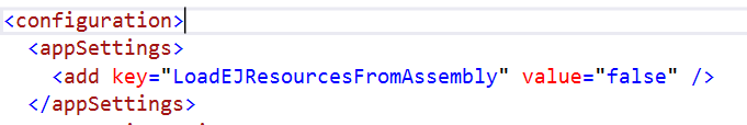
By default, Syncfusion JavaScript source files has been included into the EJ.Web assembly as an embedded source. So we no need to refer jQuery and Syncfusion scripts externally. For debugging purpose want to refer script files externally, set false to LoadEJResourcesFromAssembly in Web.config file as shows in the below image and refer jQuery and Syncfusion script files.
<!--  jquery script  -->
    <script src="http://cdn.syncfusion.com/js/assets/external/jquery-1.10.2.min.js"></script>

    <!-- Essential JS UI widget -->
    <script src="http://cdn.syncfusion.com/33.1.44/js/web/ej.web.all.min.js"></script>
NOTE
If you are using the Essential Studio below 13.4.0.53 version, then you need to refer jQuery.globalize.js script file along with the above references to render the circular gauge control.
-
Add the mentioned code to the corresponding designer page for Circular Gauge rendering.
     <ej:CircularGauge runat="server" ID="CircularGauge1">

     </ej:CircularGauge>
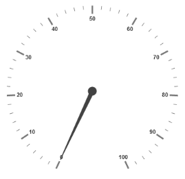
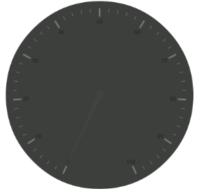
Run the above code to get a default CircularGauge with default values as follows.

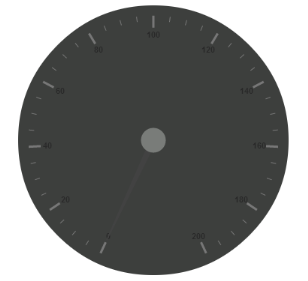
Set Height and Width values
Pointers have different height and width range so you can set the Height and Width of the gauge according to your requirements.Set the basic values of the gauge such as height and width of the canvas element.
Code:
<ej:CircularGauge runat="server" ID="CircularGauge1" Height="500" Width="500">

</ej:CircularGauge>
Run the above code to get the following output.
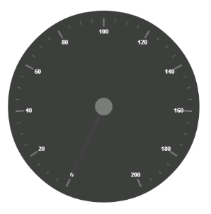
Set Background Color
You can draw the speedometer with dark BackgroundColor and to vary the speed of the pointer you can set ReadOnly to ‘false’ for user Interaction.
Code:
<ej:CircularGauge runat="server" ID="CircularGauge1" Height="500" Width="500" BackgroundColor="#3D3F3D" ReadOnly="false">

</ej:CircularGauge>
Run the above code to get the following output.
Provide scale values
- The
Scalesvalues specifies the pointers, ticks, labels, indicators and ranges of Circular Gauge. - The
PointerCapcan be customized with the following options. CapRadius, capBorderColor, capBackgroundColor, pointer capBorderWidthare some of the properties that are customizable. - The speed limit in the gauge has maximum value of 200 kph. So you can set
Maximumvalue for the gauge as 200. - Major Ticks have the
MajorIntervalValueof 20 and minor ticks have theMinorIntervalValueof 5.ShowRangesandShowIndicatorsare used to display the ranges and indicators in their respective positions.
Code:
<ej:CircularGauge runat="server" ID="CircularGauge1" Height="500" Width="500" BackgroundColor="#3D3F3D" ReadOnly="false">

<Scales>

<ej:CircularScales ShowRanges="true" ShowIndicators="true"

Maximum="200" MajorIntervalValue="20" MinorIntervalValue="5">

<PointerCap Radius="15" BackgroundColor="#797C79"

BorderColor="#797C79" BorderWidth="0">

</PointerCap>

</ej:CircularScales>

</Scales>

</ej:CircularGauge>
Run the above code to get the following output.
Add Label Customization
To display the value around the scales, Labels are used. By customizing the label Color it displays as specified.
Code:
<ej:CircularGauge runat="server" ID="CircularGauge1" Height="500" Width="500" BackgroundColor="#3D3F3D" ReadOnly="false">

<Scales>

<ej:CircularScales ShowRanges="true" ShowIndicators="true"

Maximum="200" MajorIntervalValue="20" MinorIntervalValue="5">

<PointerCap Radius="15" BackgroundColor="#797C79"

BorderColor="#797C79" BorderWidth="0">

</PointerCap>

<%--Add the labels customization code here-- %>

<LabelCollection>

<ej:CircularLabels Color="#FFFFFF"></ej:CircularLabels>

</LabelCollection>

<%--Add the pointers customization code here-- %>

<%--Add the ticks customization code here-- %>

<%--Add the ranges customization code here-- %>

<%--Add the indicators customization code here-- %>

<%--Add the Custom labels customization code here-- %>

</ej:CircularScales>

</Scales>

</ej:CircularGauge>
Run the above code to get the following output.
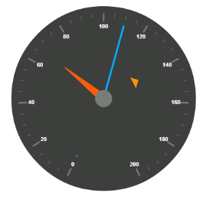
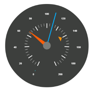
Add pointers data
Here, you have three Pointers that denote the kilometer value, rotation per minute value and torque value.The torque value pointer needs not be similar to the other two pointers. You can set torque pointer as marker pointer. And you can set other attributes for pointer such as Value, ShowBackNeedle, Type, MarkerType, NeedleType, BackgroundColor, Border Color, Length, Width, Radius and DistanceFromScale.
Code:
<ej:CircularGauge runat="server" ID="CircularGauge1" Height="500" Width="500" BackgroundColor="#3D3F3D" ReadOnly="false">

<Scales>

<ej:CircularScales ShowRanges="true" ShowIndicators="true"

Maximum="200" MajorIntervalValue="20" MinorIntervalValue="5">

<PointerCap Radius="15" BackgroundColor="#797C79"

BorderColor="#797C79" BorderWidth="0">

</PointerCap>

<%--Add the labels customization code here-- %>

<%--Add the pointers customization code here-- %>

<PointerCollection>

<ej:Pointers Value="140" DistanceFromScale="60"

ShowBackNeedle="false" Length="20" Type="Marker"

MarkerType="Triangle" Width="10" BackgroundColor="#FF940A">

<Border Color="#FF940A"/>

</ej:Pointers>

<ej:Pointers Value="110" ShowBackNeedle="false" Length="150"

NeedleType="Rectangle" Width="2" BackgroundColor="#05AFFF">

<Border Color="#05AFFF"/>

</ej:Pointers>

<ej:Pointers Value="67" ShowBackNeedle="false" Length="100"

Width="15" BackgroundColor="#FC5D07">

<Border Color="#FC5D07"/>

</ej:Pointers>

</PointerCollection>

<%--Add the ticks customization code here-- %>

<%--Add the ranges customization code here-- %>

<%--Add the indicators customization code here-- %>

<%--Add the Custom labels customization code here-- %>

</ej:CircularScales>

</Scales>

</ej:CircularGauge>
Run the above code to get the following output.
Add Ticks Details
- You can set Major
Tickswith theirWidthandHeightequal to MinorTicks. - You can set
Coloraccording to your preference for better visibility in dark backgrounds. - You can specify the tick Type either major or minor type tick and
DistanceFromScalevalues. - To display and customize the tick value add the following code example.
Code:
<ej:CircularGauge runat="server" ID="CircularGauge1" Height="500" Width="500" BackgroundColor="#3D3F3D" ReadOnly="false">

<Scales>

<ej:CircularScales ShowRanges="true" ShowIndicators="true"

Maximum="200" MajorIntervalValue="20" MinorIntervalValue="5">

<PointerCap Radius="15" BackgroundColor="#797C79"

BorderColor="#797C79" BorderWidth="0">

</PointerCap>

<%--Add the labels customization code here-- %>

<%--Add the pointers customization code here-- %>

<%--Add the ticks customization code here-- %>

<TickCollection>

<ej:CircularTicks Type="Major" DistanceFromScale="70"

Height="20" Width="3" Color="#FFFFFF"/>

<ej:CircularTicks Type="Minor" DistanceFromScale="70"

Height="12" Width="1" Color="#FFFFFF" />

</TickCollection>

<%--Add the ranges customization code here-- %>

<%--Add the indicators customization code here-- %>

<%--Add the Custom labels customization code here-- %>

</ej:CircularScales>

</Scales>

</ej:CircularGauge>
Run the above code to get the following output.
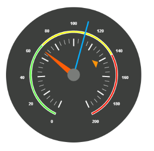
Add Range Values
- Ranges denote the property of the scale value in the speedometer. The color values of the
Rangesdenote speed variation. SetShowRangesas true for showing the ranges in the Circular Gauge. - For Low speed, you can mention it as safe zone; for moderate speed, you can call it as caution zone and for high speed, you can mark it as high speed.
- You can customize the range with properties such as
StartValue,EndValue,StartWidth,EndWidth,BackgroundColor,BorderColor,DistanceFromScale,etc.,
Code:
<ej:CircularGauge runat="server" ID="CircularGauge1" Height="500" Width="500" BackgroundColor="#3D3F3D" ReadOnly="false">

<Scales>

<ej:CircularScales ShowRanges="true" ShowIndicators="true"

Maximum="200" MajorIntervalValue="20" MinorIntervalValue="5">

<PointerCap Radius="15" BackgroundColor="#797C79"

BorderColor="#797C79" BorderWidth="0">

</PointerCap>

<%--Add the labels customization code here-- %>

<%--Add the pointers customization code here-- %>

<%--Add the ticks customization code here-- %>

<%--Add the ranges customization code here-- %>

<RangeCollection>

<ej:CircularRanges DistanceFromScale="30" StartValue="0"

EndValue="70"

BackgroundColor="#5DF243">

<Border Color="#FFFFFF"/>

</ej:CircularRanges>

<ej:CircularRanges DistanceFromScale="30" StartValue="70"

EndValue="140"

BackgroundColor="#F6FF0A">

<Border Color="#FFFFFF"/>

</ej:CircularRanges>

<ej:CircularRanges DistanceFromScale="30" StartValue="140"

EndValue="200"

BackgroundColor="#FF1807">

<Border Color="#FFFFFF"/>

</ej:CircularRanges>

</RangeCollection>

<%--Add the indicators customization code here-- %>

<%--Add the Custom labels customization code here-- %>

</ej:CircularScales>

</Scales>

</ej:CircularGauge>
Run the above code to get the following output.
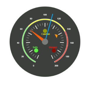
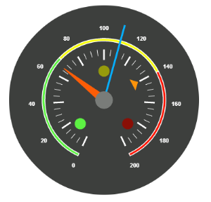
Add Indicator Details
- Indicators denote whether the pointers values are in their respective zones or not. Positioning the
Indicatorson the respective range value gives you the required changes. - By using
Positionproperty, you can set the location of the indicator. You can also specifyHeight,WidthandTypefor indicators.StateRangesdefines how the indicator should behave when the pointer is in certain values. - You can customize state ranges with properties like
EndValue,StartValue,BackgroundColor,BorderColor,Text,TextColor, etc.
Code:
<ej:CircularGauge runat="server" ID="CircularGauge1" Height="500" Width="500" BackgroundColor="#3D3F3D" ReadOnly="false">

<Scales>

<ej:CircularScales ShowRanges="true" ShowIndicators="true"

Maximum="200" MajorIntervalValue="20" MinorIntervalValue="5">

<PointerCap Radius="15" BackgroundColor="#797C79"

BorderColor="#797C79" BorderWidth="0">

</PointerCap>

<%--Add the labels customization code here-- %>

<%--Add the pointers customization code here-- %>

<%--Add the ticks customization code here-- %>

<%--Add the ranges customization code here-- %>

<%--Add the indicators customization code here-- %>

<IndicatorCollection>

<ej:CircularIndicators Type="Circle"

Height="10" Width="10">

<Position X="210" Y="300"/>

<StateRangeCollection>

<ej:CircularStateRanges StartValue="0" EndValue="70"

BackgroundColor="#5DF243" BorderColor="#5DF243">

</ej:CircularStateRanges>

<ej:CircularStateRanges StartValue="70" EndValue="200"

BackgroundColor="#145608" BorderColor="#145608">

</ej:CircularStateRanges>

</StateRangeCollection>

</ej:CircularIndicators>

<ej:CircularIndicators Type="Circle"

Height="10" Width="10">

<Position X="255" Y="200"/>

<StateRangeCollection>

<ej:CircularStateRanges StartValue="0" EndValue="70"

BackgroundColor="#969B0C" BorderColor="#969B0C">

</ej:CircularStateRanges>

<ej:CircularStateRanges StartValue="70" EndValue="140"

BackgroundColor="#F6FF0A" BorderColor="#F6FF0A">

</ej:CircularStateRanges>

<ej:CircularStateRanges StartValue="140" EndValue="200"

BackgroundColor="#969B0C" BorderColor="#969B0C">

</ej:CircularStateRanges>

</StateRangeCollection>

</ej:CircularIndicators>

<ej:CircularIndicators Type="Circle"

Height="10" Width="10">

<Position X="300" Y="300"/>

<StateRangeCollection>

<ej:CircularStateRanges StartValue="140" EndValue="200"

BackgroundColor="#FF1807" BorderColor="#FF1807">

</ej:CircularStateRanges>

<ej:CircularStateRanges StartValue="0" EndValue="140"

BackgroundColor="#890F06" BorderColor="#890F06">

</ej:CircularStateRanges>

</StateRangeCollection>

</ej:CircularIndicators>

</IndicatorCollection>

<%--Add the Custom labels customization code here-- %>

</ej:CircularScales>

</Scales>

</ej:CircularGauge>
Run the above code to get the following output.
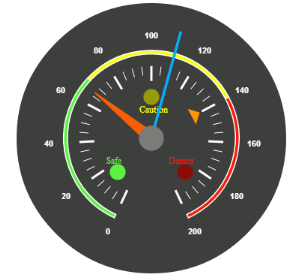
Add Custom Label Details
CustomLabels are used to specify the texts that need to be displayed in the gauge. You can customize it through various properties such as Value, Position, Color, Font Size, FontFamily and FontStyle. To display the three range description, custom texts are used here.
Code:
<ej:CircularGauge runat="server" ID="CircularGauge1" Height="500" Width="500" BackgroundColor="#3D3F3D" ReadOnly="false">

<Scales>

<ej:CircularScales ShowRanges="true" ShowIndicators="true"

Maximum="200" MajorIntervalValue="20" MinorIntervalValue="5">

<PointerCap Radius="15" BackgroundColor="#797C79"

BorderColor="#797C79" BorderWidth="0">

</PointerCap>

<%--Add the labels customization code here-- %>

<%--Add the pointers customization code here-- %>

<%--Add the ticks customization code here-- %>

<%--Add the ranges customization code here-- %>

<%--Add the indicators customization code here-- %>

<%--Add the Custom labels customization code here-- %>

<CustomLabelCollection>

<ej:CircularCustomLabel Color="#5DF243" Value="Safe">

<Position X="200" Y="280"/>

<Font FontFamily="Arial" FontStyle="Bold"

Size="12px"></Font>

</ej:CircularCustomLabel>

<ej:CircularCustomLabel Color="#F6FF0A" Value="Caution">

<Position X="253" Y="212"/>

<Font FontFamily="Arial" FontStyle="Bold"

Size="12px"></Font>

</ej:CircularCustomLabel>

<ej:CircularCustomLabel Color="#FF1807" Value="Danger">

<Position X="290" Y="280"/>

<Font FontFamily="Arial" FontStyle="Bold"

Size="12px"></Font>

</ej:CircularCustomLabel>

</CustomLabelCollection>

</ej:CircularScales>

</Scales>

</ej:CircularGauge>
The final output is as follows.