How can I help you?
Scales
Scales are the basic functional block of the Circular Gauge. By customizing the scales, the appearance of the Gauge can be improved. The functional blocks of Circular Gauge are
- Pointers
- Labels
- CustomLabels
- Indicators
- Ticks
- Ranges
- Sub-gauges.
Adding Scale Collection
Scale collection is directly added to the Gauge object. Refer the following code example to add scale collection in Gauge control.
<%--For Circular Gauge rendering-- %>

<ej:CircularGauge runat="server" Id="CircularGauge1">

<Scales>

<ej:CircularScales  Radius="130">

</ej:CircularScales>

</Scales>

</ej:CircularGauge>
Execute the above code to render the following output.
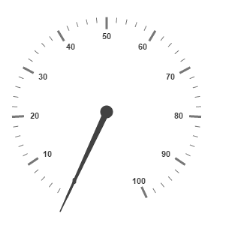
Scale Customization
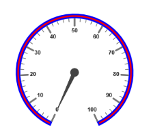
Colors and Border
- The Scale border is modified with the object called
Border. It has two border property namelyColorandWidthwhich are used to customize the border color of the scale and border width of the scale. - Setting the background color improves the look and feel of the Circular Gauge. You can customize the background color of the scale using
BackgroundColor. - The scale bar of circular gauge can be enabled by setting
ShowScaleBarproperty as true.
<%--For Circular Gauge rendering-- %>

        <ej:CircularGauge runat="server" ID="ScaleCircularGauge">

        <Scales>

        <ej:CircularScales ShowScaleBar="true" Radius="110" BackgroundColor="Red">

        <%--For setting scale border width and color-- %>

        <Border Width="3" Color="blue" />

        <PointerCollection>

        <ej:Pointers Length="80"></ej:Pointers>

        </PointerCollection>

        </ej:CircularScales>

        </Scales>

        </ej:CircularGauge>
Execute the above code to render the following output.
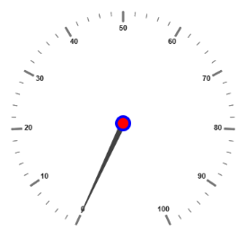
Pointer Cap
-
Pointer cap is a circular shape element that is located at the center of the Circular Gauge. The pointer cap is one of the cynosure of the Circular Gauge. By customizing the pointer cap, Gauge style is improved. The pointer cap is modified with the object
PointerCap. - It contains
Radius,BorderColor,BorderWidth,InteriorGradientandBackgroundColorproperties. The propertyradiusis used to set the radius for the pointer cap.InteriorGradientis used to provide the gradient effects to the pointer cap.
<%--For Circular Gauge rendering-- %>

        <ej:CircularGauge runat="server" ID="ScaleCircularGauge">

        <Scales>

        <ej:CircularScales>

        <PointerCap Radius="10" BackgroundColor="Red"

        BorderColor="Blue" BorderWidth="4">

        </PointerCap>

        </ej:CircularScales>

        </Scales>

        </ej:CircularGauge>
Execute the above code to render the following output.
Appearance
- Circular Gauge contains two types of scale direction such as clockwise and counter clockwise. You can set them by enumerable property called
Direction. And you can set the minimum and maximum values for the scale with the propertiesMinimumandMaximum. The two propertiesMinorIntervalValueandMajorIntervalValueare the values used to set interval value for the ticks and labels. - The
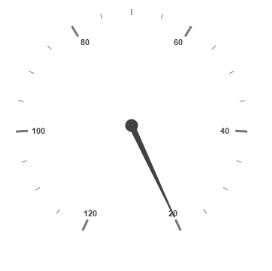
Radiusproperty is used to set the radius value for the circular scale and theSizeproperty is used to set the scale bar width. You can also adjust the Opacity of the scale with the propertyOpacity. The value for opacity lies between 0 and 1. You can also give some shadow effects for the scale by using the propertyShadowOffset. The propertyStartAngleis used to set starting position of the scale at certain angle andSweepAngleis used to shrink or expand the scale to certain angle.
<%--For Circular Gauge rendering-- %>

        <ej:CircularGauge runat="server" ID="ScaleCircularGauge">

        <%--For setting scale bar size, scale radius, minimum value, maximum value, majorinterval value, minorinterval value and direction-- %>

        <Scales>

        <ej:CircularScales Size="30" BackgroundColor="red" opacity="0.5" ShadowOffset="20" minimum="20" Maximum="120" MajorIntervalValue="20" MinorIntervalValue="5" Direction="CounterClockwise">

        </ej:CircularScales>

        </Scales>

        </ej:CircularGauge>
Execute the above code to render the following output.
Enable/Disable properties
You can enable / disable properties in Circular Gauge using some properties in scale collection. The ShowIndicators property is used to enable/disable the indicators. ShowLabels, ShowTicks, ShowRanges, ShowPointers ans ShowScaleBar are used to enable/ disable labels, ticks, ranges, pointers and scale bar respectively.
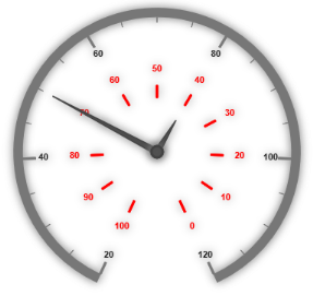
Multiple Scales
You can set Multiple scales for a single Circular Gauge control by using an array of scale objects. Each scale object is independent of each other. The following code example refers to two scale objects in a Gauge.
<%--For Circular Gauge rendering-- %>

<ej:CircularGauge runat="server" ID="ScaleCircularGauge">

<Scales>

<%--For setting scale1 -- %>

<ej:CircularScales ShowScalebar="true" Size="10" radius="150" ShadowOffset="20" minimum="20" Maximum="120" MajorIntervalValue="20" MinorIntervalValue="5" Direction="Clockwise">

<PointerCollection>

<ej:Pointers Value="50" ShowBackNeedle="true" Length="120" Width="7" BackNeedleLength="0"></ej:Pointers>

</PointerCollection>

</ej:CircularScales>

<%--For setting scale2 -- %>


<ej:CircularScales ShowScalebar="false" Size="10" radius="80" opacity="0.5" ShadowOffset="5" MajorIntervalValue="10"  Direction="CounterClockwise">

<labelCollection>

<ej:CircularLabels DistanceFromScale="-40" Color="red"></ej:CircularLabels>

</labelCollection>

<TickCollection>

<ej:CircularTicks Color="red"/>

</TickCollection>

<PointerCollection>

<ej:Pointers Value="40" distanceFromScale="-30" Length="50"></ej:Pointers>

</PointerCollection>

</ej:CircularScales>

</Scales>

</ej:CircularGauge>
Execute the above code to render the following output.