Cells in ASP.NET Core TreeGrid
12 Jul 202310 minutes to read
Tooltip
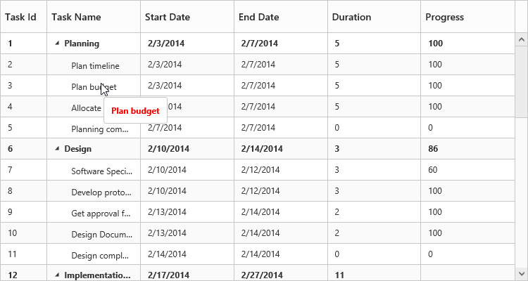
In TreeGrid tooltip can be enabled using ShowGridCellTooltip property. Using this property tooltip can be enabled for cells both header and content.
Please find the example describes the above behavior.
<ej-tree-grid id="TreeGridControl" … show-grid-cell-tooltip="true">
//...
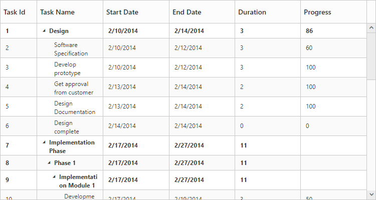
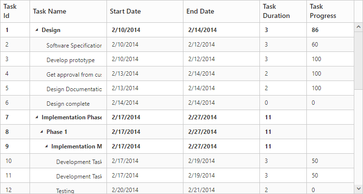
</ej-tree-grid>The following output shows the result of above code example.
Cell Tooltip
Header Tooltip
Tooltip Template
It is possible to display a custom tooltip across all the TreeGrid cells using the property CellTooltipTemplate with the property ShowGridCellTooltip enabled. We need to set the template of the custom tooltip to this property.
Please find code example describes the cell tooltip template support.
<ej-tree-grid id="TreeGridControl" … show-grid-cell-tooltip="true" cell-tooltip-template="cellTooltipTemplate">
//...
</ej-tree-grid>
<script type="text/x-jsrender" id="cellTooltipTemplate">
<table>
<tr>
<td style='padding:5px;font-weight: bold;'>
Task ID
</td>
<td style='padding:5px;'>
: {{:#data['record']['taskID']}}
</td>
</tr>
<tr>
<td style='padding:5px;font-weight: bold;'>
Task Name
</td>
<td style='padding:5px;'>
: {{:#data['record']['taskName']}}
</td>
</tr>
<tr>
<td style='padding:5px;font-weight: bold;'>
Start Date
</td>
<td style='padding:5px;'>
: {{:#data['record']['startDate']}}
</td>
</tr>
<tr>
<td style='padding:5px;font-weight: bold;'>
End Date
</td>
<td style='padding:5px;'>
: {{:#data['record']['endDate']}}
</td>
</tr>
<tr>
<td style='padding:5px;font-weight: bold;'>
Duration
</td>
<td style='padding:5px;'>
: {{:#data['record']['duration']}}
</td>
</tr>
<tr>
<td style='padding:5px;font-weight: bold;'>
Progress
</td>
<td style='padding:5px;'>
: {{:#data['record']['progress']}}
</td>
</tr>
</table>
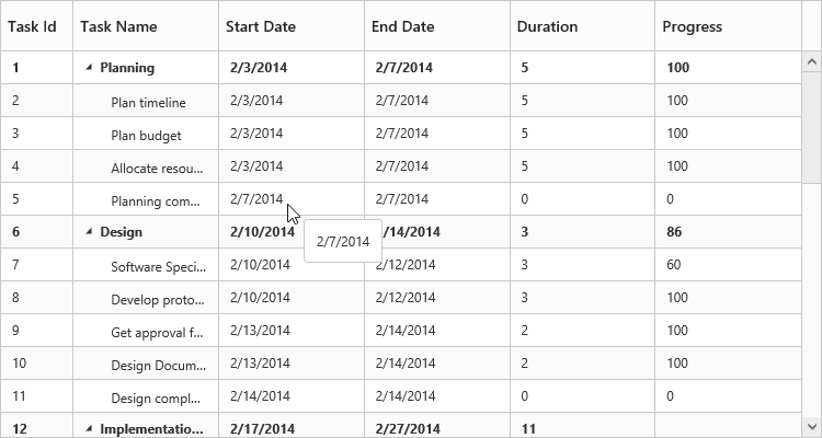
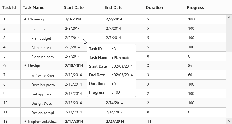
</script>The following output shows the result of above code example.
Column tooltip
By using the property Columns.Tooltip it is possible to display a custom tooltip for a specific column. The ID of the script template must be set to the Columns.Tooltip property.
Please refer the following code example for setting a custom tooltip for a specific column.
<script type="text/x-jsrender" id="template">
<div style='padding:10px;color:red;font-weight: bold;'>
{{:#data['record']['taskName']}}
</div>
</script>
<ej-tree-grid id="TreeGridControl" child-mapping="Children" >
<e-tree-grid-columns>
//..
<e-tree-grid-column header-text="Task Name" field="taskName" tooltip="template" />
//..
</e-tree-grid-columns>
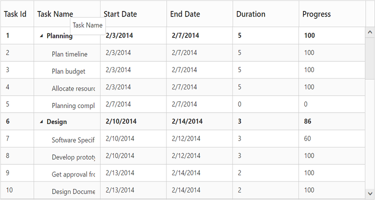
</ej-tree-grid>The following output shows the output of above code snippets.
NOTE
Template element should be enclosed with
<script>tag with type as“text/x-jsrender”.
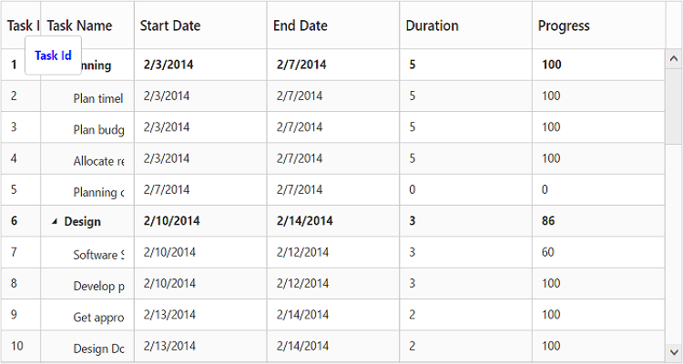
Header tooltip
By using the property Columns.HeaderTooltip it is possible to display a custom tooltip for a specific column header. The ID of the script template must be set to the Columns.HeaderTooltip property.
Please refer the following code example for setting a custom tooltip for a specific column header.
<script type="text/x-jsrender" id="template">
    <div style='padding:10px;color:blue;font-weight: bold;'>
        {{:#data['column']['headerText']}}
    </div>
</script>

<ej-tree-grid id="TreeGridControl" child-mapping="Children" >

  <e-tree-grid-columns>

      //..

     <e-tree-grid-column header-text="Task Id" field="taskID" header-tooltip="template" />

     //..

  </e-tree-grid-columns>

</ej-tree-grid>
The following output shows the result of above code example.
Clip Mode
Clip mode enables the TreeGrid to clip cell content and header content when the content exceeds the boundary of the cell width.
We can specify the type of clip mode using Columns.ClipMode property, clip mode will be enabled for both TreeGrid content and header of that specific column.
The below are the available clipping modes in TreeGrid,
- Clip
- Ellipsis
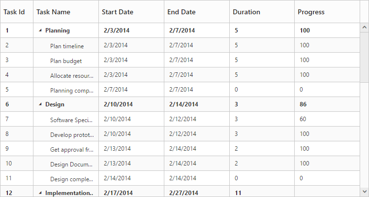
Clip
When ClipMode of Columns property set as Clip, then it truncates the overflown text in the cell.
NOTE
- By default the
ClipModewill be set asClip.
The following code example describes the above behavior.
<ej-tree-grid id="TreeGridControl" child-mapping="Children" >

  <e-tree-grid-columns>

      //..

     <e-tree-grid-column header-text="Task Id" field="taskID" clip-mode="Clip" />

     //..

  </e-tree-grid-columns>

</ej-tree-grid>
The following output shows the result of above code example.
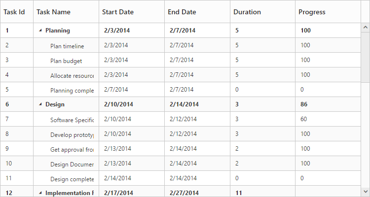
Ellipsis
When Columns.ClipMode property is set as Ellipsis then it shows ellipsis for the overflown cell.
The following code example describes the above behavior.
<ej-tree-grid id="TreeGridControl" child-mapping="Children" >

  <e-tree-grid-columns>

      //..

     <e-tree-grid-column header-text="Task Id" field="taskID" clip-mode="Ellipsis" />

     //..

  </e-tree-grid-columns>

</ej-tree-grid>
The following output is shows the result of the above code example.
Text Wrap
Text wrap enables the TreeGrid to wrap cell content or header content to next line when the content exceeds the boundary of the cell width.
Header Text Wrap
To enable header cell text wrap, set HeaderTextOverflow property as Wrap.
NOTE
By default the
HeaderTextOverflowwill be set asNone.
The following code example describes the above behavior.
<ej-tree-grid id="TreeGridControl" child-mapping="Children" header-text-overflow="Wrap" >

    //..

</ej-tree-grid>
The following output shows the result of above code example.
Content Text Wrap
To enable cell text wrap, set AllowTextWrap property as true.
NOTE
1.By default the
AllowTextWrapwill be set asfalse.
NOTE
2.The text wrap feature provide only limited support in virtualization mode.
The following code example describes the above behavior.
<ej-tree-grid id="TreeGridControl" child-mapping="Children" allow-text-wrap="true" >

    //..

</ej-tree-grid>

});
The following output shows the result of above code example.