How can I help you?
Symbol Palette
The SymbolPalette displays a collection of palettes. The Palette shows a set of nodes and connectors. It allows you to drag and drop the nodes and connectors into the Diagram.
Create symbol palette
The diagramId property of symbolpalette should be set with the corresponding Diagram ID to drag and drop the nodes and connectors into the Diagram. The following code illustrates how to create symbolpalette.
<!--Initializes the Diagram element-->
<div id="diagram"></div>;

<!-- Initializes the SymbolPalette element -->
<div id="symbolpalette"></div>;<div ng-controller="diagramCtrl">
<div>
<div ej-symbolpalette id="symbolpalette" e-height="100%" e-width="100%" e-diagramid="diagramId">
</div>
</div>
<div class="diagram_section">
<ej-diagram id="diagram" e-width="100%" e-height="100%">
</ej-diagram>
</div>
</div>syncApp.controller('diagramCtrl', function($scope) {
$scope.diagramId = "diagram";
});Add palettes to SymbolPalette
A palette allows to display a group of related symbols and it textually annotates the group with its header.
To initialize a palette, define a JSON object with the property name that is displayed as the header text of palette. The expanded property of palette allows to expand/collapse its palette items.
The following code example illustrates how to define a palette and how its added to symbol palette.
<div ng-controller="diagramCtrl">
    // Initializes the SymbolPalette control
    <div ej-symbolpalette id="symbolpalette" e-height="100%" e-width="100%" e-palettes="palettes" e-diagramid="diagramId">
    </div>
    <div>
        // Initializes the Diagram control
        <ej-diagram id="diagram" e-width="100%" e-height="100%">
        </ej-diagram>
    </div>
</div>//Defines the JSON to create a palette
var palette = {
//Sets the name of the palette
name: "Basic Shapes",
//Sets whether the palette expands/collapse its children
expanded: true,
};You can add any number of palettes to the palettes collection of the symbol palette. The following example illustrates how to define symbol palette with a palette object that is defined in the previous step.
syncApp.controller('diagramCtrl', function($scope) {
$scope.diagramId = "diagram";
//Defines the palette collection
$scope.palettes = palettes;
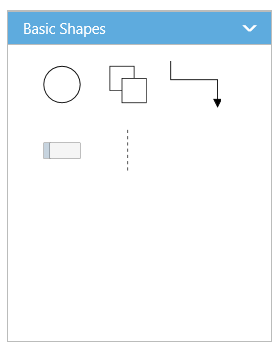
});The following image shows the symbol palette with multiple palette Items.
Customize the Palette Header
Palettes can be annotated with its header texts and you can change the height of palette header by using HeaderHeight property of symbol palette.
Also, you can embed any HTML element into a palette header by defining the ScriptTemplate id to palette’s templateId property. Following code example illustrates how to customize palette headers.
<div ng-controller="diagramCtrl">
    // Initializes the SymbolPalette control
    <div ej-symbolpalette id="symbolpalette" e-height="100%" e-width="100%" e-palettes="palettes"
         e-headerHeight="headerHeight" // Relates Diagram with SymbolPalette e-diagramid="diagramId">
    </div>
    <div>
        // Initializes the Diagram control
        <ej-diagram id="diagram" e-width="100%" e-height="100%">
        </ej-diagram>
    </div>
</div>

<!--dependency scripts-->
<script id="svgTemplate" type="text/x-jsrender">
    <!--define html element-->
    <svg version="1.0" xmlns="http://www.w3.org/2000/svg" width="225px" height="28px">
                <g visibility="visible">
                    <image width="26px" height="26px" opacity="1" xmlns:xlink="http://www.w3.org/1999/xlink" xlink:href="image.png"></image>
                    <text x="40" y="18" font-size="14">
                        <tspan>Basic Shapes</tspan>
                    </text>
                </g>
            </svg>
</script>//Defines the JSON to create a palette with custom header
var palette = {
name: "Basic Shapes",
//Sets the id of the script template
templateId: "svgTemplate",
};
syncApp.controller('diagramCtrl', function($scope) {
$scope.diagramId = "diagram";
//Defines the palette collection
$scope.palettes = palettes;
$scope.headerHeight = 30;
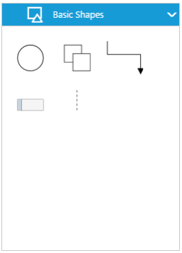
});The following image shows the customized palette header
Add symbols to palette
The symbol need to be defined and added to the items collection of the palette. You can create a symbol as a node, group, connector, lane, or phase except swimlane. To create a symbol, you first need to define that element as JSON. The following code example illustrates how to define a symbol.
//Creates a node
   var node = {
       name: "Ellipse",
       //Specifies node size
       width: 40,
       height: 40,
       //Specifies node offset and shape
       offsetX: 20,
       offsetY: 20,
       shape: "ellipse",
   };
The following code example illustrates how to define a palette with symbols that are defined in the previous section.
//Defines the JSON to create a palette
   var palette = {
       name: "Basic Shapes",
       expanded: true,
       //Adds the palette items to palette
       items: [node]
   };

   syncApp.controller('diagramCtrl', function($scope) {
       $scope.diagramId = "diagram";
       //Defines the palette collection
       $scope.palettes = palettes;
   });
Customize the size of symbols
You can customize the size of the individual symbol. The paletteItem property of node enables you to define the size of the symbols. The following code example illustrates how to change the size of a symbol.
<div ng-controller="diagramCtrl">
    // Initializes the SymbolPalette control
    <div ej-symbolpalette id="symbolpalette" e-height="100%" e-width="100%" e-palettes="palettes" e-headerHeight="headerHeight"
          e-paletteItemHeight="paletteItemHeight" e-paletteItemWidth="paletteItemWidth" // Relates Diagram with SymbolPalette e-diagramid="diagramId">
    </div>
    <div>
        // Initializes the Diagram control
        <ej-diagram id="diagram" e-width="100%" e-height="100%">
        </ej-diagram>
    </div>
</div>var palettes = [{
name: "Basic Shapes",
expanded: true,
items: [{
name: "Rectangle",
height: 40,
width: 80,
//Specifies the size of symbol
paletteItem: {
//Defines the size of the symbol
width: 50,
height: 50,
margin: {
left: 20,
right: 20,
top: 20,
bottom: 20
}
}
}]
}],
syncApp.controller('diagramCtrl', function($scope) {
$scope.diagramId = "diagram";
//Defines the palette collection
$scope.palettes = palettes;
$scope.paletteItemWidth: 50,
$scope.paletteItemHeight: 50,
});Symbol size will be set based on the following precedence.
Precedence
| Palette Item | Rendering Size |
|---|---|
| Width | paletteItem.width > model.paletteItemWidth > node.width |
| Height | paletteItem.height > model.paletteItem.Height > node.height |
- Symbol size will be rendered in the palette based on node.paletteItem’s
widthandheightproperty. - If paletteItem’s width and height property is not specified, symbol size will be rendered in the palette based on model’s
paletteItemWidthandpaletteItemHeightproperty. - If you don’t specify above two, then symbol size will be rendered in the palette based on node’s
widthandheightproperty.
Stretch the symbols into the palette
The enableScale property of the paletteItem enables you to customize the size of the symbol regardless of the precedence. The following code example illustrates how to customize the symbol size.
var palettes = [{
       name: "Basic Shapes",
       expanded: true,
       items: [{
           name: "Rectangle",
           height: 40,
           width: 80,
           //Specifies the size of palette Item
           paletteItem: {
               // Enables to fit the content into the specified palette item size
               enableScale: true
               // When it is set as false, the element is rendered with actual node size
           }
       }]
   }]
   syncApp.controller('diagramCtrl', function($scope) {
       $scope.diagramId = "diagram";
       //Defines the palette collection
       $scope.palettes = palettes;
       $scope.paletteItemWidth: 50,
           $scope.paletteItemHeight: 50,
   });
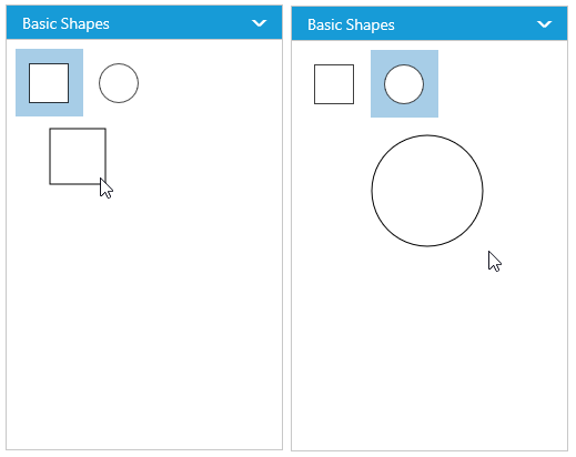
Symbol Previews
Image, simple snippet to customize the preview size
You can customize the preview size of the individual palette items. The paletteItem property of node enables you to define the preview size of the symbol items. The following code example illustrates how to change the preview size of a palette item.
var palettes = [{
        name: "Basic Shapes",
        expanded: true,
        items: [{
                name: "Rectangle",
                height: 50,
                width: 50,
                //Specifies the individual palette item preview size
                paletteItem: {
                    previewWidth: 50,
                    previewHeight: 50,
                }
            },
            {
                name: "Rectangle2",
                height: 50,
                width: 50,
                shape: "ellipse",
            }
        ]
    }],
    syncApp.controller('diagramCtrl', function($scope) {
        $scope.diagramId = "diagram";
        //Defines the palette collection
        $scope.palettes = palettes;
        $scope.paletteItemWidth: 50,
            $scope.paletteItemHeight: 50,
    });
You can also customize the preview size of the all palette items. The previewWidth and previewHeight property of SymbolPalette enables you to define the preview size to all the symbol palette items. The following code example illustrates how to change the preview size of a symbol palette items.
var palettes = [{
        name: "Basic Shapes",
        expanded: true,
        items: [{
            name: "Rectangle",
            height: 50,
            width: 50,
        }, {
            name: "Rectangle2",
            height: 50,
            width: 50,
            shape: "ellipse",
        }]
    }],
    syncApp.controller('diagramCtrl', function($scope) {
        $scope.diagramId = "diagram";
        //Defines the palette collection
        $scope.palettes = palettes;
        //Specifies the preview size to symbol palette items.
        $scope.previewWidth: 100,
            $scope.previewHeight: 100,
    });
Symbol palette allows to sets the offset of the dragging helper relative to the mouse cursor.
<div ng-controller="diagramCtrl">
    // Initializes the SymbolPalette control
    <div ej-symbolpalette id="symbolpalette" e-height="100%" e-width="100%" e-palettes="palettes"
         e-previewOffset="previewOffset" e-diagramid="diagramId">
    </div>
    <div>
        // Initializes the Diagram control
        <ej-diagram id="diagram" e-width="100%" e-height="100%">
        </ej-diagram>
    </div>
</div>var palettes = [{
name: "Basic Shapes",
expanded: true,
items: [{
name: "Rectangle",
height: 50,
width: 50,
}]
}],
syncApp.controller('diagramCtrl', function($scope) {
$scope.diagramId = "diagram";
//Defines the palette collection
$scope.palettes = palettes;
$scope.previewOffset = {
x: 50,
y: 50
},
});
Symbol preview size will be set based on the following precedence.
Precedence
| Palette Item | Preview Size |
|---|---|
| Width | paletteItem.previewWidth > model.previewWidth > node.width |
| Height | paletteItem.previewHeight > model.previewHeight > node.height |
- Symbol preview size will be set based on node.paletteItem’s
previewWidthandpreviewHeightproperty. - If paletteItem’s width and height property is not specified, symbol size will be set based on model’s
previewWidthandpreviewHeightproperty. - If you don’t specify above two, then symbol size will be rendered in the palette based on node’s
widthandheightproperty.
Show/hide the symbol Text
You can show/hide the symbol text by using the showPaletteItemText property of symbol palette.
syncApp.controller('diagramCtrl', function($scope) {
        $scope.diagramId = "diagram";
        //Defines the palette collection
        $scope.palettes = palettes;
        //Specifies whether palette item text should be visible or not
        $scope.showPaletteItemText = true;
    });
To explore the properties of symbol palette, refer to Symbol Palette Properties.