How can I help you?
Getting started
This section explains briefly about how to create an Accordion in your application with Angular.
Configure Accordion
This section encompasses the details on how you can configure the Accordion control in your application and customize it with various properties such as multiple open, rounded corner and icons for the Accordion header according to your requirement.
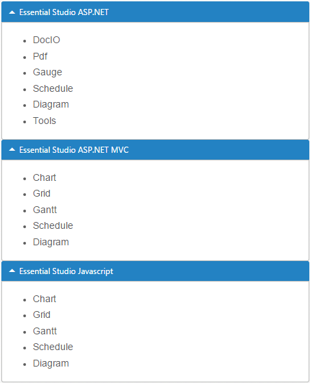
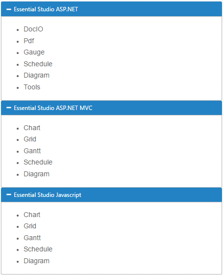
The following screenshot illustrates you the usage of Accordion control in listing the controls under the Essential Studio products.
The usage of Accordion control is described in the following sections.
Create a Simple Accordion in Angular
Create an HTML page and add the scripts references in the order mentioned in the following code example.
<!DOCTYPE html>
     <html>
     <head>
     <link href="//cdn.syncfusion.com/14.3.0.49/js/web/flat-azure/ej.web.all.min.css" rel="stylesheet" />
     <script src="node_modules/core-js/client/shim.min.js"></script>
     <script src="node_modules/zone.js/dist/zone.js"></script>
     <script src="node_modules/reflect-metadata/Reflect.js"></script>
     <script src="node_modules/systemjs/dist/system.src.js"></script>
     <script src="https://code.jquery.com/jquery-3.0.0.min.js"></script>
     <script src="http://cdn.syncfusion.com/14.3.0.49/js/web/ej.web.all.min.js" type="text/javascript"></script>
     <script src ="http://cdn.syncfusion.com/14.3.0.49/js/common/ej.angular2.min.js"></script>
     <script src="systemjs.config.js"></script>
     </head>
     <body>
     <ej-app>Loading...</ej-app>
     </body>
     </html>
NOTE
In the above code,
ej.web.all.min.jsscript reference has been added for demonstration purpose. It is not recommended to use this for deployment purpose, as its file size is larger since it contains all the widgets. Instead, you can useCSGutility to generate a custom script file with the required widgets for deployment purpose.
In the Accordion component HTML file add the below given code to render Accordion control
<ej-accordion>

    <h3>
        <a href="#">Essential Studio ASP.NET</a>
    </h3>

     <div>
       <ul>
            <li>
                <h4>DocIO</h4>
            </li>
            <li>
                <h4>Pdf  </h4>
            </li>
            <li>
                <h4>Gauge  </h4>
            </li>
            <li>
                <h4>Schedule  </h4>
            </li>
            <li>
                <h4>Diagram  </h4>
            </li>
            <li>
                <h4>Tools </h4>
            </li>
        </ul>

       </div>
       <h3>
        <a href="#">Essential Studio ASP.NET MVC</a>
       </h3>
       <div>
        <ul>
            <li>
                <h4>Chart </h4>
            </li>
            <li>
                <h4>Grid  </h4>
            </li>
            <li>
                <h4>Gantt  </h4>
            </li>
            <li>
                <h4>Schedule  </h4>
            </li>
            <li>
                <h4>Diagram  </h4>
            </li>
        </ul>
       </div>
       <h3>
        <a href="#">Essential Studio Javascript</a>
       </h3>
      <div>
       <ul>
            <li>
                <h4>Chart </h4>
            </li>
            <li>
                <h4>Grid  </h4>
            </li>
            <li>
                <h4>Gantt  </h4>
            </li>
            <li>
                <h4>Schedule  </h4>
            </li>
            <li>
                <h4>Diagram  </h4>
            </li>
        </ul>
     </div>
    </ej-accordion>
Create the Accordion control as follows.
import {Component} from '@angular/core';

    @Component({
     selector: 'sd-home',
     templateUrl: 'app/components/accordion/accordion.component.html'  //give the path file for accordion component html file.
      })
     export class AccordionComponent {
	 }
You can execute the above code example to display the Accordion control with simple control list.
You can customize the Accordion control using various properties. The Accordion control properties and its default values are described in the following section.
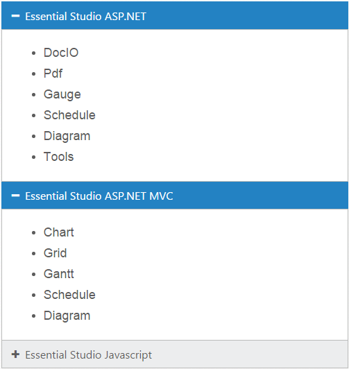
Configure Multiple Open
You can have multiple Accordion tabs opened to view all products at a time. To achieve this set the enableMultipleOpen property of the Accordion control to true.
NOTE
enableMultipleOpen property is false by default.
You can also open all the panels during initialization using the selectedItems property of the Accordion control. The following code sample illustrates the opening of multiple tabs by passing the tab index values of tab.
<ej-accordion enableMultipleOpen="true"  [(selectedItems)]="selecteditems">
    <h3>
        <a href="#">Essential Studio ASP.NET</a>
    </h3>
    <div>
       <ul>
            <li>
                <h4>DocIO</h4>
            </li>
            <li>
                <h4>Pdf  </h4>
            </li>
            <li>
                <h4>Gauge  </h4>
            </li>
            <li>
                <h4>Schedule  </h4>
            </li>
            <li>
                <h4>Diagram  </h4>
            </li>
            <li>
                <h4>Tools </h4>
            </li>
        </ul>

    </div>
    <h3>
        <a href="#">Essential Studio ASP.NET MVC</a>
    </h3>
    <div>
        <ul>
            <li>
                <h4>Chart </h4>
            </li>
            <li>
                <h4>Grid  </h4>
            </li>
            <li>
                <h4>Gantt  </h4>
            </li>
            <li>
                <h4>Schedule  </h4>
            </li>
            <li>
                <h4>Diagram  </h4>
            </li>
        </ul>
      </div>
      <h3>
        <a href="#">Essential Studio Javascript</a>
      </h3>
      <div>
       <ul>
            <li>
                <h4>Chart </h4>
            </li>
            <li>
                <h4>Grid  </h4>
            </li>
            <li>
                <h4>Gantt  </h4>
            </li>
            <li>
                <h4>Schedule  </h4>
            </li>
            <li>
                <h4>Diagram  </h4>
            </li>
        </ul>
     </div>
</ej-accordion>import {Component} from '@angular/core';
@Component({
selector: 'sd-home',
templateUrl: 'app/components/accordion/accordion.component.html'
})
export class AccordionComponent {
selecteditems:int;
constructor()
{
this.selecteditems=[0,1,2];
}
}Accordion control with enableMultipleOpen property is illustrated in the following screen shot.
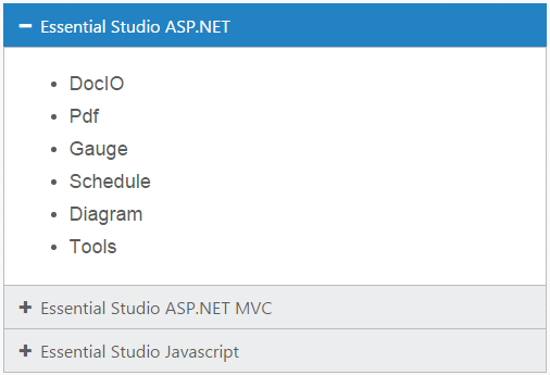
Setting rounded corner
Accordion control, by default, is rendered in a regular rectangle. You can modify the regular rectangles with rounded corners by setting the showRoundedCorner property to True.
NOTE
showRoundedCorner property is False by default.
<ej-accordion enableMultipleOpen="true" showRoundedCorner="true" [(selectedItems)]="selecteditems">
    <h3>
        <a href="#">Essential Studio ASP.NET</a>
    </h3>
    <div>
       <ul>
            <li>
                <h4>DocIO</h4>
            </li>
            <li>
                <h4>Pdf  </h4>
            </li>
            <li>
                <h4>Gauge  </h4>
            </li>
            <li>
                <h4>Schedule  </h4>
            </li>
            <li>
                <h4>Diagram  </h4>
            </li>
            <li>
                <h4>Tools </h4>
            </li>
        </ul>
     </div>
     <h3>
        <a href="#">Essential Studio ASP.NET MVC</a>
     </h3>
     <div>
        <ul>
            <li>
                <h4>Chart </h4>
            </li>
            <li>
                <h4>Grid  </h4>
            </li>
            <li>
                <h4>Gantt  </h4>
            </li>
            <li>
                <h4>Schedule  </h4>
            </li>
            <li>
                <h4>Diagram  </h4>
            </li>
        </ul>
     </div>
     <h3>
        <a href="#">Essential Studio Javascript</a>
     </h3>
     <div>
     <ul>
            <li>
                <h4>Chart </h4>
            </li>
            <li>
                <h4>Grid  </h4>
            </li>
            <li>
                <h4>Gantt  </h4>
            </li>
            <li>
                <h4>Schedule  </h4>
            </li>
            <li>
                <h4>Diagram  </h4>
            </li>
        </ul>
    </div>
    </ej-accordion>
The following screenshot illustrates the Accordion control with rounded corners.
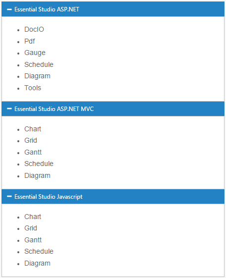
Customize Icon
You can customize the Header icon using customIcon property. This property has two features such as header and selectedHeader. By default, the classes of header and selectedHeader are e-collapse and e-expand respectively.
You can change the + and - symbols in the Accordion header, that are the default icons with Up or Down arrow icons.
Up or Down arrow icons are available in e-arrowheadup and e-arrowheaddown classes respectively in the ej.widgets.core.min.css stylesheets from the sample.
You can set the Up or Down arrow icon to Accordion header, by adding e-arrowheadup and e-arrowheaddown class to selectedHeader and header properties respectively.
<ej-accordion enableMultipleOpen="true" showRoundedCorner="true" [(selectedItems)]="selecteditems" customIcon.header="e-arrowheaddown" customIcon.selectedHeader="e-arrowheadup">
     <h3>
        <a href="#">Essential Studio ASP.NET</a>
     </h3>
     <div>
       <ul>
            <li>
                <h4>DocIO</h4>
            </li>
            <li>
                <h4>Pdf  </h4>
            </li>
            <li>
                <h4>Gauge  </h4>
            </li>
            <li>
                <h4>Schedule  </h4>
            </li>
            <li>
                <h4>Diagram  </h4>
            </li>
            <li>
                <h4>Tools </h4>
            </li>
        </ul>

    </div>
    <h3>
        <a href="#">Essential Studio ASP.NET MVC</a>
    </h3>
    <div>
        <ul>
            <li>
                <h4>Chart </h4>
            </li>
            <li>
                <h4>Grid  </h4>
            </li>
            <li>
                <h4>Gantt  </h4>
            </li>
            <li>
                <h4>Schedule  </h4>
            </li>
            <li>
                <h4>Diagram  </h4>
            </li>
        </ul>
        </div>
        <h3>
        <a href="#">Essential Studio Javascript</a>
        </h3>
        <div>
        <ul>
            <li>
                <h4>Chart </h4>
            </li>
            <li>
                <h4>Grid  </h4>
            </li>
            <li>
                <h4>Gantt  </h4>
            </li>
            <li>
                <h4>Schedule  </h4>
            </li>
            <li>
                <h4>Diagram  </h4>
            </li>
        </ul>
       </div>
       </ej-accordion>
The following screenshot illustrates the customization of selectedHeader and header of the Accordion control.