Week View in Xamarin Scheduler (SfSchedule)
8 Jan 202522 minutes to read
WeekView is to view all days of a particular week. Appointments will be arranged based on the dates on the week in respective timeslots.
ViewHeader Appearance
You can customize the default appearance of view header in WeekView by using ViewHeaderStyle property of SfSchedule.
<schedule:SfSchedule x:Name="schedule" ScheduleView ="WeekView">
	<schedule:SfSchedule.ViewHeaderStyle>
		<schedule:ViewHeaderStyle
				BackgroundColor="#009688"
				DayTextColor="#FFFFFF"
				DateTextColor="#FFFFFF"
				DayFontFamily="Arial"
				DateFontFamily="Arial">
		</schedule:ViewHeaderStyle>
	</schedule:SfSchedule.ViewHeaderStyle>
</schedule:SfSchedule>
//Create new instance of Schedule
SfSchedule schedule = new SfSchedule();
schedule.ScheduleView = ScheduleView.WeekView;
//Customize the schedule view header
ViewHeaderStyle viewHeaderStyle = new ViewHeaderStyle();
viewHeaderStyle.BackgroundColor = Color.FromHex("#009688");
viewHeaderStyle.DayTextColor = Color.FromHex("#FFFFFF");
viewHeaderStyle.DateTextColor = Color.FromHex("#FFFFFF");
viewHeaderStyle.DayFontFamily = "Arial";
viewHeaderStyle.DateFontFamily = "Arial";
schedule.ViewHeaderStyle = viewHeaderStyle;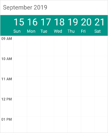
NOTE
FontAttributes and FontFamily are native to the platform. Custom font and the font which are not available in the specified platform will not be applied.
You can customize the height of the ViewHeader in WeekView by setting ViewHeaderHeight property of SfSchedule.
<schedule:SfSchedule x:Name="schedule" ScheduleView ="WeekView" ViewHeaderHeight="50" />schedule.ScheduleView = ScheduleView.WeekView;
schedule.ViewHeaderHeight = 50;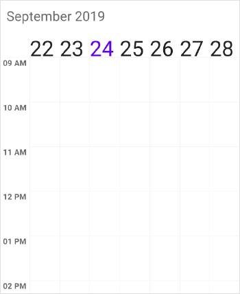
Customize Font Appearance
you can change the appearance of Font by setting the DayFontFamily and DateFontFamily property of ViewHeaderStyle property in Schedule.
<schedule:ViewHeaderStyle.DayFontFamily>
	 <OnPlatform x:TypeArguments="x:String" iOS="Lobster-Regular" Android="Lobster-Regular.ttf" WinPhone="Assets/Lobster-Regular.ttf#Lobster" />
</schedule:ViewHeaderStyle.DayFontFamily>
<schedule:ViewHeaderStyle.DateFontFamily>
	 <OnPlatform x:TypeArguments="x:String" iOS="Lobster-Regular" Android="Lobster-Regular.ttf" WinPhone="Assets/Lobster-Regular.ttf#Lobster" />
</schedule:ViewHeaderStyle.DateFontFamily>viewHeaderStyle.DayFontFamily = Device.OnPlatform("Lobster-Regular", "Lobster-Regular.ttf", "Assets/Lobster-Regular.ttf#Lobster");
viewHeaderStyle.DateFontFamily = Device.OnPlatform("Lobster-Regular", "Lobster-Regular.ttf", "Assets/Lobster-Regular.ttf#Lobster");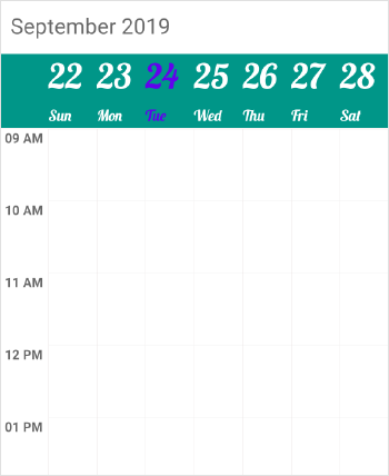
Refer this to configure the custom fonts in Xamarin.Forms.
ViewHeader Date Format
You can customize the date and day format of SfSchedule ViewHeader by using DateFormat and DayFormat properties of WeekLabelSettings
<schedule:SfSchedule>
	<schedule:SfSchedule.WeekViewSettings>
		<schedule:WeekViewSettings>
			<schedule:WeekViewSettings.WeekLabelSettings>
				<schedule:WeekLabelSettings DateFormat=“dd”>
					<schedule:WeekLabelSettings.DayFormat>
						<OnPlatform x:TypeArguments="x:String" iOS="EEEE" Android="EEEE" WinPhone="dddd" />
					</schedule:WeekLabelSettings.DayFormat>
				</schedule:WeekLabelSettings>
			</schedule:WeekViewSettings.WeekLabelSettings>
		</schedule:WeekViewSettings>
	</schedule:SfSchedule.WeekViewSettings>
</schedule:SfSchedule>schedule.ScheduleView = ScheduleView.WeekView;
//Creating new instance of WeekViewSettings
WeekViewSettings weekViewSettings = new WeekViewSettings();
//Creating new instance of WeekLabelSettings
WeekLabelSettings weekLabelSettings = new WeekLabelSettings();
//Customizing date format
weekLabelSettings.DateFormat = "dd";
weekLabelSettings.DayFormat = Device.OnPlatform("EEEE", "EEEE", "dddd");
weekViewSettings.WeekLabelSettings = weekLabelSettings;
schedule.WeekViewSettings = weekViewSettings;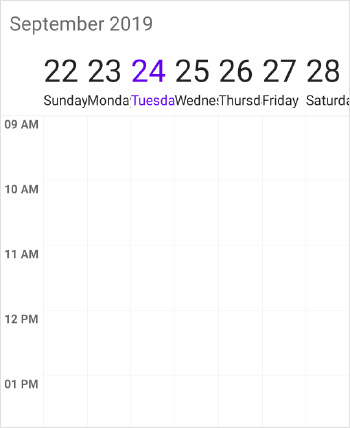
ViewHeader Tapped Event
You can handle single tap action of ViewHeader by using ViewHeaderTapped event of SfSchedule. This event will be triggered when the ViewHeader is Tapped. This event contains ViewHeaderTappedEventArgs argument which holds DateTime details in it.
<schedule:SfSchedule x:Name="schedule"
                     ScheduleView="WeekView"
                     ViewHeaderTapped="Handle_ViewHeaderTapped">
</schedule:SfSchedule>
//Creating new instance of Schedule
SfSchedule schedule = new SfSchedule();
schedule.ScheduleView = ScheduleView.WeekView;
schedule.ViewHeaderTapped += Handle_ViewHeaderTapped;private void Handle_ViewHeaderTapped(object sender, ViewHeaderTappedEventArgs e)
{
var dateTime = e.DateTime;
}Change Time Interval
You can customize the interval of timeslots in WeekView by setting TimeInterval property of SfSchedule.
<schedule:SfSchedule x:Name="schedule" ScheduleView="WeekView" TimeInterval="180"/>schedule.ScheduleView = ScheduleView.WeekView;
schedule.TimeInterval = 180;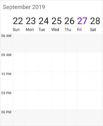
NOTE
If you modify theTimeIntervalvalue (in minutes), you need to change the time labels format by setting theTimeFormatvalue as “hh:mm”. By default, TimeFormat value is"hh a". You can refer here for changing TimeFormat value.
Change Time Interval Height
You can customize the interval height of timeslots in WeekView by setting TimeIntervalHeight property of SfSchedule.
<schedule:SfSchedule x:Name="schedule" ScheduleView="WeekView" TimeIntervalHeight="180"/>schedule.ScheduleView = ScheduleView.WeekView;
schedule.TimeIntervalHeight = 180;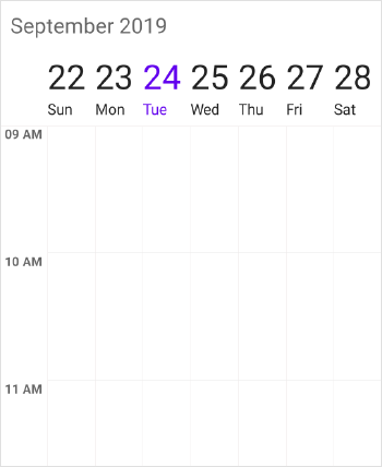
Full screen scheduler
Schedule time interval height can be adjusted based on screen height by changing the value of TimeIntervalHeight property to -1. It will auto-fit to the screen height and width.
<schedule:SfSchedule x:Name="schedule" ScheduleView="WeekView" TimeIntervalHeight="-1"/>schedule.ScheduleView = ScheduleView.WeekView;
schedule.TimeIntervalHeight = -1;Change Working hours
Working hours in WeekView of Schedule control will be differentiated with non-working hours by separate color. By default, working hours will be between 09 to 18. You can customize the working hours by setting WorkStartHour and WorkEndHour properties of WeekViewSettings. You can also customize the working hours along with minutes by setting double value which will be converted to time.
<schedule:SfSchedule x:Name="schedule" ScheduleView="WeekView">
    <schedule:SfSchedule.WeekViewSettings>
        <!--setting working hours properties -->
        <schedule:WeekViewSettings
            WorkStartHour="11.5"
            WorkEndHour="17.5">
            <schedule:WeekViewSettings.WeekLabelSettings>
                <schedule:WeekLabelSettings TimeFormat="hh:mm" />
            </schedule:WeekViewSettings.WeekLabelSettings>
        </schedule:WeekViewSettings>
    </schedule:SfSchedule.WeekViewSettings>
</schedule:SfSchedule>schedule.ScheduleView = ScheduleView.WeekView;
//Create new instance of WeekViewSettings
WeekViewSettings weekViewSettings = new WeekViewSettings();
WeekLabelSettings weekLabelSettings = new WeekLabelSettings();
weekLabelSettings.TimeFormat = "hh:mm";
weekViewSettings.WorkStartHour = 11.5;
weekViewSettings.WorkEndHour = 14.5;
weekViewSettings.WeekLabelSettings = weekLabelSettings;
schedule.WeekViewSettings = weekViewSettings;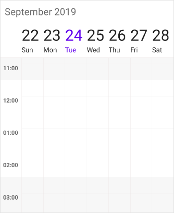
NOTE
No need to specify the decimal point values forWorkStartHourandWorkEndHour, if you don’t want to set the minutes.
Changing StartHour and EndHour
Default value for StartHour and EndHour value is 0 to 24 to show all the time slots in WeekView. You need to set StartHour and EndHour property of WeekView, to show only the required time duration for end users. You can also set StartHour and EndHour in double value which will be converted to time to show required time duration in minutes.
<schedule:SfSchedule x:Name="schedule" ScheduleView="WeekView">
    <schedule:SfSchedule.WeekViewSettings>
        <!--setting working hours properties -->
        <schedule:WeekViewSettings
            StartHour="07.5"
            EndHour="18.5">
            <schedule:WeekViewSettings.WeekLabelSettings>
                <schedule:WeekLabelSettings TimeFormat="hh:mm" />
            </schedule:WeekViewSettings.WeekLabelSettings>
        </schedule:WeekViewSettings>
    </schedule:SfSchedule.WeekViewSettings>
</schedule:SfSchedule>schedule.ScheduleView = ScheduleView.WeekView;
//Create new instance of WeekViewSettings
WeekViewSettings weekViewSettings = new WeekViewSettings();
WeekLabelSettings weekLabelSettings = new WeekLabelSettings();
weekLabelSettings.TimeFormat = "hh:mm";
weekViewSettings.StartHour = 07.5;
weekViewSettings.EndHour = 18.5;
weekViewSettings.WeekLabelSettings = weekLabelSettings;
schedule.WeekViewSettings = weekViewSettings;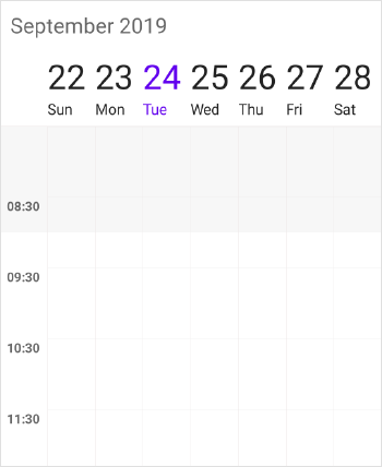
NOTE
StartHourmust be greater than or equal to 0 andEndHourmust be lesser than or equal to 24, otherwiseInvalidDataExceptionwill be thrown.EndHourvalue must be greater thanStartHour, otherwiseInvalidDataExceptionwill be thrown.- Schedule UI such as Appointments and NonAccessibleBlocks which does not fall within the
StartHourandEndHourwill not be visible and if it falls partially, it will be clipped.- No need to specify the decimal point values for
StartHourandEndHour, if you don’t want to set the minutes.- The number of time slots will be calculated based on total minutes of a day and time interval (total minutes of a day ((start hour - end hour) * 60) / time interval).
- If custom
TimeIntervalis given, then the number of time slots calculated based on givenTimeIntervalshould result in integer value (total minutes %TimeInterval= 0), otherwise next immediate time interval that result in integer value when divide total minutes of a day will be considered. For example, ifTimeInterval=”135” (2 Hours 15 minutes) and total minutes = 1440 (24 Hours per day), thenTimeIntervalwill be changed to “144” (1440%144=0) by considering (total minutes % TimeInterval = 0); it will return integer value for time slots rendering.- If the custom
StartHourandEndHourare given, then the number of time slots calculated based on givenStartHourandEndHourshould result in integer value, otherwise next immediateTimeIntervalwill be considered until the result is integer value. For example, ifStartHouris 9 (09:00AM),EndHouris 18.25 (06:15 PM),TimeIntervalis 30 minutes, and total minutes = 555 ((18.25-9)*60), then theTimeIntervalwill be changed to “37” (555%37=0) by considering (total minutes %TimeInterval= 0); it will return integer value for time slots rendering.
Timeslot Appearance
You can customize the appearance of timeslots in WeekView.
Timeslot customization in Work hours
You can customize the appearance of the working hour timeslots by its color usingTimeSlotColor ,TimeSlotBorderColor, VerticalLineStrokeWidth, VerticalLineColor and TimeSlotBorderStrokeWidth properties ofWeekViewSettings.
<schedule:SfSchedule x:Name="schedule" ScheduleView="WeekView">
	<schedule:SfSchedule.WeekViewSettings>
	  <!--setting week view settings properties -->
	  <schedule:WeekViewSettings
		  TimeSlotColor="#fcf3c9"
		  TimeSlotBorderColor="#fceb9f"
		  TimeSlotBorderStrokeWidth="5"
		  VerticalLineStrokeWidth="5"
		  VerticalLineColor="LightGray">
	  </schedule:WeekViewSettings>
	</schedule:SfSchedule.WeekViewSettings>
</schedule:SfSchedule>schedule.ScheduleView = ScheduleView.WeekView;
//Create new instance of WeekViewSettings
WeekViewSettings weekViewSettings = new WeekViewSettings();
weekViewSettings.TimeSlotBorderColor = Color.FromHex("#fceb9f") ;
weekViewSettings.VerticalLineColor = Color.LightGray;
weekViewSettings.TimeSlotColor = Color.FromHex("#fcf3c9");
weekViewSettings.TimeSlotBorderStrokeWidth = 5;
weekViewSettings.VerticalLineStrokeWidth = 5;
schedule.WeekViewSettings = weekViewSettings;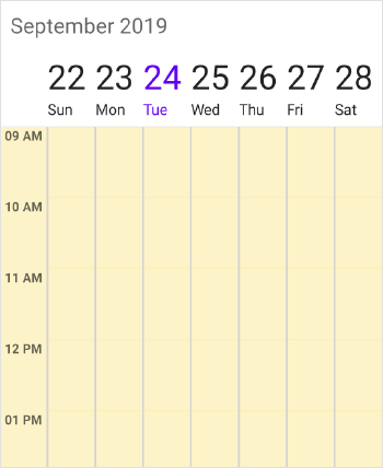
Timeslot customization in Non Working hours
You can customize the appearance of the non-working hour timeslots by its color using NonWorkingHoursTimeSlotBorderColor, NonWorkingHoursTimeSlotColor, VerticalLineStrokeWidth, VerticalLineColor and TimeSlotBorderStrokeWidth properties of WeekViewSettings.
<schedule:SfSchedule x:Name="schedule" ScheduleView="WeekView">
	<schedule:SfSchedule.WeekViewSettings>
	  <!--setting week view settings properties -->
		<schedule:WeekViewSettings
			NonWorkingHoursTimeSlotColor="#fcf3c9"
			NonWorkingHoursTimeSlotBorderColor="#fceb9f"
			TimeSlotBorderStrokeWidth="5"
			VerticalLineStrokeWidth="5"
			VerticalLineColor="LightGray">
		</schedule:WeekViewSettings>
	</schedule:SfSchedule.WeekViewSettings>
</schedule:SfSchedule>schedule.ScheduleView = ScheduleView.WeekView;
//Create new instance of WeekViewSettings
WeekViewSettings weekViewSettings = new WeekViewSettings();
weekViewSettings.NonWorkingHoursTimeSlotBorderColor = Color.FromHex("#fceb9f");
weekViewSettings.VerticalLineColor = Color.LightGray;
weekViewSettings.NonWorkingHoursTimeSlotColor = Color.FromHex("#fcf3c9");
weekViewSettings.TimeSlotBorderStrokeWidth = 5;
weekViewSettings.VerticalLineStrokeWidth = 5;
schedule.WeekViewSettings = weekViewSettings;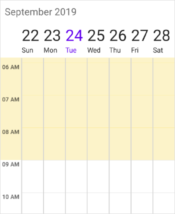
NOTE
TimeSlotBorderStrokeWidthand ` VerticalLineStrokeWidth` properties are common to both Working hours and Non-Working hour time slot customization.
Non-Accessible timeslots
You can restrict or allocate certain timeslot as Non-accessible blocks by usingNonAccessibleBlocks of WeekViewSettings so that you can allocate those timeslots for predefined events/activities like Lunch hour.
<schedule:SfSchedule x:Name="schedule" ScheduleView="WeekView">
	<!--setting non-accessing blocks-->
	<schedule:SfSchedule.WeekViewSettings>
		<schedule:WeekViewSettings>
			<schedule:WeekViewSettings.NonAccessibleBlocks>
				<schedule:NonAccessibleBlock
					 StartTime="13"
					 EndTime="14"
					 Text="LUNCH"
					 Color="Black" />
			</schedule:WeekViewSettings.NonAccessibleBlocks>
		</schedule:WeekViewSettings>
	</schedule:SfSchedule.WeekViewSettings>
</schedule:SfSchedule>schedule.ScheduleView = ScheduleView.WeekView;
//Create new instance of NonAccessibleBlock
NonAccessibleBlock nonAccessibleBlock = new NonAccessibleBlock();
//Create new instance of NonAccessibleBlocksCollection
NonAccessibleBlocksCollection nonAccessibleBlocksCollection = new NonAccessibleBlocksCollection();
WeekViewSettings weekViewSettings = new WeekViewSettings();
nonAccessibleBlock.StartTime = 13;
nonAccessibleBlock.EndTime = 14;
nonAccessibleBlock.Text = "LUNCH";
nonAccessibleBlock.Color = Color.Black;
nonAccessibleBlocksCollection.Add(nonAccessibleBlock);
weekViewSettings.NonAccessibleBlocks = nonAccessibleBlocksCollection;
schedule.WeekViewSettings = weekViewSettings;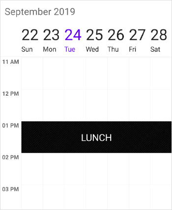
NOTE
Selection and related events will not be working in this blocks.
Change first day of week
By default, schedule control will be rendered with Sunday as the first day of the week, it can be customized to any day of the week by usingFirstDayOfWeek property of SfSchedule.
<schedule:SfSchedule x:Name="schedule" ScheduleView="WeekView" FirstDayOfWeek="3"/>schedule.ScheduleView = ScheduleView.WeekView;
schedule.FirstDayOfWeek = 3;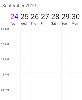
Time Label Formatting
You can customize the format for the labels which are mentioning the time, by setting TimeFormat property of WeekLabelSettings in WeekViewSettings.
schedule.ScheduleView = ScheduleView.WeekView;
WeekViewSettings weekViewSettings = new WeekViewSettings();
WeekLabelSettings weekLabelSettings = new WeekLabelSettings();
weekLabelSettings.TimeFormat = "hh mm";
weekViewSettings.WeekLabelSettings = weekLabelSettings;
schedule.WeekViewSettings = weekViewSettings;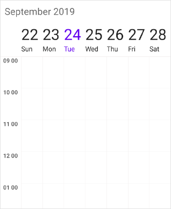
Time Label Appearance
You can customize the color for the labels which are mentioning the time, by setting TimeLabelColor property of WeekLabelSettings in WeekViewSettings.
schedule.ScheduleView = ScheduleView.WeekView;
//Create new instance of WeekViewSettings
WeekViewSettings weekViewSettings = new WeekViewSettings();
//Create new instance of WeekLabelSettings
WeekLabelSettings weekLabelSettings = new WeekLabelSettings();
weekLabelSettings.TimeLabelColor = Color.FromHex("#8282ff");
weekViewSettings.WeekLabelSettings = weekLabelSettings;
schedule.WeekViewSettings = weekViewSettings;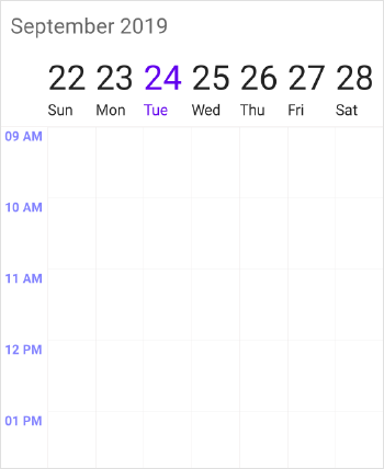
Customize time ruler label font
Change the appearance of the time ruler label font family and font attribute by setting the TimeLabelFontFamily and TimeLabelFontAttributes property of the WeekLabelSettings property in the WeekViewSettings.
<schedule:WeekViewSettings.WeekLabelSettings>
    <schedule:WeekLabelSettings TimeLabelFontAttributes="Bold">
        <schedule:WeekLabelSettings.TimeLabelFontFamily>
            <OnPlatform x:TypeArguments="x:String" iOS="Lobster-Regular" Android="Lobster-Regular.ttf" WinPhone="Assets/Lobster-Regular.ttf#Lobster" />
        </schedule:WeekLabelSettings.TimeLabelFontFamily>
    </schedule:WeekLabelSettings>
</schedule:WeekViewSettings.WeekLabelSettings>Schedule.WeekViewSettings.WeekLabelSettings.TimeLabelFontAttributes = FontAttributes.Bold;
Schedule.WeekViewSettings.WeekLabelSettings.TimeLabelFontFamily = Device.OnPlatform("Lobster-Regular", "Lobster-Regular.ttf", "Assets/Lobster-Regular.ttf#Lobster");NOTE
The FontAttributes and FontFamily are native to the platform. The custom font and the font that is not available in the specified platform will not be applied.
Time Label Size
Customize the size of the labels which are mentioning the time by setting the TimeLabelSize property of the WeekLabelSettings in the WeekViewSettings.
schedule.ScheduleView = ScheduleView.WeekView;
//Create new instance of WeekViewSettings
WeekViewSettings weekViewSettings = new WeekViewSettings();
//Create new instance of WeekLabelSettings
WeekLabelSettings weekLabelSettings = new WeekLabelSettings();
//Customizing the size of the time label
weekLabelSettings.TimeLabelSize = 15;
weekViewSettings.WeekLabelSettings = weekLabelSettings;
schedule.WeekViewSettings = weekViewSettings;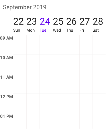
Time ruler size customization
You can customize the size of time ruler in WeekView by setting the TimeRulerSize property in WeekViewSettings.
<schedule:SfSchedule x:Name="schedule" ScheduleView="WeekView">
   <schedule:SfSchedule.WeekViewSettings>
        <schedule:WeekViewSettings TimeRulerSize="0"/>
   </schedule:SfSchedule.WeekViewSettings>
</schedule:SfSchedule>schedule.ScheduleView = ScheduleView.WeekView;
WeekViewSettings weekViewSettings = new WeekViewSettings();
wayViewSettings.TimeRulerSize = 0;
schedule.WeekViewSettings = weekViewSettings;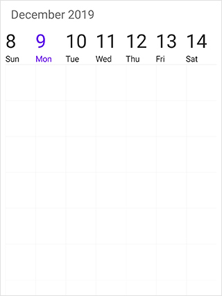
Selection
You can customize the default appearance of selection UI in the timeslots.
- Selection customization using style
- Selection customization using custom View
- Programmatic selection
Selection customization using style
You can customize the timeslot selection by using SelectionStyle property of SfSchedule.
<schedule:SfSchedule x:Name="schedule" ScheduleView="WeekView">
	<schedule:SfSchedule.SelectionStyle>
		  <schedule:SelectionStyle
			  BackgroundColor="Blue"
			  BorderColor="Black"
			  BorderThickness="5"
			  BorderCornerRadius="5">
		  </schedule:SelectionStyle>
	</schedule:SfSchedule.SelectionStyle>
</schedule:SfSchedule>schedule.ScheduleView = ScheduleView.WeekView;
//Create new instance of SelectionStyle
SelectionStyle selectionStyle = new SelectionStyle();
selectionStyle.BackgroundColor = Color.Blue;
selectionStyle.BorderColor = Color.Black;
selectionStyle.BorderThickness = 5;
selectionStyle.BorderCornerRadius = 5;
schedule.SelectionStyle = selectionStyle;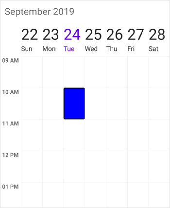
Selection customization using custom View
You can replace the default selection UI with your custom view by setting SelectionView property of SfSchedule.
<schedule:SfSchedule x:Name="schedule" ScheduleView="WeekView">
  <schedule:SfSchedule.SelectionView>
	   <Button
		   BackgroundColor="#FF9800"
		   Text="+NewEvent"
		   TextColor="White"/>
  </schedule:SfSchedule.SelectionView>
</schedule:SfSchedule>schedule.ScheduleView = ScheduleView.WeekView;
//Add the CustomView
Button customView = new Button();
customView.Text = "+NewEvent";
customView.BackgroundColor = Color.FromHex("#FF9800");
customView.TextColor = Color.White;
schedule.SelectionView = customView;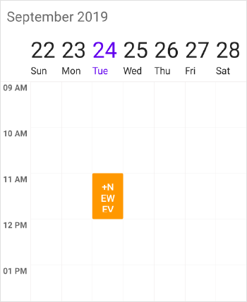
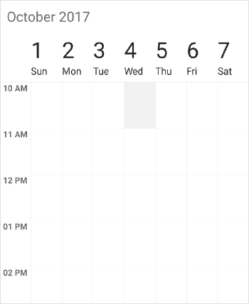
Programmatic selection
You can programmatically select the specific timeslot by setting corresponding date and time value to SelectedDate property of SfSchedule. By default, it is null.
// Setting a date and time to select
schedule.SelectedDate = new DateTime(2017, 10, 04, 10, 0, 0);
You can clear the selection by setting SelectedDate as null.
// Setting null value to deselect
schedule.SelectedDate = null;
You can download the entire source code of this demo for Xamarin.Forms from here
NOTE
SfScheduledoes not support multiple selection.SfSchedulesupports two-way binding ofSelectedDateproperty.
Current time indicator
You can display the current time indicator in WeekView by using the ShowCurrentTimeIndicator property. And you can also customize the color of current time indicator by using the CurrentTimeIndicatorColor property
<schedule:SfSchedule x:Name="schedule"
                                     ScheduleView = "WeekView"
                                     ShowCurrentTimeIndicator="true"
                                     CurrentTimeIndicatorColor="Black">
</schedule:SfSchedule>schedule.ScheduleView = ScheduleView.WeekView;
schedule.ShowCurrentTimeIndicator = true;
schedule.CurrentTimeIndicatorColor = Color.Black;NOTE
You can refer to our Xamarin Scheduler feature tour page for its groundbreaking feature representations. You can also explore our Xamarin Scheduler example to understand how to schedule and manage appointments.