Month View in Xamarin Scheduler (SfSchedule)
8 Jan 202524 minutes to read
MonthView of SfSchedule used to display entire dates of the specific month, current month will be displayed by default initially. Current date color is differentiated with other dates of the current month, also the color differentiation for dates will be applicable for previous and next month dates.
<schedule:SfSchedule x:Name="schedule"
                     ScheduleView="MonthView">
</schedule:SfSchedule>
//setting schedule view
schedule.ScheduleView = ScheduleView.MonthView;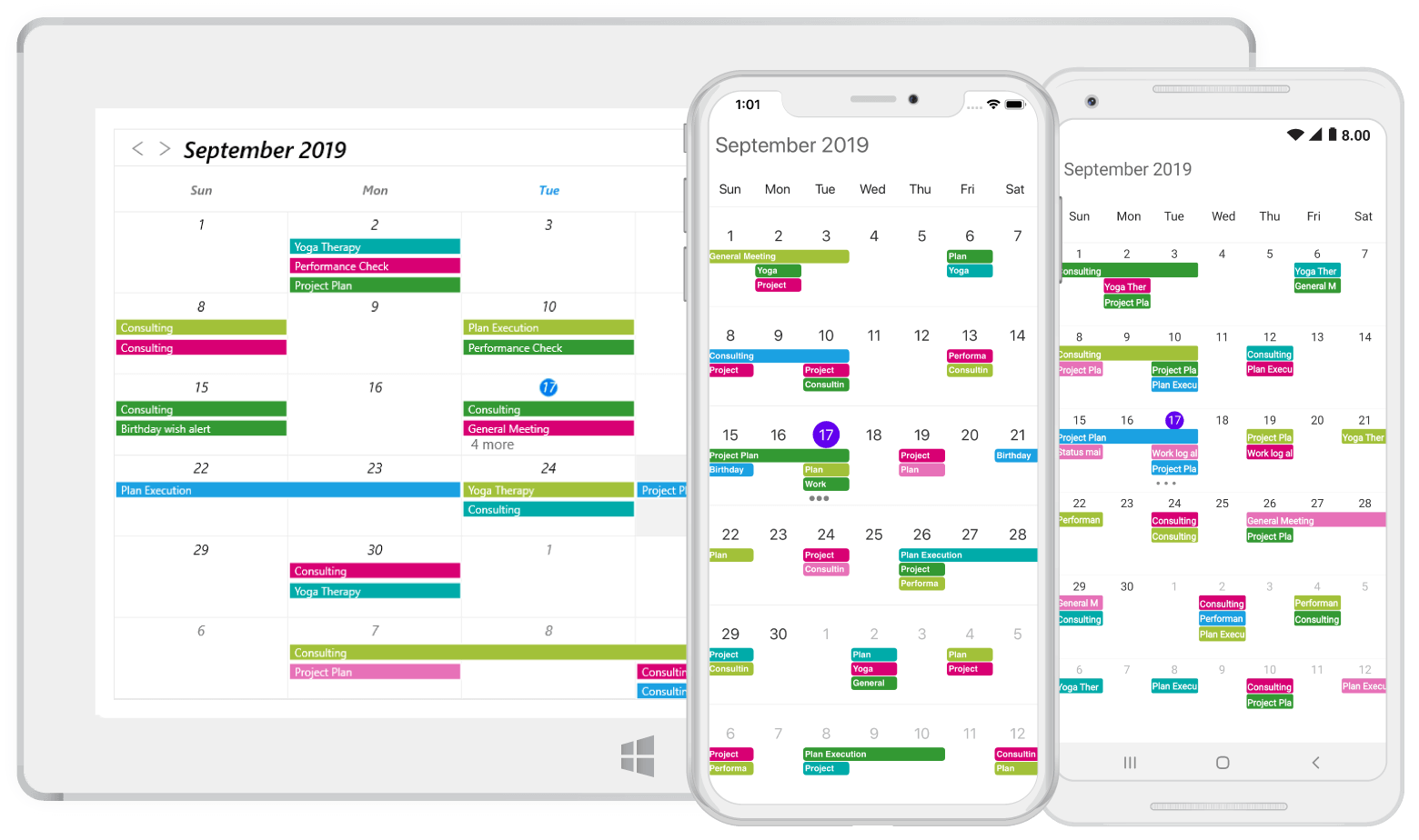
Month Appointment indicator
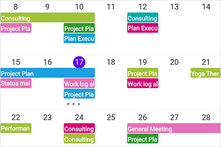
In MonthView, appointments are not viewed in the month cell instead appointment indicators are drawn. You can customize the number of appointment indicators displayed in month cell using AppointmentIndicatorCount property of MonthViewSettings in SfSchedule, by default Appointment indicator count is 3.
<schedule:SfSchedule x:Name="schedule" ScheduleView="MonthView">
    <schedule:SfSchedule.MonthViewSettings>
        <schedule:MonthViewSettings
                AppointmentIndicatorCount = "2" >
        </schedule:MonthViewSettings>
    </schedule:SfSchedule.MonthViewSettings>
</schedule:SfSchedule>
//creating new instance for MonthViewSettings
MonthViewSettings monthViewSettings = new MonthViewSettings();
monthViewSettings.AppointmentIndicatorCount = 2;
schedule.MonthViewSettings = monthViewSettings;NOTE
If appointments count are lesser than the AppointmentIndicatorCount value in the particular day, then according to number of appointments available, indicator will be displayed in the month cell.Maximum number of appointment indicators drawn in the month cell is 6 in android and ios platforms.
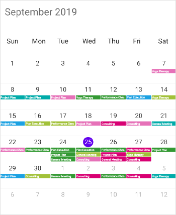
Month Appointment display mode
You can handle the schedule month view appointment display by using AppointmentDisplayMode property of MonthViewSettings. By default AppointmentDisplayMode is set as Indicator, using the AppointmentDisplayMode you can set the month view appointments display as follows.
Indicator - appointment will be denoted as the circle.
Appointment - appointment subject will be displayed in month cell.
None - appointment will not be displayed.
<schedule:SfSchedule x:Name="schedule" ScheduleView="MonthView">
    <schedule:SfSchedule.MonthViewSettings>
        <schedule:MonthViewSettings
            AppointmentDisplayMode="Appointment" >
        </schedule:MonthViewSettings>
    </schedule:SfSchedule.MonthViewSettings>
</schedule:SfSchedule>
MonthViewSettings monthViewSettings = new MonthViewSettings();
monthViewSettings.AppointmentDisplayMode = AppointmentDisplayMode.Appointment;
schedule.MonthViewSettings = monthViewSettings;NOTE
AppointmentDisplayMode.Noneis applicable only for XForms UWP and WPF platforms.
Month Appointment display count
AppointmentDisplayCount or AppointmentIndicatorCount is used to define the maximum number of appointments to be displayed in a month cell in month view. If AppointmentDisplayCount or AppointmentIndicatorCount value is 1 and the month cell have more than 1 appointments, single appointment will be displayed and remaining appointments in month cell will be displayed as more appointments.
NOTE
- The
AppointmentIndicatorCountsupport is applicable for XForms Android and iOS platforms.- The
AppointmentDisplayCountsupport is applicable for XForms UWP and WPF platforms.- By clicking more option, schedule navigates to the day view by default in XForms UWP and WPF platforms.
Disable navigation to DayView
You can disable the navigation to day view by triggering the CellTappedEvent and set the argument CancelNavigation value as true. IsMoreAppointments argument is used to determine whether the month cell more appointments count element has been tapped or not while the appointment display mode as Appointment.
monthViewSettings.AppointmentDisplayCount = 4;
monthViewSettings.AppointmentDisplayMode = AppointmentDisplayMode.Appointment;
schedule.CellTapped += Schedule_CellTapped;
private void Schedule_CellTapped(object sender, CellTappedEventArgs e)
{
	IsMoreElementTapped = e.IsMoreAppointments;
	e.CancelNavigation = true;
}
NOTE
CancelNavigationandIsMoreAppointmentsarguments applicable only for XForms UWP and WPF platform.
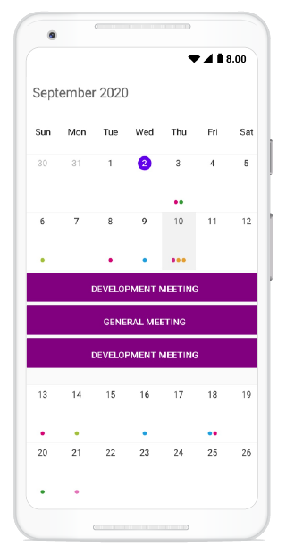
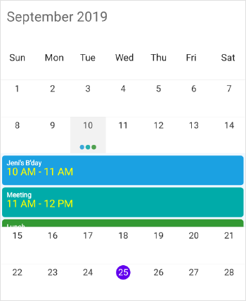
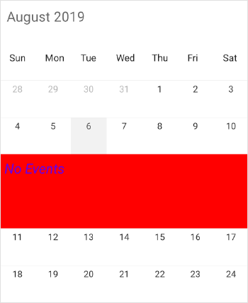
Month InlineView
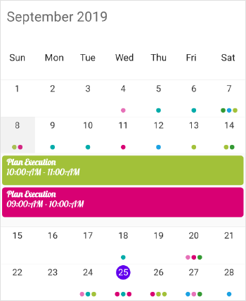
You can use ShowAppointmentsInline bool property in SfSchedule to enable / disable the month inline view, by setting ShowAppointmentsInline property as true you can view the Appointments in the specific date.
<schedule:SfSchedule
		x:Name="schedule"
		ScheduleView="MonthView"
		ShowAppointmentsInline="true">
</schedule:SfSchedule>schedule.ShowAppointmentsInline = true;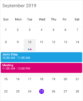
NOTE
If appointments not there in the selected day, Inline view displays the text as “No Events”
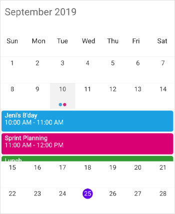
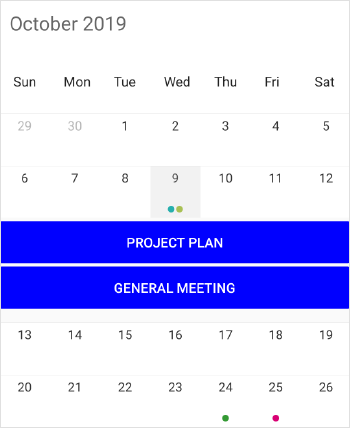
Agenda View
The Schedule month view displays a divided agenda view which is used to show the selected date’s appointments below the month. You can show agenda view by setting ShowAgendaView property as true.
<schedule:SfSchedule ScheduleView="MonthView">
	<schedule:SfSchedule.MonthViewSettings>
		<schedule:MonthViewSettings ShowAgendaView="true" />
	</schedule:SfSchedule.MonthViewSettings>
</schedule:SfSchedule>
SfSchedule schedule = new SfSchedule();
schedule.ScheduleView = ScheduleView.MonthView;
MonthViewSettings monthViewSettings = new MonthViewSettings();
monthViewSettings.ShowAgendaView = true;
schedule.MonthViewSettings = monthViewSettings;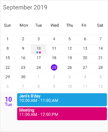
NOTE
- An agenda view displays text as “No Selected Date” until no date is selected.
- If there is no appointment in a selected day, agenda view displays the text as “No Events”.
- If you enable ShowAgendaView and ShowAppointmentsInline properties together, both of the views (Agenda View and Appointment Inline View) will be displayed in schedule month view.
- Agenda view appointments will be displayed in chronological order, such as spanning appointments, all day appointments and accompanied by regular appointments in chronological order.
Agenda View Appearance
You can customize the Agenda view appointment and Selected Date Text by setting AgendaViewStyle property of MonthViewSettings. Agenda view DateFontColor ,HeaderHeight, DateFormat , DateFontAttributes , DateFontSize , DateFontFamily , TimeFontColor , TimeFontSize , TimeFontAttributes , TimeFontFamily , TimeFormat , SubjectFontColor , SubjectFontSize , SubjectFontFamily , SubjectFontAttributes , BackgroundColor can be customized using AgendaViewStyle properties.
<schedule:SfSchedule ScheduleView="MonthView" x:Name="schedule">
    <schedule:SfSchedule.MonthViewSettings>
        <schedule:MonthViewSettings ShowAgendaView="true">
            <schedule:MonthViewSettings.AgendaViewStyle>
                <schedule:AgendaViewStyle DateFontColor="Purple" HeaderHeight="40" DateFormat="dd MMMM, yyyy" DateFontAttributes="Bold" DateFontSize="15" DateFontFamily="Arial" TimeFontColor="Red" TimeFontSize="13" TimeFontFamily="Arial" TimeFormat="hh a"
                    TimeFontAttributes="Bold" BackgroundColor="#DEF0DE" SubjectFontColor="Blue" SubjectFontSize="13" SubjectFontFamily="Arial" SubjectFontAttributes="Bold" />
            </schedule:MonthViewSettings.AgendaViewStyle>
        </schedule:MonthViewSettings>
    </schedule:SfSchedule.MonthViewSettings>
</schedule:SfSchedule>
SfSchedule schedule = new SfSchedule();
schedule.ScheduleView = ScheduleView.MonthView;
MonthViewSettings monthViewSettings = new MonthViewSettings();
monthViewSettings.ShowAgendaView = true;
schedule.MonthViewSettings = monthViewSettings;
AgendaViewStyle agendaViewStyle = new AgendaViewStyle();
// Customize selected Date Text
agendaViewStyle.DateFontColor = Color.Purple;
agendaViewStyle.HeaderHeight = 40;
agendaViewStyle.DateFormat = "dd MMMM, yyyy";
agendaViewStyle.DateFontAttributes = FontAttributes.Bold;
agendaViewStyle.DateFontSize = 15;
agendaViewStyle.DateFontFamily = "Arial";
// Customize appointment
agendaViewStyle.TimeFontColor = Color.Red;
agendaViewStyle.TimeFontSize = 13;
agendaViewStyle.TimeFontAttributes = FontAttributes.None;
agendaViewStyle.TimeFontFamily = "Arial";
agendaViewStyle.TimeFormat = "hh a";
agendaViewStyle.SubjectFontColor = Color.Blue;
agendaViewStyle.SubjectFontSize = 13;
agendaViewStyle.SubjectFontFamily = "Arial";
agendaViewStyle.SubjectFontAttributes = FontAttributes.None;
agendaViewStyle.BackgroundColor = Color.FromRgb(222, 240, 222);
schedule.MonthViewSettings.AgendaViewStyle = agendaViewStyle;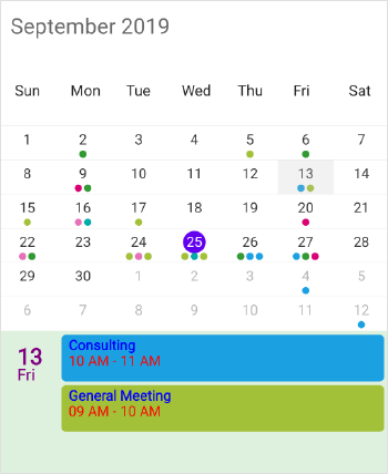
NOTE
Agenda View Appearance customization is not applicable for UWP and WPF platforms.
Agenda Item Template
The default appearance of the Appointment can be customized by using the AgendaItemTemplate property of the MonthViewSettings.
<schedule:SfSchedule x:Name="schedule" ScheduleView="MonthView">
	<schedule:SfSchedule.MonthViewSettings>
		<schedule:MonthViewSettings ShowAgendaView="True">
			<schedule:MonthViewSettings.AgendaItemTemplate>
				<DataTemplate>
					<Button BackgroundColor="Purple" Text="Template" TextColor="White" />
				</DataTemplate>
			</schedule:MonthViewSettings.AgendaItemTemplate>
		</schedule:MonthViewSettings>
	</schedule:SfSchedule.MonthViewSettings>
</schedule:SfSchedule>
SfSchedule schedule = new SfSchedule();
schedule.ScheduleView = ScheduleView.MonthView;
MonthViewSettings monthViewSettings = new MonthViewSettings();
monthViewSettings.ShowAgendaView = true;
monthViewSettings.AgendaItemTemplate = new DataTemplate(() =>
{
return new Button
{
Text = "Template",
TextColor = Color.White,
BackgroundColor = Color.Purple
};
});
schedule.MonthViewSettings = monthViewSettings;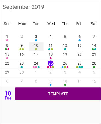
Customize inline items using AgendaView
You can customize the inline items using the AgendaItemTemplate property of the MonthViewSettings in schedule. You can show the inline view by setting the ShowAppointmentsInline property to true.
<schedule:SfSchedule x:Name="Schedule" DataSource="{Binding Meetings}" ScheduleView="MonthView" ShowAppointmentsInline="True">
    <schedule:SfSchedule.MonthViewSettings>
		<schedule:MonthViewSettings>
			<schedule:MonthViewSettings.AgendaItemTemplate>
				<DataTemplate>
					<Label BackgroundColor="Purple" Text="{Binding EventName}" TextColor="White" />
				</DataTemplate>
			</schedule:MonthViewSettings.AgendaItemTemplate>
		</schedule:MonthViewSettings>
	</schedule:SfSchedule.MonthViewSettings>
</schedule:SfSchedule>
SfSchedule Schedule = new SfSchedule();
schedule.ScheduleView = ScheduleView.MonthView;
Schedule.ShowAppointmentsInline = true;
MonthViewSettings monthViewSettings = new MonthViewSettings();
monthViewSettings.AgendaItemTemplate = new DataTemplate(() =>
{
var label = new Label();
label.SetBinding(Label.TextProperty, "EventName");
label.TextColor = Color.White;
label.BackgroundColor = Color.Purple;
return label;
});
Schedule.MonthViewSettings = monthViewSettings;Download the entire source code from GitHub here
Agenda item height
You can customize the agenda view appointment height by setting the ItemHeight in AgendaViewStyle property of MonthViewSettings.
<schedule:SfSchedule x:Name="schedule" ScheduleView="MonthView">
    <schedule:SfSchedule.MonthViewSettings>
       <schedule:MonthViewSettings ShowAgendaView="true">
          <schedule:MonthViewSettings.AgendaViewStyle>
                schedule:AgendaViewStyle ItemHeight="100"/>
          </schedule:MonthViewSettings.AgendaViewStyle>
       </schedule:MonthViewSettings>
    </schedule:SfSchedule.MonthViewSettings>
</schedule:SfSchedule>schedule.ScheduleView = ScheduleView.MonthView;
MonthViewSettings monthViewSettings = new MonthViewSettings();
monthViewSettings.ShowAgendaView = true;
schedule.MonthViewSettings = monthViewSettings;
AgendaViewStyle agendaViewStyle = new AgendaViewStyle();
agendaViewStyle.ItemHeight = 100;
schedule.MonthViewSettings.AgendaViewStyle = agendaViewStyle;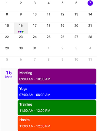
Agenda view height
You can customize the height of agenda view in MonthView by using the AgendaViewHeight property in MonthViewSettings.
<schedule:SfSchedule x:Name="schedule" ScheduleView="MonthView">
   <schedule:SfSchedule.MonthViewSettings>
        <schedule:MonthViewSettings ShowAgendaView="True" AgendaViewHeight="300"/>
   </schedule:SfSchedule.MonthViewSettings>
</schedule:SfSchedule>schedule.ScheduleView = ScheduleView.MonthView;
MonthViewSettings monthViewSettings = new MonthViewSettings();
monthViewSettings.AgendaViewHeight = 300;
schedule.MonthViewSettings = monthViewSettings;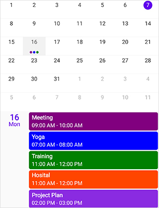
Agenda View Using Template Selector
AgendaTemplateSelector can be used to choose a DataTemplate at runtime based on the value of a data-bound to agenda appointment property through AgendaItemTemplate. It lets you choose a different data template for each appointment, customizing the appearance of a particular inline appointment based on certain conditions. DataTemplateSelector for inline appointment includes ScheduleAppointment or custom appointment as object and Schedule as bindable object.
<ContentPage.Resources>
	<ResourceDictionary>
		<local:AgendaTemplateSelector x:Key="AgendaTemplateSelector" />
	</ResourceDictionary>
</ContentPage.Resources>
<schedule:SfSchedule x:Name="schedule" ScheduleView="MonthView">
	<schedule:SfSchedule.MonthViewSettings>
		<schedule:MonthViewSettings ShowAgendaView="True" AgendaItemTemplate="{StaticResource AgendaTemplateSelector}">
		</schedule:MonthViewSettings>
	</schedule:SfSchedule.MonthViewSettings>
</schedule:SfSchedule>public class AgendaTemplateSelector : DataTemplateSelector
{
public DataTemplate DayAppointmentTemplate { get; set; }
public DataTemplate AllDayAppointmentTemplate { get; set; }
public AgendaTemplateSelector()
{
DayAppointmentTemplate = new DataTemplate(typeof(DayTemplate));
AllDayAppointmentTemplate = new DataTemplate(typeof(AllDayTemplate));
}
protected override DataTemplate OnSelectTemplate(object item, BindableObject container)
{
var schedule = (container as SfSchedule);
if (schedule == null) return null;
if ((item as ScheduleAppointment).IsAllDay)
return AllDayAppointmentTemplate;
else
return DayAppointmentTemplate;
}
}Used button to display day appointment and all day appointment.
<?xml version="1.0" encoding="UTF-8"?>
<Button
	xmlns="http://xamarin.com/schemas/2014/forms"
	xmlns:x="http://schemas.microsoft.com/winfx/2009/xaml"
	x:Class="SchPreview.DayTemplate"
	HorizontalOptions="FillAndExpand"
	VerticalOptions="FillAndExpand"
	BackgroundColor="{Binding Color}"
	Text="{Binding Subject}"
	FontAttributes="Bold"
	FontSize="15"
	TextColor="White">
</Button><?xml version="1.0" encoding="UTF-8"?>
<Button
xmlns="http://xamarin.com/schemas/2014/forms"
xmlns:x="http://schemas.microsoft.com/winfx/2009/xaml"
x:Class="SchPreview.AllDayTemplate"
HorizontalOptions="FillAndExpand"
VerticalOptions="FillAndExpand"
BackgroundColor="{Binding Color}"
Text="{Binding Subject}"
FontAttributes="Bold"
FontSize="15"
TextColor="Black">
</Button>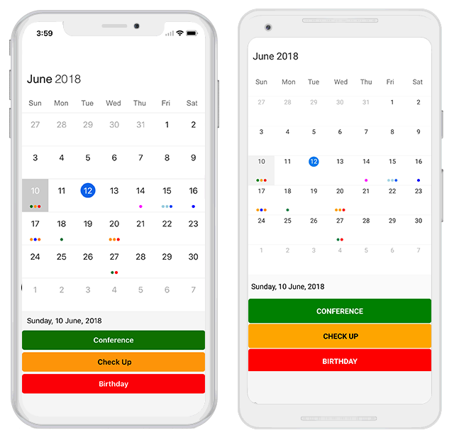
Month Navigation direction
MonthView of Schedule can be navigated in both horizontal and vertical direction. You can change the direction of navigation through MonthNavigationDirection property of MonthViewSettings in SfSchedule, by default Month navigation direction is Horizontal.
<schedule:SfSchedule x:Name="schedule" ScheduleView="MonthView">
    <schedule:SfSchedule.MonthViewSettings>
        <schedule:MonthViewSettings
                MonthNavigationDirection="Vertical">
        </schedule:MonthViewSettings>
    </schedule:SfSchedule.MonthViewSettings>
</schedule:SfSchedule>
//creating new instance for MonthViewSettings
MonthViewSettings monthViewSettings = new MonthViewSettings();
//To navigate vertically
monthViewSettings.MonthNavigationDirection = MonthNavigationDirections.Vertical;
schedule.MonthViewSettings = monthViewSettings;Restricted days in Month
You can disable the interaction for certain date in Month view by using BlackoutDates of MonthViewSettings, using this you can allocate / restrict the specific date for predefined events.
//creating new instance for MonthViewSettings
MonthViewSettings monthViewSettings = new MonthViewSettings();
ObservableCollection<DateTime> blackoutDateCollection = new ObservableCollection<DateTime>();

DateTime blockedDate1 = DateTime.Now.Date.AddDays(1);
DateTime blockedDate2 = DateTime.Now.Date.AddDays(2);
DateTime blockedDate3 = DateTime.Now.Date.AddDays(3);
DateTime blockedDate4 = DateTime.Now.Date.AddDays(4);
DateTime blockedDate5 = DateTime.Now.Date.AddDays(5);

blackoutDateCollection.Add(blockedDate1);
blackoutDateCollection.Add(blockedDate2);
blackoutDateCollection.Add(blockedDate3);
blackoutDateCollection.Add(blockedDate4);
blackoutDateCollection.Add(blockedDate5);
monthViewSettings.BlackoutDates = blackoutDateCollection;
schedule.MonthViewSettings = monthViewSettings;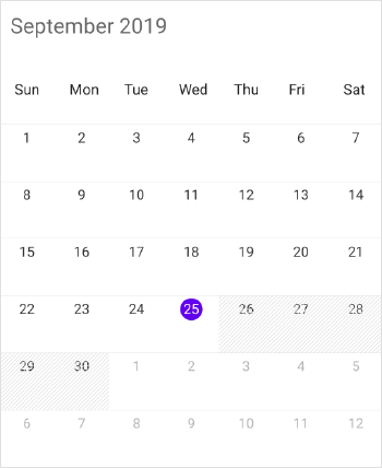
First day of Week in Month
You can set First day of week using FirstDayOfWeek property of SfSchedule, by default schedule control will rendered with Sunday as the first day of the week.
<schedule:SfSchedule
			x:Name="schedule"
			FirstDayOfWeek="3"
			ScheduleView="MonthView">
</schedule:SfSchedule>
//setting FirstDayOfWeek
schedule.FirstDayOfWeek = 3; // Tuesday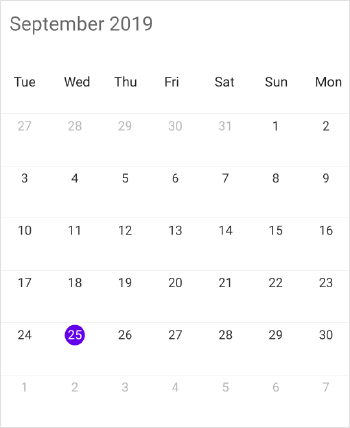
Week Number of the Year in Month
You can display the Week Number of the year in MonthView by setting ShowWeekNumber property of MonthViewSettings as true, by default it is false.
<schedule:SfSchedule x:Name="schedule" ScheduleView="MonthView">
    <schedule:SfSchedule.MonthViewSettings>
        <schedule:MonthViewSettings
                    ShowWeekNumber="true">
        </schedule:MonthViewSettings>
    </schedule:SfSchedule.MonthViewSettings>
</schedule:SfSchedule>monthViewSettings.ShowWeekNumber = true;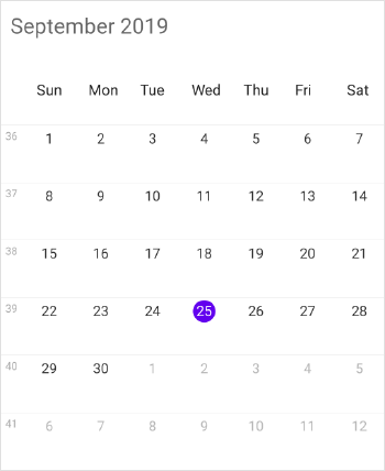
Week Number Appearance
You can customize the Week Number appearance by using WeekNumberStyle property of MonthViewSettings. Week number BackgroundColor, TextColor, FontFamily, FontSize, FontAttributes can be customized using WeekNumberStyle properties.
//creating new instance for WeekNumberStyle
WeekNumberStyle weekNumberStyle = new WeekNumberStyle();
weekNumberStyle.FontFamily = "Arial";
weekNumberStyle.FontSize = 15;
weekNumberStyle.FontAttributes = FontAttributes.None;
weekNumberStyle.BackgroundColor = Color.Blue;
weekNumberStyle.TextColor = Color.White;
monthViewSettings.WeekNumberStyle = weekNumberStyle;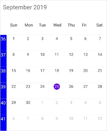
View Header Appearance
You can customize the View Header appearance by using ViewHeaderStyle property in SfSchedule. View Header BackgroundColor, DayTextColor and DayFontFamily can be customized using ViewHeaderStyle properties.
<schedule:SfSchedule x:Name="schedule" ScheduleView="MonthView">
    <schedule:SfSchedule.ViewHeaderStyle>
        <schedule:ViewHeaderStyle
                    BackgroundColor="Blue"
                    DayTextColor="White"
                    DayFontFamily="Arial">
        </schedule:ViewHeaderStyle>
    </schedule:SfSchedule.ViewHeaderStyle>
</schedule:SfSchedule>
//creating new instance for viewHeaderStyle
ViewHeaderStyle viewHeaderStyle = new ViewHeaderStyle();
viewHeaderStyle.BackgroundColor = Color.Blue;
viewHeaderStyle.DayTextColor = Color.White;
viewHeaderStyle.DayFontFamily = "Arial";
schedule.ViewHeaderStyle = viewHeaderStyle;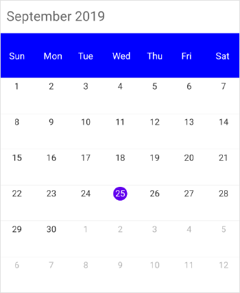
NOTE
FontAttributes and FontFamily are native to the platform. Custom font and the font which are not available in the specified platform will not be applied.
ViewHeader Date Format
You can customize the date and day format of SfSchedule ViewHeader by using DateFormat and DayFormat properties of MonthLabelSettings.
<schedule:SfSchedule>
    <schedule:SfSchedule.MonthViewSettings>
        <schedule:MonthViewSettings>
            <schedule:MonthViewSettings.MonthLabelSettings>
                <schedule:MonthLabelSettings DateFormat=“dd”>
                    <schedule:MonthLabelSettings.DayFormat>
                        <OnPlatform x:TypeArguments="x:String"
                                    iOS="EEEE"
                                    Android="EEEE"
                                    WinPhone="dddd" />
                    </schedule:MonthLabelSettings.DayFormat>
                </schedule:MonthLabelSettings>
            </schedule:MonthViewSettings.MonthLabelSettings>
        </schedule:MonthViewSettings>
    </schedule:SfSchedule.MonthViewSettings>
</schedule:SfSchedule>schedule.ScheduleView = ScheduleView.MonthView;
//Creating new instance of MonthViewSettings
MonthViewSettings monthViewSettings = new MonthViewSettings();
//Creating new instance of MonthLabelSettings
MonthLabelSettings monthLabelSettings = new MonthLabelSettings();
//Customizing date format
monthLabelSettings.DateFormat = "dd";
monthLabelSettings.DayFormat = Device.OnPlatform("EEEE", "EEEE", "dddd");
monthViewSettings.MonthLabelSettings = monthLabelSettings;
schedule.MonthViewSettings = monthViewSettings;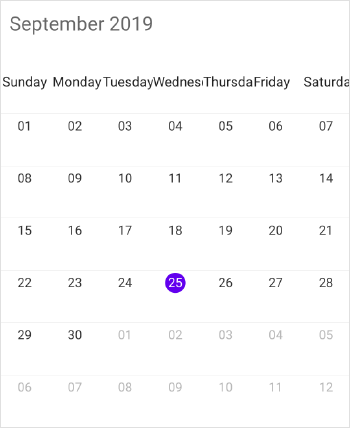
ViewHeader Tapped Event
You can handle single tap action of ViewHeader by using ViewHeaderTapped event of SfSchedule. This event will be triggered when the ViewHeader is Tapped. This event contains ViewHeaderTappedEventArgs argument which holds DateTime details in it.
<schedule:SfSchedule x:Name="schedule"
				 ScheduleView="MonthView"
				 ViewHeaderTapped="Handle_ViewHeaderTapped" >
</schedule:SfSchedule>
//Creating new instance of Schedule
SfSchedule schedule = new SfSchedule();
schedule.ScheduleView = ScheduleView.MonthView;
schedule.ViewHeaderTapped += Handle_ViewHeaderTapped;private void Handle_ViewHeaderTapped(object sender, ViewHeaderTappedEventArgs e)
{
var dateTime = e.DateTime;
}MonthCell Appearance
You can customize the Month view cell in three ways,
- Customize month cell using style
- Customize month cell using event
- Customize month cell with custom UI
- Customize month cell using DataTemplate
- Customize month cell using DataTemplateSelector
Customize month cell using style
By using MonthCellStyle of SfSchedule you can customize the month cell properties such as BackgroundColor, NextMonthBackgroundColor, NextMonthTextColor, PreviousMonthBackgroundColor, PreviousMonthTextColor, TextColor, FontSize, FontAttributes, FontFamily, TodayBackgroundColor, TodayTextColor.
<schedule:SfSchedule.MonthCellStyle>
    <schedule:MonthViewCellStyle
                BackgroundColor="#8282ff"
                TextColor="Orange"
                FontSize="20"
                FontFamily = "Arial"
                FontAttributes = "None"
                NextMonthBackgroundColor="Gray"
                NextMonthTextColor="Gray"
                PreviousMonthBackgroundColor="White"
                PreviousMonthTextColor="Gray"
                TodayBackgroundColor="#f97272"
                TodayTextColor="White">
    </schedule:MonthViewCellStyle>
</schedule:SfSchedule.MonthCellStyle>
//MonthCell Appearance
MonthViewCellStyle monthCellStyle = new MonthViewCellStyle();
monthCellStyle.BackgroundColor = Color.FromHex("#8282ff");
monthCellStyle.NextMonthBackgroundColor = Color.White;
monthCellStyle.NextMonthTextColor = Color.Gray;
monthCellStyle.PreviousMonthBackgroundColor = Color.White;
monthCellStyle.PreviousMonthTextColor = Color.Gray;
monthCellStyle.TextColor = Color.Orange;
monthCellStyle.FontFamily = "Arial";
monthCellStyle.FontSize = 20;
monthCellStyle.FontAttributes = FontAttributes.None;
monthCellStyle.TodayBackgroundColor = Color.FromHex("#f97272");
monthCellStyle.TodayTextColor = Color.White;
schedule.MonthCellStyle = monthCellStyle;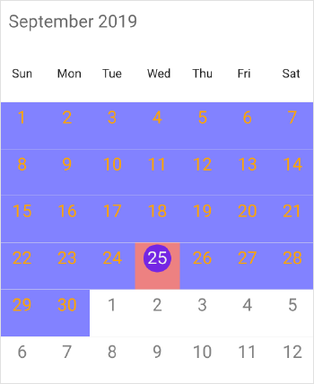
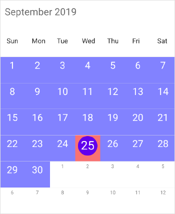
Customize month cell using event
By using OnMonthCellLoadedEvent in SfSchedule, you can customize the month cell properties in the run time. In OnMonthCellLoadedEvent, arguments such as cellStyle, appointments, date, view and boolean properties such as isToday, isNextMonthDate, isPreviousMonthDate and isBlackOutDate are in the MonthCellLoadedEventArgs.
You can customize the month cell appearance in run time by setting TextColor, FontSize, FontFamily, FontAttributes, and BackgroundColor properties of cellStyle argument in MonthCellLoadedEventArgs.
schedule.OnMonthCellLoadedEvent += Schedule_OnMonthCellLoadedEvent;

...

private void Schedule_OnMonthCellLoadedEvent(object sender, MonthCellLoadedEventArgs args)
{
	args.cellStyle = new CellStyle();
	if (args.isToday)
	{
		args.cellStyle.BackgroundColor = Color.FromHex("#f97272");
		args.cellStyle.TextColor = Color.White;
		args.cellStyle.FontFamily = "Arial";
		args.cellStyle.FontSize = 25;
	}
	else if (args.isNextMonthDate)
	{
		args.cellStyle.BackgroundColor = Color.White;
		args.cellStyle.TextColor = Color.Gray;
		args.cellStyle.FontFamily = "Arial";
		args.cellStyle.FontSize = 10;
	}
	else if (args.isPreviousMonthDate)
	{
		args.cellStyle.BackgroundColor = Color.White;
		args.cellStyle.TextColor = Color.Gray;
		args.cellStyle.FontFamily = "Arial";
		args.cellStyle.FontSize = 10;
	}
	else
	{
		args.cellStyle.BackgroundColor = Color.FromHex("#8282ff");
		args.cellStyle.TextColor = Color.White;
		args.cellStyle.FontFamily = "Arial";
		args.cellStyle.FontSize = 20;
	}
}
NOTE
FontAttributes and FontFamily are native to the platform. Custom font and the font which are not available in the specified platform will not be applied.
Customize month cell with custom UI
You can set the Custom UI for the month cell using view property of MonthCellLoadedEventArgs in the OnMonthCellLoadedEvent.
schedule.OnMonthCellLoadedEvent += Schedule_OnMonthCellLoadedEvent;

...

private void Schedule_OnMonthCellLoadedEvent(object sender, MonthCellLoadedEventArgs args)
{
	Button button = new Button();
	button.Text = args.date.Day.ToString();
	button.BackgroundColor = Color.Blue;
	button.TextColor = Color.White;
	args.view = button;
	if (args.isToday)
	{
		button.BackgroundColor = Color.Red;
		button.TextColor = Color.White;
	}
}
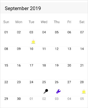
Customize month cell using DataTemplate
You can customize the default appearance of the month cell by using the MonthCellTemplate property of MonthViewSettings.
<schedule:SfSchedule
x:Name="schedule" ScheduleView="MonthView">
	<schedule:SfSchedule.MonthViewSettings>
		<schedule:MonthViewSettings>
			<schedule:MonthViewSettings.MonthCellTemplate>
				<DataTemplate>
					<Label BackgroundColor = "Purple" TextColor="White" Text="{Binding Date, StringFormat='{0:dd}'}"/>
				</DataTemplate>
			</schedule:MonthViewSettings.MonthCellTemplate>
		</schedule:MonthViewSettings>
	</schedule:SfSchedule.MonthViewSettings>
</schedule:SfSchedule>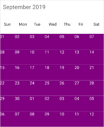
Customize month cell using DataTemplateSelector
You can use DataTemplateSelector to choose a DataTemplate at runtime based on the value of a data-bound to Schedule month cell through MonthCellTemplate. It lets you choose a different data template for each month cell, customizing the appearance of a particular month cell based on certain conditions. DataTemplateSelector for month cell includes MonthCellItem as object item and Schedule as bindable object. MonthCellItem consists of following properties, Date, Appointments, IsLeadingDay, IsTrailingDay, IsBlockOutDay.
<ContentPage.Resources>
	<ResourceDictionary>
		 <samplelocal:MonthCellDataTemplateSelector x:Key="monthCellDataTemplateSelector" />
	</ResourceDictionary>
</ContentPage.Resources>

<ContentPage.Content>
	<schedule:SfSchedule ScheduleView="MonthView" >
	<schedule:SfSchedule.MonthViewSettings>
		<schedule:MonthViewSettings x:Name="monthViewSettings"
			MonthCellTemplate="{StaticResource monthCellDataTemplateSelector}" />
		</schedule:SfSchedule.MonthViewSettings>
	</schedule:SfSchedule>
</ContentPage.Content>
Creating a DataTemplateSelector
public class MonthCellDataTemplateSelector : DataTemplateSelector
{
	public DataTemplate MonthAppointmentTemplate { get; set; }
	public DataTemplate MonthCellDatesTemplate { get; set; }

	public MonthCellDataTemplateSelector()
	{
		MonthAppointmentTemplate = new DataTemplate(typeof(MonthAppointmentTemplate));
		MonthCellDatesTemplate = new DataTemplate(typeof(MonthCellDatesTemplate));
	}
	protected override DataTemplate OnSelectTemplate(object item, BindableObject container)
	{
		var sfSchedule = (container as Syncfusion.SfSchedule.XForms.SfSchedule);
		if (sfSchedule == null) return null;
		if (sfSchedule != null)
		{
		var appointments = (IList)(item as MonthCellItem).Appointments;

		foreach (var appointment in appointments)
		{
			CustomizationViewModel.ScheduleAppointment = appointment as ScheduleAppointment;
			return MonthAppointmentTemplate;
		}
			CustomizationViewModel.MonthCellItem = item as MonthCellItem;
			return MonthCellDatesTemplate;
		}
		else
			return null;
	}
}
Used Label to display current ,next and previous month cell dates and StackLayout with label and image to denote the month cell with appointments.
<?xml version="1.0" encoding="UTF-8"?>
<!--Label as Template to display month dates-->
<Label xmlns="http://xamarin.com/schemas/2014/forms"
	xmlns:x="http://schemas.microsoft.com/winfx/2009/xaml"
	x:Class="MonthCellTemplate_Forms.CurrentViewDatesTemplate"
	xmlns:samplelocal="clr-namespace:MonthCellTemplate_Forms;assembly=MonthCellTemplate_Forms"
	BackgroundColor ="Transparent" FontSize="13" TextColor="Black"
	Text = "{Binding Date, StringFormat='{0:dd}'}">
	<Label.Behaviors>
		<samplelocal:MonthCellDateBehavior />
	</Label.Behaviors>
</Label>

	.....

<?xml version="1.0" encoding="UTF-8"?>
<!--StackLayout with Label and Image as Template to display month cell with appointment-->
<StackLayout xmlns="http://xamarin.com/schemas/2014/forms"
	xmlns:x="http://schemas.microsoft.com/winfx/2009/xaml"
	x:Class="MonthCellTemplate_Forms.MonthAppointmentTemplate"
	BackgroundColor="Transparent" Orientation="Vertical"
	xmlns:samplelocal="clr-namespace:MonthCellTemplate_Forms;assembly=MonthCellTemplate_Forms"
	VerticalOptions="FillAndExpand" HorizontalOptions="FillAndExpand">

	<Label x:Name="label" Text="{Binding Date, StringFormat='{0:dd}'}" VerticalOptions="FillAndExpand" HorizontalOptions="FillAndExpand">
		<Label.FontSize>
		<OnPlatform x:TypeArguments="x:Double" iOS="15" Android="13" WinPhone="13" />
		</Label.FontSize>
	</Label>

	<Image x:Name="Image" BackgroundColor="Transparent" Margin="15,0,0,0" HorizontalOptions="Start" VerticalOptions="Start" HeightRequest="40" WidthRequest="20" >
	</Image>

	<StackLayout.Behaviors>
	<samplelocal:MonthCellCustomViewBehavior />
	</StackLayout.Behaviors>
</StackLayout>public class MonthCellDateBehavior : Behavior<Label>
{
protected override void OnAttachedTo(Label bindable)
{
base.OnAttachedTo(bindable);
if (CustomizationViewModel.MonthCellItem == null)
return;
if (CustomizationViewModel.MonthCellItem.IsLeadingDay || CustomizationViewModel.MonthCellItem.IsTrailingDay)
{
bindable.TextColor = Color.Gray;
}
else
{
bindable.TextColor = Color.Black;
}
}
}
Getting Inline Appointment details
Using Appointment argument in the MonthInlineAppointmentTappedEventArgs of MonthInlineAppointmentTapped event, you can get the Month Inline Appointments details while tapping the specific appointment, and you can get the selected date by using the selectedDate property. MonthInlineAppointmentTapped also trigger while tapping the No Events view in inline. You can do the required functions while tapping the inline appointment using this event.
schedule.MonthInlineAppointmentTapped += Schedule_MonthInlineAppointmentTapped;

...

private void Schedule_MonthInlineAppointmentTapped(object sender, MonthInlineAppointmentTappedEventArgs args)
{
    if (args.Appointment != null)
    {
        var appointment = (args.Appointment as ScheduleAppointment);
        DisplayAlert(appointment.Subject, appointment.StartTime.ToString(), "ok");
    }
    else
    {
        DisplayAlert("", "No Events", "ok");
    }
}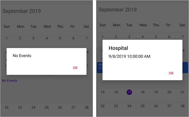
NOTE
The
MonthInlineAppointmentTappedis also applicable for AgendaView.
InlineView Appearance
You can customize the inline view with two ways,
- Using style
- Using custom view
Using style
You can customize the month inline view by setting the MonthInlineViewStyle properties such as Background, TextColor, FontSize, FontAttributes, FontFamily, TimeTextColor, TimeTextSize, and TimeTextFormat at runtime using OnMonthInlineLoadedEvent in SfSchedule. By using OnMonthInlineLoadedEvent you can get arguments such asmonthInlineViewStyle, appointments, selectedDate in the MonthInlineLoadedEventArgs.
schedule.OnMonthInlineLoadedEvent += Schedule_OnMonthInlineLoadedEvent;

...

private void Schedule_OnMonthInlineLoadedEvent(object sender, MonthInlineLoadedEventArgs args)
{
    var appointments = e.appointments.Cast<ScheduleAppointment>().ToList();
            MonthInlineViewStyle monthInlineViewStyle = new MonthInlineViewStyle();
            if (appointments != null && appointments.Count > 0)
            {
                monthInlineViewStyle.BackgroundColor = Color.AliceBlue;
                monthInlineViewStyle.TextColor = Color.White;
                monthInlineViewStyle.FontSize = 10;
                monthInlineViewStyle.FontAttributes = FontAttributes.None;
                monthInlineViewStyle.FontFamily = "Times New Roman";
                monthInlineViewStyle.TimeTextColor = Color.Yellow;
                monthInlineViewStyle.TimeTextSize = 15;
                monthInlineViewStyle.TimeTextFormat = "hh a";
            }
            else
            {
                // Style to customize the No Events label
                monthInlineViewStyle.BackgroundColor = Color.Red;
                monthInlineViewStyle.FontAttributes = FontAttributes.Italic;
                monthInlineViewStyle.FontFamily = "Times New Roman";
                monthInlineViewStyle.TimeTextColor = Color.White;
                monthInlineViewStyle.TimeTextSize = 20;
            }

            e.monthInlineViewStyle = monthInlineViewStyle;
}
Get the complete sample for this here.
NOTE
FontAttributes and FontFamily are native to the platform. Custom font and the font which are not available in the specified platform will not be applied.
Using custom view
You can set custom view for the inline view by using InlineView property of Schedule
SfSchedule schedule = new SfSchedule();
            Button button = new Button();
            button.BackgroundColor = Color.Red;
            button.Text = "No Event";
            button.TextColor = Color.White;
schedule.InlineView = button;<schedule:SfSchedule x:Name="schedule" ScheduleView="MonthView" ShowAppointmentsInline="True">
<schedule:SfSchedule.InlineView>
<Button BackgroundColor="Red" Text="No Events" TextColor="White"/>
</schedule:SfSchedule.InlineView>
</schedule:SfSchedule>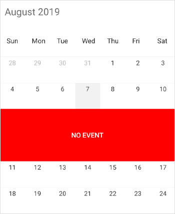
InlineAppointment Appearance
You can customize the Month inline view Appointment by using OnMonthInlineAppointmentLoadedEvent in SfSchedule, using view of MonthInlineAppointmentLoadedEventArgs argument. You can get the details of Appointment in the appointment argument.
schedule.OnMonthInlineAppointmentLoadedEvent += Schedule_OnMonthInlineAppointmentLoadedEvent;

...

private void Schedule_OnMonthInlineAppointmentLoadedEvent(object sender, MonthInlineAppointmentLoadedEventArgs args)
{
	var appointment = (args.appointment as ScheduleAppointment);
	Button button = new Button();
	button.Text = appointment.Subject;
	button.BackgroundColor = Color.Blue;
	button.TextColor = Color.White;
	args.view = button;
}
NOTE
Inline view customization - There is no support for inline view appointments customization using TimeTextSize, TimeTextFormat and TimeTextColor properties in XForms UWP and WPF platforms.
Selection
You can customize the default appearance of selection UI in the month cells.
- Selection text color customization
- Selection indicator color customization
- Selection customization using style
- Selection customization using custom View
- Programmatic selection
Selection text color customization
Month cell Selection Text Color can be customized using SelectionTextColor property of MonthViewSettings.
<schedule:SfSchedule x:Name="schedule" ScheduleView="MonthView">
    <schedule:SfSchedule.MonthViewSettings>
        <schedule:MonthViewSettings
                SelectionTextColor="Red" >
        </schedule:MonthViewSettings>
    </schedule:SfSchedule.MonthViewSettings>
</schedule:SfSchedule>
//creating new instance for MonthViewSettings
MonthViewSettings monthViewSettings = new MonthViewSettings();
monthViewSettings.SelectionTextColor = Color.Red;
schedule.MonthViewSettings = monthViewSettings;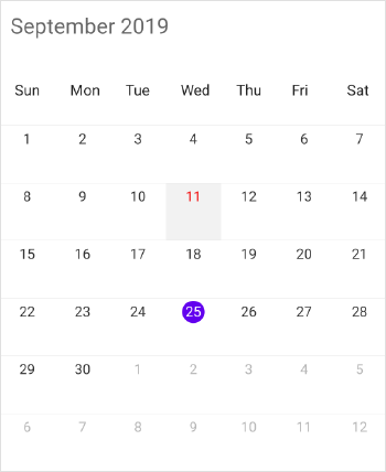
Selection indicator color customization
Month cell selection indicator color can be customized using SelectionIndicatorColor property of MonthViewSettings in Xamarin.iOS (Native). You can achieve the same in Xamarin.Forms by setting the required color to SelectionIndicatorColor property of the Xamarin.Forms (iOS) project using reflection.
public override bool FinishedLaunching(UIApplication app, NSDictionary options)
{
    global::Xamarin.Forms.Forms.Init();
    LoadApplication(new App());
    SfScheduleRenderer.Init();

    // Here ScheduleSamplePage is the Schedule rendered page in PCL
    // FormsSfSchedule is initialized public static SfSchedule in the ScheduleSamplePage
    ScheduleSamplePage.FormsSfSchedule.SelectionStyle.BackgroundColor = Color.Transparent;
    ScheduleSamplePage.FormsSfSchedule.CellTapped += FormsSchedule_CellTapped;

    return base.FinishedLaunching(app, options);
}

private void FormsSchedule_CellTapped(object sender, Syncfusion.SfSchedule.XForms.CellTappedEventArgs e)
{
	// Gets the field nativeObject from SfSchedule by using reflection
    // GetType() used to get the type of schedule instance
    var fieldInfo = GetField(SelectionSamplePage.FormsSfSchedule.GetType(), "nativeObject");
    // Gets the value of nativeObject field by using reflection
    var fieldInfo = GetField(SelectionSamplePage.FormsSfSchedule.GetType(), "nativeObject");
    var nativeSchedule = fieldInfo.GetValue(SelectionSamplePage.FormsSfSchedule);
    var monthViewSettings = new Syncfusion.SfSchedule.iOS.MonthViewSettings();
    // Setting Month cell selection indicator color
    monthViewSettings.SelectionIndicatorColor = UIColor.Red;
    (nativeSchedule as SFSchedule).MonthViewSettings = monthViewSettings;
}
NOTE
This support won’t apply for current day indicator, you can use TodayBackgroundColor property to customize it.
Selection customization using style
You can customize the month cell selection by using SelectionStyle property of SfSchedule.
<schedule:SfSchedule x:Name="schedule" ScheduleView="MonthView">
	<schedule:SfSchedule.SelectionStyle>
		<schedule:SelectionStyle
			BackgroundColor="Blue"
			BorderColor="Black"
			BorderThickness="5"
			BorderCornerRadius="5">
		</schedule:SelectionStyle>
	</schedule:SfSchedule.SelectionStyle>
</schedule:SfSchedule>schedule.ScheduleView = ScheduleView.MonthView;
//Create new instance of SelectionStyle
SelectionStyle selectionStyle = new SelectionStyle();
selectionStyle.BackgroundColor = Color.Blue;
selectionStyle.BorderColor = Color.Black;
selectionStyle.BorderThickness = 5;
selectionStyle.BorderCornerRadius = 5;
schedule.SelectionStyle = selectionStyle;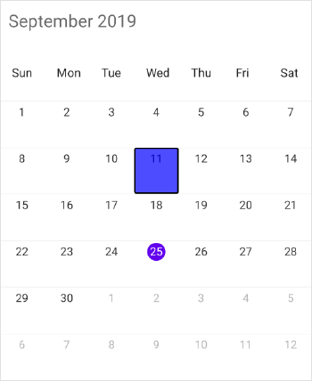
Selection customization using custom View
You can replace the default selection UI with your custom view by setting SelectionView property of SfSchedule.
<schedule:SfSchedule x:Name="schedule" ScheduleView="MonthView">
	<schedule:SfSchedule.SelectionView>
		<Button
			BackgroundColor="#FF9800"
			Text="+NewEvent"
			TextColor="White"/>
	</schedule:SfSchedule.SelectionView>
</schedule:SfSchedule>schedule.ScheduleView = ScheduleView.MonthView;
//Add the CustomView
Button customView = new Button();
customView.Text = "+NewEvent";
customView.BackgroundColor = Color.FromHex("#FF9800");
customView.TextColor = Color.White;
schedule.SelectionView = customView;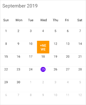
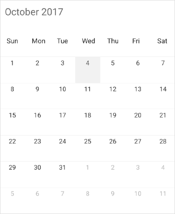
Programmatic selection
You can programmatically select the specific cell by setting corresponding date to SelectedDate property of SfSchedule. By default, it is null.
// Setting a date to select
schedule.SelectedDate = new DateTime(2017, 10, 04);
You can clear the selection by setting SelectedDate as null.
// Setting null value to deselect
schedule.SelectedDate = null;
You can download the entire source code of this demo for Xamarin.Forms from here
NOTE
SfScheduledoes not support multiple selection.SfSchedulesupports two-way binding ofSelectedDateproperty.
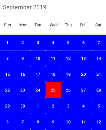
Today Background Color
You can customize the current date background of SfSchedule by using TodayBackground property of MonthViewSettings.
<schedule:SfSchedule ScheduleView=“MonthView”>
	</schedule:SfSchedule.MonthViewSettings>
		<schedule:MonthViewSettings TodayBackground="Red" />
	</schedule:SfSchedule.MonthViewSettings>
</schedule:SfSchedule>schedule.ScheduleView = ScheduleView.MonthView;
//Creating new instance of MonthViewSettings
MonthViewSettings monthViewSettings = new MonthViewSettings();
//Customizing background color
monthViewSettings.TodayBackground = Color.Red;
schedule.MonthViewSettings = monthViewSettings;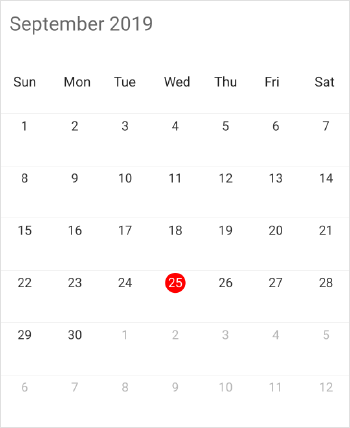
Custom Font
You can change the appearance of Font by setting the FontFamily property to the following classes.
-
ViewHeaderStyle - You can change the appearance of ViewHeaderStyle by setting the DayFontFamily and DateFontFamily properties of Schedule
ViewHeaderStyle. -
MonthCellStyle - You can change the appearance of MonthCellStyle by setting the FontFamily property of Schedule
MonthCellStyle. -
MonthInlineViewStyle - You can change the appearance of MonthInlineViewStyle by setting the FontFamily property of Schedule
MonthInlineViewStyle. -
WeekNumberStyle - You can change the appearance of WeekNumber by setting the FontFamily property of Schedule
WeekNumberStyle.
<schedule:ViewHeaderStyle.DayFontFamily>
	<OnPlatform x:TypeArguments="x:String" iOS="Lobster-Regular" Android="Lobster-Regular.ttf" WinPhone="Assets/Lobster-Regular.ttf#Lobster" />
</schedule:ViewHeaderStyle.DayFontFamily>viewHeaderStyle.DayFontFamily = Device.OnPlatform("Lobster-Regular", "Lobster-Regular.ttf", "Assets/Lobster-Regular.ttf#Lobster");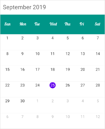
<schedule:MonthCellStyle.FontFamily>
	<OnPlatform x:TypeArguments="x:String" iOS="Lobster-Regular" Android="Lobster-Regular.ttf" WinPhone="Assets/Lobster-Regular.ttf#Lobster" />
</schedule:ViewHeaderStyle.FontFamily>monthCellStyle.FontFamily = Device.OnPlatform("Lobster-Regular", "Lobster-Regular.ttf", "Assets/Lobster-Regular.ttf#Lobster");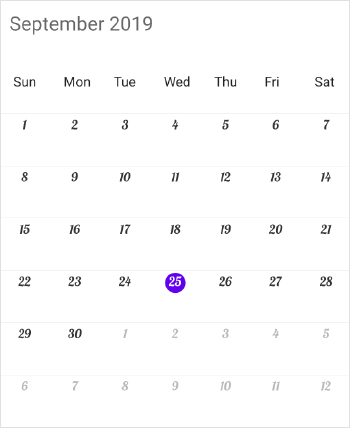
schedule.OnMonthInlineLoadedEvent += Schedule_OnMonthInlineLoadedEvent;

...

private void Schedule_OnMonthInlineLoadedEvent(object sender, MonthInlineLoadedEventArgs args)
{
	MonthInlineViewStyle monthInlineViewStyle = new MonthInlineViewStyle();
	monthInlineViewStyle.FontFamily = Device.OnPlatform("Lobster=Regular", "Lobster-Regular.ttf", "Assets/Lobster-Regular.ttf#Lobster");
	args.monthInlineViewStyle = monthInlineViewStyle;
}
weekNumberStyle.FontFamily = Device.OnPlatform("Lobster=Regular", "Lobster-Regular.ttf", "Assets/Lobster-Regular.ttf#Lobster");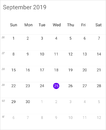
Following steps will explain how to configure the custom fonts.
Custom Font Setting in Xamarin.Forms (Android)
- Add your custom Font (e.g. Lobster-Regular.ttf) to the Assets folder in the Assets folder of the Xamarin.Forms (Android) project.
- Then, use the Custom Font name as FontFamily.
Custom Font Setting in Xamarin.Forms (ios)
- Add your custom Font (e.g. Lobster-Regular.ttf) to the Resources folder of the Xamarin.Forms (iOS) project.
- Edit info.plist and add a key Fonts provided by application (value type should be Array). In item0 of the array enter the name of the FontFamily you added in the Resource folder. (Such as Lobster-Regular.ttf).
- Then, use the Custom Font name as FontFamily.
NOTE
No need to mention .ttf when setting the Custom Font in iOS.
Custom Font Setting in Xamarin.Forms (UWP)
- Add your custom Font (e.g. Lobster-Regular.ttf) to the Assets folder of the Xamarin.Forms (UWP) project.
- Then, use the Custom Font name as FontFamily. When Setting custom font in UWP use the format (FontFamily = ” Assets/Lobster-Regular.ttf#Lobster”).
NOTE
You can refer to our Xamarin Scheduler feature tour page for its groundbreaking feature representations. You can also explore our Xamarin Scheduler example to understand how to schedule and manage appointments.
See also
How to customize AgendaView height based on schedule height?
How to show a custom agenda view besides the Xamarin.Forms scheduler in landscape mode
How to customize the month inline appointments view in Xamarin.Forms scheduler?
How to show appointments in month cell using custom view in Xamarin.Forms schedule?