Customization in Xamarin.Forms Border (SfBorder)
14 Sep 202111 minutes to read
The Xamarin Border (SfBorder) control supports customizing the border color, width, corner radius, background color, and more. The border can be customized using the following properties.
Border color
You can customize the color of the border using the BorderColor property.
<border:SfBorder x:Name="border" BorderColor = "Red"  CornerRadius="20" BorderWidth="3">
 <Label Text="James Williamson"
 TextColor="Black"/>
</border:SfBorder>
SfBorder border = new SfBorder();
border.CornerRadius = 20;
border.BorderColor = Color.Red;
border.BorderWidth = 3;
Label label = new Label();
label.Text = "James Williamson";
label.TextColor = Color.Black;
border.Content = label;
this.Content = border;
Background color
The background color of the border control can be customized using the BackgroundColor property.
<border:SfBorder x:Name="border" BorderColor = "Red" BackgroundColor= "Green" CornerRadius="20" BorderWidth="3">
 <Label Text="James Williamson"
 TextColor="Black"/>
</border:SfBorder>
SfBorder border = new SfBorder();
border.CornerRadius = 20;
border.BorderColor = Color.Red;
border.BorderWidth = 3;
Label label = new Label();
label.Text = "James Williamson";
label.TextColor = Color.Black;
border.Content = label;
border.BackgroundColor = Color.Green;
this.Content = border;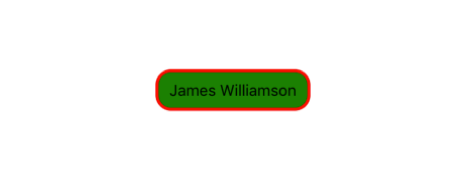
Border width
You can customize the thickness of the border using the BorderWidth property.
<border:SfBorder x:Name="border" BorderColor = "Red" CornerRadius="20" BorderWidth="12">
 <Label Text="James Williamson"
 TextColor="Black"/>
</border:SfBorder>
SfBorder border = new SfBorder();
border.CornerRadius = 20;
border.BorderColor = Color.Red;
border.BorderWidth = 12;
Label label = new Label();
label.Text = "James Williamson";
label.TextColor = Color.Black;
border.Content = label;
this.Content = border;
Dashed border
You can render the border with dashes using the DashArray property.
...
xmlns:sys="clr-namespace:System;assembly=netstandard"
...

<border:SfBorder x:Name="border">
    <border:SfBorder.DashArray>
        <x:Array Type="{x:Type sys:Double}">
            <sys:Double>3</sys:Double>
            <sys:Double>4</sys:Double>
        </x:Array>
    </border:SfBorder.DashArray>
    <Label Text="James Williamson" TextColor="Black" />
</border:SfBorder>
SfBorder border = new SfBorder();
border.DashArray = new double[2] { 3, 4 };
Label label = new Label();
label.Text = "James Williamson";
label.TextColor = Color.Black;
border.Content = label;
this.Content = border;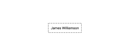
Corner radius
You can customize the corner radius of the border on four sides using the CornerRadius property with type as Thickness.
<border:SfBorder x:Name="border" BorderColor = "Red" CornerRadius="0,10,10,0" BorderWidth="12">
 <Label Text="James Williamson"
 TextColor="Black"/>
</border:SfBorder>
SfBorder border = new SfBorder();
border.CornerRadius = new Thickness (0,10,10,0);
border.BorderColor = Color.Red;
border.BorderWidth = 12;
Label label = new Label();
label.Text = "James Williamson";
label.TextColor = Color.Black;
border.Content = label;
this.Content = border;
Adding circular image
You can add any view inside the border control by adding the Content property. The following code sample demonstrates how to apply border using the CornerRadius property for a circular image.
<Grid HeightRequest="100" WidthRequest="100" HorizontalOptions="Center" VerticalOptions="Center">
    <border:SfBorder BorderColor="Black" HorizontalOptions="Center" VerticalOptions="Center" CornerRadius="50">
    <Image Source="plus.jpeg" />
    </border:SfBorder>
</Grid>
Grid grid = new Grid();
grid.HeightRequest = 100;
grid.WidthRequest = 100;
grid.HorizontalOptions = LayoutOptions.Center;
grid.VerticalOptions = LayoutOptions.Center;
SfBorder border = new SfBorder();
border.BorderColor = Color.Black;
border.HorizontalOptions = LayoutOptions.Center;
border.VerticalOptions = LayoutOptions.Center;
border.CornerRadius = 50;
Image image = new Image();
image.Source = "plus.jpeg";
border.Content = image;
grid.Children.Add(border);
this.Content = grid;
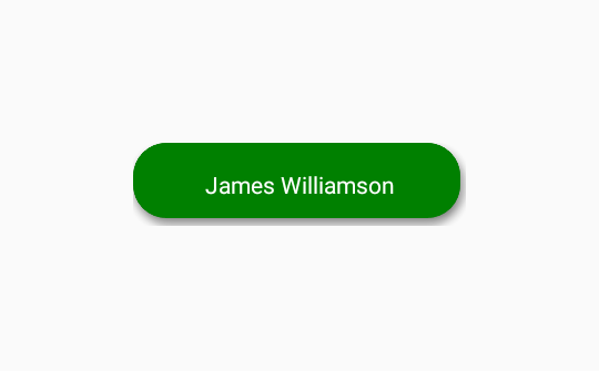
Shadow Effect
The border control provides shadow effect support. To enable shadow effect, set the HasShadow property to true.
You can customize the color of shadow using the ShadowColor property.
<border:SfBorder
                HorizontalOptions="Center"
                VerticalOptions="Center"
                BackgroundColor="Green"
                HeightRequest="50"
                WidthRequest="200"
                CornerRadius="20"
                BorderWidth="0"
                HasShadow="True"
                ShadowColor="Gray">
            <Label
                    Text="James Williamson"
                    HorizontalTextAlignment="Center"
                    VerticalTextAlignment="Center"
                    TextColor="White"/>
        </border:SfBorder>
SfBorder border = new SfBorder()
{
BackgroundColor = Color.Green,
CornerRadius = 20,
BorderWidth = 0,
HeightRequest = 50,
WidthRequest = 200,
HorizontalOptions = LayoutOptions.Center,
VerticalOptions = LayoutOptions.Center,
HasShadow = true,
ShadowColor = Color.Gray
};
Label label = new Label()
{
Text = "James Williamson",
HorizontalTextAlignment = TextAlignment.Center,
VerticalTextAlignment = TextAlignment.Center,
TextColor = Color.White
};
border.Content = label;
this.Content = border;NOTE
Shadow support has not been provided for UWP Platform.
BorderThickness
By using the BorderThickness property, you can customize the border thickness of the border on four sides.
<border:SfBorder x:Name="border" HorizontalOptions="Center"
 VerticalOptions="Center" BorderColor = "#5534eb" BackgroundColor="#f6f6f6"
 BorderThickness="0,0,0,1" >
 <Label Text="James Williamson" TextColor="#5534eb" HorizontalTextAlignment="Center" VerticalTextAlignment="Center" />
</border:SfBorder>
SfBorder border = new SfBorder();
border.BorderColor = Color.FromHex("#5534eb");
border.BackgroundColor= Color.FromHex("#f6f6f6");
border.BorderThickness = new Thickness (0,0,0,1);
border.HorizontalOptions = LayoutOptions.Center;
border.VerticalOptions = LayoutOptions.Center;
Label label = new Label();
label.Text = "James Williamson";
label.TextColor = Color.FromHex("#5534eb");
label.HorizontalTextAlignment = TextAlignment.Center;
label.VerticalTextAlignment = TextAlignment.Center;
border.Content = label;
this.Content = border;