How can I help you?
Appearance in Xamarin.Android TreeView
18 Jan 202314 minutes to read
The TreeView allows customizing appearance of the underlying data, and provides different functionalities to the end-user.
Adapter
An Adapter can be used to present the data in a way that makes sense for the application by using different controls.
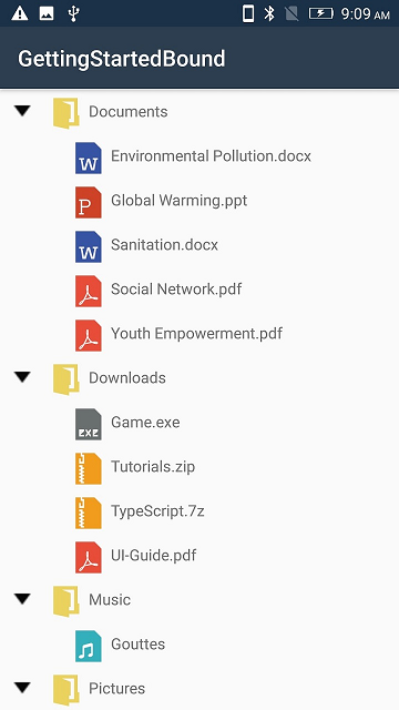
The TreeView allows you to customize the appearance of content view and expander view by setting the Adapter property.You can customize the content view and expander view by overriding the CreateContentView, CreateExpanderView methods and update its content in the UpdateContentView and UpdateExpanderView methods of TreeViewAdapter.
protected override void OnCreate(Bundle savedInstanceState)
{
    SfTreeView treeView = new SfTreeView();
    treeView.Adapter = new CustomAdapter();
}
Creating custom Adapter
Creating a custom adapter class derived from TreeViewAdapter.
// Adapter extension class
public class CustomAdapter : TreeViewAdapter
{
    public CustomAdapter()
    {
    }

    protected override View CreateContentView(TreeViewItemInfoBase itemInfo)
    {
        var customView = new CustomContentView(TreeView.Context);
        return customView;
    }

    protected override void UpdateContentView(View view, TreeViewItemInfoBase itemInfo)
    {
        var grid = view as CustomContentView;
        var treeViewNode = itemInfo.Node;
        if (grid != null)
        {
            var icon = grid.GetChildAt(0) as ImageView;
            if (icon != null)
            {
                var imageID = (treeViewNode.Content as FileManager).ImageIcon;
                icon.SetImageResource(imageID);
            }

            var label1 = grid.GetChildAt(1) as ContentLabel;
            if (label1 != null)
            {
                label1.Text = (treeViewNode.Content as FileManager).FileName.ToString();
            }
        }
    }

    protected override View CreateExpanderView(TreeViewItemInfoBase itemInfo)
    {
        var expanderView = new ImageView(TreeView.Context);
        return expanderView;
    }

    protected override void UpdateExpanderView(View view, TreeViewItemInfoBase itemInfo)
    {
        var image = view as ImageView;
        var node = itemInfo.Node;
        if (image != null && node.HasChildNodes)
        {
            image.SetImageResource(node.IsExpanded ? Resource.Drawable.expand : Resource.Drawable.collapse);
        }
    }
}
To create custom view to use in adapter, refer this link.
You can also download the entire source code of this demo from here
Indentation
The TreeView allows customizing the indent spacing of items by setting the Indentation property. The default value of this property is 40. This property can be customized at runtime.
SfTreeView treeView = new SfTreeView();
treeView.Indentation = 40;
ItemHeight
The TreeView allows customizing the height of items by setting the ItemHeight property. The default value of this property is 40. This property can be customized at runtime.
SfTreeView treeView = new SfTreeView();
treeView.ItemHeight = 40;
ExpanderWidth
The TreeView allows customizing the width of expander view by setting the ExpanderWidth property. The default value of this property is 40. This property can be customized at runtime.
SfTreeView treeView = new SfTreeView();
treeView.ExpanderWidth = 40;
ExpanderPosition
The TreeView allows you change the position of expander view by setting the ExpanderPosition property. The default value of this property is Start.This property has following two positions:
-
Start: Allows displaying the expander view at the start position. -
End: Allows displaying the expander view at the end position.
SfTreeView treeView = new SfTreeView();
treeView.ExpanderPosition = ExpanderPosition.End;
Level based Customization
Level based views
The TreeView allows you to customize the content view and expander view with different views by using CreateContentView and CreateExpanderView override methods based on specific constraints.
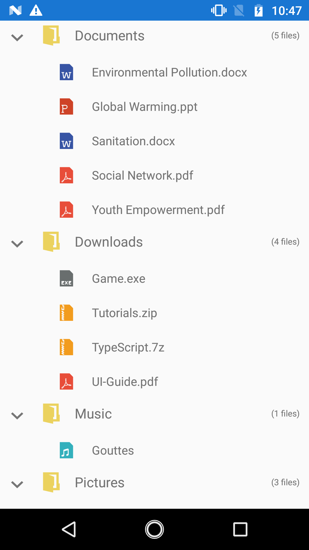
Following example illustrates you to load different content views based on the node level.
// Adapter extension class
public class NodeImageAdapter : TreeViewAdapter
{
    public NodeImageAdapter()
    {
    }

    protected override View CreateContentView(TreeViewItemInfoBase itemInfo)
    {
        if (itemInfo.Node.Level == 0)
        {
            var gridView = new CustomView1(TreeView.Context);
            return gridView;
        }
        else
        {
            var gridView = new CustomView2(TreeView.Context);
            return gridView;
        }
    }

    protected override void UpdateContentView(View view, TreeViewItemInfoBase itemInfo)
    {
        var grid = view as CustomView1;
        var treeViewNode = itemInfo.Node;
        if (grid != null)
        {
            var icon = grid.GetChildAt(0) as ImageView;
            if (icon != null)
            {
                var imageID = (treeViewNode.Content as FileManager).ImageIcon;
                icon.SetImageResource(imageID);
            }

            var label1 = grid.GetChildAt(1) as ContentLabel;
            if (label1 != null)
            {
                label1.Text = (treeViewNode.Content as FileManager).FileName.ToString();
            }
            var label2 = grid.GetChildAt(2) as ContentLabel;
            label2.Text = treeViewNode.HasChildNodes ? treeViewNode.ChildNodes.Count.ToString()+" files" : "No files";
        }
        else
        {
            var grid1 = view as CustomView2;
            if (grid1 != null)
            {
                var icon = grid1.GetChildAt(0) as ImageView;
                if (icon != null)
                {
                    var imageID = (treeViewNode.Content as FileManager).ImageIcon;
                    icon.SetImageResource(imageID);
                }
                    var label1 = grid1.GetChildAt(1) as ContentLabel;
                if (label1 != null)
                {
                    label1.Text = (treeViewNode.Content as FileManager).FileName.ToString();
                }
            }
        }
    }
}
You can also download the entire source code of this demo from here
Level based styling.
The TreeView allows you to customize the style of TreeViewItem based on different levels by customizing the adapter by using UpdateContentView and UpdateExpanderView override methods.
You can customize the content view and expander view by overriding the CreateContentView, CreateExpanderView methods and update its content in the UpdateContentView and UpdateExpanderView methods of TreeViewAdapter.
protected override void UpdateContentView(View view, TreeViewItemInfoBase itemInfo)
{
    var grid = view as TemplateView;
    var treeViewNode = itemInfo.Node;
    var typeface = Android.Graphics.Typeface.Default;
    if (grid != null)
    {
        var label = grid.GetChildAt(0) as ContentLabel;
        if (label != null)
        {
            label.Text = (treeViewNode.Content as MailFolder).FolderName;
            if (treeViewNode.Level == 0)
            {
                label.SetTypeface(typeface, Android.Graphics.TypefaceStyle.Bold);
            }
            else
                label.SetTypeface(typeface, Android.Graphics.TypefaceStyle.Italic);
        }

        var label1 = grid.GetChildAt(1) as ContentLabel;
        if (label1 != null)
        {
            if ((treeViewNode.Content as MailFolder).MailsCount > 0)
            {
                label1.Text = (treeViewNode.Content as MailFolder).MailsCount.ToString();
                label1.SetTextColor(Android.Graphics.Color.White);
                label1.SetBackgroundColor(Android.Graphics.Color.ParseColor("#FF6377EB"));
            }
        }
    }
}
You can download the example for level based styling demo from here.

Animation
The SfTreeView supports to animate expanding or collapsing the TreeViewNode. To enable/disable the animation use IsAnimationEnabled property of SfTreeView.
NOTE
The default value of the
IsAnimationEnabledproperty isfalse.
SfTreeView treeView = new SfTreeView();
treeView.IsAnimationEnabled = true;