Selection in Xamarin.Android.DataGrid (SfDataGrid)
23 Sep 202013 minutes to read
This section explains how to enable selection in the data grid and the selection modes, properties, events involved in selection and customizations available for selection in the data grid.
The data grid selects a specific row or group of rows either programmatically or by touch interactions. To enable the selection in the data grid, set the SfDataGrid.SelectionMode property to None. The data grid has different selection modes to perform selection operation as listed as follows:
Selection modes
| Modes | Description |
|---|---|
| Disables selection and no rows can be selected. This is the default value. | |
| Selects a single row. Upon selecting the next row the selection in the previous row is cleared. | |
| Selects more than one row. The selection is not cleared when selecting more than one records. When you click on a selected row for the second time, the selection will be cleared. | |
| Selects only a single row. However, upon tapping the row again the selection is cleared. Similar to the single mode, upon selecting the next row the selection in the previous row is cleared. |
The following code example illustrates how to set the selection mode in the data grid:
dataGrid.SelectionMode = SelectionMode.Multiple;
Getting selected rows
The SfDataGrid provides SelectedIndex,SelectedItem and CurrentItem properties to get details of the selected rows when the selection mode is Single, Multiple and SingleDeselect.
SfDataGrid.SelectedItem: Provides the underlying data object of the selected row. Denotes the first selected row in multiple selection.
SfDataGrid.SelectedIndex: Provides the index of SfDataGrid.SelectedItem.
SfDataGrid.CurrentItem: Provides the underlying data object of the currently selected row in the data grid. Denotes the first selected row in multiple selection.
Row selection
When multiple rows are selected, the SelectedItems and SelectionController.SelectedRows properties provide information about all the selected rows.
SfDataGrid.SelectedItems: Provides all the selected records of the selected items when multiple selection is enabled.
SfDataGrid.SelectionController.SelectedRows: Provides collection of the underlying model object(row data) of all the selected items..
CurrentItem vs SelectedItem
Both SelectedItem and CurrentItem returns the same data object when the selection mode is single. When multiple selection is enabled, the initially selected row will be maintained in the SelectedItem and the currently selected row will be maintained in the CurrentItem
Programmatic selection
When the SfDataGrid.SelectionMode is other than None, select the row/rows in the data grid from the code by setting the SfDataGrid.SelectedIndex, SfDataGrid.SelectedItem, or SfDataGrid.SelectedItems property based on the selection mode. The following code example illustrates how to enable selection from code in the data grid:
When the selection mode is single, programmatically select a row in two ways, either by setting the row index to the SfDataGrid.SelectedIndex property or by setting the underlying object to be selected to the SfDataGrid.SelectedItem property.
The following code example illustrates how to programmatically select a row from the code:
//Perform selection using selected index
dataGrid.SelectedIndex = 3;

//Perform selection using selected item
dataGrid.SelectedItem = viewModel.OrdersInfo [5];
When the selection mode is multiple, programmatically select more than one row by adding the underlying object to be selected to the SfDataGrid.SelectedItems property.
The following code example illustrates how to programmatically select more than one rows from the code.
//Perform multiple selection using selected item
dataGrid.SelectedItems.Add (viewModel.OrdersInfo [5]);
dataGrid.SelectedItems.Add (viewModel.OrdersInfo [8]);
dataGrid.SelectedItems.Add (viewModel.OrdersInfo [10]);
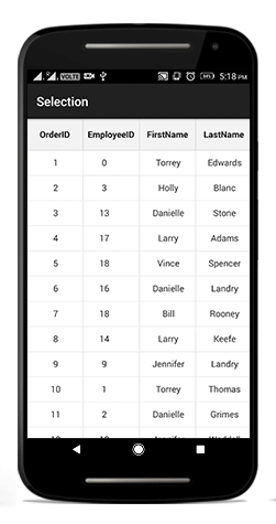
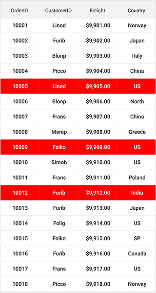
dataGrid.SelectedItems.Add (viewModel.OrdersInfo [12]);The following screenshot shows the selection functionality in SfDataGrid.
Scroll to Selected Item
You can scroll programmatically to the selected item by passing the SelectedIndex to the SfDataGrid.ScrollToRowIndex method. Refer the below code snippet for the same.
dataGrid.ScrollToRowIndex((int)dataGrid.SelectedIndex);Clear selection
Data grid allows you to clear the selection applied in the grid rows either by setting the SfDataGrid.SelectionMode to None or by calling the SfDataGrid.SelectionController.ClearSelection () method.
//Clear selection using selection mode
dataGrid.SelectionMode = SelectionMode.None;

//Clear selection using selection controller
dataGrid.SelectionController.ClearSelection ();
NOTE
Selected items and the selections will be cleared whenever the ItemsSource changed at runtime.
Row header selection
Data grid allows you to select the grid row(s) upon tapping them over the grid cells. It also allows you to select the grid rows when you tap the row header cells. To enable selection in the data grid, set the SfDataGrid.SelectionMode property to a value other than None.
Select records in the data grid when tapping only on the row header cells
The data grid allows selecting a specific row or group of rows by touching the grid cells. However, to select the record only when tapping on the row header cells, use SfDataGrid.SelectionChanging event.
The following code example illustrates how to select records in the data grid when tapping only on the row header cells:
dataGrid.SelectionMode = SelectionMode.Single;

private void DataGrid_SelectionChanging(object sender, GridSelectionChangingEventArgs e)
{
    e.Cancel = true;
}

private void DataGrid_GridTapped(object sender, GridTappedEventsArgs e)
{
    if(e.RowColumnIndex.ColumnIndex == 0)
    {
        dataGrid.SelectedIndex = e.RowColumnIndex.RowIndex;
    }
}
NOTE
To enable the row header in the data grid, set the
SfDataGrid.ShowRowHeadertotrue.
Selection animation
The data grid supports selecting one or more rows programmatically or by touch interactions. In addition, the control also provides extensibility to animate the selected rows.
It can be done by extending the GridSelectionController.
Refer to the following example in which a CustomSelectionController is derived from GridSelectionController and an instance of it is assigned to the SfDataGrid.SelectionController property to perform selection animation.
dataGrid.SelectionController = new CustomSelectionController(dataGrid);
dataGrid.SelectionMode = SelectionMode.Multiple;public class CustomSelectionController : GridSelectionController
{
public CustomSelectionController(SfDataGrid sfGrid)
{
this.DataGrid = sfGrid;
}
protected override void SetSelectionAnimation(VirtualizingCellsControl rowElement)
{
rowElement.Alpha = 0.5f;
rowElement.Animate().Alpha(0.5f).SetDuration(1000).AlphaBy(1f).WithEndAction(new Runnable(() =>
{
rowElement.Alpha = 1f;
}));
}
}
Events in selection
The data grid provides the following events for the selection:
- SelectionChanging: This event is raised while selecting a row at the execution time. Hence, it allows canceling the selection action by setting the Cancel property of GridSelectionChangingEventArgs.
- SelectionChanged: This event is raised after the column is selected.
These two events are triggered with GridSelectionChangingEventArgs and GridSelectionChangedEventArgs that contains the following properties:
- AddedItems: Gets the collection of the underlying data objects added to selection.
- RemovedItems: Gets the collection of the underlying data objects removed from selection.
The following code example illustrates how to hook the SfDataGrid.SelectionChanging event and cancel the selection of a column:
dataGrid.SelectionChanging += DataGrid_SelectionChanging;

void DataGrid_SelectionChanging (object sender, GridSelectionChangingEventArgs e)
{
    e.Cancel = true;
}
The following code explains how to get the selected item in code-behind by making use of the SfDataGrid.SelectionChanged event:
dataGrid.SelectionChanged += DataGrid_SelectionChanged;

private void DataGrid_SelectionChanged (object sender, GridSelectionChangedEventArgs e)
{
    // Gets the selected item.
    var selectedItems = e.AddedItems[0];
}
CurrentItem
The SfDataGrid.CurrentItem property holds the underlying data of the last selected row in data grid.
Get the current item in the SfDataGrid.SelectionChanged event by setting the SfDataGrid.SelectionMode as Multiple or SingleDeselect. If the SelectionMode is Single, the current item and selected item are same.
The following code example illustrates how to set the selection mode for the data grid in the SelectionChanged event.
dataGrid.SelectionMode = SelectionMode.Multiple;

dataGrid.SelectionChanged += DataGrid_SelectionChanged;

void DataGrid_SelectionChanged (object sender, GridSelectionChangedEventArgs e)
{
 var currentItem = dataGrid.CurrentItem;

 //your codes
}
Customizing Selection Appearance
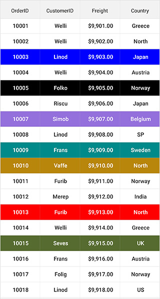
Adding multiple selection colors
The data grid supports selecting one or more rows either programmatically or by touch interactions. By default, the data grid applies a common background color for the selected rows based on the current theme. However, it also provides extensibility to have multiple selection colors when touching the rows by writing a custom SelectionController derived from GridSelectionController and, assigning it to the SfDataGrid.SelectionController property. Override the GetSelectionColor() method to apply different colors for selection at runtime.
The following code example illustrates how to set different colors for the selected rows in the data grid:
sfGrid.SelectionController = new CustomSelectionController(sfGrid);
sfGrid.SelectionMode = SelectionMode.Multiple;public class CustomSelectionController : GridSelectionController
{
public Color[] SelectionColors { get; set; }
public CustomSelectionController(SfDataGrid datagrid)
{
this.DataGrid = datagrid;
SelectionColors = new Color[11]
{
Color.DarkSalmon,
Color.DarkSlateGray,
Color.Red,
Color.Blue,
Color.DarkOliveGreen,
Color.Black,
Color.Gray,
Color.MediumPurple,
Color.BurlyWood,
Color.DarkCyan,
Color.DarkGoldenrod
};
}
//Code to set multiple selection colors
public override Color GetSelectionColor(int rowIndex, object rowData)
{
if (SelectionColors != null)
return SelectionColors[rowIndex % 11];
else
return Color.Blue;
}
}The following screenshot shows the outcome upon execution of the above code:
Changing selection background and foreground color
The SfDataGrid allows you to change the selection background and foreground colors by returning the required color in the GetSelectionBackgroundColor and GetSelectionForegroundColor properties overrides in the custom style class overriding from DataGridStyle, and assign it to the SfDataGrid.GridStyle property.
//Apply custom style to SfDataGrid from code
dataGrid.GridStyle = new SelectionStyle();//Custom style class
public class SelectionStyle : DataGridStyle
{
public SelectionStyle()
{
}
public override Color GetSelectionBackgroundColor()
{
return Color.Blue;
}
public override Color GetSelectionForegroundColor()
{
return Color.White;
}
}
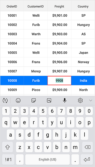
Changing current cell border color
The SfDataGrid allows you to change the current cell border color applied to the grid cells when entering the edit mode by returning the required color in the GetCurrentCellBorderColor override of your custom style class derived from DataGridStyle, and assign it to the SfDataGrid.GridStyle property.
//Apply custom style to SfDataGrid from code
dataGrid.GridStyle = new SelectionStyle();//Custom style class
public class SelectionStyle : DataGridStyle
{
public SelectionStyle()
{
}
public override Color GetCurrentCellBorderColor()
{
return Color.Pink;
}
}