How can I help you?
Getting started with Xamarin.Android ComboBox
17 Jan 202511 minutes to read
This section explains the steps required to create combo box, populate it with data, and filter suggestions.Here we create a simple sample for changing the resolution and this section covers only the minimal features that are needed to get started with the ComboBox.
Referencing Essential Studio® components in your solution
After installing Essential Studio® for Xamarin,find all the required assemblies in the installation folders,
{Syncfusion Installed location}\Essential Studio\12.4.0.24\lib
Add the following assembly references to the Android project,
android\Syncfusion.SfComboBox.Android.dll
Adding SfComboBox
The following steps help to add SfComboBox control.
- Add the following namespace for the added assemblies.
using Syncfusion.Android.ComboBox;- Then, add the SfComboBox control with a required optimal name using the included namespace.
// Set the layout to display the control
LinearLayout linearLayout = new LinearLayout(this);
linearLayout.LayoutParameters = new ViewGroup.LayoutParams(500, ViewGroup.LayoutParams.MatchParent); linearLayout.SetBackgroundColor(Android.Graphics.Color.White);
// Add the Combobox Control
SfComboBox comboBox = new SfComboBox(this);
comboBox.LayoutParameters = new ViewGroup.LayoutParams(ViewGroup.LayoutParams.MatchParent, 50);
//Add the control in layout to display
linearLayout.AddView(comboBox);
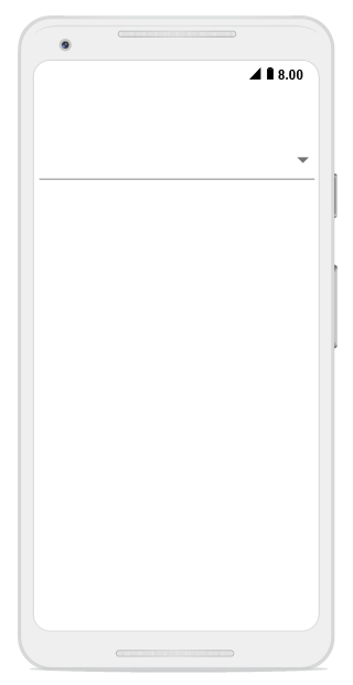
SetContentView(linearLayout);The following screenshot depicts view of the control after adding SfComboBox.
Adding items
A list of string with resolution list are created and added to the combo box source. This list is populated as suggestion list by setting the ComboBoxSource property based on text entry.
You can set the suggestion list to the SfComboBox using the ComboBoxSource property and you can customize the dropdown height using the MaximumDropDownHeight property.Add the ComboBoxSource for the SfComboBox as in the following.
// Set the layout to display the control
LinearLayout linearLayout = new LinearLayout(this);
linearLayout.LayoutParameters = new ViewGroup.LayoutParams(500, ViewGroup.LayoutParams.MatchParent);
linearLayout.SetPadding(10, 0, 10, 0);
linearLayout.SetBackgroundColor(Android.Graphics.Color.White);
// Add the Combobox Control
SfComboBox comboBox = new SfComboBox(this);
comboBox.LayoutParameters = new ViewGroup.LayoutParams(ViewGroup.LayoutParams.MatchParent, 50);
//Add the items
List<String> resolutionList = new List<String>();
resolutionList.Add("1920 x 1080");
resolutionList.Add("1680 x 1050");
resolutionList.Add("1600 x 900");
resolutionList.Add("1440 x 900");
resolutionList.Add("1400 x 1050");
resolutionList.Add("1366 x 768");
resolutionList.Add("1360 x 768");
resolutionList.Add("1280 x 1024");
resolutionList.Add("1280 x 960");
resolutionList.Add("1280 x 720");
resolutionList.Add("854 x 480");
resolutionList.Add("800 x 480");
resolutionList.Add("480 X 640");
resolutionList.Add("480 x 320");
resolutionList.Add("432 x 240");
resolutionList.Add("360 X 640");
resolutionList.Add("320 x 240");
//Add the ComboBox source
ArrayAdapter<String> resolutionListDataAdapters = new ArrayAdapter<String>(this, Android.Resource.Layout.SimpleListItem1, resolutionList);
comboBox.ComboBoxSource = resolutionListDataAdapters ;
//Set MaximumDropDownHeight
comboBox.MaximumDropDownHeight = 150;
//Add the control in layout to display
linearLayout.AddView(comboBox);
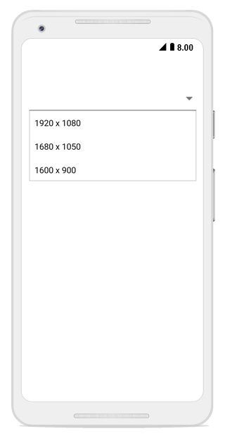
SetContentView(linearLayout);The following screenshot depicts view of the control after adding items.
Refer to this link link to learn more about the options available in SfComboBox to populate data.
Combo box modes
The SfComboBox supports both editable and non-editable text boxes to choose selected items in given data source. Users can select an item from the suggestion list.
NOTE
The default value of the IsEditableMode property is false.
Non-editable combo box
Non-editable mode is used to prevent users from typing and allows them to select items from drop-down list. If the “IsEditable” property is set to false, it is set to be non-editable mode. In non-editable mode, the suggestion box can be displayed by clicking the control or drop-down button.
// Set the layout to display the control
LinearLayout linearLayout = new LinearLayout(this);
linearLayout.LayoutParameters = new ViewGroup.LayoutParams(500, ViewGroup.LayoutParams.MatchParent);
linearLayout.SetPadding(10, 0, 10, 0);
linearLayout.SetBackgroundColor(Android.Graphics.Color.White);

// Add the Combobox Control
SfComboBox comboBox = new SfComboBox(this);
comboBox.LayoutParameters = new ViewGroup.LayoutParams(ViewGroup.LayoutParams.MatchParent, 50);

//Add the items
List<String> resolutionList = new List<String>();
resolutionList.Add("1920 x 1080");
resolutionList.Add("1680 x 1050");
resolutionList.Add("1600 x 900");
resolutionList.Add("1440 x 900");
resolutionList.Add("1400 x 1050");
resolutionList.Add("1366 x 768");
resolutionList.Add("1360 x 768");
resolutionList.Add("1280 x 1024");
resolutionList.Add("1280 x 960");
resolutionList.Add("1280 x 720");
resolutionList.Add("854 x 480");
resolutionList.Add("800 x 480");
resolutionList.Add("480 X 640");
resolutionList.Add("480 x 320");
resolutionList.Add("432 x 240");
resolutionList.Add("360 X 640");
resolutionList.Add("320 x 240");

//Add the ComboBox source
ArrayAdapter<String> resolutionListDataAdapters = new ArrayAdapter<String>(this, Android.Resource.Layout.SimpleListItem1, resolutionList);
comboBox.ComboBoxSource = resolutionListDataAdapters ;
//Set MaximumDropDownHeight
comboBox.MaximumDropDownHeight = 150;
//Set IsEditableMode
comboBox.IsEditableMode = false;

//Add the control in layout to display
linearLayout.AddView(comboBox);
SetContentView(linearLayout);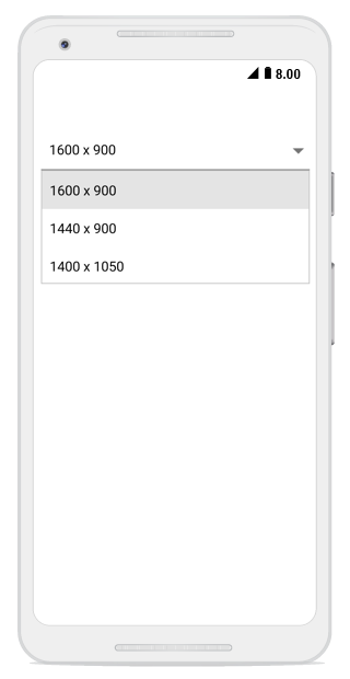
## Editable combo box
In editable mode, the combo box allows users to edit in the text box that shows suggestions in drop-down list based on the input. With the previous codes, the ‘IsEditableMode’ property can be set to true. This helps users to edit the SfComboBox control.
// Set the layout to display the control
LinearLayout linearLayout = new LinearLayout(this);
linearLayout.LayoutParameters = new ViewGroup.LayoutParams(500, ViewGroup.LayoutParams.MatchParent);
linearLayout.SetPadding(10, 0, 10, 0);
linearLayout.SetBackgroundColor(Android.Graphics.Color.White);

// Add the Combobox Control
SfComboBox comboBox = new SfComboBox(this);
comboBox.LayoutParameters = new ViewGroup.LayoutParams(ViewGroup.LayoutParams.MatchParent, 50);

//Add the items
List<String> resolutionList = new List<String>();
resolutionList.Add("1920 x 1080");
resolutionList.Add("1680 x 1050");
resolutionList.Add("1600 x 900");
resolutionList.Add("1440 x 900");
resolutionList.Add("1400 x 1050");
resolutionList.Add("1366 x 768");
resolutionList.Add("1360 x 768");
resolutionList.Add("1280 x 1024");
resolutionList.Add("1280 x 960");
resolutionList.Add("1280 x 720");
resolutionList.Add("854 x 480");
resolutionList.Add("800 x 480");
resolutionList.Add("480 X 640");
resolutionList.Add("480 x 320");
resolutionList.Add("432 x 240");
resolutionList.Add("360 X 640");
resolutionList.Add("320 x 240");

//Add the ComboBox source
ArrayAdapter<String> resolutionListDataAdapters = new ArrayAdapter<String>(this, Android.Resource.Layout.SimpleListItem1, resolutionList);
comboBox.ComboBoxSource = resolutionListDataAdapters ;
//Set MaximumDropDownHeight
comboBox.MaximumDropDownHeight = 150;
//Set IsEditableMode
comboBox.IsEditableMode = true;

//Add the control in layout to display
linearLayout.AddView(comboBox);
SetContentView(linearLayout);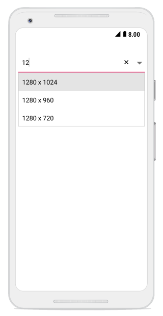
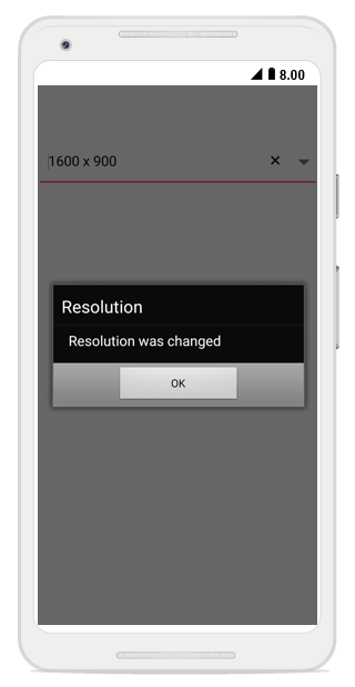
Selecting item
When selecting an item from the drop-down list, the selection changed event will be called. Using the following code snippet, a dialogue box will be displayed when a new item is selected from the suggestion box.
// Set the layout to display the control
LinearLayout linearLayout = new LinearLayout(this);
linearLayout.LayoutParameters = new ViewGroup.LayoutParams(500, ViewGroup.LayoutParams.MatchParent);
linearLayout.SetPadding(10, 0, 10, 0);
linearLayout.SetBackgroundColor(Android.Graphics.Color.White);
//Create Alert
AlertDialog.Builder alertDialogue = new AlertDialog.Builder(this);

// Add the Combobox Control
SfComboBox comboBox = new SfComboBox(this);
comboBox.LayoutParameters = new ViewGroup.LayoutParams(ViewGroup.LayoutParams.MatchParent, 50);

//Add the items
List<String> resolutionList = new List<String>();
resolutionList.Add("1920 x 1080");
resolutionList.Add("1680 x 1050");
resolutionList.Add("1600 x 900");
resolutionList.Add("1440 x 900");
resolutionList.Add("1400 x 1050");
resolutionList.Add("1366 x 768");
resolutionList.Add("1360 x 768");
resolutionList.Add("1280 x 1024");
resolutionList.Add("1280 x 960");
resolutionList.Add("1280 x 720");
resolutionList.Add("854 x 480");
resolutionList.Add("800 x 480");
resolutionList.Add("480 X 640");
resolutionList.Add("480 x 320");
resolutionList.Add("432 x 240");
resolutionList.Add("360 X 640");
resolutionList.Add("320 x 240");

//Add the ComboBox source
ArrayAdapter<String> resolutionListDataAdapters = new ArrayAdapter<String>(this, Android.Resource.Layout.SimpleListItem1, resolutionList);
comboBox.ComboBoxSource = resolutionListDataAdapters ;
//Set MaximumDropDownHeight
comboBox.MaximumDropDownHeight = 150;
//Set IsEditableMode
comboBox.IsEditableMode = true;

//Create SelectionChanged Event
comboBox.SelectionChanged += (object sender, SelectionChangedEventArgs e) =>
{
    //Set Alert Title
    alertDialogue.SetTitle("Resolution");
    //Set Alert Message
    alertDialogue.SetMessage(Resolution was changed);
    //Show the Alert
    alertDialogue.Create().Show();
};
//Set OK button
alertDialogue.SetPositiveButton("OK", (object sender, DialogClickEventArgs e) =>
{

});

//Add the control in layout to display
linearLayout.AddView(comboBox);
SetContentView(linearLayout);
The following screenshot depicts the output of previous codes.
You can find the complete getting started sample from this Link