Gauge Customization in WPF Olap Gauge
6 May 20212 minutes to read
Layout customization
The OLAP gauge displays multiple gauges in a structured layout. You can customize the layout by using the ColumnsCount and RowsCount properties. These properties are used to specify the number of columns and rows for displaying the control.
<syncfusion:OlapGauge x:Name="OlapGauge1" RowsCount="2" ColumnsCount="2"/>this.OlapGauge1.ColumnsCount = 2;
this.OlapGauge1.RowsCount = 2;Me.OlapGauge1.ColumnsCount = 2
Me.OlapGauge1.RowsCount = 2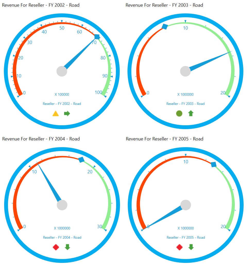
Gauge header
The gauge header is the combination of details about the measure and KPI. The header components of the OLAP gauge can be hidden by using the ShowGaugeHeaders property as specified in the following code snippet.
<syncfusion:OlapGauge x:Name="OlapGauge1" ShowGaugeHeaders="False"/>OlapGauge1.ShowGaugeHeaders = false;OlapGauge1.ShowGaugeHeaders = False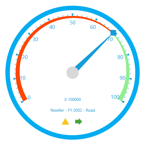
Gauge label
The visibility of gauge labels that are displayed inside the gauge can be toggled with the help of ShowGaugeLabels property. The following code snippet shows how to hide labels of the OLAP gauge.
<syncfusion:OlapGauge x:Name="OlapGauge1" ShowGaugeLabels="False"/>OlapGauge1.ShowGaugeLabels = false;OlapGauge1.ShowGaugeLabels = False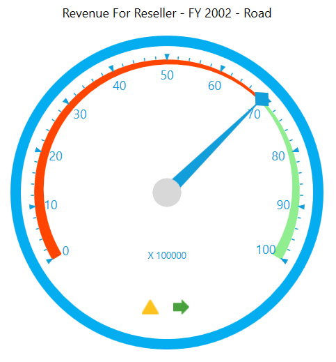
Gauge factor
The gauge factor component can be hidden by using the ShowGaugeFactors property as specified in the following code snippet.
<syncfusion:OlapGauge x:Name="OlapGauge1" ShowGaugeFactors="False"/>OlapGauge1.ShowGaugeFactors = false;OlapGauge1.ShowGaugeFactors = False