Date Selector in WPF DatePicker (SfDatePicker)
18 Feb 202512 minutes to read
The SfDateSelector is a sub-control of SfDatePicker which opens inside the drop-down popup and used to select the date for the SfDatePicker. It contains the date, month and year selection cells for select the date. The selected date of the SfDateSelector is assigned to the SfDatePicker.Value property.
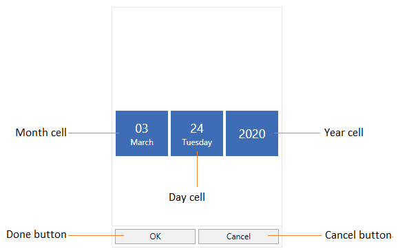
The visual elements of the date selector can be customized using the SelectorStyle property.
Change the Cell templates
We can changes the template for the Date, Month or Year selector by using the DayCellTemplate, MonthCellTemplate or YearCellTemplate which are available in the SfDateSelector.
NOTE
The DataContext of Month, Date and Year selection cell is DateTimeWrapper.
Change the DayCell Template
We can change the day selector template by using the DayCellTemplate property. In that, we can add like image, icon or text with the day numbers.
<syncfusion:SfDatePicker VerticalAlignment="Center"
HorizontalAlignment="Center"
Width="200"
Name="sfDatePicker">
<syncfusion:SfDatePicker.SelectorStyle>
<Style TargetType="syncfusion:SfDateSelector">
<Setter Property="DayCellTemplate">
<Setter.Value>
<DataTemplate>
<Grid>
<TextBlock VerticalAlignment="Top"
HorizontalAlignment="Right"
Margin="5"
FontSize="22"
FontFamily="Segoe UI Symbol"
Text=""/>
<TextBlock Text="{Binding DayNumber}"
VerticalAlignment="Bottom"
Margin="5"
FontSize="22"/>
</Grid>
</DataTemplate>
</Setter.Value>
</Setter>
</Style>
</syncfusion:SfDatePicker.SelectorStyle>
</syncfusion:SfDatePicker>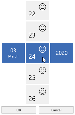
Change the MonthCell Template
We can change the month selector template by using the MonthCellTemplate property. In that, we can add like image, icon or text with the month numbers.
<syncfusion:SfDatePicker VerticalAlignment="Center"
HorizontalAlignment="Center"
Width="200"
Name="sfDatePicker">
<syncfusion:SfDatePicker.SelectorStyle>
<Style TargetType="syncfusion:SfDateSelector">
<Setter Property="MonthCellTemplate">
<Setter.Value>
<DataTemplate>
<Grid>
<TextBlock VerticalAlignment="Top"
HorizontalAlignment="Right"
Margin="5"
FontSize="22"
FontFamily="Segoe UI Symbol"
Text=""/>
<TextBlock Text="{Binding MonthNumber}"
VerticalAlignment="Bottom"
Margin="5"
FontSize="22"/>
</Grid>
</DataTemplate>
</Setter.Value>
</Setter>
</Style>
</syncfusion:SfDatePicker.SelectorStyle>
</syncfusion:SfDatePicker>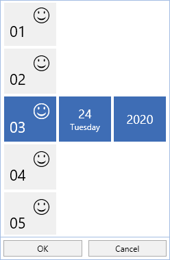
Change the YearCell Template
We can change the year selector template by using the YearCellTemplate property. In that, we can add like image, icon or text with the year numbers.
<syncfusion:SfDatePicker VerticalAlignment="Center"
HorizontalAlignment="Center"
Width="200"
Name="sfDatePicker">
<syncfusion:SfDatePicker.SelectorStyle>
<Style TargetType="syncfusion:SfDateSelector">
<Setter Property="YearCellTemplate">
<Setter.Value>
<DataTemplate>
<Grid>
<TextBlock VerticalAlignment="Top"
HorizontalAlignment="Right"
Margin="5"
FontSize="22"
FontFamily="Segoe UI Symbol"
Text=""/>
<TextBlock Text="{Binding YearNumber}"
VerticalAlignment="Bottom"
Margin="5"
FontSize="22"/>
</Grid>
</DataTemplate>
</Setter.Value>
</Setter>
</Style>
</syncfusion:SfDatePicker.SelectorStyle>
</syncfusion:SfDatePicker>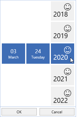
Change size of cells
We can change the cell size in the SfDateSelector control by setting the SelectorItemWidth and SelectorItemHeight properties. The default value of the SelectorItemWidth and SelectorItemHeight properties is 80 and 70.
<syncfusion:SfDatePicker SelectorItemWidth="100"
                         SelectorItemHeight="100"
	                     x:Name="sfDatePicker"/>
SfDatePicker sfDatePicker = new SfDatePicker();
sfDatePicker.SelectorItemWidth = 100;
sfDatePicker.SelectorItemHeight = 100;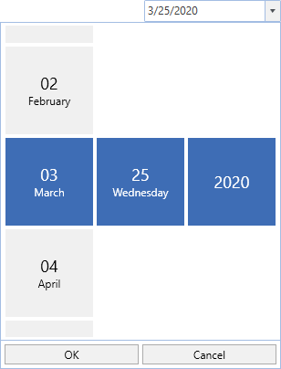
DateSelector item spacing
We can change the space between SfDateSelector date, month and year items by using the SelectorItemSpacing property. The default value of the SelectorItemSpacing property is 4.
<syncfusion:SfDatePicker SelectorItemSpacing="50"
	                     x:Name="sfDatePicker"/>
SfDatePicker sfDatePicker = new SfDatePicker();
sfDatePicker.SelectorItemSpacing = 50;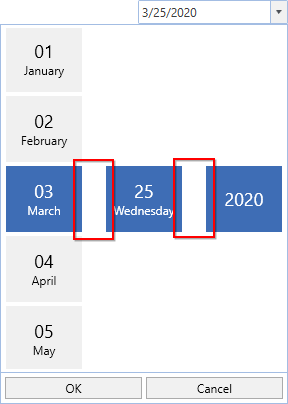
Click here to download the sample that showcases the SfDateSelector template customization.