Getting Started with WPF Color Picker Palette
24 Mar 202616 minutes to read
This section explains how to create a WPF ColorPickerPalette and explains about its structure and features.
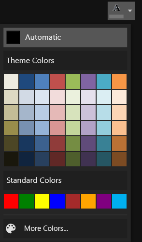
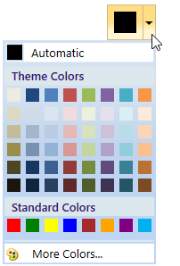
Control Structure
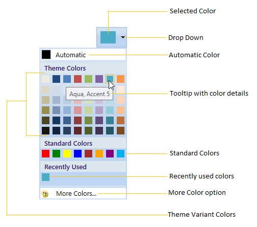
- The Selected Color represents the color that you select.
- The Drop-Down represents a button,
ColorPickerPalettewindow will open when you click on it. - The Automatic Color represents the Color, which can be set by you as default color.
- The ToolTip with Color Details represents the ToolTip, when the mouse hovers on the Color.
- The Standard Colors stores the standard colors like Red, Green, Blue and so on.
- The Recently User Colors stores the Colors that are recently selected.
- The More Colors Option provides wide range of color in addition to colors in the palette.
- The Theme Variant Colors represents the Theme colors with variant.
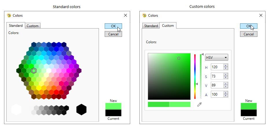
More Color Window
Assembly deployment
Refer to the control dependencies section to get the list of assemblies or NuGet package that needs to be added as reference to use the control in any application.
You can find more details about installing the NuGet package in a WPF application in the following link:
Adding WPF ColorPickerPalette via designer
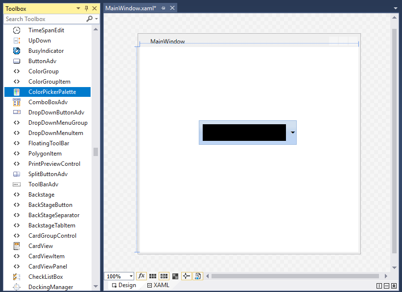
You can add the WPF Color Picker Palette control to an application by dragging it from the toolbox to a view of the designer. The following dependent assembly will be added automatically.
- Syncfusion.Shared.WPF
Adding WPF ColorPickerPalette via XAML
To add the ColorPickerPalette control manually in XAML, follow these steps:
-
Create a new WPF project in Visual Studio.
- Add the following assembly references to the project,
- Syncfusion.Shared.WPF
-
Import Syncfusion® WPF schema http://schemas.syncfusion.com/wpf and declare the
ColorPickerPalettecontrol in XAML page. -
Declare the
ColorPickerPalettecontrol in XAML page.<Window xmlns="http://schemas.microsoft.com/winfx/2006/xaml/presentation" xmlns:x="http://schemas.microsoft.com/winfx/2006/xaml" xmlns:syncfusion="http://schemas.syncfusion.com/wpf" x:Class="ColorPickerPaletteSample.MainWindow" Title="ColorPickerPalette Sample" Height="350" Width="525"> <Grid> <!--Adding ColorPickerPalette control --> <syncfusion:ColorPickerPalette x:Name="colorPickerPalette" Width="60" Height="40" /> </Grid> </Window>
Adding WPF ColorPickerPalette via C#
To add the ColorPickerPalette control manually in C#, follow these steps:
-
Create a new WPF application via Visual Studio.
- Add the following assembly references to the project,
- Syncfusion.Shared.WPF
-
Include the required namespace and create an instance of
ColorPickerPaletteand add it to the window. -
Declare the
ColorPickerPalettecontrol using C#.using Syncfusion.Windows.Tools.Controls; public partial class MainWindow : Window { public MainWindow() { InitializeComponent(); //Creating an instance of ColorPickerPalette control ColorPickerPalette colorPickerPalette = new ColorPickerPalette(); colorPickerPalette.Width = 60; colorPickerPalette.Height = 40; //Adding ColorPickerPalette as window content this.Content = colorPickerPalette; } }
Accessing a Color programmatically
We can set or change the selected color of the ColorPickerPalette programmatically by setting the value for Color property. If we want know the selected color name, use the ColorName property that holds the name of the selected color item. The default value of Color and ColorName property is Black and Color.
NOTE
You can also set or changes the selected color brush by using the SelectedBrush property.
<syncfusion:ColorPickerPalette Color="Red"
                               Name="colorPickerPalette"
                               Width="60"
                               Height="40">
</syncfusion:ColorPickerPalette>
ColorPickerPalette colorPickerPalette = new ColorPickerPalette();
colorPickerPalette.Color = Colors.Red;
colorPickerPalette.Width = 60;
colorPickerPalette.Height = 40;
Here, Red color is selected color in the ColorPickerPalette.
Select color from color palette
We can select a different colors from Theme Color and Standard Color panels. we can show or hide the variant colors of the base Theme Colors and Standard Colors by using the GenerateThemeVariants and GenerateStandardVariants properties value as true or false.
<syncfusion:ColorPickerPalette GenerateThemeVariants="True"
                               GenerateStandardVariants="True"
                               Name="colorPickerPalette"
                               Width="60"
                               Height="40">
</syncfusion:ColorPickerPalette>
ColorPickerPalette colorPickerPalette = new ColorPickerPalette();
colorPickerPalette.GenerateThemeVariants = true;
colorPickerPalette.GenerateStandardVariants = true;
colorPickerPalette.Width = 60;
colorPickerPalette.Height = 40;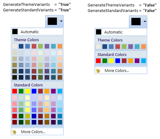
Add your own color in the palette
If we want to allow the user to select a color from own colors, add that color with its name using CustomColor.ColorName and CustomColor.Color into the CustomColorsCollection and set the SetCustomColors property value as true. The provided CustomColor.ColorName is shown in the tooltip while mouse hovering on the color item. We can change the custom color panel header text and its visibility by using the CustomHeaderText and CustomHeaderVisibility properties. The default value of CustomHeaderText is CustomColors and default value of CustomHeaderVisibility is Visible.
public class ViewModel : NotificationObject {
    private ObservableCollection<CustomColor> newColorCollection;
    public ObservableCollection<CustomColor> NewColorCollection {
        get {
            return newColorCollection;
        }
        set {
            newColorCollection = value;
            this.RaisePropertyChanged("NewColorCollection");
        }
    }
    public ViewModel() {
        NewColorCollection = new ObservableCollection<CustomColor>();
    }
}<Window.Resources>
<local:ViewModel x:Key="viewModel">
<local:ViewModel.NewColorCollection>
<!-- Defining the color details -->
<syncfusion:CustomColor Color="#FF11EBF8" ColorName="Aqua" />
<syncfusion:CustomColor Color="#FFF80FA6" ColorName="Deep Pink" />
<syncfusion:CustomColor Color="#FF8BA7C2" ColorName="Dark Gray" />
<syncfusion:CustomColor Color="#F53CDF07" ColorName="Lime Green" />
<syncfusion:CustomColor Color="#C2929545" ColorName="Olive Drab" />
<syncfusion:CustomColor Color="#2E956145" ColorName="Sienna" />
<syncfusion:CustomColor Color="#78458E95" ColorName="Steel Blue" />
<syncfusion:CustomColor Color="#8B8220E4" ColorName="Blue Violet" />
</local:ViewModel.NewColorCollection>
</local:ViewModel>
</Window.Resources>
<syncfusion:ColorPickerPalette CustomColorsCollection="{Binding NewColorCollection}"
CustomHeaderText="New Colors"
CustomHeaderVisibility="Visible"
SetCustomColors="True"
DataContext="{StaticResource viewModel}"
Name="colorPickerPalette"
Width="60"
Height="40">
</syncfusion:ColorPickerPalette>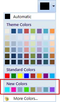
Click here to download the sample that showcases how to add your own color items into the palette.
Recently used color items
The recently selected color items are displayed in the RecentlyUsedPanel. If we want to choose a color which are previously selected, use the RecentlyUsedPanel.
<syncfusion:ColorPickerPalette RecentlyUsedPanelVisibility="Visible"
                               Name="colorPickerPalette"
                               Width="60"
                               Height="40">
</syncfusion:ColorPickerPalette>
ColorPickerPalette colorPickerPalette = new ColorPickerPalette();
colorPickerPalette.RecentlyUsedPanelVisibility = Visibility.Visible;
colorPickerPalette.Width = 60;
colorPickerPalette.Height = 40;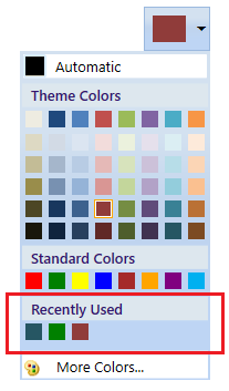
Choosing a color from MoreColor window
If we wants more standard and custom colors to select, click the more color option and select the color from standard color tab or custom color tab and click the Ok button.
<syncfusion:ColorPickerPalette MoreColorOptionVisibility="Visible"
                               Name="colorPickerPalette"
                               Width="60"
                               Height="40">
</syncfusion:ColorPickerPalette>
ColorPickerPalette colorPickerPalette = new ColorPickerPalette();
colorPickerPalette.MoreColorOptionVisibility = Visibility.Visible;
colorPickerPalette.Width = 60;
colorPickerPalette.Height = 40;
NOTE
We can show or hide all color panels. Refer the Dealing with ColorPickerPalette page that explains the panel visibility support.
Reset selected color
If you want to reset the selected color as Transparent color, click the No Color button. You will be display the No color button only by setting the NoColorVisibility property value as Visible. The default value of NoColorVisibility property is Collapsed.
<syncfusion:ColorPickerPalette NoColorVisibility="Visible"
Name="colorPickerPalette"/>colorPickerPalette.NoColorVisibility = Visibility.Visible;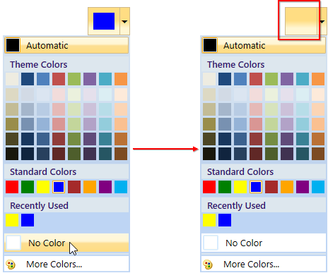
NOTE
Selected brush or color changed notification
The selected brush or color changed in ColorPickerPalette can be examined using SelectedBrushChanged event. The SelectedBrushChangedEventArgs contains the old and newly selected brush and its color values in the OldBrush,NewBrush and OldColor, NewColor properties.
<syncfusion:ColorPickerPalette SelectedBrushChanged="ColorPickerPalette_SelectedBrushChanged"
                               Name="ColorPickerPalette"
                               Width="60"
                               Height="40">
</syncfusion:ColorPickerPalette>
ColorPickerPalette colorPickerPalette = new ColorPickerPalette();
colorPickerPalette.SelectedBrushChanged += ColorPickerPalette_SelectedBrushChanged;
colorPickerPalette.Width = 60;
colorPickerPalette.Height = 40;//Invoked when the selected color or brush is changed
private void ColorPickerPalette_SelectedBrushChanged(object sender, SelectedBrushChangedEventArgs e) {
//Old and newly selected brushes
var OldBrush = e.OldBrush ;
var newBrush = e.NewBrush;
//Old and newly selected colors
var oldColor = e.OldColor;
var newColor = e.NewColor;
}Click here to download the sample that showcases different type of color items with its panel visibility customization.
Localization support
Localization is the process of translating the application resources into different language for the specific cultures. You can localize the ColorPickerPalette control by adding resource file for each language.
NOTE
Refer Localization page to know more about how to provide a localization support for the
ColorPickerPalette.
Theme
ColorPickerPalette supports various built-in themes. Refer to the below links to apply themes for the ColorPickerPalette,