Dealing with ColorPickerPalette in WPF Color Picker Palette
This section explains the different types of colors available in the ColorPickerPalette and how to choose the colors and its panel customizations.
Accessing a Color programmatically
We can get or change the selected color of the ColorPickerPalette programmatically by setting the value to the Color property. If we want know the selected color name, use the ColorName property that holds the name of the selected color item. The default value of Color and ColorName property is Black and Color.
<syncfusion:ColorPickerPalette Color="Red"
                               Name="colorPickerPalette"
                               Width="60"
                               Height="40">
</syncfusion:ColorPickerPalette>
ColorPickerPalette colorPickerPalette = new ColorPickerPalette();
colorPickerPalette.Color = Colors.Red;
colorPickerPalette.Width = 60;
colorPickerPalette.Height = 40;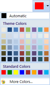
Here, Red color is selected color in the ColorPickerPalette.
Setting automatic color
If we want to change the default selected color on application launching, set the value for AutomaticColor property. If we changed the selected color, then we can easily make the default color as selected color by clicking the automatic color panel. We can hide the automatic color visibility by setting the AutomaticColorVisibility property value as Collapsed. The default value of AutomaticColor property is Black and the default value of AutomaticColorVisibility property is Visible.
<syncfusion:ColorPickerPalette AutomaticColor="Green"
                               AutomaticColorVisibility="Visible"
                               Name="colorPickerPalette"
                               Width="60"
                               Height="40">
</syncfusion:ColorPickerPalette>
ColorPickerPalette colorPickerPalette = new ColorPickerPalette();
colorPickerPalette.AutomaticColor = Colors.Green;
colorPickerPalette.AutomaticColorVisibility= Visibility.Visible;
colorPickerPalette.Width = 60;
colorPickerPalette.Height = 40;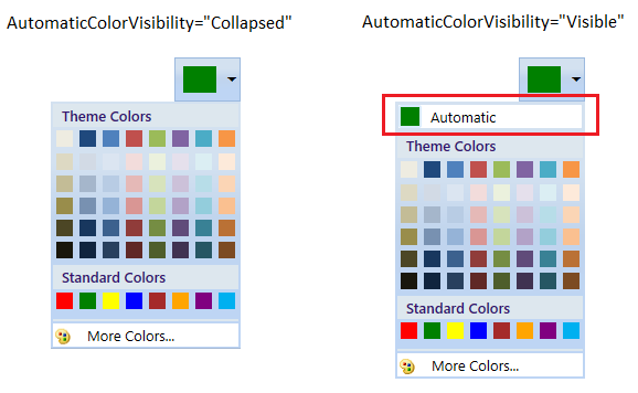
Select a predefined colors
We can select a color from either various theme color items or standard color items. We can show or hide the color items panel visibilities.
Select a color from theme color items
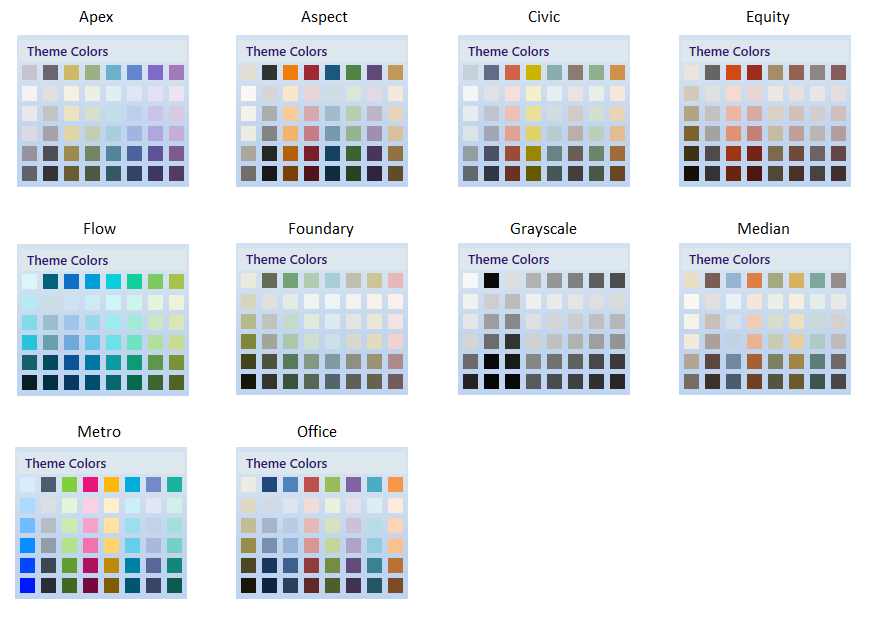
We can select a various theme colors by setting the value for Themes property. Based on the Themes value, the respective base color items are displayed with its variants. If we want allow the user to select only base theme colors without its variants color, use the GenerateThemeVariants property as false. We can hide the theme color panel by setting the ThemePanelVisibility property value as Collapsed. The default value of Themes property is Office and default value of ThemePanelVisibility property is Visible.
<syncfusion:ColorPickerPalette Themes="Metro"
                               GenerateThemeVariants="True"
                               ThemePanelVisibility="Visible"
                               Name="colorPickerPalette"
                               Width="60"
                               Height="40">
</syncfusion:ColorPickerPalette>
ColorPickerPalette colorPickerPalette = new ColorPickerPalette();
colorPickerPalette.Themes = PaletteTheme.Metro;
colorPickerPalette.GenerateThemeVariants = true;
colorPickerPalette.ThemePanelVisibility = Visibility.Visible;
colorPickerPalette.Width = 60;
colorPickerPalette.Height = 40;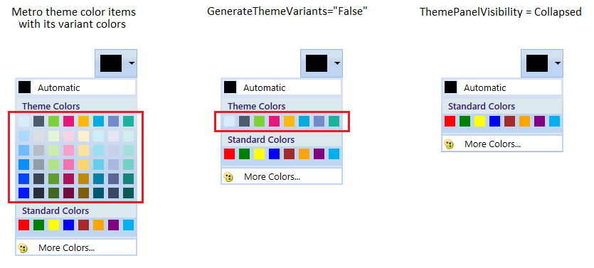
Select a color from standard color items
We can select a standard colors from the standard color panel. If we want allow the user to select standard colors with its variant colors, use the GenerateStandardVariants property as true. We can hide the standard color panel by setting the StandardPanelVisibility property value as Collapsed. The default value of GenerateStandardVariants property is false and default value of StandardPanelVisibility property is Visible.
<syncfusion:ColorPickerPalette GenerateStandardVariants="True"
                               StandardPanelVisibility="Visible"
                               Name="colorPickerPalette"
                               Width="60"
                               Height="40">
</syncfusion:ColorPickerPalette>
ColorPickerPalette colorPickerPalette = new ColorPickerPalette();
colorPickerPalette.GenerateStandardVariants = true;
colorPickerPalette.StandardPanelVisibility = Visibility.Visible;
colorPickerPalette.Width = 60;
colorPickerPalette.Height = 40;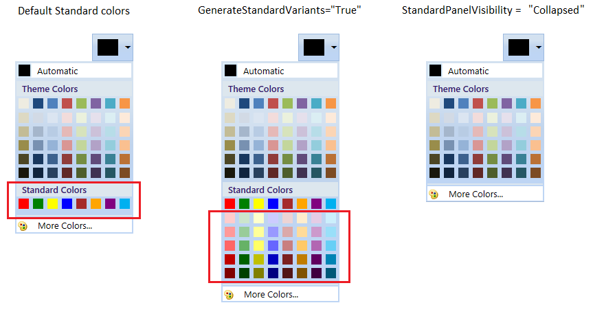
Show white and black color variants
If we want to allow the user to select the theme color from white or black or both color variants, use the BlackWhiteVisibility property as White or Black or Both. The default value of BlackWhiteVisibility property is None.
<syncfusion:ColorPickerPalette BlackWhiteVisibility="Both"
                               Name="colorPickerPalette"
                               Width="60"
                               Height="40">
</syncfusion:ColorPickerPalette>
ColorPickerPalette colorPickerPalette = new ColorPickerPalette();
colorPickerPalette.BlackWhiteVisibility = BlackWhiteVisible.Both;
colorPickerPalette.Width = 60;
colorPickerPalette.Height = 40;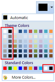
Add your own colors in the palette
If we want to allow the user to select a color from own colors, add that color with its name using CustomColor.ColorName and CustomColor.Color into the CustomColorsCollection and set the SetCustomColors property value as true. The provided CustomColor.ColorName is shown in the tooltip while mouse hovering on the color item. We can change the custom color panel header text and its visibility by using the CustomHeaderText and CustomHeaderVisibility properties. The default value of CustomHeaderText is CustomColors and default value of CustomHeaderVisibility is Visible.
public class ViewModel : NotificationObject {
    private ObservableCollection<CustomColor> newColorCollection;
    public ObservableCollection<CustomColor> NewColorCollection {
        get {
            return newColorCollection;
        }
        set {
            newColorCollection = value;
            this.RaisePropertyChanged("NewColorCollection");
        }
    }
    public ViewModel() {
        NewColorCollection = new ObservableCollection<CustomColor>();
    }
}<Window.Resources>
<local:ViewModel x:Key="viewModel">
<local:ViewModel.NewColorCollection>
<!-- Defining the color details -->
<syncfusion:CustomColor Color="#FF11EBF8" ColorName="Aqua" />
<syncfusion:CustomColor Color="#FFF80FA6" ColorName="Deep Pink" />
<syncfusion:CustomColor Color="#FF8BA7C2" ColorName="Dark Gray" />
<syncfusion:CustomColor Color="#F53CDF07" ColorName="Lime Green" />
<syncfusion:CustomColor Color="#C2929545" ColorName="Olive Drab" />
<syncfusion:CustomColor Color="#2E956145" ColorName="Sienna" />
<syncfusion:CustomColor Color="#78458E95" ColorName="Steel Blue" />
<syncfusion:CustomColor Color="#8B8220E4" ColorName="Blue Violet" />
</local:ViewModel.NewColorCollection>
</local:ViewModel>
</Window.Resources>
<syncfusion:ColorPickerPalette CustomColorsCollection="{Binding NewColorCollection}"
CustomHeaderText="New Colors"
CustomHeaderVisibility="Visible"
SetCustomColors="True"
DataContext="{StaticResource viewModel}"
Name="colorPickerPalette"
Width="60"
Height="40">
</syncfusion:ColorPickerPalette>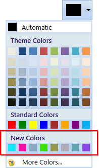
Click here to download the sample that showcases how to add your own color items into the palette.
Recently used color items
The recently selected color items are displayed in the RecentlyUsedPanel. If we want to choose a color which are previously selected, use the RecentlyUsedPanel. We can hide the RecentlyUsedPanel by using the RecentlyUsedPanelVisibility property value as Collapsed. The default value of RecentlyUsedPanelVisibility property is Visible.
<syncfusion:ColorPickerPalette RecentlyUsedPanelVisibility="Visible"
                               Name="colorPickerPalette"
                               Width="60"
                               Height="40">
</syncfusion:ColorPickerPalette>
ColorPickerPalette colorPickerPalette = new ColorPickerPalette();
colorPickerPalette.RecentlyUsedPanelVisibility = Visibility.Visible;
colorPickerPalette.Width = 60;
colorPickerPalette.Height = 40;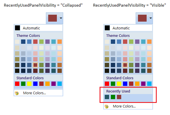
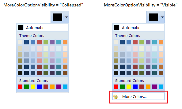
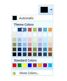
Choosing a color from MoreColor window
In addition to colors in Theme colors and Standard colors, MoreColor feature allows you to select wide range of color options. MoreColor feature includes two categories namely Standard Colors and Custom Colors. We can hide the visibility of the MoreColor Option by using the MoreColorOptionVisibility property value as Collapsed.
Selecting more standard colors
We can select color from 140 standard colors clustered in the shape of a Hexagon. If we want to hide the Standard color tab, use the IsStandardTabVisible property value as Collapsed. The color chosen from this cluster will also be added in the RecentlyUsedPanel.
<syncfusion:ColorPickerPalette IsStandardTabVisible="Visible"
                               Name="colorPickerPalette"
                               Width="60"
                               Height="40">
</syncfusion:ColorPickerPalette>
ColorPickerPalette colorPickerPalette = new ColorPickerPalette();
colorPickerPalette.IsStandardTabVisible = Visibility.Visible;
colorPickerPalette.Width = 60;
colorPickerPalette.Height = 40;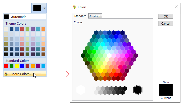
Selecting more custom colors
We can select any color and adjusting its saturation level by using the custom tab color picker . If we want to hide the custom color tab, use the IsCustomTabVisible property value as Collapsed. The color chosen from custom color picker will also be added in the RecentlyUsedPanel.
<syncfusion:ColorPickerPalette IsCustomTabVisible="Visible"
                               Name="colorPickerPalette"
                               Width="60"
                               Height="40">
</syncfusion:ColorPickerPalette>
ColorPickerPalette colorPickerPalette = new ColorPickerPalette();
colorPickerPalette.IsCustomTabVisible = Visibility.Visible;
colorPickerPalette.Width = 60;
colorPickerPalette.Height = 40;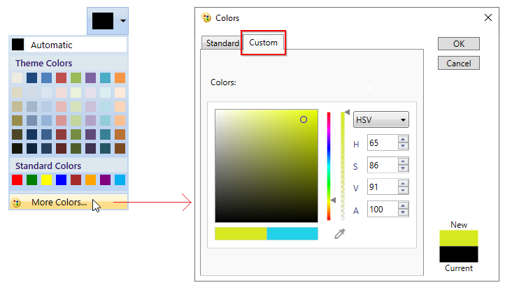
NOTE
If we set
IsCustomTabVisibleandIsStandardTabVisibleproperty value asfalse, then MoreColor option automatically hides.
Color changed notification
The selected color changed in ColorPickerPalette can be examined using ColorChanged event. The ColorChanged event contains the old and newly selected color values in the OldValue, NewValue properties.
<syncfusion:ColorPickerPalette ColorChanged="ColorPickerPalette_ColorChanged"
                               Name="ColorPickerPalette"
                               Width="60"
                               Height="40">
</syncfusion:ColorPickerPalette>
ColorPickerPalette colorPickerPalette = new ColorPickerPalette();
colorPickerPalette.ColorChanged += ColorPickerPalette_ColorChanged;
colorPickerPalette.Width = 60;
colorPickerPalette.Height = 40;//Invoked when the selected color is changed
private void ColorPickerPalette_ColorChanged(DependencyObject d, DependencyPropertyChangedEventArgs e) {
Console.WriteLine(e.OldValue.ToString());
Console.WriteLine(e.NewValue.ToString());
}Tooltip support
Tooltip is used to show the information about the segment, when you mouse over on the segment. We can show information about the name of the color item using tooltip when hovering the mouse on the specific color item.
Expanded mode
If we want to directly use the ColorPickerPalette without drop down, set the IsExpanded property value as true. The default value of IsExpanded is true.
<syncfusion:ColorPickerPalette IsExpanded="true"
                               Name="colorPickerPalette"
                               Width="60"
                               Height="40">
</syncfusion:ColorPickerPalette>
ColorPickerPalette colorPickerPalette = new ColorPickerPalette();
colorPickerPalette.IsExpanded = true;
colorPickerPalette.Width = 60;
colorPickerPalette.Height = 40;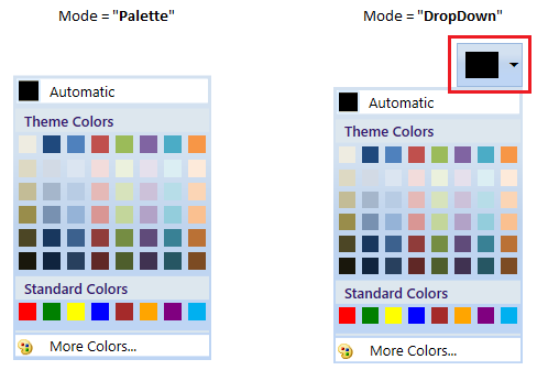
Change color item size
We can change each color item size by using the BorderWidth and BorderHeight properties. Based on the color items size, the color palette is resized. The default value of BorderWidth and BorderHeight properties is 17.
<syncfusion:ColorPickerPalette BorderWidth="30"
                               BorderHeight="30"
                               Name="colorPickerPalette"
                               Width="60"
                               Height="40">
</syncfusion:ColorPickerPalette>
ColorPickerPalette colorPickerPalette = new ColorPickerPalette();
colorPickerPalette.BorderWidth = 30;
colorPickerPalette.BorderHeight = 30;
colorPickerPalette.Width = 60;
colorPickerPalette.Height = 40;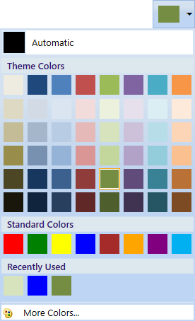
Change color palette size
We can change the color palette pop size by using the PopupWidth and PopupHeight properties. Based on the popup color palette size, the color items are resized. The default value of PopupWidth and PopupHeight properties is 175 and 200.
<syncfusion:ColorPickerPalette PopupWidth="120"
                               PopupHeight="100"
                               Name="colorPickerPalette"
                               Width="60"
                               Height="40">
</syncfusion:ColorPickerPalette>
ColorPickerPalette colorPickerPalette = new ColorPickerPalette();
colorPickerPalette.PopupWidth = 120;
colorPickerPalette.PopupHeight = 100;
colorPickerPalette.Width = 60;
colorPickerPalette.Height = 40;
NOTE
If we use both
PopupWidth&PopupHeightandBorderWidth&BorderHeight, thenBorderWidth&BorderHeightproperties have higher priority.
Change header and more color icons
We can set the icons for control header which is placed left to the DropDown button and more color panel header by using the Icon and MoreColorsIcon properties. We can change the icon size for the control icon and more color icon by using the IconSize and MoreColorsIconSize properties.
<syncfusion:ColorPickerPalette Icon="/Label.png"
                               IconSize="18,18"
                               MoreColorsIcon="/MoreColor.png"
                               MoreColorsIconSize="50,50"
                               Name="colorPickerPalette"
                               Width="60"
                               Height="40">
</syncfusion:ColorPickerPalette>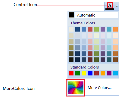
Click here to download the sample that showcases features and different type color items with its panel visibility customization.