How can I help you?
Sizing Collapsed Content in UWP Navigation Pane (SfGroupBar)
10 May 20211 minute to read
Content is displayed in Popup when SfGroupBar is in Collapsed mode. Content popup is opened when the popup expander button is clicked. The content popup can be customized in several ways using the property PopupSizeMode.
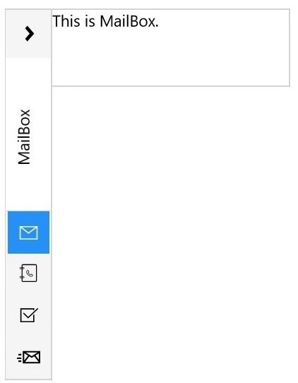
Displaying Popup in Full Size
PopUp can be displayed in full height of the SfGroupBar by setting PopupSizeMode as FullSize.
<navigation:SfGroupBar PopupSizeMode="FullSize" VerticalAlignment="Stretch">

<navigation:SfGroupBar/>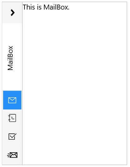
Displaying PopUp in Default Size
PopUp can be displayed in equal height of the popup expander button in SfGroupBar by setting PopupSizeMode as DefaultSize.
<navigation:SfGroupBar PopupSizeMode="DefaultSize" VerticalAlignment="Stretch">

<navigation:SfGroupBar/>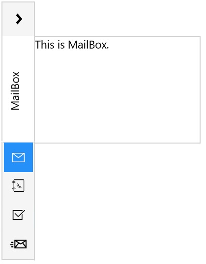
Displaying Popup in Custom Size
Content popup can be set to custom size using the properties PopupSizeMode, PopupHeight and PopupWidth.
<navigation:SfGroupBar Margin="5 0 0 5" PopupSizeMode="CustomSize"
                       PopupWidth="500" PopupHeight="100"
					   VerticalAlignment="Stretch">

<navigation:SfGroupBar/>