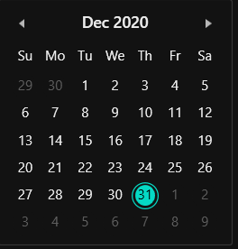
Appearance in WPF Calendar
This section explains different styling, theming options available in CalendarEdit control.
Setting the foreground
You can change the default foreground, mouse hover foreground and border brush of the CalendarEdit by using the Foreground, MouseOverForeground and MouseOverBorderBrush properties. The default value of Foreground is Dark SlateGray and MouseOverForeground is Black.
<Window
    . . .
    xmlns:syncfusion="http://schemas.syncfusion.com/wpf">
    <syncfusion:CalendarEdit Foreground="Blue"
                         MouseOverForeground="Red"
                         MouseOverBorderBrush="DarkGoldenrod"
                         Name="calendarEdit" />
</Window>
using Syncfusion.Windows.Shared;
this.calendarEdit.Foreground = Brushes.Blue;
this.calendarEdit.MouseOverForeground = Brushes.Red;
this.calendarEdit.MouseOverBorderBrush = Brushes.DarkGoldenrod;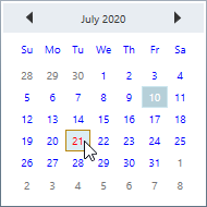
NOTE
Setting the background
You can change the default background and mouse hover background color of the CalendarEdit by using the Background and MouseOverBackground properties. The default value of Background is White and MouseOverBackground is Lavender.
<Window
    . . .
    xmlns:syncfusion="http://schemas.syncfusion.com/wpf">
    <syncfusion:CalendarEdit Background="Pink"
                         MouseOverBackground="Green"
                         Name="calendarEdit" />
</Window>
using Syncfusion.Windows.Shared;
this.calendarEdit.Background = Brushes.Pink;
this.calendarEdit.MouseOverBackground = Brushes.Green;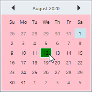
NOTE
Change flow direction
You can change the flow direction of the CalendarEdit layout from right to left by setting the FlowDirection property value as RightToLeft. The default value of FlowDirection property is LeftToRight.
<Window
    . . .
    xmlns:syncfusion="http://schemas.syncfusion.com/wpf">
    <syncfusion:CalendarEdit FlowDirection="RightToLeft"
                         Name="calendarEdit" />
</Window>
using Syncfusion.Windows.Shared;
this.calendarEdit.FlowDirection = FlowDirection.RightToLeft;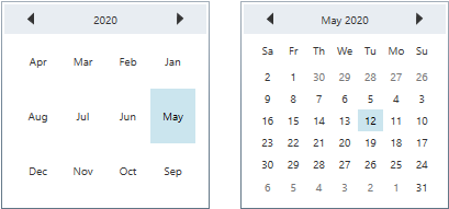
NOTE
Theme
CalendarEdit supports various built-in themes. Refer to the below links to apply themes for the CalendarEdit,