Getting started with .NET MAUI Time Picker
29 Jun 20264 minutes to read
This section explains how to add the .NET MAUI Time Picker control. It covers only the basic features needed to get started with the Syncfusion Time Picker. Follow the steps below to add a .NET MAUI Time picker to your project.
To get start quickly with our .NET MAUI Time Picker, you can check the below video.
Prerequisites
Before proceeding, ensure the following are set up:
- Install .NET 9 SDK or later.
- Set up a .NET MAUI environment with Visual Studio 2022 v17.12 or later.
Step 1: Create a new .NET MAUI project
- Go to File > New > Project and choose the .NET MAUI App template.
- Name the project and choose a location. Then click Next.
- Select the .NET framework version and click Create.
Step 2: Install the Syncfusion® .NET MAUI Picker NuGet package
- In Solution Explorer, right-click the project and choose Manage NuGet Packages.
- Search for Syncfusion.Maui.Picker and install the latest version.
- Ensure the necessary dependencies are installed correctly, and the project is restored.
Prerequisites
Before proceeding, ensure the following are set up:
- Install .NET 9 SDK or later.
- Set up a .NET MAUI environment with Visual Studio Code.
- Ensure that the .NET MAUI workloads are installed and configured as described here.
Step 1: Create a new .NET MAUI project
- Open the command palette by pressing
Ctrl+Shift+Pand type .NET:New Project and enter. - Choose the .NET MAUI App template.
- Select the project location, type the project name and press Enter.
- Then choose Create project.
Step 2: Install the Syncfusion® .NET MAUI Picker NuGet package
- Press Ctrl + ` (backtick) to open the integrated terminal in Visual Studio Code.
- Ensure you’re in the project root directory where your .csproj file is located.
- Run the command
dotnet add package Syncfusion.Maui.Pickerto install the Syncfusion® .NET MAUI Picker NuGet package. - To ensure all dependencies are installed, run
dotnet restore.
Prerequisites
Before proceeding, ensure the following are set up:
- Install .NET 9 SDK or later.
- Set up a .NET MAUI environment with JetBrains Rider 2024.3 or later.
- Make sure the MAUI workloads are installed and configured as described here.
Step 1: Create a new .NET MAUI project
- Go to File > New Solution, Select .NET (C#) and choose the .NET MAUI App template.
- Enter the Project Name, Solution Name, and Location.
- Select the .NET framework version and click Create.
Step 2: Install the Syncfusion® MAUI Picker NuGet package
- In Solution Explorer, right-click the project and choose Manage NuGet Packages.
- Search for Syncfusion.Maui.Picker and install the latest version.
- Ensure the necessary dependencies are installed correctly, and the project is restored. If not, Open the Terminal in Rider and manually run:
dotnet restore
Step 3: Register Syncfusion handler
Make sure to add the namespace.
using Syncfusion.Maui.Core.Hosting;Register the Syncfusion core handler in your CreateMauiApp method of MauiProgram.cs file to use Syncfusion controls.
builder.ConfigureSyncfusionCore();Step 4: Import the TimePicker namespace
Add the following namespace in your XAML or C#.
xmlns:picker="clr-namespace:Syncfusion.Maui.Picker;assembly=Syncfusion.Maui.Picker"using Syncfusion.Maui.TimePicker;Step 5: Add the TimePicker Component
Initialize the TimePicker control and configure its properties to select time values in an intuitive and customizable interface. The SfTimePicker control allows you to add the header text by setting the Text property in the PickerHeaderView. Enable the header view by setting the Height property in the PickerHeaderView.
<picker:SfTimePicker x:Name="picker">
    <picker:SfTimePicker.HeaderView>
        <picker:PickerHeaderView Text="Time Picker" Height="40" />
    </picker:SfTimePicker.HeaderView>
</picker:SfTimePicker>
SfTimePicker picker = new SfTimePicker();
picker.HeaderView = new PickerHeaderView()
{
Text = "Time Picker",
Height = 40,
};
this.Content = picker;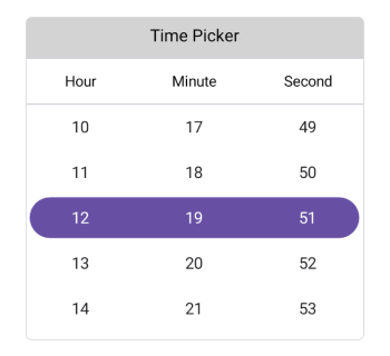
You can download the TimePicker Getting Started sample from GitHub.