Overview of .NET MAUI Popup
18 Nov 20185 minutes to read
Syncfusion® .NET MAUI Popup layout allows you to display an alert message with customizable buttons or load any desired view inside a popup. It provides options to fully customize the popup with custom header, body, and footer capabilities, allowing you to display important information precisely how users want to.
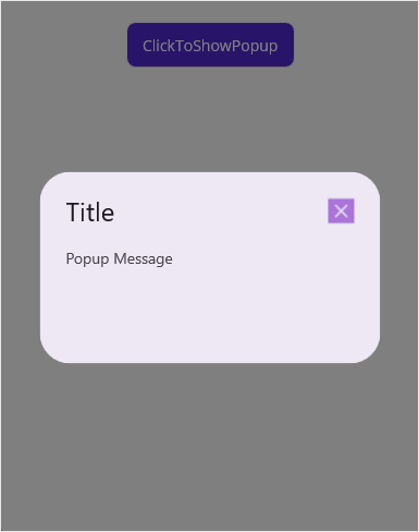
Business use cases
- Applications that require displaying alerts, confirmations, or notifications to users.
- Form-based workflows that use modal dialogs for validation, input confirmation, or action prompts.
- Mobile apps that present contextual content such as tips, menus, or additional details in overlays.
- Business applications that require custom popup layouts for interactive user experiences.
Key features
- Flexible positioning allows displaying the popup at any location on the screen.
- Relative positioning allows aligning the popup based on a target UI element.
- Full-screen mode allows displaying popup content across the entire screen for engaging experiences.
- Auto sizing allows adjusting popup dimensions automatically based on loaded content.
- Predefined layout allows using built-in layouts such as single-button or two-button dialog styles.
- Template allows loading custom views for header, content, and footer using templates.
- Modal behavior allows preventing interaction with background content until the popup is closed.
Globalization
The following table summarizes the globalization support available in this control.
 Full Support
 No Support
 Not Applicable
| Control | Localization | RTL | Time zone | Screen reader | Keyboard navigation |
|---|---|---|---|---|---|
| Popup | |
|
|
|
|
Related controls
- Navigation Drawer for creating sliding panels for navigation and content display.
- Backdrop Page for implementing layered UI interactions with front and back panels.
- Busy Indicator for displaying loading or status feedback within popup overlays.
See Also
- Getting Started shows a step‑by‑step guide to begin using the Popup control.
- Customization explains how to customize layout and appearance.
- Positioning helps configure popup positioning and alignment.
- UI Kit provides interactive demos and ready‑made UI examples.
Resources
Feature Tour
Get a quick overview of key features and capabilities to kick start your journey.
Explore Features
Tutorial Videos
Watch step‑by‑step video guides to quickly understand concepts and implementation.
Watch now
Knowledge Base
Find practical solutions, troubleshooting tips and how‑to guides for common scenarios.
Search KB's
Use Case Sample
Explore a real-world application that demonstrates the practical use of the Popup.
View Sample