Polar Line Chart in .NET MAUI Polar Chart
18 Nov 20184 minutes to read
Polar Line Chart
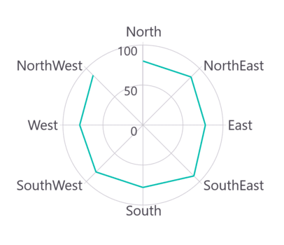
To display a line series in a polar chart, instantiate the PolarLineSeries and include it in the Series collection property of SfPolarChart.
Prerequisite: Ensure that the required NuGet package is installed, the necessary namespaces are imported, and the SfPolarChart control is properly configured in your application. For detailed setup and configuration instructions, refer to the Getting Started guide.
<chart:SfPolarChart>
    <chart:SfPolarChart.PrimaryAxis>
        <chart:CategoryAxis/>
    </chart:SfPolarChart.PrimaryAxis>

    <chart:SfPolarChart.SecondaryAxis>
        <chart:NumericalAxis/>
    </chart:SfPolarChart.SecondaryAxis>

    <chart:PolarLineSeries ItemsSource = "{Binding PlantDetails}"
                           XBindingPath = "Direction"
                           YBindingPath = "Tree"/>
</chart:SfPolarChart>
SfPolarChart chart = new SfPolarChart();
CategoryAxis primaryAxis = new CategoryAxis();
chart.PrimaryAxis = primaryAxis;
NumericalAxis secondaryAxis = new NumericalAxis();
chart.SecondaryAxis = secondaryAxis;
PolarLineSeries series = new PolarLineSeries()
{
ItemsSource = new PlantViewModel().PlantDetails,
XBindingPath = "Direction",
YBindingPath = "Tree"
};
chart.Series.Add(series);
this.Content = chart;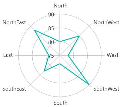
Customizing Line Appearance
You can customize the polar line series appearance using the following properties:
- Stroke - Gets or sets the brush for the line color
- StrokeWidth - Gets or sets the thickness of the line
- StrokeDashArray - Gets or sets the pattern for dashed lines
The following code example demonstrates line customization:
<chart:SfPolarChart>
    <!-- code omitted for brevity -->
    <chart:PolarLineSeries ItemsSource = "{Binding PlantDetails}"
                           XBindingPath = "Direction"
                           YBindingPath = "Tree"
                           Stroke = "Blue"
                           StrokeWidth = "2"/>
</chart:SfPolarChart>
SfPolarChart chart = new SfPolarChart();
// code omitted for brevity
PolarLineSeries series = new PolarLineSeries()
{
ItemsSource = new PlantViewModel().PlantDetails,
XBindingPath = "Direction",
YBindingPath = "Tree",
Stroke = Colors.Blue,
StrokeWidth = 2
};
chart.Series.Add(series);
this.Content = chart;Closed Series
The IsClosed property is used to render the series with or without closed path. The default value of IsClosed is true.
<chart:SfPolarChart>
    <!-- code omitted for brevity -->
    <chart:PolarLineSeries ItemsSource = "{Binding PlantDetails}"
                           XBindingPath = "Direction"
                           YBindingPath = "Tree"
                           IsClosed = "False"/>
</chart:SfPolarChart>
SfPolarChart chart = new SfPolarChart();
// code omitted for brevity
PolarLineSeries series = new PolarLineSeries()
{
ItemsSource = new PlantViewModel().PlantDetails,
XBindingPath = "Direction",
YBindingPath = "Tree",
IsClosed = false
};
chart.Series.Add(series);
this.Content = chart;