Basic Features in .NET MAUI Numeric Entry (SfNumericEntry)
17 Mar 202621 minutes to read
Setting Placeholder Text
You can prompt the user with any information using the Placeholder property. Placeholder text will be displayed only when the value of the AllowNull property is true and the value of the NumericEntry control is null. The default value of the Placeholder property is string.Empty (No string will be displayed).
<editors:SfNumericEntry WidthRequest="200"
                        HorizontalOptions="Center"
                        VerticalOptions="Center"
                        Placeholder="Enter input here..." />
SfNumericEntry sfNumericEntry= new SfNumericEntry();
sfNumericEntry.WidthRequest=200;
sfNumericEntry.Placeholder = "Enter input here...";
sfNumericEntry.HorizontalOptions = LayoutOptions.Center;
sfNumericEntry.VerticalOptions = LayoutOptions.Center;
Clear button visibility
The ShowClearButton property is used to show or hide the clear button in the NumericEntry. By default, visibility of the clear button is enabled.
NOTE
The clear button appears only when the text box is focused and the
IsEditableproperty value is set to true.
<editors:SfNumericEntry WidthRequest="200"
                        ShowClearButton="True"
                        IsEditable="True"
                        Value="10"/>
SfNumericEntry sfNumericEntry= new SfNumericEntry();
sfNumericEntry.WidthRequest=200;
sfNumericEntry.Value=10;
sfNumericEntry.ShowClearButton = true;
sfNumericEntry.IsEditable = true;If IsEditable is true

If IsEditable is false

Value changed notification
The ValueChanged event is triggered when the Value property of the NumericEntry control is changed. The value will not be changed when the user enters the input. The value of the NumericEntry control will be changed after validation is performed on the Enter keypress or when the focus is lost in the control. The ValueChanged contains the following properties.
-
NewValue- Contains the new input value. -
OldValue- Contains the previous input value.
<editors:SfNumericEntry WidthRequest="200"
                        HorizontalOptions="Center"
                        VerticalOptions="Center"
                        ValueChanged="sfNumericEntry_ValueChanged" />
SfNumericEntry sfNumericEntry = new SfNumericEntry();
sfNumericEntry.WidthRequest=200;
sfNumericEntry.HorizontalOptions = LayoutOptions.Center;
sfNumericEntry.VerticalOptions = LayoutOptions.Center;
sfNumericEntry.ValueChanged += sfNumericEntry_ValueChanged;You can handle the event as follows.
private void sfNumericEntry_ValueChanged(object sender, NumericEntryValueChangedEventArgs e)
{
    var oldValue = e.OldValue;
    var newValue = e.NewValue;
}
Value Change Mode
The ValueChangeMode property determine when the values are updated.
The supported value change modes are as follows:
* OnLostFocus - The value will be updated when the editor loses its focus or the focus moved to the next control. By default, the ValueChangeMode is OnLostFocus.
* OnKeyFocus - The value will be updated with each key press.
<VerticalStackLayout Spacing="10" VerticalOptions="Center">
    <editors:SfNumericEntry x:Name="numericEntry"
                            WidthRequest="200"
                            HeightRequest="40"
                            VerticalOptions="Center"
                            ValueChangeMode="OnKeyFocus"
                            Value="50">
    </editors:SfNumericEntry>
    <HorizontalStackLayout Spacing="2" HeightRequest="40" WidthRequest="200">
        <Label Text="Dollar:"  />
        <Label x:Name="valueDisplay"
               TextColor="Green"
               Text="{Binding Path=Value, Source={x:Reference numericEntry}, StringFormat='${0:F2}'}"
               HeightRequest="40" />
    </HorizontalStackLayout>
</VerticalStackLayout>
public partial class MainPage : ContentPage
{
public Label valueDisplay;
public MainPage()
{
InitializeComponent();
var verticalStackLayout = new StackLayout
{
Spacing = 10,
VerticalOptions = LayoutOptions.Center
};
var numericEntry = new SfNumericEntry
{
WidthRequest = 200,
HeightRequest = 40,
VerticalOptions = LayoutOptions.Center,
ValueChangeMode = ValueChangeMode.OnKeyFocus,
Value = 50
};
var horizontalStackLayout = new StackLayout
{
Spacing = 2,
HeightRequest = 40,
WidthRequest = 200
};
var labelDollar = new Label
{
Text = "Dollar:"
};
valueDisplay = new Label
{
Text="$50",
TextColor = Colors.Green
};
numericEntry.ValueChanged += NumericEntry_ValueChanged;
horizontalStackLayout.Children.Add(labelDollar);
horizontalStackLayout.Children.Add(valueDisplay);
verticalStackLayout.Children.Add(numericEntry);
verticalStackLayout.Children.Add(horizontalStackLayout);
Content = verticalStackLayout;
}
private void NumericEntry_ValueChanged(object sender, NumericEntryValueChangedEventArgs e)
{
valueDisplay.Text="$"+e.NewValue.ToString();
}
}
Completed Event
The Completed event is raised when the user finalizes the text in the SfNumericEntry editable mode by pressing return key on the keyboard. The handler for the event is a generic event handler, taking the sender and EventArgs(the EventArgs value is string.Empty):
<editors:SfNumericEntry x:Name="numericEntry"
                        WidthRequest="200"
                        Value = "153"
                        Completed="numericEntry_Completed"/>
SfNumericEntry numericEntry = new SfNumericEntry()
{
WidthRequest = 200;
Value = 153,
};
numericEntry.Completed += numericEntry_Completed;Completed event can be Handled in C# as follows:
private async void numericEntry_Completed(object sender, EventArgs e)
    {
        await DisplayAlert("Message", "Text entering Completed", "ok");
    }
ClearButtonClicked Event
The ClearButtonClicked event is raised when the user activates the clear button in the SfNumericEntry editable mode by tapping or pressing the clear button on the keyboard. The handler for the event is a generic event handler, taking the sender and EventArgs.
<editors:SfNumericEntry x:Name="numericEntry"
                        WidthRequest="200"
                        Value="153"
                        ClearButtonClicked="numericEntry_Completed"/>
SfNumericEntry numericEntry = new SfNumericEntry()
{
WidthRequest = 200;
value = 153,
};
numericEntry.ClearButtonClicked += numericEntry_ClearButtonClicked;ClearButtonClicked event can be Handled in C# as follows:
private async void numericEntry_ClearButtonClicked(object sender, EventArgs e)
    {
        await DisplayAlert("Message", "Clear Button Clicked", "ok");
    }
Stroke
The NumericEntry border color can be changed by using the Stroke property. The default Stroke color is Black.
<editors:SfNumericEntry WidthRequest="200"
                        HorizontalOptions="Center"
                        VerticalOptions="Center"
                        Stroke="Red" />
SfNumericEntry sfNumericEntry = new SfNumericEntry();
sfNumericEntry.WidthRequest=200;
sfNumericEntry.HorizontalOptions = LayoutOptions.Center;
sfNumericEntry.VerticalOptions = LayoutOptions.Center;
sfNumericEntry.Stroke = Colors.Red;You can find the complete getting started sample of .NET MAUI from this link.
Border visibility
The ShowBorder property of SfNumericEntry is used to modify the visibility of the border and its default value is true. The following code example demonstrates how to change the border visibility,
<editors:SfNumericEntry WidthRequest="200"
                        HeightRequest="40"
                        ShowBorder="False"/>
SfNumericEntry sfNumericEntry= new SfNumericEntry();
sfNumericEntry.WidthRequest = 200;
sfNumericEntry.HeightRequest = 40;
sfNumericEntry.ShowBorder = false;The following image illustrates the result of the above code:

TextAlignment
The SfNumericEntry provides support to customize the text alignment by using the HorizontalTextAlignment and VerticalTextAlignment properties.
NOTE
Dynamic changes to the
HorizontalTextAlignmentproperty may not be functioning as expected on Android platform.
<editors:SfNumericEntry WidthRequest="200"
                        HeightRequest="50"
                        HorizontalTextAlignment="Center"
                        VerticalTextAlignment="Start"/>
SfNumericEntry sfNumericEntry= new SfNumericEntry();
sfNumericEntry.WidthRequest = 200;
sfNumericEntry.HeightRequest = 50;
sfNumericEntry.HorizontalTextAlignment = TextAlignment.Center;
sfNumericEntry.VerticalTextAlignment = TextAlignment.Start;The following image illustrates the result of the above code:

Select text on focus
The SelectAllOnFocus property allows you to automatically select all the text in the numeric entry when the control gains focus. This can improve user efficiency by making it easy to replace the entire content. The default value of this property is true.
<editors:SfNumericEntry WidthRequest="200"
                        Value="123456"
                        SelectAllOnFocus="False" />
SfNumericEntry numericEntry = new SfNumericEntry();
numericEntry.WidthRequest = 200;
numericEntry.Value = 123456;
numericEntry.SelectAllOnFocus = false;ReturnType
The ReturnType property specifies the return button (e.g., Next, Done, Go) of the keyboard. It helps manage the flow between multiple input fields by defining what happens when the action button is pressed.
You can define the return key type of SfNumericEntry by using the ReturnType property.
NOTE
Default value of ReturnType is
Default.
<editors:SfNumericEntry x:Name="numericEntry"
                        WidthRequest="200"
                        ReturnType="Next"/>
SfNumericEntry sfNumericEntry = new SfNumericEntry();
sfNumericEntry.WidthRequest=200;
sfNumericEntry.ReturnType = ReturnType.Next;
Clear button customization
The ClearButtonPath property allows users to set the path for customizing the appearance of the SfNumericEntry clear button.
<editors:SfNumericEntry x:Name="numericEntry"
                        WidthRequest="200"
                        ShowClearButton="True"
                        IsEditable="True"
                        Value="10">
            <editors:SfNumericEntry.ClearButtonPath>
                <Path Data="M1.70711 0.292893C1.31658 -0.097631 0.683417 -0.097631 0.292893 0.292893C-0.097631 0.683417 -0.097631 1.31658 0.292893 1.70711L5.58579 7L0.292893 12.2929C-0.097631 12.6834 -0.097631 13.3166 0.292893 13.7071C0.683417 14.0976 1.31658 14.0976 1.70711 13.7071L7 8.41421L12.2929 13.7071C12.6834 14.0976 13.3166 14.0976 13.7071 13.7071C14.0976 13.3166 14.0976 12.6834 13.7071 12.2929L8.41421 7L13.7071 1.70711C14.0976 1.31658 14.0976 0.683417 13.7071 0.292893C13.3166 -0.097631 12.6834 -0.097631 12.2929 0.292893L7 5.58579L1.70711 0.292893Z"
                Fill="Red"
                Stroke="Red"/>
            </editors:SfNumericEntry.ClearButtonPath>
</editors:SfNumericEntry>
private string _customPath = "M1.70711 0.292893C1.31658 -0.097631 0.683417 -0.097631 0.292893 0.292893C-0.097631 0.683417 -0.097631 1.31658 0.292893 1.70711L5.58579 7L0.292893 12.2929C-0.097631 12.6834 -0.097631 13.3166 0.292893 13.7071C0.683417 14.0976 1.31658 14.0976 1.70711 13.7071L7 8.41421L12.2929 13.7071C12.6834 14.0976 13.3166 14.0976 13.7071 13.7071C14.0976 13.3166 14.0976 12.6834 13.7071 12.2929L8.41421 7L13.7071 1.70711C14.0976 1.31658 14.0976 0.683417 13.7071 0.292893C13.3166 -0.097631 12.6834 -0.097631 12.2929 0.292893L7 5.58579L1.70711 0.292893Z";
var converter = new PathGeometryConverter();
var path = new Path()
{
Data = (PathGeometry)converter.ConvertFromInvariantString(_customPath),
Fill = Colors.Red,
Stroke = Colors.Red
};
SfNumericEntry numericEntry = new SfNumericEntry();
numricEntry.Value=10;
numericEntry.WidthRequest=200;
numericEntry.ShowClearButton = true;
numericEntry.IsEditable = true;
numericEntry.ClearButtonPath = path;The following image illustrates the result of the above code:

Return Command and Return Command Parameter
-
ReturnCommand, of type ICommand, defines the command to be executed when the return key is pressed. -
ReturnCommandParameter, of type object, specifies the parameter for theReturnCommand.
<ContentPage.BindingContext>
    <local:CommandDemoViewModel/>
</ContentPage.BindingContext>

<editors:SfNumericEntry x:Name="numericEntry"
            WidthRequest="200"
            ReturnCommand="{Binding AlertCommand}"
            ReturnCommandParameter="Return key is pressed">
</editors:SfNumericEntry>
var viewModel = new CommandDemoViewModel();
SfNumericEntry numericEntry = new SfNumericEntry();
numericEntry.WidthRequest=200;
numericEntry.ReturnCommand = viewModel.AlertCommand;
numericEntry.ReturnCommandParameter = "Return key is pressed";//ViewModel.cs
public class CommandDemoViewModel
{
public ICommand AlertCommand => new Command<string>(OnAlertCommandExecuted);
private async void OnAlertCommandExecuted(string parameter)
{
await Application.Current.MainPage.DisplayAlert("Alert", parameter, "OK");
}
}Automation ID
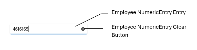
The SfNumericEntry control provides AutomationId support specifically for the editable entry and the clear button, enabling UI automation frameworks to reliably target these two elements. Each element’s AutomationId is derived from the control’s AutomationId to ensure uniqueness.
For example, if the SfNumericEntry’s AutomationId is set to “Employee NumericEntry,” the editable entry can be targeted as “Employee NumericEntry Entry” and the clear button as “Employee NumericEntry Clear Button.” This focused support improves accessibility and automated UI testing by providing stable, predictable identifiers for the primary interactive elements.
The following screenshot illustrates the AutomationIds of inner elements.