How can I help you?
Notice: After Volume 3 2025 (Mid of Sep 2025), feature enhancements for this control will no longer be available in the Syncfusion® package. Please switch to the Syncfusion® Toolkit for .NET MAUI for continued support. For a smooth transition refer this migration document.
Getting started with .NET MAUI Circular ProgressBar
7 Jul 202513 minutes to read
This section explains the steps required to add the circular progress bar control with the progress and its customizable elements such as indeterminate, segment, progress fill, and track fill. This section covers only the basic features needed to know and gets started with the Syncfusion® circular progress bar. Follow the steps below to add a .NET MAUI Circular progress bar to your project.
To get start quickly with our .NET MAUI Circular ProgressBar, check the following video.
Prerequisites
Before proceeding, ensure the following are set up:
- Install .NET 7 SDK or later is installed.
- Set up a .NET MAUI environment with Visual Studio 2022 (v17.3 or later).
Step 1: Create a New .NET MAUI Project
- Go to File > New > Project and choose the .NET MAUI App template.
- Name the project and choose a location. Then click Next.
- Select the .NET framework version and click Create.
Step 2: Install the Syncfusion® MAUI Circular ProgressBar NuGet Package
- In Solution Explorer, right-click the project and choose Manage NuGet Packages.
- Search for Syncfusion.Maui.ProgressBar and install the latest version.
- Ensure the necessary dependencies are installed correctly, and the project is restored.
Step 3: Register the handler
The Syncfusion.Maui.Core NuGet is a dependent package for all Syncfusion® controls of .NET MAUI. In the MauiProgram.cs file, register the handler for Syncfusion core.
using Syncfusion.Maui.Core.Hosting;
namespace GettingStarted
{
    public static class MauiProgram
    {
        public static MauiApp CreateMauiApp()
        {
            var builder = MauiApp.CreateBuilder();

            builder.ConfigureSyncfusionCore();
            builder
            .UseMauiApp<App>()
            .ConfigureFonts(fonts =>
            {
                fonts.AddFont("OpenSans-Regular.ttf", "OpenSansRegular");
            });

            return builder.Build();
        }
    }
}
Step 4: Add .NET MAUI Circular ProgressBar control
- To initialize the control, import the
Syncfusion.Maui.ProgressBarnamespace into your code. - Initialize SfCircularProgressBar.
xmlns:progressBar="clr-namespace:Syncfusion.Maui.ProgressBar;assembly=Syncfusion.Maui.ProgressBar"using Syncfusion.Maui.ProgressBar;Create an instance for the circular progress bar control, and add it as content.
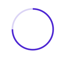
<progressBar:SfCircularProgressBar Progress="75"/>SfCircularProgressBar circularProgressBar = new SfCircularProgressBar { Progress = 75 };
this.Content = circularProgressBar;Prerequisites
Before proceeding, ensure the following are set up:
- Install .NET 7 SDK or later is installed.
- Set up a .NET MAUI environment with Visual Studio Code.
- Ensure that the .NET MAUI extension is installed and configured as described here.
Step 1: Create a New .NET MAUI Project
- Open the command palette by pressing
Ctrl+Shift+Pand type .NET:New Project and enter. - Choose the .NET MAUI App template.
- Select the project location, type the project name and press Enter.
- Then choose Create project.
Step 2: Install the Syncfusion® MAUI Circular ProgressBar NuGet Package
- Press Ctrl + ` (backtick) to open the integrated terminal in Visual Studio Code.
- Ensure you’re in the project root directory where your .csproj file is located.
- Run the command
dotnet add package Syncfusion.Maui.ProgressBarto install the Syncfusion® .NET MAUI ProgressBar NuGet package. - To ensure all dependencies are installed, run
dotnet restore.
Step 3: Register the handler
The Syncfusion.Maui.Core NuGet is a dependent package for all Syncfusion® controls of .NET MAUI. In the MauiProgram.cs file, register the handler for Syncfusion core.
using Syncfusion.Maui.Core.Hosting;
namespace GettingStarted
{
    public static class MauiProgram
    {
        public static MauiApp CreateMauiApp()
        {
            var builder = MauiApp.CreateBuilder();

            builder.ConfigureSyncfusionCore();
            builder
            .UseMauiApp<App>()
            .ConfigureFonts(fonts =>
            {
                fonts.AddFont("OpenSans-Regular.ttf", "OpenSansRegular");
            });

            return builder.Build();
        }
    }
}
Step 4: Add .NET MAUI Circular ProgressBar control
- To initialize the control, import the
Syncfusion.Maui.ProgressBarnamespace into your code. - Initialize SfCircularProgressBar.
xmlns:progressBar="clr-namespace:Syncfusion.Maui.ProgressBar;assembly=Syncfusion.Maui.ProgressBar"using Syncfusion.Maui.ProgressBar;Create an instance for the circular progress bar control, and add it as content.
<progressBar:SfCircularProgressBar Progress="75"/>SfCircularProgressBar circularProgressBar = new SfCircularProgressBar { Progress = 75 };
this.Content = circularProgressBar;Prerequisites
Before proceeding, ensure the following are set up:
- Ensure you have the latest version of JetBrains Rider.
- Install .NET 8 SDK or later is installed.
- Make sure the MAUI workloads are installed and configured as described here.
Step 1: Create a new .NET MAUI Project
- Go to File > New Solution, Select .NET (C#) and choose the .NET MAUI App template.
- Enter the Project Name, Solution Name, and Location.
- Select the .NET framework version and click Create.
Step 2: Install the Syncfusion® MAUI Circular ProgressBar NuGet Package
- In Solution Explorer, right-click the project and choose Manage NuGet Packages.
- Search for Syncfusion.Maui.ProgressBar and install the latest version.
- Ensure the necessary dependencies are installed correctly, and the project is restored. If not, Open the Terminal in Rider and manually run:
dotnet restore
Step 3: Register the handler
The Syncfusion.Maui.Core NuGet is a dependent package for all Syncfusion® controls of .NET MAUI. In the MauiProgram.cs file, register the handler for Syncfusion core.
using Syncfusion.Maui.Core.Hosting;
namespace GettingStarted
{
    public static class MauiProgram
    {
        public static MauiApp CreateMauiApp()
        {
            var builder = MauiApp.CreateBuilder();

            builder.ConfigureSyncfusionCore();
            builder
            .UseMauiApp<App>()
            .ConfigureFonts(fonts =>
            {
                fonts.AddFont("OpenSans-Regular.ttf", "OpenSansRegular");
            });

            return builder.Build();
        }
    }
}
Step 4: Add .NET MAUI Circular ProgressBar control
- To initialize the control, import the
Syncfusion.Maui.ProgressBarnamespace into your code. - Initialize SfCircularProgressBar.
xmlns:progressBar="clr-namespace:Syncfusion.Maui.ProgressBar;assembly=Syncfusion.Maui.ProgressBar"using Syncfusion.Maui.ProgressBar;Create an instance for the circular progress bar control, and add it as content.
<progressBar:SfCircularProgressBar Progress="75"/>SfCircularProgressBar circularProgressBar = new SfCircularProgressBar { Progress = 75 };
this.Content = circularProgressBar;NOTE
By default, the value of progress should be specified between 0 and 100. To determine the progress value between 0 and 1, set the Minimum property to 0 and the Maximum property to 1.
Run the project, and check if you get following output to make sure that the project has been configured properly to add the circular progress bar.

Enabling indeterminate state
When the progress of a task cannot be shown determinately, you can enable the indeterminate state using the IsIndeterminate property to know if any progress is happening in the background.
<progressBar:SfCircularProgressBar IsIndeterminate="True"/>SfCircularProgressBar circularProgressBar = new SfCircularProgressBar { IsIndeterminate = true };
this.Content = circularProgressBar;
Enable segments
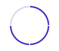
To visualize the progress of a multiple sequential task, split the circular progress bar into the multiple segments by defining the SegmentCount property as demonstrated in the following code sample.
<progressBar:SfCircularProgressBar SegmentCount="4" Progress="75"/>SfCircularProgressBar circularProgressBar = new SfCircularProgressBar { Progress = 75, SegmentCount = 4 };
this.Content = circularProgressBar;
Apply colors
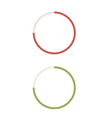
Customize the color of the progress indicator and track by defining the ProgressFill and TrackFill properties, respectively.
<progressBar:SfCircularProgressBar Progress="75"
                                   TrackFill="#33c15244"
                                   ProgressFill="#FFc15244"/>

<progressBar:SfCircularProgressBar Progress="75"
                                   TrackFill="#3390a84e"
                                   ProgressFill="#FF90a84e"/>
SfCircularProgressBar circularProgressBar = new SfCircularProgressBar
{
Progress = 75,
TrackFill = new SolidColorBrush(Color.FromArgb("#33c15244")),
ProgressFill = new SolidColorBrush(Color.FromArgb("#FFc15244"))
};
SfCircularProgressBar sfCircularProgressBar = new SfCircularProgressBar
{
Progress = 75,
TrackFill = new SolidColorBrush(Color.FromArgb("#3390a84e")),
ProgressFill = new SolidColorBrush(Color.FromArgb("#FF90a84e"))
};
NOTE
- Get the complete getting started sample from GitHub link.
- Refer to our .NET MAUI Circular ProgressBar feature tour page for its groundbreaking feature representations.