Appearance in .NET MAUI Circular ProgressBar (SfCircularProgressBar)
1 Apr 202610 minutes to read
Angle
The appearance of the circular progress bar can be customized to semi-circle, arc, and more. The start and end angles can be customized using the StartAngle and EndAngle properties respectively.
The following code sample demonstrates how to change the appearance of the circular progress bar to semi-circle.
<progressBar:SfCircularProgressBar Progress="75"
                                   StartAngle="180"
                                   EndAngle="360" />
SfCircularProgressBar circularProgressBar = new SfCircularProgressBar();
circularProgressBar.Progress = 75;
circularProgressBar.StartAngle = 180;
circularProgressBar.EndAngle = 360;
this.Content = circularProgressBar;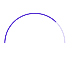
Range colors
Visualize multiple ranges with different colors mapped to each range to enhance the readability of progress.
The colors can be mapped to the specific ranges using the GradientStops property, which holds a collection of ProgressGradientStop.
The following properties in the GradientStops are used to map the colors to a range:
-
Color:Represents the color to the specified range. -
Value:Represents the start or end value for the specified color.
The following code sample demonstrates how to map the solid color range in the circular progress bar.
<progressBar:SfCircularProgressBar Progress="100" >
    <progressBar:SfCircularProgressBar.GradientStops>
        <progressBar:ProgressGradientStop Color="#00bdaf" Value="0"/>
        <progressBar:ProgressGradientStop Color="#00bdaf" Value="25"/>
        <progressBar:ProgressGradientStop Color="#2f7ecc" Value="25"/>
        <progressBar:ProgressGradientStop Color="#2f7ecc" Value="50"/>
        <progressBar:ProgressGradientStop Color="#e9648e" Value="50"/>
        <progressBar:ProgressGradientStop Color="#e9648e" Value="75"/>
        <progressBar:ProgressGradientStop Color="#fbb78a" Value="75"/>
        <progressBar:ProgressGradientStop Color="#fbb78a" Value="100"/>
    </progressBar:SfCircularProgressBar.GradientStops>
</progressBar:SfCircularProgressBar>
SfCircularProgressBar circularProgressBar = new SfCircularProgressBar();
circularProgressBar.Progress = 100;
circularProgressBar.GradientStops.Add(new ProgressGradientStop { Color = Color.FromArgb("00bdaf"), Value = 0 });
circularProgressBar.GradientStops.Add(new ProgressGradientStop { Color = Color.FromArgb("00bdaf"), Value = 25 });
circularProgressBar.GradientStops.Add(new ProgressGradientStop { Color = Color.FromArgb("2f7ecc"), Value = 25 });
circularProgressBar.GradientStops.Add(new ProgressGradientStop { Color = Color.FromArgb("2f7ecc"), Value = 50 });
circularProgressBar.GradientStops.Add(new ProgressGradientStop { Color = Color.FromArgb("e9648e"), Value = 50 });
circularProgressBar.GradientStops.Add(new ProgressGradientStop { Color = Color.FromArgb("e9648e"), Value = 75 });
circularProgressBar.GradientStops.Add(new ProgressGradientStop { Color = Color.FromArgb("fbb78a"), Value = 75 });
circularProgressBar.GradientStops.Add(new ProgressGradientStop { Color = Color.FromArgb("fbb78a"), Value = 100 });
this.Content = circularProgressBar;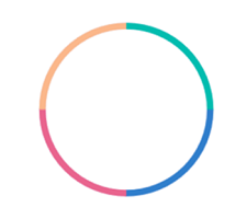
The following code sample demonstrates how to apply gradient transition effect to the range colors in the circular progress bar.
<progressBar:SfCircularProgressBar Progress="100">
    <progressBar:SfCircularProgressBar.GradientStops>
        <progressBar:ProgressGradientStop Color="#00bdaf" Value="0"/>
        <progressBar:ProgressGradientStop Color="#2f7ecc" Value="25"/>
        <progressBar:ProgressGradientStop Color="#e9648e" Value="50"/>
        <progressBar:ProgressGradientStop Color="#fbb78a" Value="75"/>
    </progressBar:SfCircularProgressBar.GradientStops>
</progressBar:SfCircularProgressBar>
SfCircularProgressBar circularProgressBar = new SfCircularProgressBar();
circularProgressBar.Progress = 100;
circularProgressBar.GradientStops.Add(new ProgressGradientStop { Color = Color.FromArgb("00bdaf"), Value = 0 });
circularProgressBar.GradientStops.Add(new ProgressGradientStop { Color = Color.FromArgb("2f7ecc"), Value = 25 });
circularProgressBar.GradientStops.Add(new ProgressGradientStop { Color = Color.FromArgb("e9648e"), Value = 50 });
circularProgressBar.GradientStops.Add(new ProgressGradientStop { Color = Color.FromArgb("fbb78a"), Value = 75 });
this.Content = circularProgressBar;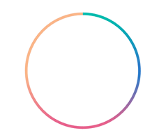
Thickness
The following properties are used to customize the appearance of the circular progress bar:
-
ProgressRadiusFactor:Defines the outer radius of the progress indicator. -
ProgressThickness:Defines the thickness of the progress indicator. -
TrackRadiusFactor:Defines the outer radius of the track indicator. -
TrackThickness:Defines the thickness of the track indicator. -
ThicknessUnit:Specifies whether theProgressThicknessorTrackThicknessare defined in pixel or factor.
The ProgressThickness or TrackThickness of the progress bar can be specified either in pixel or factor. If the ThicknessUnit is specified as Pixel, the range will be rendered based on the provided pixel value. If the ThicknessUnit is set as Factor, the provided factor value will be multiplied by the outer radius. For example, if the thickness width is set as 0.1, then 10% of outer radius is considered as thickness.
The following code sample demonstrates how to customize the appearance of the circular progress bar.
<progressBar:SfCircularProgressBar Progress="75"
                                   TrackRadiusFactor="0.8"
                                   ProgressRadiusFactor="0.75"
                                   ThicknessUnit="Factor"
                                   TrackThickness="0.05"
                                   ProgressThickness="0.05" />
SfCircularProgressBar circularProgressBar = new SfCircularProgressBar();
circularProgressBar.Progress = 75;
circularProgressBar.TrackRadiusFactor = 0.8;
circularProgressBar.ProgressRadiusFactor = 0.75;
circularProgressBar.TrackThickness = 0.05;
circularProgressBar.ProgressThickness = 0.05;
circularProgressBar.ThicknessUnit = SizeUnit.Factor;
this.Content = circularProgressBar;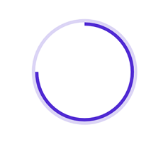
Corner style customization
The ProgressCornerStyle and TrackCornerStyle property of the circular progress bar specifies the corner type for the progress and track. The corners can be customized using the BothFlat, BothCurve, StartCurve, and EndCurve options. The default value of this property is BothFlat.
The following code sample demonstrates the corner style customization in progress and track indicator.
<progressBar:SfCircularProgressBar Progress="50"
                                   TrackCornerStyle="BothCurve"
                                   ProgressCornerStyle="BothCurve"
                                   StartAngle="180"
                                   EndAngle="360" />
SfCircularProgressBar circularProgressBar = new SfCircularProgressBar();
circularProgressBar.Progress = 50;
circularProgressBar.TrackCornerStyle = CornerStyle.BothCurve;
circularProgressBar.ProgressCornerStyle = CornerStyle.BothCurve;
circularProgressBar.StartAngle = 180;
circularProgressBar.EndAngle = 360;
this.Content = circularProgressBar;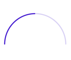
Color customization
The following properties are used to customize the color in the circular progress bar.
-
ProgressFill:Represents the color of the progress indicator. -
TrackFill:Represents the color of the track indicator.
The following code sample demonstrates the color customization in progress and track indicator.
<progressBar:SfCircularProgressBar Progress="75"
                                   TrackFill="#3351483a"
                                   ProgressFill="#FF51483a"/>
SfCircularProgressBar circularProgressBar = new SfCircularProgressBar();
circularProgressBar.Progress = 75;
circularProgressBar.TrackFill = Color.FromArgb("3351483a");
circularProgressBar.ProgressFill = Color.FromArgb("FF51483a");
this.Content = circularProgressBar;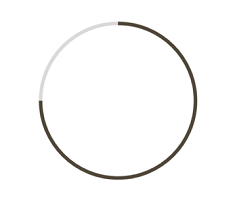
NOTE
Refer to our .NET MAUI Circular ProgressBar feature tour page for its groundbreaking feature representations. Also explore our .NET MAUI Circular ProgressBar example that shows how to configure a SfCircularProgressBar in .NET MAUI.