Custom Content in .NET MAUI Circular Progress Bar
18 Nov 20183 minutes to read
In the Circular Progress Bar, add any view to the center using the Content property.
For example, include an add, start, or pause button to control the progress. You can also add an image that indicates the actual task in progress, or add custom text that conveys how far the task is completed.
The following code sample demonstrates how to add custom text content.
<progressBar:SfCircularProgressBar x:Name="customContentCircularProgressBar"
                                   Progress="23">
    <progressBar:SfCircularProgressBar.Content>
        <Grid>
            <Grid.RowDefinitions>
                <RowDefinition />
                <RowDefinition />
            </Grid.RowDefinitions>
            <Label TextColor="#007cee"
                   Text="{Binding Source={x:Reference customContentCircularProgressBar},Path=Progress,StringFormat='{0}%'}"
                   HorizontalTextAlignment="Center"
                   VerticalTextAlignment="End">
            </Label>
            <Label Grid.Row="1"
                   TextColor="#007cee"
                   Text="used"
                   VerticalOptions="Start"
                   HorizontalTextAlignment="Center"
                   VerticalTextAlignment="Start">
            </Label>
        </Grid>
    </progressBar:SfCircularProgressBar.Content>
</progressBar:SfCircularProgressBar>
using Syncfusion.Maui.ProgressBar;
SfCircularProgressBar circularProgressBar = new SfCircularProgressBar();
circularProgressBar.Progress = 23;
Grid grid = new Grid();
grid.RowDefinitions.Add(new RowDefinition());
grid.RowDefinitions.Add(new RowDefinition());
Label label = new Label();
label.BindingContext = circularProgressBar;
Binding binding = new Binding();
binding.Path = "Progress";
binding.StringFormat = "{0}%";
label.SetBinding(Label.TextProperty, binding);
label.HorizontalTextAlignment = TextAlignment.Center;
label.VerticalOptions = LayoutOptions.End;
label.TextColor = Color.FromArgb("007cee");
Grid.SetRow(label, 0);
grid.Children.Add(label);
Label textLabel = new Label();
textLabel.Text = "used";
textLabel.HorizontalTextAlignment = TextAlignment.Center;
textLabel.VerticalOptions = LayoutOptions.Start;
textLabel.TextColor = Color.FromArgb("007cee");
Grid.SetRow(textLabel, 1);
grid.Children.Add(textLabel);
circularProgressBar.Content = grid;
this.Content = circularProgressBar;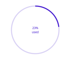
Refer to our .NET MAUI Circular Progress Bar feature tour page for its groundbreaking feature representations. Also explore our .NET MAUI Circular Progress Bar example that shows how to configure a SfCircularProgressBar in .NET MAUI.