Getting started with .NET MAUI Card
29 Jun 20266 minutes to read
This section details the process of integrating the .NET MAUI Cards control and focuses solely on the fundamental features required for initiating your exploration of Syncfusion® Card. Follow the steps below to add a .NET MAUI Cards control to your project.
To get start quickly with our .NET MAUI Cards, you can check the below video.
Prerequisites
Before proceeding, ensure the following are set up:
- Install .NET 9 SDK or later.
- Set up a .NET MAUI environment with Visual Studio 2022 v17.12 or later.
Step 1: Create a new .NET MAUI project
- Go to File > New > Project and choose the .NET MAUI App template.
- Name the project and choose a location. Then click Next.
- Select the .NET framework version and click Create.
Step 2: Install the Syncfusion® MAUI Cards NuGet package
- In Solution Explorer, right-click the project and choose Manage NuGet Packages.
- Search for Syncfusion.Maui.Cards and install the latest version.
- Ensure the necessary dependencies are installed correctly, and the project is restored.
Prerequisites
Before proceeding, ensure the following are set up:
- Install .NET 9 SDK or later.
- Set up a .NET MAUI environment with Visual Studio Code.
- Ensure that the .NET MAUI workloads are installed and configured as described here.
Step 1: Create a new .NET MAUI project
- Open the command palette by pressing
Ctrl+Shift+Pand type .NET:New Project and enter. - Choose the .NET MAUI App template.
- Select the project location, type the project name and press Enter.
- Then choose Create project.
Step 2: Install the Syncfusion® MAUI Cards NuGet package
- Press Ctrl + ` (backtick) to open the integrated terminal in Visual Studio Code.
- Ensure you’re in the project root directory where your .csproj file is located.
- Run the command
dotnet add package Syncfusion.Maui.Cardsto install the Syncfusion® .NET MAUI Cards NuGet package. - To ensure all dependencies are installed, run
dotnet restore.
Prerequisites
Before proceeding, ensure the following are set up:
- Install .NET 9 SDK or later.
- Set up a .NET MAUI environment with JetBrains Rider 2024.3 or later.
- Make sure the MAUI workloads are installed and configured as described here.
Step 1: Create a new .NET MAUI project
- Go to File > New Solution, Select .NET (C#) and choose the .NET MAUI App template.
- Enter the Project Name, Solution Name, and Location.
- Select the .NET framework version and click Create.
Step 2: Install the Syncfusion® MAUI Cards NuGet package
- In Solution Explorer, right-click the project and choose Manage NuGet Packages.
- Search for Syncfusion.Maui.Cards and install the latest version.
- Ensure the necessary dependencies are installed correctly, and the project is restored. If not, Open the Terminal in Rider and manually run:
dotnet restore
Step 3: Register Syncfusion handler
Make sure to add the namespace.
using Syncfusion.Maui.Core.Hosting;Register the Syncfusion core handler in your CreateMauiApp method of MauiProgram.cs file to use Syncfusion controls.
builder.ConfigureSyncfusionCore();Step 4: Import the Card namespace
Add the following namespace in your XAML or C#.
xmlns:cards="clr-namespace:Syncfusion.Maui.Cards;assembly=Syncfusion.Maui.Cards"using Syncfusion.Maui.Cards;Step 5: Add the Card component
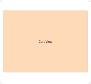
Create an instance for the Card control.
<cards:SfCardView>
    <Label Text="CardView"
           Background="PeachPuff"
           HorizontalTextAlignment="Center"
           VerticalTextAlignment="Center"/>
</cards:SfCardView>
SfCardView cardView = new SfCardView();
cardView.Content = new Label()
{
Text = "CardView",
HorizontalTextAlignment = TextAlignment.Center,
VerticalTextAlignment = TextAlignment.Center,
BackgroundColor = Colors.PeachPuff
};The following screenshot illustrates the result of the above code.
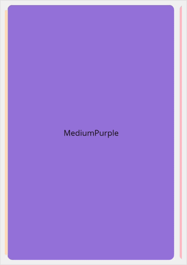
Define the card layout
Initialize a card layout with a card view using the provided code sample below.
<cards:SfCardLayout HeightRequest="500" BackgroundColor="#F0F0F0">

    <cards:SfCardView CornerRadius="10">
        <Label  Text="Peach" BackgroundColor="PeachPuff"/>
    </cards:SfCardView>

    <cards:SfCardView CornerRadius="10">
        <Label  Text="MediumPurple" BackgroundColor="MediumPurple"/>
    </cards:SfCardView>

    <cards:SfCardView CornerRadius="10" >
        <Label  Text="LightPink" BackgroundColor="LightPink"/>
    </cards:SfCardView>

</cards:SfCardLayout>
SfCardLayout cardLayout = new SfCardLayout();
cardLayout.Children.Add(new SfCardView() { Content = new Label() { Text = "Peach", BackgroundColor = Colors.PeachPuff }, CornerRadius = 15 });
cardLayout.Children.Add(new SfCardView() { Content = new Label() { Text = "MediumPurple", BackgroundColor = Colors.MediumPurple },CornerRadius = 15 });
cardLayout.Children.Add(new SfCardView() { Content = new Label() { Text = "LightPink", BackgroundColor = Colors.LightPink },CornerRadius = 15 });The following screenshot illustrates the result of the above code.
You can download the Card Getting Started sample from GitHub
NOTE
You can refer to our .NET MAUI Cards feature tour page for its groundbreaking feature representations. You can also explore our .NET MAUI Cards Example that shows you how to render and configure the Cards in .NET MAUI.