Customization in MAUI Cards
10 Jun 20269 minutes to read
ShowSwipedCard
Enabling the ShowSwipedCard option allows the swiped cards to be displayed at the edge of the card layout.
<cards:SfCardLayout ShowSwipedCard="true">
</cards:SfCardLayout>
SfCardLayout cardLayout = new SfCardLayout()
{
ShowSwipedCard = true
};
VisibleIndex
The VisibleIndex is utilized when providing the index of the card that is intended to be displayed at the front of the card layout.
<cards:SfCardLayout VisibleIndex="1">
</cards:SfCardLayout>
SfCardLayout cardLayout = new SfCardLayout()
{
VisibleIndex = 1
};
SwipeDirection
The SwipeDirection property specifies the direction of swiping, which can be Left, Right, Top, or Bottom. Default value of SwipeDirection is “Right”.
<cards:SfCardLayout SwipeDirection="Left">
</cards:SfCardLayout>
SfCardLayout cardLayout = new SfCardLayout()
{
SwipeDirection = CardSwipeDirection.Left
};
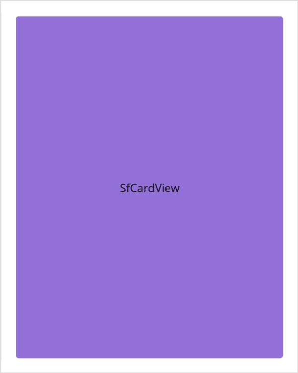
SwipeToDismiss
The SwipeToDismiss property enables or disables the swiping feature in SfCardView.
<cards:SfCardView SwipeToDismiss="true">
    <Label Text="SfCardView" Background="MediumPurple" HorizontalTextAlignment="Center" VerticalTextAlignment="Center"/>
</cards:SfCardView>
using Syncfusion.Maui.Cards;
. . .
public partial class MainPage : ContentPage
{
public MainPage()
{
InitializeComponent();
SfCardView cardView = new SfCardView();
cardView.SwipeToDismiss = true;
cardView.Content = new Label()
{
Text="SfCardView",
HorizontalTextAlignment = TextAlignment.Center,
VerticalTextAlignment = TextAlignment.Center,
BackgroundColor = Colors.MediumPurple
};
this.Content = cardView;
}
}NOTE
This property will not work when adding the SfCardView as a child of SfCardLayout.
Dismiss the card programmatically
The IsDismissed property enables you to retrieve the view state of the card, and also provides the capability for the user to programmatically modify the card’s view state.
<card:SfCardView IsDismissed="true">
     <Label Text="SfCardView"/>
</card:SfCardView>
using Syncfusion.Maui.Cards;
. . .
public partial class MainPage : ContentPage
{
public MainPage()
{
InitializeComponent();
SfCardView cardView = new SfCardView();
cardView.IsDismissed = true;
cardView.Content = new Label(){ Text="SfCardView" };
this.Content = cardView;
}
}Customization in CardView
Customization of the border color, thickness, and card corner radius can be achieved by the following properties.
-
BorderColor - Used to customize the card view border color.
-
BorderWidth - Used to customize the card view border thickness.
-
CornerRadius - Used to customize the card view corner radius.
<cards:SfCardView Background="#472902">
    <Grid Padding="20">
        <Grid.RowDefinitions>
            <RowDefinition Height="Auto"/>
            <RowDefinition Height="Auto"/>
            <RowDefinition Height="30"/>
            <RowDefinition Height="Auto"/>
        </Grid.RowDefinitions>
        <Label Text="Wells Fargo" HorizontalOptions="Start" TextColor="White" FontSize="20" FontAttributes="Bold"/>
        <Grid Grid.Row="1" Padding="0,20,0,15">
            <Grid.ColumnDefinitions>
                <ColumnDefinition Width="60"/>
                <ColumnDefinition Width="*"/>
            </Grid.ColumnDefinitions>
            <Image Source="cardchip.png" WidthRequest="60" HeightRequest="30" HorizontalOptions="Center" VerticalOptions="Center"/>
            <Label Grid.Column="1" Text="Business Elite" FontAttributes="Bold" TextColor="White" FontSize="17" HorizontalOptions="Start" VerticalOptions="Center" Padding="30,0,0,0"/>
        </Grid>
        <Label Grid.Row="2" HorizontalOptions="Start" VerticalOptions="End" Text="Rick Sanchez" FontSize="17" FontAttributes="Bold" TextColor="White"/>
        <Label Grid.Row="3" HorizontalOptions="Start" VerticalOptions="End" Text="9 0 5 7    4 0 8 1    2 1 7 5    0 0 5 6" TextColor="White" Padding="0,10,0,0"/>
    </Grid>
</cards:SfCardView>
Grid mainStack = new Grid()
{
Children =
{
new SfCardView(){
Content = new Grid()
{
Padding = 20,
Children =
{
new Label(){Text="Wells Fargo", HorizontalOptions=LayoutOptions.Start, TextColor=Colors.White, FontSize=20, FontAttributes=FontAttributes.Bold},
new Grid(){
Children=
{
new Image(){Source="cardchip.png", WidthRequest=60, HeightRequest=30, HorizontalOptions=LayoutOptions.Center, VerticalOptions=LayoutOptions.Center},
new Label(){Text="Business Elite", FontAttributes=FontAttributes.Bold, TextColor=Colors.White, FontSize=17, HorizontalOptions=LayoutOptions.Center,VerticalOptions=LayoutOptions.Center ,Padding=30 }
} },
new Label(){HorizontalOptions=LayoutOptions.Start ,VerticalOptions=LayoutOptions.End, Text="Rick Sanchez", FontSize=17, FontAttributes=FontAttributes.Bold, TextColor=Colors.White},
new Label(){HorizontalOptions=LayoutOptions.Start, VerticalOptions=LayoutOptions.End, Text="9 0 5 7 4 0 8 1 2 1 7 5 0 0 5 6", TextColor=Colors.White, Padding=10},
}
},
BackgroundColor = Colors.Brown
}
}
};
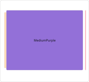
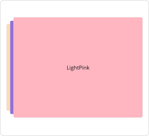
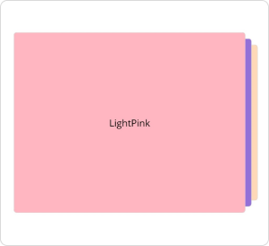
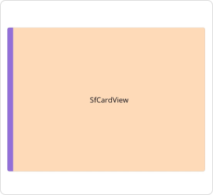
Indicator customization
Indicators are used to signify or communicate the state or level of something.
<cards:SfCardView IndicatorColor="MediumPurple" BackgroundColor="PeachPuff" HeightRequest="300" IndicatorThickness="12" IndicatorPosition="Left" >
    <Label  Text="SfCardView" VerticalTextAlignment="Center" HorizontalTextAlignment="Center"/>
</cards:SfCardView>
SfCardView cardView = new SfCardView()
{
Content = new Label()
{
Text = "SfCardView",
HorizontalTextAlignment = TextAlignment.Center,
VerticalTextAlignment = TextAlignment.Center
},
IndicatorThickness = 12,
HeightRequest = 300,
IndicatorPosition = IndicatorPosition.Left,
IndicatorColor = Colors.MediumPurple,
BackgroundColor = Colors.PeachPuff
};
FadeOutOnSwiping
The FadeOutOnSwiping option can be enabled when the card view is intended to fade in response to swiping.
<cards:SfCardView FadeOutOnSwiping="true"/>SfCardView cardView = new SfCardView()
{
FadeOutOnSwiping = true
};NOTE
This property won’t work when adding the SfCardView as a child of SfCardLayout.