How can I help you?
Set Header in .NET MAUI Busy Indicator (SfBusyIndicator)
21 May 20257 minutes to read
The Syncfusion® .NET MAUI Busy Indicator provides a feature to display a title with customizable fonts.
Title
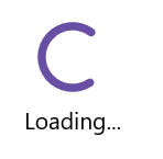
The .NET MAUI Busy Indicator allows you to set text that indicates loading-related information using the Title property.
<core:SfBusyIndicator x:Name="busyindicator"
                      IsRunning="True"
                      AnimationType="CircularMaterial"
                      Title="Loading..." />
SfBusyIndicator busyIndicator = new SfBusyIndicator()
{
IsRunning = true,
AnimationType = AnimationType.CircularMaterial,
Title = "Loading...",
};The following screenshot illustrates the result of the above code.
TextColor
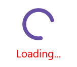
The .NET MAUI Busy Indicator allows you to change the color of the title text using the TextColor property.
<core:SfBusyIndicator x:Name="busyindicator"
                      IsRunning="True"
                      AnimationType="CircularMaterial"
                      Title="Loading..."
                      TextColor = "Red" />
SfBusyIndicator busyIndicator = new SfBusyIndicator()
{
IsRunning = true,
AnimationType = AnimationType.CircularMaterial,
Title = "Loading...",
TextColor = Colors.Red
};The following screenshot illustrates the result of the above code.
TitlePlacement
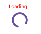
The .NET MAUI Busy Indicator provides options to set the Title at the top or bottom of the Busy Indicator using the TitlePlacement property. To omit the title, set the TitlePlacement property to None.
<core:SfBusyIndicator x:Name="busyindicator"
                      IsRunning="True"
                      AnimationType="CircularMaterial"
                      Title="Loading..."
                      TextColor = "Red"
                      TitlePlacement="Top"/>
SfBusyIndicator busyIndicator = new SfBusyIndicator()
{
IsRunning = true,
AnimationType = AnimationType.CircularMaterial,
Title = "Loading...",
TextColor = Colors.Red,
TitlePlacement = BusyIndicatorTitlePlacement.Top
};The following screenshot illustrates the result of the above code.
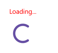
TitleSpacing
You can set the space between the indicator and the title using the TitleSpacing property.
<core:SfBusyIndicator x:Name="busyindicator"
                      IsRunning="True"
                      AnimationType="CircularMaterial"
                      Title="Loading..."
                      TextColor = "Red"
                      TitlePlacement="Top"
                      TitleSpacing="20"/>
SfBusyIndicator busyIndicator = new SfBusyIndicator()
{
IsRunning = true,
AnimationType = AnimationType.CircularMaterial,
Title = "Loading...",
TextColor = Colors.Red,
TitlePlacement = BusyIndicatorTitlePlacement.Top,
TitleSpacing = 20
};The following screenshot illustrates the result of the above code.
Font customization
The .NET MAUI Busy Indicator allows customization of the title text using properties such as FontSize, FontAttributes, and FontFamily properties.
<core:SfBusyIndicator x:Name="busyindicator"
                      IsRunning="True"
                      AnimationType="CircularMaterial"
                      Title="Loading..."
                      TextColor = "Red"
                      FontSize = "16"
                      FontAttributes="Bold"
                      FontFamily="serif" />
SfBusyIndicator busyIndicator = new SfBusyIndicator()
{
IsRunning = true,
AnimationType = AnimationType.CircularMaterial,
Title = "Loading...",
TextColor = Colors.Red,
FontSize = 16,
FontAttributes=FontAttributes.Bold,
FontFamily="serif"
};The following screenshot illustrates the result of the above code.

FontAutoScalingEnabled
The FontAutoScalingEnabled property automatically scales the Busy Indicator’s title font size based on the operating system’s text size. The default value of the FontAutoScalingEnabled property is false.
<core:SfBusyIndicator FontAutoScalingEnabled="True"/>SfBusyIndicator busyIndicator = new SfBusyIndicator()
{
FontAutoScalingEnabled = true
};