About Syncfusion® .NET MAUI Time Picker Control
Syncfusion® .NET MAUI Time Picker (SfTimePicker) control allows you to select the time and visualize its items inside a popup or a drop-down UI element. The Time Picker also enables you to set time formats and customize its dialog appearance by configuring its header, footer, and more.
Business use cases
- Scheduling applications that require time selection for appointments, meetings, or reminders.
- Booking systems that allow users to choose available time slots efficiently.
- Form-based applications that collect time inputs such as start and end times.
- Business applications that require customizable time selection UI with validation and formatting.
Key features
-
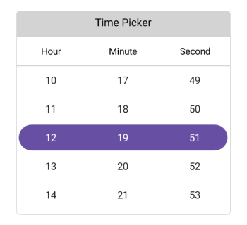
Header view allows adding and customizing header text for contextual information.
-
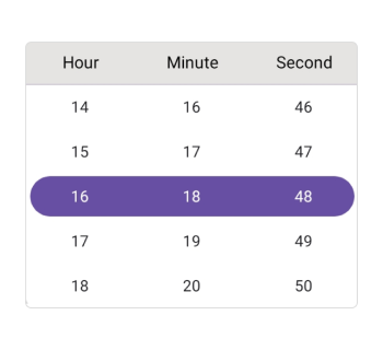
Column header allows displaying and customizing labels for hours, minutes, and seconds.
-
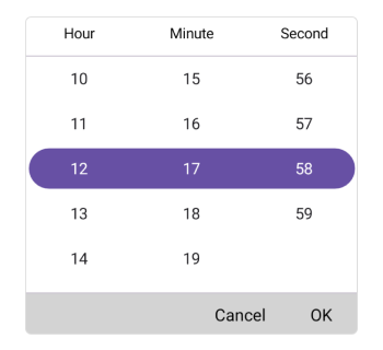
Footer view allows providing confirmation actions such as OK and Cancel with customizable appearance.
-
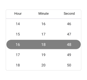
Selection view allows displaying the selected time clearly with configurable UI.
-
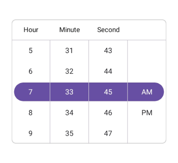
Time format allows presenting values in predefined formats for better readability.
-
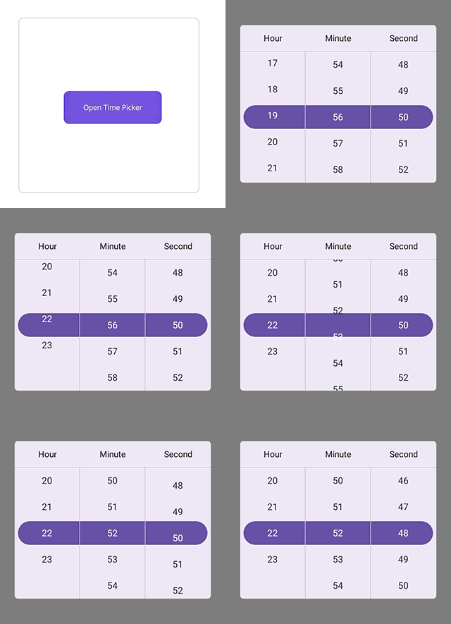
Picker mode allows displaying the control in popup or dialog modes with flexible positioning.
-
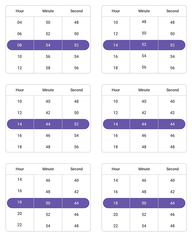
Interval allows defining custom intervals for hours, minutes, and seconds.
-
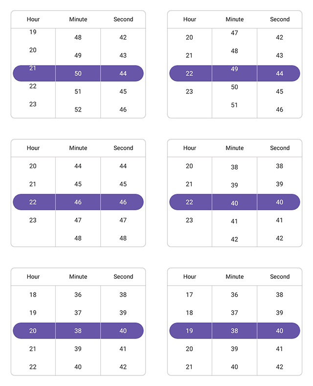
User interaction allows selecting time values through tap and scroll gestures.
Globalization
The following table summarizes the globalization support available in this control.
 Full Support
| Control | Localization | RTL | Time zone | Screen reader | Keyboard navigation |
|---|---|---|---|---|---|
| Time Picker | |
|
|
|
|
Related controls
- Date Picker for selecting date values in applications.
- Date Time Picker for selecting combined date and time values.
- Picker for general-purpose item selection.
See Also
- Getting Started shows a step‑by‑step guide to begin using the Time Picker control.
- Customization explains how to customize layout and appearance.
- Formatting helps configure time formats and intervals.
- UI Kit provides interactive demos and ready‑made UI examples.