How can I help you?
Legend in ASP.NET Webforms SunburstChart
The legend is used to represent the first level of items in the Sunburst Chart.The Legend can be initialized using the below code snippet
<ej:SunburstChart  ID="container" runat="server">
 <Legend Visible="true"></Legend>
</ej:SunburstChart>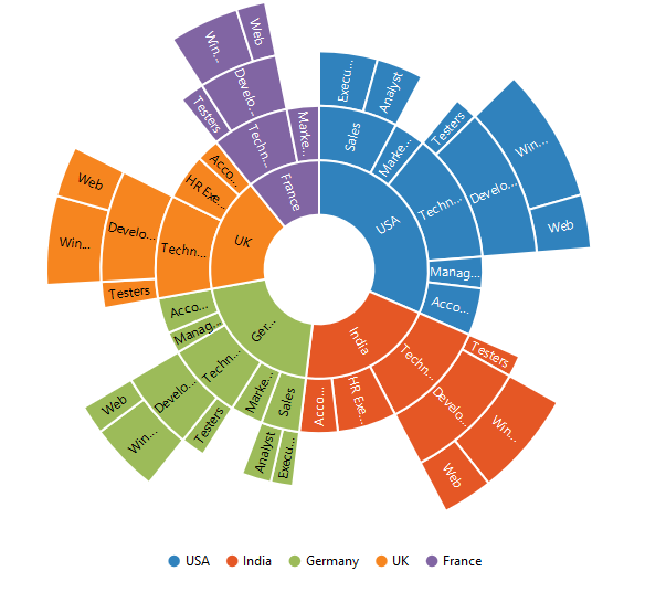
Legend Icon
You can specify different shapes of legend icon by using the Shape property of the legend. By default, legend shape is Circle. The Sunburst chart has some predefined shapes such as:
- Circle
- Cross
- Diamond
- Pentagon
- Rectangle
- Triangle
<ej:SunburstChart  ID="container" runat="server">
 <Legend Visible="true" Shape="Pentagon"></Legend>
</ej:SunburstChart>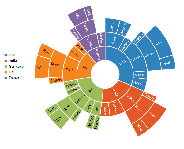
Positioning the Legend
By using the Position property, you can position the legend at left, right, top or bottom of the chart.
<ej:SunburstChart  ID="container" runat="server">
 <Legend Visible="true" Position="Top"></Legend>
</ej:SunburstChart>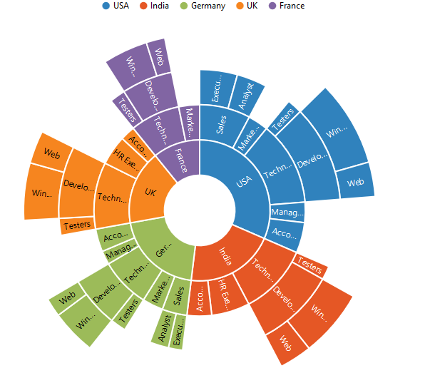
Customization
Legend Item Size and border
You can change the size of the legend items by using the ItemStyle-Width and ItemStyle-Heightproperties. To change the legend item border, use border property of the legend .
<ej:SunburstChart  ID="container" runat="server">
<Legend Visible="true" Position="Top" ItemStyle-Height="13" ItemStyle-Width="13">
<Border Color="#FF0000" Width="1"></Border>
</Legend>
</ej:SunburstChart>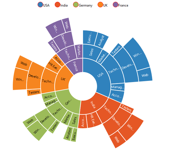
Legend Size
By default, legend takes 20% of the height horizontally when it was placed on the top or bottom position and 20% of the width vertically while placing on the left or right position of the chart. You can change this default legend size by using the e-legend-size property of the legend.
<ej:SunburstChart  ID="container" runat="server">
<Legend Visible="true" Position="Top" Size-Height="75" Size-Width="200">
<Border Color="#FF0000" Width="1"></Border>
</Legend>
</ej:SunburstChart>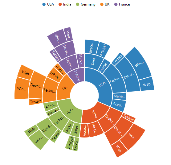
Legend Row and Columns
You can arrange the legend items horizontally and vertically by using the RowCount and ColumnCountproperties of the legend.
• When only the rowCount is specified, the legend items are arranged according to the rowCount and number of columns may vary based on the number of legend items.
• When only the columnCount is specified, the legend items are arranged according to the columnCount and number of rows may vary based on the number of legend items.
• When both the properties are specified, then the one which has higher value is given preference. For example, when the rowCount is 4 and columnCount is 3, legend items are arranged in 4 rows.
• When both the properties are specified and have the same value, the preference is given to the columnCount when it is positioned at the top/bottom position. The preference is given to the rowCount when it is positioned at the left/right position.
<ej:SunburstChart  ID="container" runat="server">
<Legend Visible="true" Position="Top" RowCount="2" ColumnCount="3">
</Legend>
</ej:SunburstChart>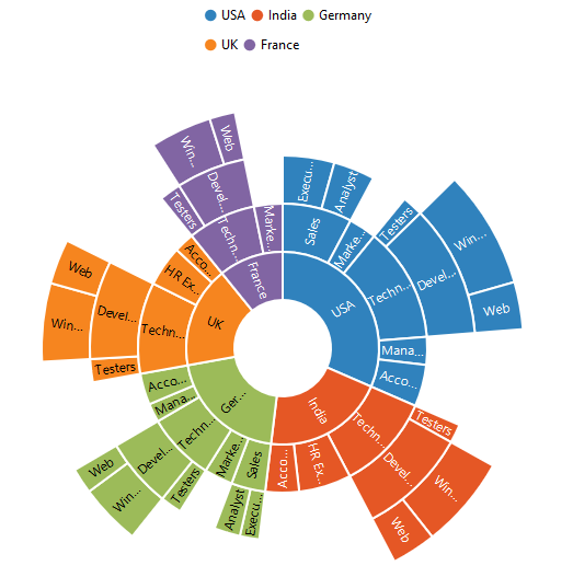
LegendInteractivity
You can select a specific category while clicking on corresponding legend item through SunburstClickAction property.
It has three types of action
- ToggleSegmentSelection
- ToggleSegmentVisibility
- None
ToggleSegmentSelection
Used to highlight specific category while clicking on legend item
<ej:SunburstChart  ID="container" runat="server">
<Legend Visible="true" SunburstClickAction="ToggleSegmentSelection"
</Legend>
</ej:SunburstChart>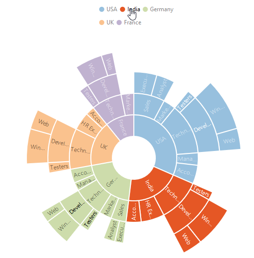
Toggle Segment Visibility
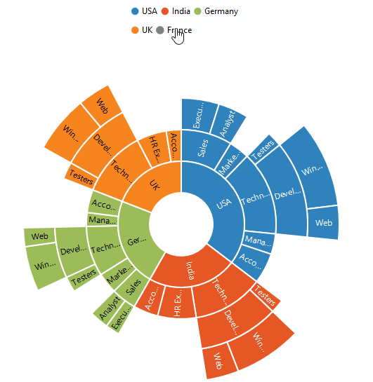
Used to disable the specific category while clicking on legend item.
<ej:SunburstChart  ID="container" runat="server">
<Legend Visible="true" SunburstClickAction="ToggleSegmentVisibility"
</Legend>
</ej:SunburstChart>