How can I help you?
Node in Angular Diagram
Nodes are graphical objects used to visually represent the geometrical information, process flow, internal business procedure, entity, or any other kind of data.
Create Node
A node can be created and added to the Diagram, either programmatically or interactively. Nodes are stacked on the Diagram area from bottom to top in the order they are added.
Add node through nodes collection
To create a node, You have to define the node object and add that to nodes collection of the Diagram model. The following code example illustrates how to add a node to the Diagram.
<div>
    <ej-diagram  id="diagramCore" width="100%" height="600px" [nodes]="nodes">
    </ej-diagram>
</div>import { Component } from '@angular/core';
@Component({
selector: 'ej-app',
templateUrl: 'app/components/diagram/default.component.html'
})
export class NodesComponent {
nodes: Array<any>;
constructor() {
this.nodes = [
{
name: "node1",
width: 100,
height: 100,
offsetX: 250,
offsetY: 250,
fillColor: "darkcyan",
borderWidth: 2
}
];
}
}
Position
Position of a node is controlled by using its offsetX and offsetY properties. By default, these offset properties represent the distance between origin of the Diagram’s page and node’s center point. You may expect this offset values to represent the distance between page origin and node’s top left corner instead of center. pivot property helps solve this problem. Default value of node’s pivot point is (0.5, 0.5), that means center of Node.
The following table illustrates how pivot relates offset values with node boundaries.
| Pivot | Offset |
|---|---|
| (0.5,0.5) | offsetX and offsetY values are considered as the node’s center point. |
| (0,0) | offsetX and offsetY values are considered as the top left corner of node |
| (1,1) | offsetX and offsetY values are considered as the bottom right corner of the node. |
The following code illustrates how to change the pivot value.
export class NodesComponent {
    nodes: Array<any>;
    constructor() {
        this.nodes = [
            {
                name: "node1",
                width: 100,
                height: 100,
                offsetX: 250,
                offsetY: 250,
                shape: "rectangle",
                pivot: ej.datavisualization.Diagram.Point(0, 0)
            }
        ];
    }
}
Types
Diagram allows to add different kind of nodes. To explore the types of nodes, refer to Types of Nodes.
Appearance
You can customize the appearance of a node by changing its font, fill colors, patterns, line weight and style, or shadow. The following code illustrates how to customize the appearance of the shape.
export class NodesComponent {
    nodes: Array<any>;
    constructor() {
        this.nodes = [
            {
                name: "node1",
                width: 100,
                height: 100,
                offsetX: 250,
                offsetY: 250,
                fillColor: "darkcyan",
                borderWidth: 2,
                borderColor: "black",
                borderDashArray: "5 5",
            }
        ];
    }
}
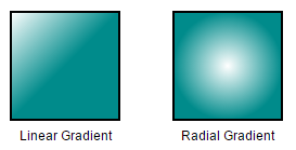
Gradient
There are two types of gradients.
- Linear gradient - Defines a smooth transition between a set of colors (so-called “stops”) on a line.
- Radial gradient - Defines a smooth transition between stops on a circle.
The gradient property of node allows you to define and applies the gradient effect to that node.
<ej-diagram id="diagram" width="100%" height="600">
    <e-nodes>
        <e-node name="node1" [width]="100" [height]="100" [offsetX]="250" [offsetY]="250" borderWidth="2"
        [gradient]="radialgradient" [fillColor]="darkcyan">
        </e-node>
        <e-node name="node2" [width]="100" [height]="100" [offsetX]="450" [offsetY]="450" borderWidth="2"
        [gradient]="lineargradient" [fillColor]="darkcyan">
        </e-node>
    </e-nodes>
</e-diagram>import { Component, ViewChild} from '@angular/core';
import { EJComponents } from './../../ej/core';
@Component({
selector: 'ej-app',
templateUrl: 'app/components/diagram/pagesettings.component.html',
})
export class PageSettingsComponent {
@ViewChild('diagram') diagram: EJComponents<any, any>;
radialgradient: Object;
lineargradient: Object;
gradient2: Object;
constructor() {
this.radialgradient = {
type: 'radial',
//Center point of outer circle
cx: 50,
cy: 50,
//Center point of inner circle
fx: 25,
fy: 25,
//Radius of a radial gradient
r: 50,
//Sets an array of stop objects
stops: [
{ offset: 0, color: 'white'},
{ offset: 100, color: 'darkCyan'}
]
};
this.lineargradient = {
type: 'linear',
//Start point of linear gradient
x1: 0,
y1: 0,
//End point of linear gradient
x2: 50,
y2: 50,
//Sets an array of stop objects
stops: [
{ offset: 0, color: 'white', opacity: 0 },
{ offset: 100, color: '#A0D05F', opacity: 1 }
]
};
}
}
Shadow
Diagram provides support to add shadow effect to a node that is disabled by default. It can be enabled with the constraints property of node. The following code illustrates how to drop shadow.
export class NodesComponent {
    nodes: Array<any>;
    constructor() {
        this.nodes = [
            {
                name: "node1",
                width: 100,
                height: 100,
                offsetX: 100,
                offsetY: 100,
                //Enables Shadow for the node.
                constraints: ej.datavisualization.Diagram.NodeConstraints.Default | ej.datavisualization.Diagram.NodeConstraints.Shadow,
                shape: "rectangle",
            }
        ];
    }
}
The following code illustrates how to disable shadow effect at runtime.
export class NodesComponent {
    nodes: Array<any>;
    constructor() {
        this.nodes = [
            {
                name: "node1",
                width: 100,
                height: 100,
                offsetX: 100,
                offsetY: 100,
                //Disables Shadow for the node.
                constraints: ej.datavisualization.Diagram.NodeConstraints.Default & ~ ej.datavisualization.Diagram.NodeConstraints.Shadow,
                shape: "rectangle",
            }
        ];
    }
}
Customizing Shadow
The angle, translation, and opacity of the shadow can be customized with the shadow property of node. The following code example illustrates how to customize shadow.
export class NodesComponent {
    nodes: Array<any>;
    constructor() {
        this.nodes = [
            {
                name: "node1",
                width: 100,
                height: 100,
                offsetX: 100,
                offsetY: 100,
                //Enables Shadow for the node.
                constraints: ej.datavisualization.Diagram.NodeConstraints.Default |ej.datavisualization.Diagram.NodeConstraints.Shadow,
                //Customizes shadow effect
                shadow: {
                    opacity: 0.8,
                    distance: 9,
                    angle: 50
                }
                shape: "rectangle",
            }
        ];
    }
}
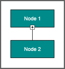
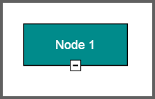
Icon
Diagram provides support to describe the state of the node. i.e., node is expanded or collapsed state.
NOTE
Icon can be created only when the node has outedges.
To explore the properties of expandIcon and collapseIcon, refer to Icon Properties.
The shape property of icon allows to define the shape of the icon. The following code example illustrates how to create icon of various shapes.
<ej-diagram  id="diagramCore" width="100%" height="490px" [nodes]="nodes" [connectors]="connectors">
</ej-diagram>import { Component } from '@angular/core';
@Component({
selector: 'ej-app',
templateUrl: 'app/components/diagram/default.component.html'
})
export class ShapesComponent {
nodes: Array<any>;
connectors: Array<any>;
constructor() {
this.nodes = [
{
name: "node1",
width: 100,
height: 100,
offsetX: 100,
offsetY: 100,
shape: "rectangle",
expandIcon: {
shape: "arrowdown",
width: 10,
height: 10,
},
collapseIcon: {
shape: "arrowup",
width: 10,
height: 10,
}
},
{
name: "node2",
offsetX: 100,
offsetY: 100,
height: 100,
width: 100,
shape: "rectangle"
}
];
this.connectors = [
{
name: "connect",
sourceNode: "node1",
targetNode: "node2"
}];
}
}
Interaction
Diagram provides support to drag, resize, or rotate the node interactively. For more information about editing a node at runtime, refer to Edit Nodes.
Constraints
The constraints property of node allows you to enable/disable certain features. For more information about node constraints, refer to Node Constraints.