How can I help you?
Display Type
17 Jan 20252 minutes to read
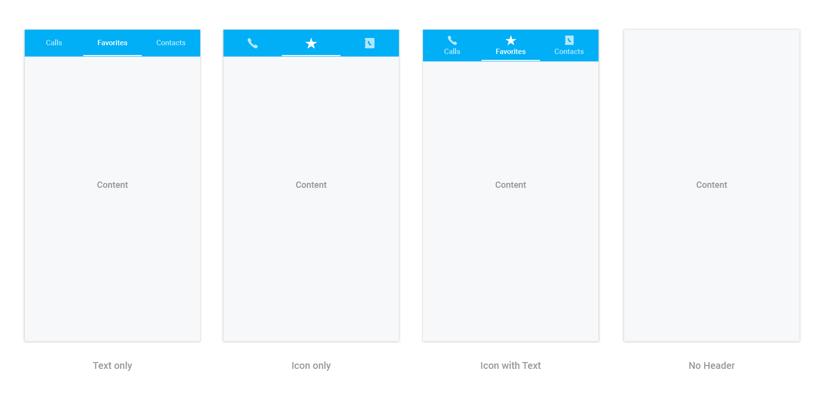
Tab view displays the title of each tab item by default. This can be changed to any of the following types:
- Text only
- Image only
- Image with text
- No header
Display type can be changed by setting the DisplayMode property of SfTabView.
tabView.DisplayMode = TabDisplayMode.ImageWithText;The “no header” type can be used when the header is not needed for the tab view control, so the content space will be occupied to the entire available height.
NOTE
The appearance of image in the header can be achieved through font icons.
How to change the selection color for text and font icons?
The selected index can be differentiated by setting the SelectionColor property of SfTabItem.
var tabViewItem = new SfTabItem()
			{
				Title = "Calls",
				TitleFontColor = Color.Green,
			}
The further customizations of header are discussed in the following sections:
How to customize text appearance of the header title?
var tabViewItem = new SfTabItem()
			{
				Title = "Calls",
				Content = allContactsGrid,
				TitleFontColor = Color.Red,

			}
How to set and customize font icons’ appearance in the header?
Add the font file to your application by using the following steps:
Adding font file for iOS
- Add the font file with the
BundleResourcebuild action. - Update the
Info.plistfile (fonts provided by application, UIAppFonts, or key).
Setting font file for font icons
var tabViewItem = new SfTabItem
		{
			Title = "Calls",
			Content = allContactsGrid,
			IconFont = "a", // setting value for font icons as mentioned in *.ttf.
			FontIconFontColor = Color.LightBlue,
			FontIconFont = UIFont.FromName("TabIcons", 20);
		};