Getting Started with WPF Split Button
8 May 202624 minutes to read
This section provides an overview of how to work with WPF Split Button control. It describes the control structure, the control initialization and the image setting for the control and add items to the control.
Control structure
Assembly deployment
Refer SplitButtonAdv control dependencies section to get the list of assemblies or NuGet package needs to be added as reference to use the SplitButtonAdv control in any application.
Creating simple application with SplitButton
In this walk through, you will create WPF application that contains Split Button control. By the following ways, one can add the controls:
Adding control via designer
WPF Split Button control can be added to the application by dragging SplitButtonAdv from toolbox and dropping it in designer view. After dropping the controls in designer view, the assemblies such as Syncfusion.Shared.WPF gets added into the project automatically. The following code snippets will be added into the XAML.
<syncfusion:SplitButtonAdv x:Name="splitButtonAdv" Label="Split Button"/>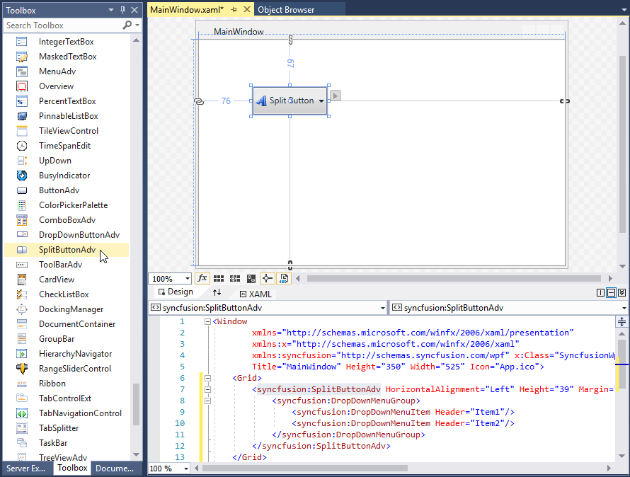
NOTE
syncfusion in XAML is an auto generated namespace.
Adding control manually in XAML
In order to add the control manually in XAML, follow the below steps.
-
Add the below required assembly reference to the project.
- Syncfusion.Shared.WPF
-
Import Syncfusion® WPF schema
http://schemas.syncfusion.com/wpfor the control namespaceSyncfusion.Windows.Tools.Controlsin XAML page. -
Declare SplitButtonAdv control in XAML page.
<Window xmlns="http://schemas.microsoft.com/winfx/2006/xaml/presentation"
        xmlns:x="http://schemas.microsoft.com/winfx/2006/xaml"
        xmlns:local="clr-namespace:SplitButtonadv_GetStart_Sample"
        xmlns:syncfusion="http://schemas.syncfusion.com/wpf"
        xmlns:Syncfusion="http://schemas.microsoft.com/netfx/2009/xaml/presentation"
        mc:Ignorable="d"
        Title="MainWindow" Height="450" Width="800">
    <Grid>
        <syncfusion:SplitButtonAdv Height="44"  VerticalAlignment="Center" HorizontalAlignment="Center" Width="162"/>
     </Grid>
</Window>
Adding control manually in C#
In order to add control manually in C#, do the below steps.
-
Add the below required assembly references to the project.
- Syncfusion.Shared.WPF
-
Import the
Syncfusion.Windows.Tools.Controlsnamespace. -
Create SplitButtonAdv control instance and add it to the window.
<Window xmlns="http://schemas.microsoft.com/winfx/2006/xaml/presentation"
        xmlns:x="http://schemas.microsoft.com/winfx/2006/xaml"
        xmlns:local="clr-namespace:SplitButtonadv_GetStart_Sample"
        xmlns:syncfusion="http://schemas.syncfusion.com/wpf"
        xmlns:Syncfusion="http://schemas.microsoft.com/netfx/2009/xaml/presentation"
        mc:Ignorable="d"
        Title="MainWindow" Height="450" Width="800">
    <Grid x:Name="Root">

    </Grid>
</Window>
using Syncfusion.Windows.Tools.Controls; namespace ButtonSample { public partial class MainWindow : Window { public MainWindow() { InitializeComponent(); SplitButtonAdv splitButtonAdv = new SplitButtonAdv(); splitButtonAdv.Height=44; splitButtonAdv.Width=31; Root.Children.Add(splitButtonAdv); } } }
Setting label
The label on the button is a text that explains its action to the end-user. Apply the text by using the Label property.
<syncfusion:SplitButtonAdv Label="Colors" SmallIcon="Images\color.png"/>SplitButtonAdv button = new SplitButtonAdv();
button.Label = "Colors";
button.SmallIcon = new BitmapImage(new Uri("Images\colors.png", UriKind.RelativeOrAbsolute));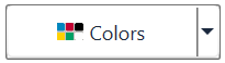
Setting size mode
Size mode is used to render Split Button control in different pre-defined sizes based on application demand. Apply the size mode by setting the SizeMode property.
The SizeMode is an enumeration which contains the following values:
- Small
- Normal
- Large
Small mode
When the mode is set to small, the control is displayed without the label. Only icon will be present in it.
<syncfusion:SplitButtonAdv SizeMode="Small" SmallIcon="Images\color.png" Label="Colors"/>SplitButtonAdv button = new SplitButtonAdv();
button.Label = "Colors";
button.SizeMode = SizeMode.Small;
button.SmallIcon = new BitmapImage(new Uri("Images\colors.png", UriKind.RelativeOrAbsolute));
Normal mode
In a normal size button, a small image with the text on the side will be displayed.
<syncfusion:SplitButtonAdv SizeMode="Normal" SmallIcon="Images\color.png" Label="Colors"/>SplitButtonAdv button = new SplitButtonAdv();
button.Label = "Colors";
button.SizeMode = SizeMode.Normal;
button.SmallIcon = new BitmapImage(new Uri("Images\colors.png", UriKind.RelativeOrAbsolute));
Large mode
In a large size button, a large image along with the text at the bottom will be displayed.
<syncfusion:SplitButtonAdv SizeMode="Large" LargeIcon="Images\color.png" Label="Colors"/>SplitButtonAdv button = new SplitButtonAdv();
button.Label = "Colors";
button.SizeMode = SizeMode.Large;
button.LargeIcon = new BitmapImage(new Uri("Images\colors.png", UriKind.RelativeOrAbsolute));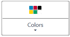
Setting icon template
The IconTemplate property provides support for setting up any type of image such as path data, font icons, etc. to the SplitButtonAdv. The icon will automatically resize the template content according to its size provided in the data template.
<Window x:Class="SplitButtonAdv_IconTemplate.MainWindow"
        xmlns="http://schemas.microsoft.com/winfx/2006/xaml/presentation"
        xmlns:x="http://schemas.microsoft.com/winfx/2006/xaml"
        xmlns:d="http://schemas.microsoft.com/expression/blend/2008"
        xmlns:mc="http://schemas.openxmlformats.org/markup-compatibility/2006"
        xmlns:local="clr-namespace:SplitButtonAdv_IconTemplate"
        xmlns:syncfusion="http://schemas.syncfusion.com/wpf"
        mc:Ignorable="d"
        Title="MainWindow" Height="450" Width="800">
    <Window.Resources>
        <DataTemplate x:Key="smallIconTemplate">
            <Grid Width="12" Height="16">
                <Path
                        Data="M11.403995,24.319994C12.395995,24.319994 13.199994,25.127996 13.199994,26.124 13.199994,27.121004 12.395995,27.928007 11.403995,27.928007 10.412996,27.928007 9.6089972,27.121004 9.6089972,26.124 9.6089972,25.127996 10.412996,24.319994 11.403995,24.319994z M17.906996,23.344005C18.898996,23.344005 19.702995,24.152004 19.702995,25.148004 19.702995,26.144005 18.898996,26.952003 17.906996,26.952003 16.915996,26.952003 16.111997,26.144005 16.111997,25.148004 16.111997,24.152004 16.915996,23.344005 17.906996,23.344005z M6.6579994,19.755001C7.6499986,19.755001 8.4539975,20.563002 8.4539975,21.559 8.4539975,22.555 7.6499986,23.362999 6.6579994,23.362999 5.6670007,23.362999 4.8630012,22.555 4.8630012,21.559 4.8630012,20.563002 5.6670007,19.755001 6.6579994,19.755001z M22.225996,18.761007C23.217995,18.761007 24.021994,19.568006 24.021994,20.565006 24.021994,21.561005 23.217995,22.369005 22.225996,22.369005 21.234997,22.369005 20.430998,21.561005 20.430998,20.565006 20.430998,19.568006 21.234997,18.761007 22.225996,18.761007z M22.123995,12.392005C23.115993,12.392005 23.919992,13.199004 23.919992,14.196004 23.919992,15.192003 23.115993,16.000004 22.123995,16.000004 21.132995,16.000004 20.328997,15.192003 20.328997,14.196004 20.328997,13.199004 21.132995,12.392005 22.123995,12.392005z M14.34922,4.7026652C15.503031,4.733209 16.70268,5.8161396 17.219744,7.4063476 17.829737,9.2813538 17.257744,11.15236 15.943761,11.583361 14.628778,12.015363 13.068799,10.844358 12.458807,8.9693526 11.849814,7.0933465 12.420807,5.2233409 13.735789,4.7913393 13.900037,4.7374643 14.068128,4.7086047 14.237728,4.7030128 14.274828,4.7017897 14.312,4.7016796 14.34922,4.7026652z M11.384993,2.000007C10.416991,2.0000073,9.6289967,2.7939981,9.6289967,3.7699956L9.6289967,10.694005C9.6289967,13.375005 7.4559931,15.556995 4.7850031,15.556995 3.2369992,15.556995 1.9999997,16.800999 1.9999994,18.330997 1.9999997,24.765001 7.2070001,30 13.608001,30L14.014998,30C20.736997,30,26.205,24.502993,26.205,17.746006L26.205,16.897007C26.205,8.6830043,19.557005,2.0000073,11.384993,2.000007z M11.384993,0C20.660002,0,28.205,7.5800074,28.205,16.897007L28.205,17.746006C28.205,25.606005,21.839994,32,14.014998,32L13.608001,32C6.1049951,32 -1.6119111E-07,25.867998 0,18.330997 -1.6119111E-07,15.698002 2.1340023,13.556996 4.7559961,13.556996 6.3529962,13.556996 7.6289972,12.272008 7.6289972,10.694005L7.6289972,3.7699956C7.6289972,1.6910015,9.3139943,0,11.384993,0z"
                        Fill="#FF3A3A38"
                        Stretch="Fill" />
            </Grid>
        </DataTemplate>

        <DataTemplate x:Key="normalIconTemplate">
            <Grid Width="16" Height="16">
                <Path
                        Data="M11.403995,24.319994C12.395995,24.319994 13.199994,25.127996 13.199994,26.124 13.199994,27.121004 12.395995,27.928007 11.403995,27.928007 10.412996,27.928007 9.6089972,27.121004 9.6089972,26.124 9.6089972,25.127996 10.412996,24.319994 11.403995,24.319994z M17.906996,23.344005C18.898996,23.344005 19.702995,24.152004 19.702995,25.148004 19.702995,26.144005 18.898996,26.952003 17.906996,26.952003 16.915996,26.952003 16.111997,26.144005 16.111997,25.148004 16.111997,24.152004 16.915996,23.344005 17.906996,23.344005z M6.6579994,19.755001C7.6499986,19.755001 8.4539975,20.563002 8.4539975,21.559 8.4539975,22.555 7.6499986,23.362999 6.6579994,23.362999 5.6670007,23.362999 4.8630012,22.555 4.8630012,21.559 4.8630012,20.563002 5.6670007,19.755001 6.6579994,19.755001z M22.225996,18.761007C23.217995,18.761007 24.021994,19.568006 24.021994,20.565006 24.021994,21.561005 23.217995,22.369005 22.225996,22.369005 21.234997,22.369005 20.430998,21.561005 20.430998,20.565006 20.430998,19.568006 21.234997,18.761007 22.225996,18.761007z M22.123995,12.392005C23.115993,12.392005 23.919992,13.199004 23.919992,14.196004 23.919992,15.192003 23.115993,16.000004 22.123995,16.000004 21.132995,16.000004 20.328997,15.192003 20.328997,14.196004 20.328997,13.199004 21.132995,12.392005 22.123995,12.392005z M14.34922,4.7026652C15.503031,4.733209 16.70268,5.8161396 17.219744,7.4063476 17.829737,9.2813538 17.257744,11.15236 15.943761,11.583361 14.628778,12.015363 13.068799,10.844358 12.458807,8.9693526 11.849814,7.0933465 12.420807,5.2233409 13.735789,4.7913393 13.900037,4.7374643 14.068128,4.7086047 14.237728,4.7030128 14.274828,4.7017897 14.312,4.7016796 14.34922,4.7026652z M11.384993,2.000007C10.416991,2.0000073,9.6289967,2.7939981,9.6289967,3.7699956L9.6289967,10.694005C9.6289967,13.375005 7.4559931,15.556995 4.7850031,15.556995 3.2369992,15.556995 1.9999997,16.800999 1.9999994,18.330997 1.9999997,24.765001 7.2070001,30 13.608001,30L14.014998,30C20.736997,30,26.205,24.502993,26.205,17.746006L26.205,16.897007C26.205,8.6830043,19.557005,2.0000073,11.384993,2.000007z M11.384993,0C20.660002,0,28.205,7.5800074,28.205,16.897007L28.205,17.746006C28.205,25.606005,21.839994,32,14.014998,32L13.608001,32C6.1049951,32 -1.6119111E-07,25.867998 0,18.330997 -1.6119111E-07,15.698002 2.1340023,13.556996 4.7559961,13.556996 6.3529962,13.556996 7.6289972,12.272008 7.6289972,10.694005L7.6289972,3.7699956C7.6289972,1.6910015,9.3139943,0,11.384993,0z"
                        Fill="#FF3A3A38"
                        Stretch="Fill" />
            </Grid>
        </DataTemplate>

        <DataTemplate x:Key="largeIconTemplate">
            <Grid  Width="16" Height="16">
                <Path
                        Width="16"
                        Height="16"
                        Data="M11.403995,24.319994C12.395995,24.319994 13.199994,25.127996 13.199994,26.124 13.199994,27.121004 12.395995,27.928007 11.403995,27.928007 10.412996,27.928007 9.6089972,27.121004 9.6089972,26.124 9.6089972,25.127996 10.412996,24.319994 11.403995,24.319994z M17.906996,23.344005C18.898996,23.344005 19.702995,24.152004 19.702995,25.148004 19.702995,26.144005 18.898996,26.952003 17.906996,26.952003 16.915996,26.952003 16.111997,26.144005 16.111997,25.148004 16.111997,24.152004 16.915996,23.344005 17.906996,23.344005z M6.6579994,19.755001C7.6499986,19.755001 8.4539975,20.563002 8.4539975,21.559 8.4539975,22.555 7.6499986,23.362999 6.6579994,23.362999 5.6670007,23.362999 4.8630012,22.555 4.8630012,21.559 4.8630012,20.563002 5.6670007,19.755001 6.6579994,19.755001z M22.225996,18.761007C23.217995,18.761007 24.021994,19.568006 24.021994,20.565006 24.021994,21.561005 23.217995,22.369005 22.225996,22.369005 21.234997,22.369005 20.430998,21.561005 20.430998,20.565006 20.430998,19.568006 21.234997,18.761007 22.225996,18.761007z M22.123995,12.392005C23.115993,12.392005 23.919992,13.199004 23.919992,14.196004 23.919992,15.192003 23.115993,16.000004 22.123995,16.000004 21.132995,16.000004 20.328997,15.192003 20.328997,14.196004 20.328997,13.199004 21.132995,12.392005 22.123995,12.392005z M14.34922,4.7026652C15.503031,4.733209 16.70268,5.8161396 17.219744,7.4063476 17.829737,9.2813538 17.257744,11.15236 15.943761,11.583361 14.628778,12.015363 13.068799,10.844358 12.458807,8.9693526 11.849814,7.0933465 12.420807,5.2233409 13.735789,4.7913393 13.900037,4.7374643 14.068128,4.7086047 14.237728,4.7030128 14.274828,4.7017897 14.312,4.7016796 14.34922,4.7026652z M11.384993,2.000007C10.416991,2.0000073,9.6289967,2.7939981,9.6289967,3.7699956L9.6289967,10.694005C9.6289967,13.375005 7.4559931,15.556995 4.7850031,15.556995 3.2369992,15.556995 1.9999997,16.800999 1.9999994,18.330997 1.9999997,24.765001 7.2070001,30 13.608001,30L14.014998,30C20.736997,30,26.205,24.502993,26.205,17.746006L26.205,16.897007C26.205,8.6830043,19.557005,2.0000073,11.384993,2.000007z M11.384993,0C20.660002,0,28.205,7.5800074,28.205,16.897007L28.205,17.746006C28.205,25.606005,21.839994,32,14.014998,32L13.608001,32C6.1049951,32 -1.6119111E-07,25.867998 0,18.330997 -1.6119111E-07,15.698002 2.1340023,13.556996 4.7559961,13.556996 6.3529962,13.556996 7.6289972,12.272008 7.6289972,10.694005L7.6289972,3.7699956C7.6289972,1.6910015,9.3139943,0,11.384993,0z"
                        Fill="#FF3A3A38"
                        Stretch="Fill" />
            </Grid>
        </DataTemplate>
    </Window.Resources>
    <StackPanel>
        <syncfusion:SplitButtonAdv x:Name="smallIcon" SizeMode="Small" Label="Login" HorizontalAlignment="Center" VerticalAlignment="Center" Margin="10" IconTemplate="{StaticResource smallIconTemplate}">
        </syncfusion:SplitButtonAdv>
        <syncfusion:SplitButtonAdv x:Name="normalIcon"  SizeMode="Normal" Label="Login" HorizontalAlignment="Center" VerticalAlignment="Center" Margin="10" IconTemplate="{StaticResource normalIconTemplate}">
        </syncfusion:SplitButtonAdv>
        <syncfusion:SplitButtonAdv x:Name="largeIcon" SizeMode="Large" Label="Login" HorizontalAlignment="Center" VerticalAlignment="Center" Margin="10" IconTemplate="{StaticResource largeIconTemplate}">
        </syncfusion:SplitButtonAdv>
    </StackPanel>
</Window>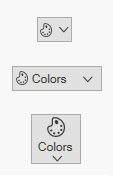
NOTE
The SplitButtonAdv loads the icon in the following priority order.
Setting icon template selector
The IconTemplateSelector property which allows you to specify a different data template based on the value given in the data templates.
<Window x:Class="TemplateSelector_SplitButtonAdv.MainWindow"
        xmlns="http://schemas.microsoft.com/winfx/2006/xaml/presentation"
        xmlns:x="http://schemas.microsoft.com/winfx/2006/xaml"
        xmlns:d="http://schemas.microsoft.com/expression/blend/2008"
        xmlns:mc="http://schemas.openxmlformats.org/markup-compatibility/2006"
        xmlns:local="clr-namespace:TemplateSelector_SplitButtonAdv"
        xmlns:syncfusion="http://schemas.syncfusion.com/wpf"
        mc:Ignorable="d"
        Title="MainWindow" Height="450" Width="800">
    <Window.Resources>
        <DataTemplate x:Key="newIcon">
            <Grid Width="12" Height="16">
                <Path
                      Margin="0.5"
                      Data="M0,0 L5.9999999,0 11,5 11,15 0,15 z"
                      Fill="White"
                      Stretch="Fill" />
                <Path
                     Data="M7,1.7070007 L7,5 10.292999,5 z M1,1 L1,15 11,15 11,6 6,6 6,1 z M0,0 L6.7070007,0 12,5.2929993 12,16 0,16 z"
                     Fill="#FF3A3A38"
                     Stretch="Fill" />
            </Grid>
        </DataTemplate>
        <DataTemplate x:Key="OpenIcon">
            <Grid Width="16" Height="16">
                <Path
                     Margin="0.5,0.5,0.738,0.502"
                     Data="M0,0 L5,0 6,1 12,1 12,3.4999998 11.499065,3.9999996 14.716998,3.9999996 11.92699,10.999 4.1853847,10.984859 0,10.982999 z"
                     Fill="White"
                     Stretch="Fill" />
                <Path
                     Data="M5.162991,5.0009986 L1.7839907,10.979999 4.3081884,10.984653 5.0009999,10.984999 5.0009999,10.98593 12.088991,10.999 14.480014,5.0009986 z M0,0 L5.7069998,0 6.7069998,1 13,1 13,3.9999998 12,3.9999998 12,1.9999998 6.2930002,1.9999998 5.2930002,1 0.99999994,1 0.99999994,10.335325 4.5790062,4.0009986 15.954991,4.0009986 12.765994,12.000998 4.552258,11.98482 0,11.982999 z"
                     Fill="#FF3A3A38"
                     Stretch="Fill" />
            </Grid>
        </DataTemplate>
        <local:TemplateSelector x:Key="IconTemp" NewIcon="{StaticResource newIcon}" OpenIcon="{StaticResource OpenIcon}"/>
    </Window.Resources>
    <Grid>
        <StackPanel VerticalAlignment="Center">
            <CheckBox Name="Check" IsChecked="True" Checked="Check_Checked" Unchecked="Check_Unchecked" HorizontalAlignment="Center" Command="{Binding CheckCommand}" Content="ChangeIcon"/>
            <syncfusion:SplitButtonAdv HorizontalAlignment="Center" Margin="10" Content="{Binding IsChecked}" Label="IconTemplateSelector" IconTemplateSelector="{StaticResource IconTemp}"/>
        </StackPanel>
    </Grid>
</Window>
public class TemplateSelector : DataTemplateSelector
{
public DataTemplate NewIcon { get; set; }
public DataTemplate OpenIcon { get; set; }
public override DataTemplate SelectTemplate(object item, DependencyObject container)
{
if (item == null)
{
return OpenIcon;
}
if ((item as Model).IsChecked)
{
return NewIcon;
}
return base.SelectTemplate(item, container);
}
}NOTE
The SplitButtonAdv loads the icon in the following priority order.
Setting image
The image option helps to provide pictorial representation of the button. Image can be added either using the SmallIcon or LargeIcon property.
- SmallIcon — This property will be used to set the image when size mode is Normal or Small.
- LargeIcon — This property will be used to set the image when size mode is Large.
The SmallIcon property can be set as follows:
<syncfusion:SplitButtonAdv SizeMode="Small" Label="Syncfusion" SmallIcon="Images\syncfusion.png"/>SplitButtonAdv button = new SplitButtonAdv();
button.Label = "Syncfusion";
button.SizeMode = SizeMode.Small;
button.SmallIcon = new BitmapImage(new Uri("Images\syncfusion.png", UriKind.RelativeOrAbsolute));
The SmallIcon property can be set even when the sizeMode is Normal.
<syncfusion:SplitButtonAdv SizeMode="Normal" SmallIcon="Images\Syncfusion.png" Label="Syncfusion"/>SplitButtonAdv button = new SplitButtonAdv();
button.Label = "Syncfusion";
button.SizeMode = SizeMode.Normal;
button.SmallIcon = new BitmapImage(new Uri("Images\syncfusion.png", UriKind.RelativeOrAbsolute));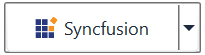
The LargeIcon property can be set as follows:
<syncfusion:SplitButtonAdv SizeMode="Large" LargeIcon="Images\Syncfusion.png" Label="Syncfusion"/>SplitButtonAdv button = new SplitButtonAdv();
button.Label = "Syncfusion";
button.SizeMode = SizeMode.Large;
button.LargeIcon = new BitmapImage(new Uri("Images\syncfusion.png", UriKind.RelativeOrAbsolute));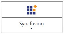
Setting icon width and height
Icon width and icon height can be set using IconWidth and IconHeight properties respectively.
<syncfusion:SplitButtonAdv SizeMode="Normal" IconHeight="20" IconWidth="20" Label="Syncfusion" SmallIcon="Images\syncfusion.png" />SplitButtonAdv splitbutton = new SplitButtonAdv();
splitbutton.Label = "Syncfusion";
splitbutton.IconWidth=20;
splitbutton.IconHeight=20;
splitbutton.SmallIcon = new BitmapImage(new Uri("Images\syncfusion.png", UriKind.RelativeOrAbsolute));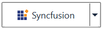
<syncfusion:SplitButtonAdv x:Name="splitbutton" SizeMode="Normal" IconHeight="30" IconWidth="30" Label="Syncfusion" SmallIcon="Images\syncfusion.png" />SplitButtonAdv splitbutton = new SplitButtonAdv();
splitbutton.Label = "Syncfusion";
splitbutton.IconWidth=30;
splitbutton.IconHeight=30;
splitbutton.SmallIcon = new BitmapImage(new Uri("Images\syncfusion.png", UriKind.RelativeOrAbsolute));
NOTE
View sample in GitHub. This sample showcases how to add split button control and its basic features like image sizing options and size modes.
IsDefault mode
The IsDefault property indicates whether the SplitButtonAdv is a Default button and is used to activate the SplitButtonAdv by pressing using Enter key. When setting the IsDefault property to true, the user can invoke the button by pressing the Enter key.
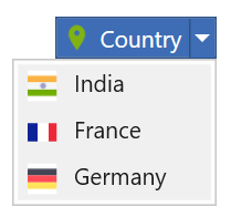
<syncfusion:SplitButtonAdv x:Name="defaultButton" Label="Default" Grid.Column="1" Grid.Row="1" VerticalAlignment="Top" HorizontalAlignment="Center" Click="SplitButtonAdv_Click" IsDefault="True" />Adding items to Split Button
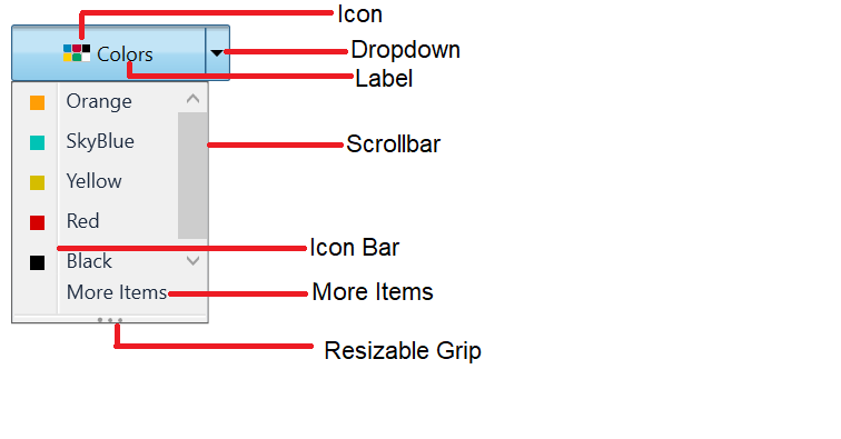
The DropDownMenuGroup acts as a container for the Split Button control. It provides options to add menu items and also options like header name, re-sizing and scrollbar.
NOTE
For more information on how to bind data with command actions for Split Button please refer to the topics Data Binding and Command Binding.
<Window x:Class="Split_Button_Menuitem_Binding.MainWindow"
        xmlns="http://schemas.microsoft.com/winfx/2006/xaml/presentation"
        xmlns:x="http://schemas.microsoft.com/winfx/2006/xaml"
        xmlns:d="http://schemas.microsoft.com/expression/blend/2008"
        xmlns:mc="http://schemas.openxmlformats.org/markup-compatibility/2006"
        xmlns:local="clr-namespace:Dropdown_Button_Menuitem_Binding"
        xmlns:syncfusion="http://schemas.syncfusion.com/wpf"
        mc:Ignorable="d"
        Title="MainWindow" Height="450" Width="800">
    <Window.DataContext>
        <local:CountryViewModel/>
    </Window.DataContext>
    <Grid>
        <syncfusion:SplitButtonAdv Label="Country" SmallIcon="Images/flagsmall.png" >
            <syncfusion:DropDownMenuGroup ItemsSource="{Binding DropDownItems}">
                <syncfusion:DropDownMenuGroup.ItemTemplate>
                    <DataTemplate>
                        <syncfusion:DropDownMenuItem Header="{Binding Name}" HorizontalAlignment="Left">
                            <syncfusion:DropDownMenuItem.Icon>
                                <Image Source="{Binding Flag}"/>
                            </syncfusion:DropDownMenuItem.Icon>
                        </syncfusion:DropDownMenuItem>
                    </DataTemplate>
                </syncfusion:DropDownMenuGroup.ItemTemplate>
            </syncfusion:DropDownMenuGroup>
        </syncfusion:SplitButtonAdv>
    </Grid>
</window>
public class Country
{
private string name;
public string Name
{
get
{
return name;
}
set
{
name = value;
}
}
private BitmapImage flag;
public BitmapImage Flag
{
get
{
return flag;
}
set
{
flag = value;
}
}
}
public class CountryViewModel
{
private List<Country> dropDownItems;
public List<Country> DropDownItems
{
get
{
return dropDownItems;
}
set
{
dropDownItems = value;
}
}
public CountryViewModel()
{
DropDownItems = new List<Country>();
DropDownItems.Add(new Country()
{
Name = "India",
Flag = new BitmapImage(new Uri("/Images/india.png", UriKind.RelativeOrAbsolute))
});
DropDownItems.Add(new Country()
{
Name = "France",
Flag = new BitmapImage(new Uri("/Images/france.png", UriKind.RelativeOrAbsolute))
});
DropDownItems.Add(new Country()
{
Name = "Germany",
Flag = new BitmapImage(new Uri("/Images/germany.png", UriKind.RelativeOrAbsolute))
});
}
}
NOTE
View sample in GitHub.
Theme
Split Button supports various built-in themes. Refer to the below links to apply themes for the Split Button,