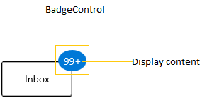
- Structure of Badge control
- Assembly deployment
- Adding WinUI Badge control via XAML
- Adding WinUI Badge control via C#
- Adding badge for a Button
- Adding badge without BadgeContainer
- Setting Badge display content
- Alignment of Badge
- Positioning of Badge
- Predefined colors for displaying the badges
- Custom colors for displaying the badges
- Predefined shapes for displaying the Badge
- Custom shape for displaying the Badge
- Animate when content changes
- Stroke customization
- Hide the Badge
- Display number formatting
- Change Badge size
- Badge content alignment
- Text formatting
- Rotate the Badge
- Change opacity of Badge
Contact Support
Getting Started with WinUI Badge control
This section describes how to create a Badge control in a WinUI application and overview of its basic functionalities.
Structure of Badge control
Assembly deployment
Refer to the Control Dependencies section to get the list of assemblies or NuGet package that needs to be added as a reference to use the control in any application.
Refer to this documentation to find more details about installing nuget packages in a WinUI application.
Adding WinUI Badge control via XAML
To add the Badge control manually in XAML, follow these steps:
1) Create a new WinUI project in Visual Studio.
2) Add the following required assembly references to the project:
- Syncfusion.Notifications.WinUI
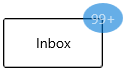
3) Import Syncfusion WinUI schema using:Syncfusion.UI.Xaml.Notifications and declare the Badge control in XAML page.
<Page
    x:Class="Badgecontrol_sample.MainPage"
    xmlns="http://schemas.microsoft.com/winfx/2006/xaml/presentation"
    xmlns:x="http://schemas.microsoft.com/winfx/2006/xaml"
    xmlns:local="using:Getting_Started"
    xmlns:d="http://schemas.microsoft.com/expression/blend/2008"
    xmlns:mc="http://schemas.openxmlformats.org/markup-compatibility/2006"
    xmlns:syncfusion="using:Syncfusion.UI.Xaml.Notifications">
    <Grid>
        <syncfusion:Badge Name="badge"
                          Content="99+"
                          Height="30"
                          Width="30"/>
    </Grid>
</Page>
Adding WinUI Badge control via C#
To add the Badge control manually in C#, follow these steps:
1) Create a new WinUI application via Visual Studio.
2) Add the following required assembly references to the project:
- Syncfusion.Notifications.WinUI
3) Include the required namespace.
using Syncfusion.UI.Xaml.Notifications;4) Create an instance of Badge control and add it to the page.
// Creating an instance of the Badge control
Badge badge = new Badge();

// Setting height and width to Badge control
badge.Height = 30;
badge.Width = 30;
Adding badge for a Button
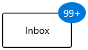
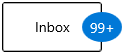
If you want to assign Badge for any objects, create the Badge and assign the badge to the BadgeContainer.Badge property. Before that you need to create a BadgeContainer and add that object to the BadgeContainer.Content property.
Here, Badge control added for the Button control.
<syncfusion:BadgeContainer Name="badgeContainer"  >
    <syncfusion:BadgeContainer.Badge>
        <syncfusion:Badge Name="badge"
                          Content="10"/>
    </syncfusion:BadgeContainer.Badge>
    <syncfusion:BadgeContainer.Content>
        <Button Content="Inbox">
        </Button>
    </syncfusion:BadgeContainer.Content>
</syncfusion:BadgeContainer>
//Creating Badge control
Badge badge = new Badge();
badge.Content = "10";
BadgeContainer badgeContainer = new BadgeContainer();
badgeContainer.Content = new Button(){ Content="Inbox" };
//Assigning Badge control to the content of BadgeContainer
badgeContainer.Badge = badge;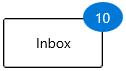
Adding badge without BadgeContainer
You can directly add the Badge to any objects without using the BadgeContainer.
public class ListItem {
    public string ItemName { get; set; }
    public int? UnreadMessageount { get; set; }
}

public class ViewModel {
    public List<ListItem> MailItems { get; set; }

    public ViewModel() {
        MailItems = new List<ListItem>();
        MailItems.Add(new ListItem() { ItemName = "Inbox",
            UnreadMessageount = 20 });
        MailItems.Add(new ListItem() { ItemName = "Drafts",
            UnreadMessageount = null });
        MailItems.Add(new ListItem() { ItemName = "Sent Intems",
            UnreadMessageount = 5 });
        MailItems.Add(new ListItem() { ItemName = "Deleted Items",
            UnreadMessageount = null });
        MailItems.Add(new ListItem() { ItemName = "Junk Email",
            UnreadMessageount = null });
    }
}<Page.DataContext>
<local:ViewModel/>
</Page.DataContext>
<Grid>
<ListView BorderThickness="1"
BorderBrush="LightGray"
ItemsSource="{Binding MailItems}"
SelectedIndex="0"
VerticalAlignment="Center"
HorizontalAlignment="Center">
<ListView.ItemTemplate>
<DataTemplate>
<Grid>
<Grid.ColumnDefinitions>
<ColumnDefinition Width="150"/>
<ColumnDefinition Width="100"/>
</Grid.ColumnDefinitions>
<ContentPresenter
Grid.Column="0"
Content="{Binding ItemName}"
VerticalAlignment="Center"/>
<syncfusion:Badge
x:Name="badge4"
Grid.Column="1"
Height="20"
Width="40"
Content="{Binding UnreadMessageount}"
Shape="Oval"
Fill="Warning">
</syncfusion:Badge>
</Grid>
</DataTemplate>
</ListView.ItemTemplate>
</ListView>
</Grid>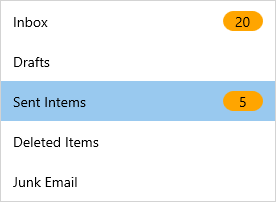
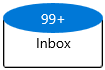
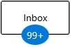
Setting Badge display content
If you want to set or change the display content of the Badge, use the Badge.Content property. The default value of Badge.Content property is null.
<syncfusion:BadgeContainer Name="badgeContainer"  >
    <syncfusion:BadgeContainer.Badge>
        <syncfusion:Badge  Name="badge"
                           Content="99+"/>
    </syncfusion:BadgeContainer.Badge>
    <syncfusion:BadgeContainer.Content>
        <Button Content="Inbox">
        </Button>
    </syncfusion:BadgeContainer.Content>
</syncfusion:BadgeContainer>
Badge badge = new Badge();
//Setting Badge display content
badge.Content = "99+";
BadgeContainer badgeContainer = new BadgeContainer();
badgeContainer.Content = new Button(){ Content="Inbox" };
//Assigning Badge control to the content of BadgeContainer
badgeContainer.Badge = badge;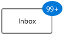
Custom UI for Badge content
You can change the appearance of Badge content by using Badge.ContentTemplate property. The DataContext of Badge.ContentTemplate property is Badge.Content.
<syncfusion:BadgeContainer Name="badgeContainer"  >
    <syncfusion:BadgeContainer.Badge>
        <syncfusion:Badge  Name="badge"
                           Content="10">
            <syncfusion:Badge.ContentTemplate>
                <DataTemplate>
                    <Grid Background="Yellow">
                        <TextBlock Text="{Binding}"
                                   Foreground="Red"/>
                    </Grid>
                </DataTemplate>
            </syncfusion:Badge.ContentTemplate>
        </syncfusion:Badge>
    </syncfusion:BadgeContainer.Badge>
    <syncfusion:BadgeContainer.Content>
        <Button Content="Inbox">
        </Button>
    </syncfusion:BadgeContainer.Content>
</syncfusion:BadgeContainer>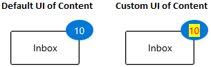
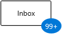
Alignment of Badge
you can align the Badge either horizontally or vertically by using the Badge.HorizontalAlignment or Badge.VerticalAlignment properties. The default value of Badge.HorizontalAlignment property is Right and Badge.VerticalAlignment property is Top.
| VerticalAlignment | Left | Center | Right | Stretch |
|---|---|---|---|---|
| Top | 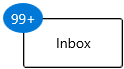 |
 |
 |
 |
| Center | 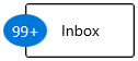 |
 |
 |
 |
| Bottom | 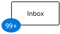 |
 |
 |
 |
| Stretch | 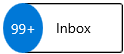 |
 |
 |
 |
<syncfusion:BadgeContainer Name="badgeContainer"  >
    <syncfusion:BadgeContainer.Badge>
        <syncfusion:Badge HorizontalAlignment="Left"
                          VerticalAlignment="Center"
                          Content="99+"
                          Name="badge"/>
    </syncfusion:BadgeContainer.Badge>
    <syncfusion:BadgeContainer.Content>
        <Button Content="Inbox">
        </Button>
    </syncfusion:BadgeContainer.Content>
</syncfusion:BadgeContainer>badge.HorizontalAlignment = HorizontalAlignment.Left;
badge.VerticalAlignment = VerticalAlignment.Center;
badge.Content = "99+";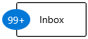
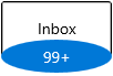
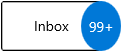
Positioning of Badge
You can change the horizontal or vertical position of the Badge either inside, outside or in the middle by using the Badge.HorizontalAnchor and Badge.VerticalAnchor properties. The default value of Badge.HorizontalAnchor and Badge.VerticalAnchor properties is Center.
<syncfusion:BadgeContainer Name="badgeContainer"  >
    <syncfusion:BadgeContainer.Badge>
        <syncfusion:Badge HorizontalAnchor="Outside"
                          VerticalAnchor="Center"
                          Content="99+"
                          Name="badge"/>
    </syncfusion:BadgeContainer.Badge>
    <syncfusion:BadgeContainer.Content>
        <Button Content="Inbox">
        </Button>
    </syncfusion:BadgeContainer.Content>
</syncfusion:BadgeContainer>badge.HorizontalAnchor = BadgeAnchor.Outside;
badge.VerticalAnchor = BadgeAnchor.Center;
badge.Content = "99+";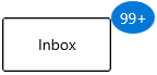
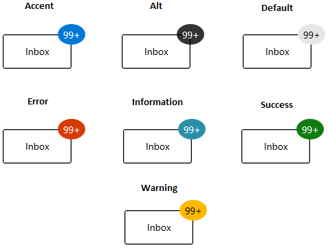
Predefined colors for displaying the badges
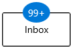
You can change background color of the Badge by using the Badge.Fill property. Based on the value of Badge.Fill property, respective background color will be applied to the Badge. The default value of Badge.Fill property is Accent.
The Badge supports the following different essential states :
-
Accent - RoyalBlue background will be applied
-
Alt - DarkSlateGray background will be applied
-
Default - Lavender background will be applied
-
Error - OrangeRed background will be applied
-
Information - LightSeaGreen background will be applied
-
Success - Green background will be applied
-
Warning - Orange background will be applied
<syncfusion:BadgeContainer Name="badgeContainer"  >
    <syncfusion:BadgeContainer.Badge>
        <syncfusion:Badge Fill="Success"
                          Content="99+"
                          Name="badge"/>
    </syncfusion:BadgeContainer.Badge>
    <syncfusion:BadgeContainer.Content>
        <Button Content="Inbox">
        </Button>
    </syncfusion:BadgeContainer.Content>
</syncfusion:BadgeContainer>badge.Fill = BadgeFill.Success;
badge.Content = "99+";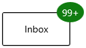
Custom colors for displaying the badges
If you want to change the background color of the Badge other than the default Badge.Fill colors, use the Badge.Background property. You can also change foreground of the Badge by using the Badge.Foreground property. The default value of Badge.Background and Badge.Foreground properties is null.
<syncfusion:BadgeContainer Name="badgeContainer"  >
    <syncfusion:BadgeContainer.Badge>
        <syncfusion:Badge Background="Black"
                          Foreground="Yellow"
                          Content="99+"
                          Name="badge"/>
    </syncfusion:BadgeContainer.Badge>
    <syncfusion:BadgeContainer.Content>
        <Button Content="Inbox">
        </Button>
    </syncfusion:BadgeContainer.Content>
</syncfusion:BadgeContainer>badge.Background = new SolidColorBrush(Colors.Black);
badge.Foreground = new SolidColorBrush(Colors.Yellow);
badge.Content = "99+";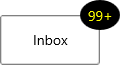
Predefined shapes for displaying the Badge
You can change the default shape to either Rectangle, Oval or Ellipse by using Badge.Shape property. If you want to display the Badge content without any default shapes , use the Badge.Shape property value as None. The default value of Badge.Shape property is Ellipse.
<syncfusion:BadgeContainer Name="badgeContainer"  >
    <syncfusion:BadgeContainer.Badge>
        <syncfusion:Badge Shape="Oval"
                          Content="99+"
                          Name="badge"/>
    </syncfusion:BadgeContainer.Badge>
    <syncfusion:BadgeContainer.Content>
        <Button Content="Inbox">
        </Button>
    </syncfusion:BadgeContainer.Content>
</syncfusion:BadgeContainer>badge.Shape = BadgeShape.Oval;
badge.Content = "99+";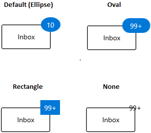
Custom shape for displaying the Badge
If you want to change the shape of the Badge other than the default shapes, use the Badge.CustomShape property. You can enable the custom shapes by setting the Badge.Shape property value as Custom.
<syncfusion:BadgeContainer Name="badgeContainer"  >
    <syncfusion:BadgeContainer.Badge>
        <syncfusion:Badge Shape="Custom"
                          CustomShape="M 300 100 L 500 400 100 400 Z"
                          Content="10"
                          Width="50" Height="30"
                          Name="badge"/>
    </syncfusion:BadgeContainer.Badge>
    <syncfusion:BadgeContainer.Content>
        <Button Content="Inbox">
        </Button>
    </syncfusion:BadgeContainer.Content>
</syncfusion:BadgeContainer>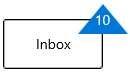
Animate when content changes
You can enable the Scale or Opacity based animation for displaying the Badge text by using Badge.AnimationType property. You can only see the animation when you change the text of the Badge. The default value of Badge.AnimationType property is None.
<syncfusion:BadgeContainer Name="badgeContainer"  >
    <syncfusion:BadgeContainer.Badge>
        <syncfusion:Badge AnimationType="Scale"
                          Background="Red"
                          Content="1"
                          Name="badge"/>
    </syncfusion:BadgeContainer.Badge>
    <syncfusion:BadgeContainer.Content>
        <Button Content="Inbox">
        </Button>
    </syncfusion:BadgeContainer.Content>
</syncfusion:BadgeContainer>badge.AnimationType = AnimationType.Scale;
badge.Content = "1";Scaling based animation

Opacity based animation
Stroke customization
You can change stroke color and its thickness by using the Badge.Stroke and Badge.StrokeThikness properties. The default value of Badge.Stroke property is null and Badge.StrokeThikness property is 0.
<syncfusion:BadgeContainer Name="badgeContainer"  >
    <syncfusion:BadgeContainer.Badge>
        <syncfusion:Badge Stroke="Red"
                          StrokeThickness="3"
                          Content="99+"
                          Name="badge"/>
    </syncfusion:BadgeContainer.Badge>
    <syncfusion:BadgeContainer.Content>
        <Button Content="Inbox">
        </Button>
    </syncfusion:BadgeContainer.Content>
</syncfusion:BadgeContainer>badge.Stroke = new SolidColorBrush(Colors.Red);
badge.StrokeThickness = 3;
badge.Content = "99+";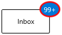
Hide the Badge
You can hide the Badge by setting the Badge.Visibility property value as Collapsed. Badge will be hidden when its content is null. The default value of Badge.Visibility property is Visible.
<syncfusion:BadgeContainer Name="badgeContainer"  >
    <syncfusion:BadgeContainer.Badge>
        <syncfusion:Badge Visibility="Collapsed"
                          Content="99+"
                          Name="badge"/>
    </syncfusion:BadgeContainer.Badge>
    <syncfusion:BadgeContainer.Content>
        <Button Content="Inbox">
        </Button>
    </syncfusion:BadgeContainer.Content>
</syncfusion:BadgeContainer>badge.Visibility = Visibility.Collapsed;
badge.Content = "99+";
Display number formatting
You can format the numbers which are displayed in the Badge content by using the converters. For example, you can display the number as 99+ which is greater than or equal to 100.
public class CustomNumberConverter : IValueConverter {
    public object Convert(object value, Type targetType, object parameter, string language)
    {
        if (int.TryParse(value.ToString(), out int number)) {
            if (number <= 99) {
                return value;
            }
            else if (number <= 999) {
                return "99+";
            }
            else if (number < 99999) {
                return (number / 1000).ToString("0.#") + "K";
            }
            else if (number < 999999) {
                return (number / 1000).ToString("#,0K");
            }
            else if (number < 9999999) {
                return (number / 1000000).ToString("0.#") + "M";
            }
            else {
                return (number / 1000000).ToString("#,0M");
            }
        }
        return value;
    }

    public object ConvertBack(object value, Type targetType, object parameter, string language) {
        throw new NotImplementedException();
    }
}<Page.Resources>
<local:CustomNumberConverter x:Key="customNumberConverter"/>
</Page.Resources>
<Grid>
<Grid.ColumnDefinitions>
<ColumnDefinition/>
<ColumnDefinition/>
</Grid.ColumnDefinitions>
<syncfusion:BadgeContainer Name="badgeContainer">
<syncfusion:BadgeContainer.Badge>
<syncfusion:Badge Name="badge"
Background="Red"
Content="{x:Bind badgeContent.Text,
Mode=OneWay,
Converter={StaticResource
customNumberConverter}}"/>
</syncfusion:BadgeContainer.Badge>
<syncfusion:BadgeContainer.Content>
<Button Content="Inbox">
</Button>
</syncfusion:BadgeContainer.Content>
</syncfusion:BadgeContainer>
<Grid Grid.Column="1">
<muxc:NumberBox x:Name="badgeContent"
Header="BadgeContent"
Value="99"
SpinButtonPlacementMode="Compact"
Minimum="0"
Maximum="100000000"/>
</Grid>
</Grid>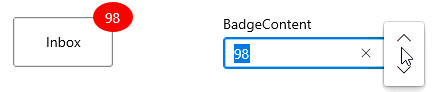
Change Badge size
You can change the size of Badge by using the Badge.Width and Badge.Height properties. The default value of Badge.Width property is 40 and Badge.Height property is 30.
<syncfusion:BadgeContainer Name="badgeContainer"  >
    <syncfusion:BadgeContainer.Badge>
        <syncfusion:Badge Width="60"
                          Height="60"
                          Content="99+"
                          Name="badge"/>
    </syncfusion:BadgeContainer.Badge>
    <syncfusion:BadgeContainer.Content>
        <Button Content="Inbox">
        </Button>
    </syncfusion:BadgeContainer.Content>
</syncfusion:BadgeContainer>badge.Width = 60;
badge.Height = 60;
badge.Content = "99+";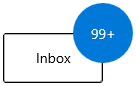
Badge content alignment
you can place the Badge content either horizontally or vertically by using the Badge.HorizontalContentAlignment or Badge.VerticalContentAlignment properties. The default value of Badge.HorizontalContentAlignment and Badge.VerticalContentAlignment properties is Center.
<syncfusion:BadgeContainer Name="badgeContainer"  >
    <syncfusion:BadgeContainer.Badge>
        <syncfusion:Badge HorizontalContentAlignment="Right"
                          VerticalContentAlignment="Top"
                          Content="99+"
                          Name="badge"/>
    </syncfusion:BadgeContainer.Badge>
    <syncfusion:BadgeContainer.Content>
        <Button Content="Inbox">
        </Button>
    </syncfusion:BadgeContainer.Content>
</syncfusion:BadgeContainer>badge.HorizontalContentAlignment = HorizontalAlignment.Right;
badge.VerticalContentAlignment = VerticalAlignment.Top;
badge.Content = "99+";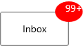
Text formatting
You can change the style, size and font family of the Badge display content by using the Badge.FontFamily, Badge.FontStyle and Badge.FontSize properties. The default value of Badge.FontFamily property is Segoe UI, Badge.FontStyle property is Normal and Badge.FontSize property is 14.
<syncfusion:BadgeContainer Name="badgeContainer"  >
    <syncfusion:BadgeContainer.Badge>
        <syncfusion:Badge  Name="badge"
                           FontFamily="Perpetua"
                           FontSize="20"
                           FontStyle="Oblique"
                           Content="99+"/>
    </syncfusion:BadgeContainer.Badge>
    <syncfusion:BadgeContainer.Content>
        <Button Content="Inbox">
        </Button>
    </syncfusion:BadgeContainer.Content>
</syncfusion:BadgeContainer>badge.FontFamily = new FontFamily("Perpetua");
badge.FontSize = 20;
badge.FontStyle = Windows.UI.Text.FontStyle.Oblique;
badge.Content = "99+";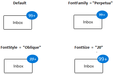
Rotate the Badge
You can place the Badge with a specific rotation angle by using the Rotation property. The default value of Rotation property is 0.
<syncfusion:BadgeContainer Name="badgeContainer"  >
    <syncfusion:BadgeContainer.Badge>
        <syncfusion:Badge Rotation="30"
                          Content="99+"
                          Name="badge"/>
    </syncfusion:BadgeContainer.Badge>
    <syncfusion:BadgeContainer.Content>
        <Button Content="Inbox">
        </Button>
    </syncfusion:BadgeContainer.Content>
</syncfusion:BadgeContainer>badge.Rotation = 30;
badge.Content = "99+";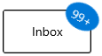
Change opacity of Badge
You can change opacity of the Badge by using the Opacity property. The default value of Opacity property is 1.
<syncfusion:BadgeContainer Name="badgeContainer"  >
    <syncfusion:BadgeContainer.Badge>
        <syncfusion:Badge Opacity="0.6"
                          Content="99+"
                          Name="badge"/>
    </syncfusion:BadgeContainer.Badge>
    <syncfusion:BadgeContainer.Content>
        <Button Content="Inbox">
        </Button>
    </syncfusion:BadgeContainer.Content>
</syncfusion:BadgeContainer>badge.Opacity = 0.6;
badge.Content = "99+";