How can I help you?
ChildButtonCustomization in Windows Forms ButtonEdit
4 Feb 20256 minutes to read
The child buttons in a ButtonEdit control are normal windows button, but supports additional features within ButtonEdit control.
Button Types and Border Styles
Button Types
The button types for child Buttons in ButtonEdit control are similar to that of ButtonAdv control. To learn more about ButtonType of ButtonEditChildButton click here.
Border Styles
The border styles for the ButtonEditChildButton in ButtonEdit can be set through BorderStyleAdv property.
| Property | Description |
|---|---|
| BorderStyleAdv |
Specifies the border style for child buttons of the ButtonEdit control. The styles are, None, Default, Dashed, Dotted, Inset, Outset, Solid, Bump, Etched, Flat, Raised, RaisedInner, RaisedOuter, Sunken, SunkenInner and SunkenOuter. |
NOTE
This setting will be effective only for Office2003, OfficeXP and WindowsXP styles set through ButtonStyle property of ButtonEdit control. We can also set border style for ButtonEdit controls without enabling visual styles.
//Sample code for setting "Bump" Border Style for BorderEdit Child Button
this.buttonEditChildButton1.BorderStyleAdv = Syncfusion.Windows.Forms.ButtonAdvBorderStyle.Bump;
'Sample code for setting "Bump" Border Style for BorderEdit Child Button
Me.buttonEditChildButton1.BorderStyleAdv = Syncfusion.Windows.Forms.ButtonAdvBorderStyle.Bump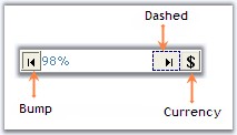
See Also
Style Settings, How to set tooltip for ButtonEdit Child buttons?
Button Alignment
You can align the child buttons inside the ButtonEdit control is set through ButtonAlign property.
| Property | Description |
|---|---|
| ButtonAlign | Specifies whether the child button should be aligned to left or right of the ButtonEdit control. |
this.buttonEditChildButton1.ButtonAlign = Syncfusion.Windows.Forms.Tools.ButtonAlignment.Left;Me.buttonEditChildButton1.ButtonAlign = Syncfusion.Windows.Forms.Tools.ButtonAlignment.Left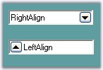
Image and Text Settings
The image and text of child buttons in ButtonEdit can be customized by using Image, ImageAlign, ImageIndex, ImageList, PreferredWidth, Text, TextAlign and TextImageRelation properties.
| Properties | Description |
|---|---|
| Image | Sets image for the child button. |
| ImageAlign | Sets alignment of the image. |
| ImageIndex | Sets the index of the image to be set for the child button. |
| ImageList | Indicates the image list to be used for child button. |
| PreferredWidth | Specifies the width of the button. Default value is 18. |
| Text | Sets text for the button if ButtonType is set to Normal. |
| TextAlign | Sets the alignment of the text in the child button control. |
| TextImageRelation | Sets the relative location of the image to the text in the button. |
this.buttonEditChildButton1.Image = ((System.Drawing.Image)(resources.GetObject("buttonEditChildButton2.Image")));
this.buttonEditChildButton1.ImageAlign = System.Drawing.ContentAlignment.MiddleLeft;
this.buttonEditChildButton1.Text = "Browse";
this.buttonEditChildButton1.TextAlign = System.Drawing.ContentAlignment.MiddleLeft;
this.buttonEditChildButton1.TextImageRelation = System.Windows.Forms.TextImageRelation.ImageBeforeText;
this.buttonEditChildButton1.PreferredWidth = 64;Me.buttonEditChildButton1.Image = DirectCast((resources.GetObject("buttonEditChildButton2.Image")), System.Drawing.Image)
Me.buttonEditChildButton1.ImageAlign = System.Drawing.ContentAlignment.MiddleLeft
Me.buttonEditChildButton1.Text = "Browse"
Me.buttonEditChildButton1.TextAlign = System.Drawing.ContentAlignment.MiddleLeft
Me.buttonEditChildButton1.TextImageRelation = System.Windows.Forms.TextImageRelation.ImageBeforeText
Me.buttonEditChildButton1.PreferredWidth = 64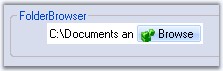
Flat Style for the Buttons
You can customize the child button for flat style or appearance in ButtonEdit using FlatStyle and FlatAppearance property.
| Properties | Description |
|---|---|
| FlatAppearance | Represents the appearance of the border and the color for the check state and mouse over state. Set FlatStyle to Flat and UseVisualStyleBackColor should be set to false to make this setting effective. |
| FlatStyle | Specifies the flat style for the button. The options are Flat, Popup, Standard and System. |
this.buttonEditChildButton1.FlatStyle = System.Windows.Forms.FlatStyle.Flat;
this.buttonEditChildButton1.FlatAppearance.BorderColor = System.Drawing.Color.Crimson;
this.buttonEditChildButton1.FlatAppearance.MouseOverBackColor = System.Drawing.Color.Pink;Me.buttonEditChildButton1.FlatStyle = System.Windows.Forms.FlatStyle.Flat
Me.buttonEditChildButton1.FlatAppearance.BorderColor = System.Drawing.Color.Crimson
Me.buttonEditChildButton1.FlatAppearance.MouseOverBackColor = System.Drawing.Color.Pink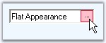
Style Settings
The visual style of child buttons can be set in ButtonEdit using UseVisualStyleBackColor, Office2007ColorScheme and Office2010ColorScheme properties.
| Properties | Description |
|---|---|
| UseVisualStyleBackColor | Determines whether the background of child button is drawn using visual style if the button supports visual styles. |
| Office2007ColorScheme | Specifies the office2007 color scheme. |
| Office2010ColorScheme | Specifies the office2010 color scheme. |
NOTE
Visual style of a child buttons is inherited from the visual style of it’s parent ButtonEdit control. You can override those settings using the above properties.
Focusing the Child Button at Runtime
The child buttons can be focused based on the order set by TabIndex property set for individual child buttons and TabStop property should be enabled to make this effective. While focusing the button, we can display a focus rectangle, by enabling KeepFocusRectangle property of ButtonEditChildButton control.
this.buttonEditChildButton1.KeepFocusRectangle = true;Me.buttonEditChildButton1.KeepFocusRectangle = True
Hide Child Button in ButtonEdit
You can hide the child buttons of ButtonEdit control by using HideButton method.
| Method | Description |
|---|---|
| HideButton | Indicates whether a child button is hidden or visible. The parameters are, buttonIndex - Specifies the index of the button. visible - Specifies the visibility of the button. It can be true or false. If true, the button will be visible and if false, the button will not be visible. |
this.buttonEdit1.HideButton(0, false);Me.buttonEdit1.HideButton(0, False)