How can I help you?
ButtonEditAppearance in Windows Forms ButtonEdit
4 Feb 20255 minutes to read
A ButtonEdit control is a combination of controls with textbox and buttons. The ButtonEdit control supports properties which controls the appearance and behavior of the control.
See Also
TextBox Settings for ButtonEdit, Child Button Customization
Style Settings
The ButtonEdit control can be customized by following ways,
- Button Styles.
- Custom Colors for ButtonEdit.
- Border Styles.
Button Styles
Styles for the ButtonEdit control can be applied using ButtonStyle property. UseVisualStyle property must be enabled before applying style for ButtonEdit.
| Properties | Description |
|---|---|
| ButtonStyle | Specifies the button style for the control. The styles are, Classic, Office2000, WindowsXP, OfficeXP, Office2003, Office2007, Metro, Office2016Colorful, Office2016White, Office2016DarkGray and Office2016Black. |
| UseVisualStyle | Specifies whether the visual styles can be applied using ButtonStyle property or not. This property should be set to true to make the ButtonStyle setting effective. |
this.buttonEdit.UseVisualStyle = true;
this.buttonEdit.ButtonStyle = Syncfusion.Windows.Forms.ButtonAppearance.Office2016Colorful;Me.buttonEdit.UseVisualStyle = True
Me.buttonEdit.ButtonStyle = Syncfusion.Windows.Forms.ButtonAppearance.Office2016Colorful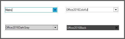
NOTE
ButtonEdit control also supports all the three windows color themes, i.e., Blue, Silver and Oliver themes. We need to change the Windows theme color in desktop properties for this.
Custom Colors for ButtonEdit
You can apply custom colors to the ButtonEdit Control by setting Office2007ColorScheme of individual child buttons to “Managed” and specifying the custom color through the ApplyManagedColors method as follows.
this.buttonEditChildButton1.Office2007ColorScheme = Syncfusion.Windows.Forms.Office2007Theme.Managed;
this.buttonEditChildButton2.Office2007ColorScheme = Syncfusion.Windows.Forms.Office2007Theme.Managed;
this.buttonEditChildButton3.Office2007ColorScheme = Syncfusion.Windows.Forms.Office2007Theme.Managed;
Office2007Colors.ApplyManagedColors(this, Color.LightGreen);Me.buttonEditChildButton1.Office2007ColorScheme = Syncfusion.Windows.Forms.Office2007Theme.Managed
Me.buttonEditChildButton2.Office2007ColorScheme = Syncfusion.Windows.Forms.Office2007Theme.Managed
Me.buttonEditChildButton3.Office2007ColorScheme = Syncfusion.Windows.Forms.Office2007Theme.Managed
Office2007Colors.ApplyManagedColors(Me, Color.LightGreen)
Border Styles
The border styles for the ButtonEdit control can be customized using the Border3DStyle, BorderSides, FlatStyle and FlatBorderColor properties.
| Properties | Description |
|---|---|
| Border3DStyle | Sets the 3D border style for the control. The options are, RaisedOuter, RaisedInner, SunkenOuter, SunkenInner, Raised, Sunken, Etched, Flat, Adjust and Bump. |
| BorderSides | Specifies the sides of the control which should have border. |
| FlatStyle | Specifies the flat style to be applied to the ButtonEdit control. Set UseVisualStyle property to false to make this setting effective. |
| FlatBorderColor | Specifies the border color for the control, when FlatStyle is set to "Flat". This color setting can be reset by calling ButtonEdit.ResetFlatBorderColor method. |
this.buttonEdit.UseVisualStyle = false;
this.buttonEdit.FlatBorderColor = System.Drawing.Color.Red;
this.buttonEdit.FlatStyle = System.Windows.Forms.FlatStyle.Flat;Me.buttonEdit.UseVisualStyle = False
Me.buttonEdit.FlatBorderColor = System.Drawing.Color.Red;
Me.buttonEdit.FlatStyle = System.Windows.Forms.FlatStyle.Flat;
NOTE
The Border styles of the child buttons can be controlled using ButtonEditChildButton BorderStyleAdv property. SeeSee Button Types and Border Styles topic for details.
Size Settings
You can set the maximum and minimum size for the ButtonEdit control using MaximumSize and MinimumSize properties.
| Properties | Description |
|---|---|
| MaximumSize | Sets the maximum size of the ButtonEdit control. |
| MinimumSize | Sets the minimum size of the ButtonEdit control. |
Foreground Settings
The font style and the fore color of the ButtonEdit control can be customized by Font and ForeColor properties. These property settings can be overridden by TextBox.Font and TextBox.ForeColor respectively.
this.buttonEdit.Font = new System.Drawing.Font("Verdana", 8.25F, System.Drawing.FontStyle.Regular);
this.buttonEdit.ForeColor = Color.SteelBlue;Me.buttonEdit.Font = New System.Drawing.Font("Verdana", 8.25F, System.Drawing.FontStyle.Regular)
Me.buttonEdit.ForeColor = Color.SteelBlueNOTE
Foreground settings for the ButtonEditChildButton can be specified using Font and ForeColor properties.

Case Settings
Using CharacterCasing property of ButtonEdit, we can specify whether the case of the character can be modified as they are typed. The options are Upper, Lower and Normal.
buttonEdit.Text = "ButtonEdit1";
buttonEdit.CharacterCasing = CharacterCasing.Lower;Me.buttonEdit.Text = "ButtonEdit1"
Me.buttonEdit.CharacterCasing = CharacterCasing.LowerNOTE
This case setting can be overridden by TextBox.CharacterCasing property.